Colors play a big role in how a room feels. They can make it cozy, vibrant, or peaceful. When it comes to interior design, neutral colors are a go-to because they never go out of style.
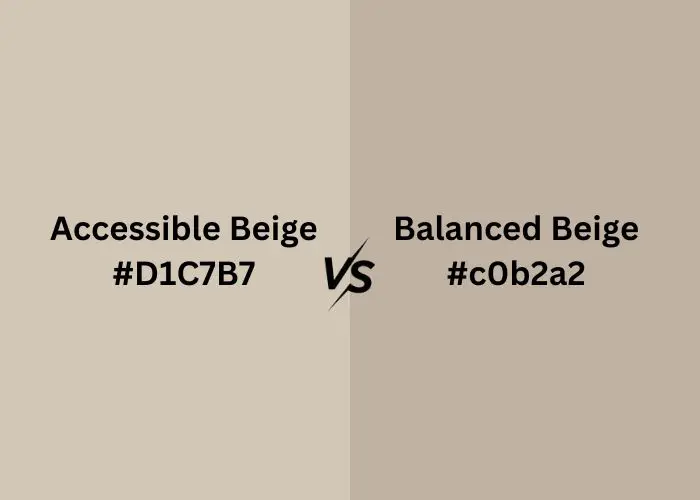
Two popular neutral colors are Accessible Beige and Balanced Beige. They’re known for their simple yet elegant look.
In this article, we’ll explore these two colors and help you understand their differences.
Whether you’re redesigning a room or starting from scratch, knowing more about Accessible Beige vs Balanced Beige can make your decision easier. Let’s get started.
What is Accessible Beige?

Accessible Beige is a paint color. It’s like a soft, light tan. Think of a sandy beach or a warm, cozy blanket.
Accessible Beige doesn’t scream for attention; instead, it creates a gentle, inviting feeling in a room. It’s a neutral color, which means it goes well with lots of other colors.
That makes it super versatile. Accessible Beige can make a room feel open and airy or snug and comfy.
People often choose it when they want a warm, neutral background that’s easy to decorate around. It’s a go-to choice for creating a relaxed and timeless vibe in your space.
What is Balanced Beige?

Balanced Beige is another paint color, just like Accessible Beige. But instead of being very light, it’s a bit deeper and warmer, like a cozy cup of cocoa.
It falls into the neutral color family, too. Balanced Beige has this great quality – it feels calm and relaxed without being too plain.
It’s like a soft, earthy hug for your room. When you use Balanced Beige, it can give a space a sense of comfort and a touch of sophistication.
It’s also quite flexible and pairs well with various colors and styles. So, if you want a cozy, warm vibe in your room, Balanced Beige might be your pick.
Accessible Beige Vs Balanced Beige: Head-to-Head Comparison
Let’s now compare Accessible Beige and Balanced Beige to help you decide which one could be your ideal choice.
Visual Comparison
When you look at Accessible Beige and Balanced Beige side by side, you’ll notice a clear visual difference. Accessible Beige is noticeably lighter, resembling a soft, pale tan.
It imparts a sense of openness and brightness to a room, making it seem more spacious. In contrast, Balanced Beige leans slightly deeper and warmer, like a muted earthy tone.
It doesn’t have the same airy quality but instead offers a cozier and snugger ambiance. Your choice between the two should depend on whether you prefer a light and open feel or a warmer and more intimate atmosphere in your space.
Warmth/Coolness
When it comes to the warmth or coolness of colors, Accessible Beige and Balanced Beige have distinct qualities. Accessible Beige tends to bring a cooler, breezier vibe to a room.
It feels a bit like a cool breeze on a sunny day, giving a sense of freshness and lightness to your space. In contrast, Balanced Beige leans toward warmth.
It’s more like the comforting warmth you feel from a cup of hot cocoa on a chilly evening. When you use Balanced Beige, it infuses your room with a cozy, inviting feeling.
So, the choice between these two colors depends on whether you want your space to feel cool and refreshing or warm and inviting.
Complementary Color Schemes
Both Accessible Beige and Balanced Beige are quite flexible when it comes to pairing them with other colors. However, they tend to work better with certain color schemes.
Accessible Beige plays nicely with cooler tones like blues and greens. It’s like a cool friend who easily gets along with others. These combinations create a balanced and harmonious look in your space.
Balanced Beige, on the other hand, thrives with earthy and warmer color companions. Think about pairing it with deep browns, terracottas, or even rich olive greens. These combinations give your room a cozy and grounded feel.
So, when choosing between the two, consider the color palette you have in mind. Accessible Beige excels with cooler colors, while Balanced Beige shines when paired with warmer, earthy tones.
And if you’re still undecided, you might even explore complementary color schemes like “agreeable gray vs accessible beige” to find the perfect balance for your space.
Light Reflectance Value (LRV)
The Light Reflectance Value (LRV) is a way to measure how much light a color reflects. It’s a number that tells us how light or dark a color appears in a room.
For Accessible Beige, its LRV is around 58, which means it reflects a good amount of light. This makes it a suitable choice for rooms where you want a bright and airy feel.
On the other hand, Balanced Beige has a lower LRV, around 44.86. This means it reflects less light compared to Accessible Beige. As a result, it tends to create a cozier and slightly darker atmosphere in a space.
So, when picking between these two colors, think about the amount of light you want in your room. Accessible Beige brings more brightness, while Balanced Beige offers a slightly dimmer, more intimate setting.
HEX and RGB Codes
HEX and RGB codes are like secret recipes that define the exact color of paint. They’re crucial when you want to match or reproduce a color accurately.
- Accessible Beige HEX Code: #d1c9bf
- Accessible Beige RGB Code: 209, 201, 191
These codes are like digital fingerprints for Accessible Beige. They tell you precisely how to recreate this color on your walls.
- Balanced Beige HEX Code: #c3b5a9
- Balanced Beige RGB Code: 195, 181, 169
Similarly, these codes help you pinpoint the exact shade of Balanced Beige.
Remember, if you need to match these colors or coordinate them with other elements in your room, these codes come in handy.
Undertone Intensity
Undertone intensity is a characteristic that can affect how a color feels in a room.
Accessible Beige has a subtle greenish-gray undertone. It’s not too strong, so it won’t dominate the room, but it can add a touch of coolness to the atmosphere.
Balanced Beige, on the other hand, carries a slightly more noticeable reddish-brown undertone. It’s still quite subtle, but it contributes to the warm and cozy feeling of the color.
Application
Accessible Beige:
- Living Rooms: Ideal for a welcoming and open living space.
- Kitchens: Creates a warm and inviting kitchen atmosphere.
- Dining Rooms: Adds a cozy yet elegant touch to dining areas.
- Hallways: Makes hallways feel more spacious and well-lit.
- Home Offices: Provides a productive and soothing work environment.
- Bright and Open Areas: Suitable for any room where you want a sense of space and light.
Balanced Beige:
- Bedrooms: Perfect for a cozy and restful bedroom ambiance.
- Dens or Family Rooms: Makes these spaces comfortable and inviting.
- Cozy Reading Nooks: Ideal for creating a snug reading corner.
- Bathrooms: Adds a spa-like, peaceful feel to bathrooms.
- Warm and Snug Spaces: Works well in areas where you want a sense of warmth and comfort.
- Sophisticated Comfort: Balances sophistication with comfort in various rooms.
Versatility
Both Accessible Beige and Balanced Beige are like the Swiss Army knives of paint colors—they can handle a variety of situations. Here’s how they do it:
- Accessible Beige: It’s a bit like a chameleon. It easily fits in with different styles, whether you like modern, traditional, or something in between. You can change up your decor, and Accessible Beige will still look great.
- Balanced Beige: This color has a timeless quality. It feels classic and adaptable, working well with a range of furniture and design choices. It’s like your favorite pair of jeans—always in style.
So, whether your taste evolves or you want a color that stands the test of time, both Accessible Beige and Balanced Beige are versatile options for your home.
Comparison Table
| Aspect | Accessible Beige | Balanced Beige |
| Visual Appearance | Light and open | Cozy and warm |
| Warmth/Coolness | Cooler | Warmer |
| Complementary Colors | Cooler tones (blues, greens) | Warmer tones (browns, terracottas) |
| Light Reflectance Value (LRV) | Higher (around 58) | Lower (around 44.86) |
| HEX Code | #d1c9bf | #c3b5a9 |
| Undertone | Subtle greenish-gray | Slightly noticeable reddish-brown |
| Ideal Application | Bright and open spaces | Cozy and intimate areas |
| Versatility | Adapts to various styles | Timeless and versatile |
FAQs
When not to use accessible beige?
Accessible Beige may not be the best choice if you’re seeking a very dark or bold look for your space. If you prefer deep, dramatic colors or want a striking contrast, Accessible Beige’s subtleness might not fit your vision.
Is balanced beige too dark?
Balanced Beige isn’t extremely dark, but it’s not the lightest shade either. If you have a room with limited natural light and want to keep it feeling bright, you might find Balanced Beige a bit too warm and cozy for your needs.
Conclusion
In conclusion, your choice between Accessible Beige and Balanced Beige depends on what kind of atmosphere you want.
Accessible Beige is light and open, while Balanced Beige is warm and cozy. Both colors are flexible and can fit different styles.
Think about your room’s purpose and how much light it gets when making your decision.
Whether you go with Accessible Beige’s freshness or Balanced Beige’s warmth, both colors can make your space look great and feel comfortable.


Leave a Reply