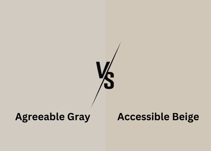
Choosing the perfect paint color for your home can be a daunting task. Among the myriad options available, two shades have risen to popularity: Agreeable Gray and Accessible Beige.
These versatile “greige” colors have become the talk of the town among homeowners and interior designers alike.
But which one is the right choice for your living space? In this article, we’ll dive into Agreeable Gray and Accessible Beige, looking at their special traits, backgrounds, and when to use them.
Whether you want your place to feel snug or contemporary, our comparison will help you choose the perfect color. Let’s make your decision easier.
What is Greige?
Greige is a mix of two classic colors: gray and beige. It’s a versatile paint color that combines the neutrality of gray with the warmth of beige.
Greige comes in various shades, and it’s known for its ability to adapt to different lighting conditions.
Whether you want a cozy, inviting atmosphere or a more modern look, greige provides a great middle ground. It’s a popular choice in interior design, making spaces feel balanced and stylish.
What is Agreeable Gray?
Agreeable Gray is a versatile and popular paint color that falls within the greige spectrum, blending the calm neutrality of gray with the inviting warmth of beige.
Its soft and balanced appearance makes it an excellent choice for various living spaces.
History, Meaning, Pros, and Cons
Agreeable Gray has gained fame in recent years, becoming a staple in interior design. It’s known for its ability to create welcoming atmospheres.
This color’s name perfectly describes its character. It’s agreeable and adaptable, capable of enhancing the ambiance of any room.
Pros:
- Flexible
- Ability to complement a wide range of decor styles
- Suitability for different lighting conditions.
Cons:
- Some might find Agreeable Gray too subtle if they’re looking for a bold statement color.
- Its undertones can vary in different lighting, which may affect its appearance.
What is Accessible Beige?

Accessible Beige is a timeless and versatile paint color. It’s known as a greige, which means it smoothly combines gray and beige shades.
This delightful color creates a warm and inviting atmosphere while still having a modern touch. That’s why it’s a favorite pick for interior design.
However, it’s not uncommon for some to confuse Accessible Beige with Balanced Beige. To discern the nuances between these two captivating shades, we invite you to explore our article on Accessible Beige vs Balanced Beige.
History, Meaning, Pros, and Cons
Accessible Beige boasts a rich history in the realm of interior design, often selected for its enduring appeal.
The name “Accessible Beige” conveys its approachable and easy-to-work-with nature. Making it a preferred option for homeowners.
Pros and Cons
Pros:
- Versatility: Accessible Beige complements a wide range of decor styles.
- Lighting Adaptability: It adapts gracefully to various lighting conditions.
- Timeless Charm: This color creates a cozy, timeless atmosphere.
Cons:
- Subtle Impact: Some may find it less bold compared to deeper shades.
- Variable Undertones: The undertones may appear differently in diverse lighting settings.
If you’re keen on creating your own beige hue, be sure to explore our article on crafting beige using acrylic paint right from the comfort of your home.
Agreeable Gray Vs Accessible Beige: Head-to-Head Comparison
Accessible Beige Vs Agreeable Gray: Visual Comparison
At first glance, Agreeable Gray and Accessible Beige may seem quite alike. But upon closer inspection, you’ll notice some key differences.
These differences can greatly affect the overall feel of your space. Agreeable Gray leans towards a cooler and lighter shade of gray. Imagine the freshness of a crisp morning.
It radiates a modern and clean look, making it an excellent choice for spaces where you want that contemporary touch. This color thrives in rooms with ample natural light.
Accessible Beige, on the other hand, brings warmth and comfort to your space. It’s like a cozy embrace from a soft blanket.
With sandy beige undertones, it effortlessly adds a touch of tradition and rustic charm. This shade flourishes in rooms where you want to create a welcoming and relaxed atmosphere.
In the visual aspect, it’s all about the vibes they bring to your room – fresh and modern for Agreeable Gray, or warm and inviting for Accessible Beige. Your choice depends on the mood you want to set.
Sherwin Williams Accessible Beige Vs Agreeable Gray: Warmth/Coolness
The warmth or coolness of a paint color can significantly impact the ambiance of a room. Let’s break down how Agreeable Gray and Accessible Beige measure up in this aspect.
Agreeable Gray tends to lean towards the cooler side of the spectrum. Picture a refreshing breeze on a summer day.
It brings a sense of airiness and crispness to your space. In rooms with good lighting, it can appear slightly cooler, giving a clean and modern feel.
Accessible Beige, on the other hand, exudes warmth. Think of the cozy embrace of a soft blanket. It adds a touch of tradition and rustic charm.
This color thrives in rooms where you want to create a welcoming and relaxed atmosphere.
Agreeable Gray brings a cooler vibe, while Accessible Beige offers a warmer and cozier feel. Your choice depends on the atmosphere you desire for your room.
Sherwin Williams Agreeable Gray Vs Accessible Beige: Light Reflectance Value (LRV)
Light Reflectance Value (LRV) is a way to measure how much light a paint color reflects or absorbs. It’s on a scale of 0 to 100, with 0 being absolute black (absorbing all light) and 100 being pure white (reflecting all light).
Agreeable Gray has an LRV of 60. This means it reflects a good amount of light, giving your space a bright and open feel. It’s not too dark, making it ideal for rooms with ample natural light.
Accessible Beige has an LRV of 58, which is just slightly lower than Agreeable Gray. It also reflects a decent amount of light, creating a warm and inviting atmosphere. It’s suitable for spaces with good lighting conditions.
Both colors provide a welcoming feel, with Agreeable Gray being a tad brighter. When choosing between them, consider the amount of natural light your room receives and your preference for brightness.
Agreeable Gray or Accessible Beige: Uses
Both Agreeable Gray and Accessible Beige are incredibly versatile paint colors that can be used in various settings. Here’s where they shine:
- Living Rooms. These colors work beautifully in living rooms, creating a cozy and inviting atmosphere. You can pair them with a range of furniture styles and decor.
- Bedrooms. Whether it’s the master bedroom or a guest room, both colors lend a soothing backdrop for relaxation and sleep.
- Bathrooms. These neutral hues are great for bathrooms, offering a spa-like ambiance. They complement white fixtures and tiles well.
- Kitchens. In the kitchen, they serve as an excellent backdrop for both light and dark cabinetry. You can add colorful accents through accessories and backsplashes.
- Dining Rooms. Both colors are ideal for dining areas, creating an elegant backdrop for family meals and gatherings.
- Hallways and Foyers. They make hallways and entryways feel warm and welcoming, setting a positive tone for anyone entering your home.
- Home Offices. Whether you work from home or need a study space, these colors provide a neutral background for focus and productivity.
Accessible Beige Vs Worldly Gray: Furniture and Decor Compatibility
When it comes to furniture and decor, both Agreeable Gray and Accessible Beige are quite accommodating. Here’s how they complement different styles:
- Modern and Minimalist. If you prefer clean lines and a contemporary look, Agreeable Gray is an excellent choice. It pairs well with sleek, modern furniture and minimalist decor.
- Traditional and Classic. Accessible Beige exudes warmth, making it suitable for traditional and classic interiors. It complements antique furniture and rich, timeless decor.
- Rustic and Farmhouse. Both colors work beautifully in rustic and farmhouse-style settings. They enhance the cozy, rustic feel of wooden furniture and natural textures.
- Bohemian and Eclectic. For eclectic spaces with a mix of patterns and colors, either color can serve as a neutral base, allowing your decor to take center stage.
- Scandinavian and Coastal. If you love the simplicity of Scandinavian or coastal design, both shades provide a neutral canvas for achieving these airy and light aesthetics.
- Accent Colors. These neutrals are versatile enough to accommodate a wide range of accent colors. Whether you prefer bold, vibrant hues or soft pastels, they play well with various color schemes.
Accessible Beige Vs Modern Gray: HEX and RGB Codes
For those who enjoy dabbling in the finer details of color, HEX and RGB codes are essential. These codes help you precisely match or coordinate colors for various design elements.
Here’s how Agreeable Gray and Accessible Beige translate into these digital color codes:
- Agreeable Gray (SW 7029): In HEX, it’s represented as #D3CDC1, while its RGB breakdown is R: 211, G: 205, B: 193. These codes ensure consistency when using the color in digital or print media.
- Accessible Beige (SW 7036): This warm hue translates to #C6B9A5 in HEX, with an RGB composition of R: 198, G: 185, B: 165. Having these codes on hand makes it easier to replicate the color accurately across various platforms.
Worldly Gray Vs Accessible Beige: Versatility
When it comes to choosing a paint color, versatility is a key factor. Both Agreeable Gray and Accessible Beige offer remarkable adaptability.
Making them suitable for various spaces and design preferences. Agreeable Gray leans toward the cooler side of the greige spectrum.
Its versatility shines as it effortlessly complements a wide range of decor styles. Whether you prefer a modern, minimalist look or a cozy, traditional ambiance, Agreeable Gray can harmonize with your vision.
Accessible Beige, on the other hand, brings warmth to any room. Its versatile nature allows it to pair beautifully with both light and dark accents.
It’s an excellent choice if you want a paint color that can adapt to changing decor trends over the years. Both colors work well in living rooms, bedrooms, bathrooms, and more.
Their ability to play nicely with various color schemes and design elements makes them top choices for interior designers and homeowners alike.
Pediment Vs Agreeable Gray: Undertones
Every paint color has undertones that can subtly affect the overall mood of a room. Understanding the undertones of Agreeable Gray and Accessible Beige can help you make the right choice for your space.
Agreeable Gray exhibits a blend of gray and beige with hints of green undertones. In certain lighting conditions, it may appear slightly cooler or even take on a subtle blue hue.
This versatility allows it to adapt to different settings, from well-lit living rooms to cozier bedrooms. Accessible Beige, true to its name, leans towards warm undertones.
While primarily a beige color, it also features green and gray undertones. This warmth adds a cozy and inviting feel to rooms, especially those with ample natural light.
To make an informed decision, consider your room’s lighting and the mood you want to create. Test samples in your space to see how the undertones interact with your decor and lighting conditions.
Sherwin Williams Modern Gray Vs Accessible Beige: Coordinating Colors
Pairing colors effectively is crucial to achieve a cohesive and pleasing look in your home. When it comes to coordinating colors with Agreeable Gray and Accessible Beige, you have a range of options to consider.
Greige Palette
For a classic and timeless appearance, combine these neutrals with whites and greiges.
Sherwin Williams Pure White and Sherwin Williams Eider White complement both Agreeable Gray and Accessible Beige seamlessly, creating a serene atmosphere.
Green and Greige Palette
If you prefer a more earthy and grounded feel, incorporate subtle greens and rich browns. Sherwin Williams Urbane Bronze and Sherwin Williams Thunderous are excellent choices.
Urbane Bronze adds depth, while Thunderous introduces a hint of green, infusing vitality into your space.
Blue and Greige Palette
For those who lean towards cooler undertones, integrate soft blues into your decor. Benjamin Moore Hamilton Blue and Benjamin Moore Hale Navy are great options.
Hamilton Blue’s warm blue with a touch of yellow undertones complements both colors, while Hale Navy provides a bold contrast for a striking effect.
So, whether you’re aiming for a classic, earthy, or cool and refreshing ambiance, the Agreeable Gray color palette and Accessible Beige color palette offer a versatile foundation for your home’s color scheme.
Trim Color Options
Choosing the right trim color can enhance the overall look of your room. Agreeable Gray and Accessible Beige each offer various trim color options to suit your taste and style.
- Sherwin Williams Alabaster. A popular choice, Sherwin Williams Alabaster is a soft white that pairs harmoniously with both colors. It provides a cohesive and monochromatic look.
- Sherwin Williams Extra White. If you prefer a brighter white for a high-contrast effect, Sherwin Williams Extra White is an excellent option. It creates a striking visual separation when paired with Agreeable Gray or Accessible Beige. (Find out more about Sherwin Williams extra white in our article “Extra white vs High reflective white“)
- Behr Diamonds Therapy. For those open to different paint brands, Behr Diamonds Therapy offers a crisp white shade that works well with both colors. It provides a fresh and clean look.
These trim color choices offer versatility and can adapt to various design styles. Consider your room’s lighting, decor, and personal preferences when making your final selection.
Equivalent Colors in Other Popular Brands
If you’re considering Agreeable Gray or Accessible Beige but prefer paints from other popular brands, you’re in luck. Several alternatives closely match these shades:
- Behr Silver Drop. Behr’s equivalent to Agreeable Gray, offering a similar warm gray tone for your walls.
- Benjamin Moore Revere Pewter. A popular alternative to both colors, known for its timeless appeal and versatility.
- Benjamin Moore Edgecomb Gray. A close match to Accessible Beige, offering a warm and welcoming feel.
- Valspar Filtered Shade. Valspar’s version of a greige that falls between Agreeable Gray and Accessible Beige.
- Behr Wheat Bread. A warm and inviting greige alternative to both colors in the Behr collection.
- Sherwin Williams Agreeable Beige. If you want something in-between, this color bridges Agreeable Gray and Accessible Beige.
- Benjamin Moore Balboa Mist. A soft, neutral alternative that complements various design styles. Here’s a Balboa Mist vs Pale Oak article that will help you make an informed choice for your next project.
Comparison Table
| Aspect | Agreeable Gray | Accessible Beige |
| Color Category | Light Greige | Warm Greige |
| Warmth/Coolness | Versatile (Can lean warm or cool) | Generally Warm |
| Light Reflectance Value (LRV) | LRV of 60 | LRV of 58 |
| Primary Use | Walls, Trim, and Cabinets | Walls, Trim, and Accents |
| Furniture Compatibility | Complements various furniture styles | Works well with wood tones |
| HEX Code | #D3CEC4 (Lighter) | #C1B9B3 (Slightly Darker) |
| RGB Code | R: 211, G: 206, B: 196 | R: 193, G: 185, B: 179 |
| Versatility | Suitable for different lighting | Creates cozy and inviting spaces |
| Undertones | Slight green and beige undertones | Warm beige undertones |
| Coordinating Colors | Blues, greens, and warm neutrals | Complements earthy tones |
| Trim Color Options | Works with both white and warm tones | Beautiful with crisp whites |
| Equivalent Colors | Behr Silver Drop, Benjamin Moore Revere Pewter, Benjamin Moore Edgecomb Gray, Valspar Filtered Shade, Behr Wheat Bread, Sherwin Williams Agreeable Beige, Benjamin Moore Balboa Mist | – |
Where to Use Accessible Beige and Agreeable Gray
Accessible Beige and Agreeable Gray are versatile paint colors that can enhance various areas of your home:
- Living Room. Consider using Agreeable Gray for a cozy and inviting living room. It pairs well with a range of furniture styles, from modern to traditional.
- Kitchen. Both colors work wonders in kitchens. Agreeable Gray can brighten up the space, while Accessible Beige adds warmth and complements wooden cabinets.
- Bedroom. Create a serene bedroom with Accessible Beige for a soothing atmosphere, or go with Agreeable Gray for a more neutral backdrop that lets your decor shine.
- Bathroom. Agreeable Gray adds a touch of elegance to bathroom walls and works beautifully with white fixtures. Accessible Beige can create a spa-like ambiance when used strategically.
- Dining Room. For an inviting dining area, both colors are great choices. Agreeable Gray can make the space feel airy, while Accessible Beige brings a touch of warmth to your meals.
- Hallways and Entryways. Use these neutrals in high-traffic areas to create continuity throughout your home. They pair well with various decor elements.
- Exterior. While primarily interior colors, these shades can also work on the exterior of your home, especially for doors and trim, when you want a timeless and elegant look.
When to Choose Each Color Paint
Choosing between Accessible Beige and Agreeable Gray depends on your design goals and the lighting in your space:
Agreeable Gray
Opt for this shade when you want a lighter, cooler-toned greige that can create an airy and open feel. It’s an excellent choice for well-lit spaces and rooms with large windows.
Agreeable Gray pairs beautifully with blues and cooler tones, creating a fresh and modern look.
Accessible Beige
If you prefer a warmer, cozier atmosphere, especially in rooms with less natural light, Accessible Beige is ideal. It brings a touch of beige to your space while maintaining a neutral base.
This color pairs well with earthy tones and warmer decor, creating a welcoming environment.
Consider these factors when making your choice:
- Lighting. The amount of natural and artificial light in your space can significantly impact how these colors appear. Agreeable Gray in well-lit rooms and Accessible Beige in spaces with limited light often yield the best results.
- Decor. Think about the colors and styles of your existing furniture and decor. Both shades are versatile and can complement various design schemes.
- Personal Preference. Your personal style and the atmosphere you want to create play a crucial role. Agreeable Gray leans more towards modern and cool, while Accessible Beige offers warmth and timelessness.
Specific Brand Colors (Sherwin Williams)
Sherwin Williams Accessible Beige
Color Code: SW 7036
Accessible Beige is a classic and versatile choice for interiors. It belongs to the greige family, blending warm beige and subtle gray paint colors.
This color exudes a sense of coziness and pairs well with a wide range of decor styles. Its timeless appeal makes it a popular option for accent wall, trim, and even cabinetry.
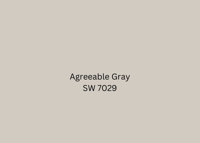
Sherwin Williams Agreeable Gray
Color Code: SW 7029
Agreeable gray sherwin williams is a delightful greige with a touch of warmth. It falls on the lighter side, making it perfect for creating open and airy spaces.
This color tends to look more gray in well-lit areas and slightly beige in rooms with less light. Its versatility and ability to harmonize with various color schemes make it a top choice for many homeowners.
FAQs
Is accessible beige or agreeable gray better?
Agreeable Gray is a safer bet. Its slightly lighter and cooler undertones make it a versatile choice for various lighting conditions and decor styles. Accessible Beige, while also a great option, may appear warmer in some settings.
Is accessible beige lighter than agreeable gray?
Accessible Beige and Agreeable Gray are very close in lightness. Agreeable Gray is just a tad lighter, making it suitable for well-lit spaces, while Accessible Beige adds warmth in slightly dimmer rooms.
Does agreeable gray look more gray or beige?
Agreeable Gray is a true greige, appearing more gray in some lighting conditions and beige in others. Its adaptable nature allows it to complement both gray and beige decor.
What color is better than agreeable gray?
Several colors are comparable to Agreeable Gray, such as Repose Gray or Worldly Gray by Sherwin Williams, or Edgecomb Gray by Benjamin Moore. These shades offer similar versatility and appeal for interior spaces.
Conclusion
When it’s time to pick between Agreeable Gray and Accessible Beige, you’ve got two fantastic greige choices.
Agreeable Gray is lighter and cooler, suitable for many rooms. Meanwhile, Accessible Beige offers a warmer and cozier feel, timeless in its appeal.
Both paints are versatile and can match various color schemes and styles. Your decision should reflect your preferences, room lighting, and the mood you want.
Whichever you go for, you can be sure your space will shine with a lovely, enduring color.


Leave a Reply