
When discussing colors, we often focus on the three primary colors – red, blue, and yellow – and their direct offspring.
But what about the more complex, rich colors that fill our world? Let’s talk about brown – often seen but less frequently examined.
Understanding brown, its place on the color wheel, and its relationships with other colors can unlock new realms of creativity.
From harmonious color combinations to psychological impacts, diving into the world of brown can bring a refreshing perspective.
Let’s embark on this color journey together, starting with the basics of the color wheel.
What Is The Opposite Of Brown On The Color Wheel?
The opposite of brown on the color wheel is blue or bluish-grey. But, specific shades of brown may have different complementary colors due to varying red, yellow, or green tints. These subtleties add depth and versatility to the color brown.
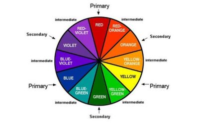
Understanding the Color Wheel
What’s a color wheel? It’s a circular diagram showing the relationships between different colors in lay terms.
Since its inception, this handy tool has aided artists, designers, and color enthusiasts.
At the heart of the wheel are the primary colors – red, blue, and yellow. They’re the fundamental trio from which all other colors originate. You can’t create them by mixing other colors.
Taking a step further, we encounter secondary colors. When you blend the primary colors, green, orange, and purple hues come to life. For instance, blue and yellow give birth to green.
Lastly, we have the tertiary colors, the middle children of the color family. They’re born from a primary color mixing with its nearest secondary color. Examples include red-orange or blue-green.
But what’s the purpose of this colorful wheel? It serves as a guide to understanding color relationships, harmonies, contrasts, and more. It’s a color roadmap, simplifying the complexities of color theory for us.
Understanding Color Relations on the Color Wheel
Complementary colors
Complementary colors are color pairs that, when combined, cancel each other out. They produce a grayscale color when combined.
They sit directly opposite each other on the color wheel, offering a stark contrast when side by side.
Opposite color pairs on the color wheel
Royal Blue and Brown: Royal blue and brown make a vibrant duo pleasing to the eye.
The cool, deep tone of royal blue color combinations offsets the warmth of brown. It thus creates a balanced and eye-catching combination.
Eggplant Purple and Brown: There’s an earthy richness when eggplant purple meets brown.
The deep, dark purple brings a touch of mystery and luxury, which complements Brown’s grounded, comforting nature.
Lavender and Brown: If you’re looking for a softer contrast, lavender and brown are your go-to.
The light, airy feel of lavender provides a delicate contrast to the brown, resulting in a soothing, calming palette.
Teal Blue and Brown: Teal blue and brown offer a harmony of warmth and coolness.
The serene, refreshing vibe of teal blue cuts through the warm, rustic appeal of brown, especially red-brown, creating an inviting and balanced blend.
Analogous colors
When you glance at the color wheel, analogous colors are neighboring each other.
This group includes a particular color and its closest friends, for instance, dark blue, blue, and light blue. Luckily, if you know how to make light blue or either, adjust the mixing ratios to achieve the three shades.
These colors smoothly transition into each other, creating a harmonious and pleasing effect.
They often appear in nature, making them a favorite color for designers seeking a natural and calming palette.
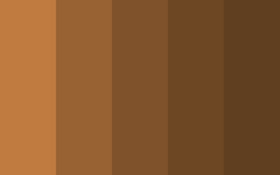
Monochromatic colors
The monochromatic color scheme explores a single color’s shades, tints, and tones. Consider dark orange.
Adjusting the saturation and brightness allows you to create a range of colors, from the deepest, richest orange to the palest, most delicate peach.
This scheme allows for unity and variety, creating depth while maintaining cohesion.
Triadic colors
Moving onto triadic colors, we’re now dealing with a trio. This scheme involves three colors that are evenly spaced on the color wheel.
Think of it as a perfect color triangle. For example, you could have red, blue, and yellow as the primary colors.
Triadic color schemes are vibrant and dynamic, making them a go-to for adding energy to a design.
Tetradic colors
Tetradic colors are also known as double complementary colors. This scheme is the most diverse, involving two pairs of complementary colors.
Let’s say you have warm colors like red and orange. Their complements in the cool spectrum would be green and blue, respectively.
These colors offer a wide range and contrast while maintaining balance when combined.
But beware, given its diverse palette, and this scheme requires a careful eye to prevent chaos.
Exploring the Color Brown
What is brown on the color wheel?

On the color wheel, brown is an intriguing resident. It doesn’t claim its spot in the classic rainbow lineup, but rather, it emerges from the blend of primary colors or a mix of complementary colors.
You can make brown with primary colors on the color wheel. Mix red and yellow colors with a touch of blue. Adjust the ratios to create different shades, ranging from lighter to darker tones of brown.
The psychology of brown
In psychology, brown has quite a reputation. It’s seen as a color of stability, reliability, and earthiness.
It invokes feelings of comfort, security, and a sense of home. As such, it’s frequently used in interior design and branding to create a feeling of warmth and wholesomeness.
Color theory rule for brown
Like its RGB color code, the color theory rule for browns lies in its versatility.
From a theoretical perspective, brown stands between the warmth of red and orange and the coolness of blue and green.
As a derivative of red-violet, it straddles the warm and cool domains, making it a unique player in fine arts and design.
It blends well with almost any color, making it a favorite neutral among designers.
Finding the Opposite and Complementary Colors of Dark Brown
Navigating the color wheel to find dark brown complements and opposite colors is fascinating.
But first, we must pin down our specific shade of dark brown. We’ll use the HEX Code #5C4033 in the vast color space to identify it.
Now, what’s the opposite of this deep, rich brown? Generally, the color wheel points us toward a cool teal or blue-grey.
These hues provide a stark yet pleasing contrast to the warmth and depth of dark brown. Meanwhile, complementary colors add to the richness of dark brown.
Hues like soft, pastel blues and greens contrast and enhance the deep tones of our chosen brown, creating a palette full of depth, harmony, and intrigue.
Brown Color Combinations
Warm brown combinations with yellow and orange
Imagine the beauty of a ripe harvest or the magical tones of an autumn leaf pile. In this combination, the earthy warmth of brown acting as the canvas.
It ties together the cheerful brightness of yellow and the lively intensity of orange.
It’s like a palette that communicates warmth, comfort and even a touch of nostalgia.
This trio is ideal for rooms seeking a cozy feel or designs that celebrate the change of seasons.
Brown combinations with green
What color does brown and green make when mixed?
This partnership brings to mind the tranquility of a forest trail. The grounded, comforting presence of brown complements the life-affirming freshness of green.
This blend generates a color scheme that embodies balance, tranquility, and vitality.
Mother Nature curated this combination of designs to instill a sense of peace and natural harmony.
Cool down combinations with orange.
A surprising yet captivating mix. The cool undertones of brown meet the energetic burst of orange, producing an unexpected dynamic.
The cool brown serves to temper the fiery orange while the orange injects a dose of vivacity into the calm brown.
This combination is great for designs seeking to stimulate and energize without overwhelming.
Neutral dark brown combinations with black and white
Picture the timeless elegance of a classic film or a monochrome photograph. The depth of dark brown serves as a bridge between the stark black and pure white.
This palette oozes sophistication, a sleek monochrome with a twist. Perfect for spaces requiring an aura of refinement or designs aspiring to be classy.
Neutral light brown combinations with creams
Envision a latte’s frothy top or a warm biscuit’s softness. The gentle presence of light brown pairs with various creamy tones, creating a soothing, delicate palette.
It’s an unassuming mix, gentle and inviting, evoking tranquility. For designs seeking comfort and calm, this pairing is an excellent choice.
Neutral brown combinations with teal
The mix is refreshing, like a cool breeze on a warm day. The calm, serene teal contrasts with the stable, grounded brown, creating a harmonious but vibrant blend.
While balanced, this color duo offers a hint of playful energy. It’s an inspired choice for designs that balance being relaxed and lively.
Importance of Color Harmony
Color harmony is important for a variety of reasons:
Balance and Unity: When colors work together in harmony, they create a sense of balance and unity in the design. No color overpowers the others, and each has its space and role.
Guiding Perception: Harmonious colors guide the viewer’s eye through the design, creating a visual narrative. This guidance helps viewers understand and appreciate the design.
Evoking Emotion: Colors can evoke specific emotions and moods. They can create a particular atmosphere or feeling, from tranquility and relaxation to energy and excitement when harmoniously combined.
Aesthetic Appeal: Harmony in colors enhances the aesthetic appeal of a design. It’s the difference between a visually pleasing design and one that’s jarring or unpleasant.
Memorability: Harmonious color combinations are more likely to be memorable. They make a design stand out and leave a lasting impression on the viewer.
Communication: Colors can communicate specific ideas or messages. They can reinforce the message and make it more effective when used harmoniously.
Applications of Brown in Design
Brown is a Neutral Color
In the realm of colors, brown is a reliable neutral. Its earthy tone helps in grounding bolder colors and fostering a balanced palette.
It can make bright colors pop without stealing the spotlight, playing the supporting role with grace and subtlety. Look at red and brown; the pairing can create a warm and earthy color scheme.
Incorporating Brown in Branding
Brown can be a powerful tool in branding. It’s associated with reliability, stability, and comfort.
Brands that convey a sense of tradition, quality, or dependability use brown. It can create an image of being grounded, reliable, and trustworthy.
Fashion and Brown: Styling Tips
In fashion, brown is a timeless classic. It pairs beautifully with various colors, from bright hues to muted tones.
Combining brown with pastels can create a soft, romantic look. Pairing it with bolder colors like royal blue or emerald green can make a striking statement. The beauty of brown lies in its versatility.
Brown Carpets and Wall Colors
Regarding interior design, brown carpets offer a wide range of possibilities. They pair well with warm tones like peach or yellow for a cozy feel.
Pair a brown carpet with cool colors like gray or teal for a more modern look.
Colors That Complement Brown
Several colors bring out the best in brown. Sky blue offers a refreshing contrast to brown’s earthiness. If you understand which color mix to make sky blue, then you can experiment with various shades and intensities to create the perfect complement for brown.
White, with its purity and simplicity, enhances brown’s warmth. Emerald green and brown together can create a vibrant, nature-inspired palette.
Pairing Brown and Beige: A Perfect Match?
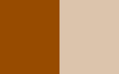
Brown and beige together create a neutral palette that’s comforting and peaceful. Beige lightens brown’s depth, while brown adds richness to beige’s lightness.
Brown and beige complement each other beautifully, creating a versatile palette that works well in various contexts, from fashion to interior design.
Brown and beige and a touch of champagne gold color combine to form a harmonious and tranquil neutral palette.
Read on: beige vs cream
FAQs
What color is the opposite of tan?
On the color wheel, the color that lies opposite to tan (a shade of orange) is blue. A cool sky blue can provide a striking contrast to tan, balancing its warmth with a cool freshness.
What is the difference between warm and cool colors?
Warm colors include reds, oranges, and yellows associated with warmth and energy. They can stimulate and draw attention. Cool colors like blues, greens, and purples evoke calm and tranquility. They’re often used to create a soothing and relaxed atmosphere.
Which colors look best when paired with brown?
Brown pairs well with a variety of colors. It can look sophisticated with navy blue, vibrant emerald green, and chic with pastel pink. Bright white mixed with brown can give a crisp, modern look to brown, while beige can create a soft, neutral palette.
How can brown and beige be effectively paired together?
Brown and beige can be paired by balancing their intensity. Use beige as the base color for a light, airy feel, and add brown accents for depth and warmth. Or, use brown as the base color and lighten the mood with beige accessories or details.
Conclusion
Wrapping up and understanding the color wheel is crucial. It helps us to see how colors interact. This knowledge can greatly improve our design, style, and creation of visual combos.
Brown stands out with its warm, earthy richness. It offers a world of options.
Color balance is key in designing a brand or outfit or decorating a room. Consider the mix of complementary and analogous colors.
Exploring how colors relate can lead to pleasing designs. These designs won’t just look good. They’ll also stir up the right feelings and responses.


Leave a Reply