Champagne and gold colors are both associated with luxury and elegance, but they have distinct characteristics.
Champagne color is a light, pale beige with hints of yellow or pink, reminiscent of the sparkling wine it is named after.
It exudes sophistication and subtlety, making it a versatile choice for various applications. On the other hand, gold color is a warm, metallic shade resembling pure gold.
It represents opulence, wealth, and grandeur. With its rich and vibrant nature, gold color adds a touch of glamour and luxury to designs.
Both colors have unique qualities and can be used creatively to evoke different moods and associations.
Let’s explore the difference between Champagne vs Gold Color.
What is Champagne Color?

Champagne color is a delicate and muted shade that resembles the light golden hue of champagne in the color wheel. It is named after the beverage of the the same name.
It is often associated with elegance, sophistication, and luxury. Let’s delve into the history, meaning, pros and cons, and ways to use champagne color.
The history of champagne color
The origin of champagne color can be traced back to the traditional method of producing champagne, a sparkling wine named after the Champagne region in France.
The color of the beverage, with its golden undertones, inspired the creation of the champagne color.
In the world of fashion and design, the term “champagne” was first used in the early 20th century to describe the pale, muted gold shade reminiscent of the sparkling wine.
Over the years, champagne color has gained popularity and become a timeless choice for various applications.
The meaning of champagne color
Champagne color is often associated with elegance, refinement, and celebration. It exudes a sense of luxury and sophistication while maintaining a subtle and understated allure.
The soft golden tones evoke feelings of warmth, charm, and a touch of glamour.
Pros and cons of champagne color
Pros
- Versatility. Champagne color complements a wide range of other hues, making it suitable for various color palettes and combinations.
- Timeless appeal. The soft and muted nature of champagne color gives it a timeless quality that can withstand changing trends.
- Elegance and sophistication. Champagne color adds a touch of refinement and sophistication to any design or space.
- Versatile applications. Champagne color can be used in interior design, fashion, graphic design, and more, allowing for creative expression.
Cons
- Subtlety. The muted nature of champagne color may not provide the desired impact for those seeking bold and vibrant visuals.
- Limited contrast. Due to its softness, champagne color might not provide strong contrast when paired with certain colors.
How to use champagne color
- Interior design. Incorporate champagne color in wall paint, furniture, or accessories for a subtle and elegant ambiance.
- Fashion. Use champagne-colored clothing or accessories to add a touch of sophistication and glamour to your ensemble.
- Weddings and events. Champagne color can be an excellent choice for wedding decor, table settings, and attire, creating a romantic and refined atmosphere.
- Graphic design and branding. Utilize champagne color in logos, packaging, or website design to convey elegance and luxury.
Different shades of champagne color
- Pale Champagne. Pale Champagne is a light and delicate shade with subtle beige or off-white undertones. It embodies elegance and sophistication, providing a soft and neutral backdrop. HEX: #F7E7CE, RGB: 247, 231, 206.
- Golden Champagne. Golden Champagne has a warm golden hue, exuding richness and luxury. It adds a touch of opulence and can create a sense of glamour in designs. HEX: #E6CBA8, RGB: 230, 203, 168.
- Champagne Pink. Champagne Pink combines the subtle champagne base with a soft pink undertone. It brings a romantic and feminine charm, offering a gentle color option. HEX: #F1C2CC, RGB: 241, 194, 204.
- Champagne Beige. Champagne Beige features a slightly deeper beige tone with warm undertones. It creates a sense of warmth and tranquility. HEX: #E8D8B9, RGB: 232, 216, 185.
What is Gold Color?
Gold color is a warm and radiant hue that resembles the precious metal gold. It is often associated with wealth, success, and opulence.
Let’s explore the history, meaning, pros and cons, and ways to use gold color.
The history of gold color
Gold has been revered throughout history for its rarity and beauty. The use of gold in decorative arts dates back thousands of years, with ancient civilizations incorporating it into jewelry, artifacts, and architectural elements.
The color gold emerged as a representation of the metal itself and became associated with wealth, power, and divine attributes.
In art and design, gold color gained popularity during the Byzantine and Renaissance periods, where gold leaf was used to embellish religious paintings and luxurious manuscripts.
The use of gold color has continued to evolve and remains a symbol of prestige and grandeur.
The meaning of gold color
Gold color symbolizes wealth, success, abundance, and prosperity. It represents achievement, luxury, and a sense of extravagance.
It exudes warmth, radiance, and a sense of timeless beauty. Gold color is often associated with prestige and high value.
Pros and cons of gold color
Pros
- Symbolic significance. Gold color carries positive connotations of wealth, success, and prosperity.
- Elegance and opulence. Gold color adds a touch of luxury and grandeur to any design or space.
- Versatility. Gold color can be used as a focal point or as an accent, complementing a wide range of colors and styles.
- Emotional impact. The warm and radiant nature of gold color can evoke feelings of joy, warmth, and positivity.
Cons
- Overuse caution. Excessive use of gold color may create an overwhelming or gaudy effect.
- Limited suitability. In some contexts or design themes, gold color may not be appropriate or harmonious.
How to use gold color
- Interior design. Incorporate gold color through accents like lighting fixtures, trimmings, or decorative objects to add a touch of luxury and elegance to a space.
- Fashion and accessories. Use gold-colored clothing, jewelry, or accessories to make a statement and add a touch of glamour to an outfit such as bridesmaids dress or gown.
- Branding and marketing. Gold color can be utilized in logos, packaging, or advertisements to convey a sense of prestige and high quality.
- Celebrations and events. Gold color is often associated with special occasions. Use it in decorations, invitations, or table settings to create a celebratory and gorgeous atmosphere.
Different shades of gold color
Gold color comes in various shades and variations. Some notable examples include:
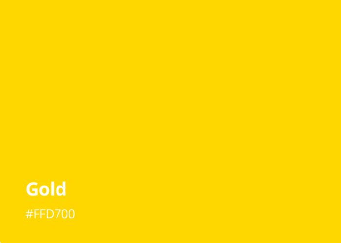
- Yellow Gold. The classic and widely recognized shade of gold, symbolizing luxury and elegance. HEX: #FFD700, RGB: 255, 215, 0.
- Rose Gold. Trendy and romantic, with pink or copper undertones. HEX: #FFC0CB, RGB: 255, 192, 203.
- White Gold. A contemporary mix of light gold with white, offering a sleek and modern alternative. HEX: #F7F7A6, RGB: 245, 245, 245.
- Antique Gold. Deeper and darker are created by gold and silver combined or mixing silver and other metals, creating an aged or vintage look. HEX: #8B6914, RGB: 139, 105, 20. Used historically for jewelry and decor.
Next, learn how to make gold paint
Champagne Vs Gold Color: Head-by-Head Comparison
1. Psychological effects
Champagne color creates a sense of refinement, elegance, and subtle luxury. It evokes relaxation, tranquility, and understated beauty.
In contrast, gold color elicits feelings of opulence, success, and grandeur. It carries an aura of power and allure, inspiring joy and positivity.
Both colors offer distinct psychological effects, providing options for different atmospheres and aesthetics.
2. Associations
Associations greatly influence how we perceive champagne colors and gold colors. Champagne color is associated with celebrations, luxury, and elegance.
It symbolizes joy, refinement, and timelessness. Gold color, on the other hand, is linked to wealth, prestige, and divine attributes.
It represents opulence, success, and spiritual enlightenment. These associations shape the symbolic meaning and emotional impact of the colors in different contexts.
3. Uses
Champagne and gold colors have versatile uses. Champagne color adds elegance and sophistication to interior design and fashion.
It creates a luxurious ambiance in event decor. Gold color enhances jewelry design and represents high quality in branding.
Both colors offer creative possibilities for expressing refinement and luxury.
4. HEX and RGB code
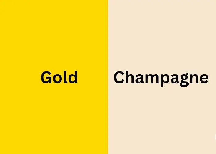
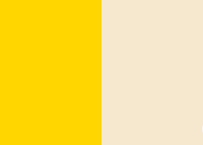
The HEX code for Champagne color is typically #F7E7CE, while the HEX code for gold color is usually #FFD700.
Regarding RGB codes, Champagne color is represented by RGB values (247, 231, 206), while gold color is represented by RGB values (255, 215, 0).
5. Saturation
Champagne color generally has lower saturation levels compared to gold color. Champagne color tends to exhibit softer and more muted tones, with a reduced intensity of color.
On the other hand, gold color can range from subtle and muted to highly saturated and vibrant, depending on the desired effect.
6. Brightness
Champagne color tends to have a lighter and softer appearance. It radiates a gentle luminosity that is not overly bright or intense.
On the other hand, gold color tends to have a higher level of brightness. It exudes a strong and radiant glow, reflecting the brilliance often associated with the precious metal.
7. Warmth/Coolness
Both Champagne and gold colors are generally considered warm colors. Warm colors evoke a sense of coziness and comfort.
Champagne color leans towards warm tones, offering a soft and inviting feel. Gold color also has warm undertones, but it can vary in intensity, ranging from subtle warmth to a more vibrant and intense hue.
The warm nature of both colors contributes to their ability to create a welcoming and inviting atmosphere in various applications.
8. Metallic appearance
Champagne color has a subtle shine resembling satin or brushed metal. In contrast, gold color has a strong and shiny metallic look, like polished gold surfaces.
The metallic quality of gold color enhances its connection to luxury and opulence. Similarly, the soft metallic sheen of Champagne color adds a touch of elegance and sophistication to designs.
9. Symbolic meaning
Symbolic meaning refers to the deeper meanings or associations that colors hold. Champagne color is often associated with celebration, refinement, and a touch of luxury.
It represents joyous occasions and exudes an aura of elegance and sophistication. On the other hand, gold color carries symbolism related to wealth, success, and abundance.
It is often seen as a symbol of prestige and high value, representing prosperity and achievement.
10. Popularity
Champagne and gold colors have gained significant recognition and appreciation. Champagne color has been increasingly favored for its understated elegance and versatility.
Its timeless appeal has resonated with individuals seeking a classic and refined aesthetic. Gold color, on the other hand, has maintained long-standing popularity.
This is due to its association with opulence and prestige. Its captivating allure and symbolic significance have made it a popular choice.
Both colors continue to enjoy popularity in design, fashion, and other creative fields.
Comparison Table: Champagne Color vs Gold Color
| Comparison Factors | Champagne Color | Gold Color |
| Psychological effects | Evokes refinement, elegance, and subtle luxury. | Elicits feelings of opulence, success, and grandeur. |
| Associations | Associated with celebrations, luxury, and elegance. | Linked to wealth, prestige, and divine attributes. |
| Uses | Adds elegance to interior design and fashion. | Enhances jewelry design and represents high quality in branding. |
| HEX and RGB code | HEX: #F7E7CE – RGB: (247, 231, 206) | HEX: #FFD700 – RGB: (255, 215, 0) |
| Saturation | Generally has lower saturation levels with muted tones. | Can range from subtle to highly saturated and vibrant. |
| Brightness | Lighter and softer appearance, radiating a gentle luminosity. | Higher level of brightness, exuding a strong and radiant glow. |
| Warmth/Coolness | Both are warm colors, creating a cozy and inviting feel. | Emit warm tones, ranging from subtle warmth to vibrant hues. |
| Metallic appearance | Subtle metallic sheen resembling satin or brushed metal. | Strong metallic look resembling polished gold surfaces. |
| Symbolic meaning | Represents refinement, elegance, and joyous occasions. | Symbolizes wealth, success, and prosperity. |
| Popularity | Increasingly favored for understated elegance and versatility. | Long-standing popularity due to opulence and symbolic significance. |
FAQs
Is champagne color like gold?
No, champagne color is not exactly like gold. While they both have warm tones, champagne color is a softer and more muted shade, resembling the light golden hue of champagne. Gold color, on the other hand, has a more vibrant and intense appearance, reflecting the bright and lustrous qualities of the precious metal.
What color is champagne close to?
Champagne color is often close to a pale or light beige color. It shares similar warm undertones and a soft, muted appearance. The subtle differences lie in the specific hues and tones. Champagne color have a slight golden or yellow with hints on orange, while beige tends to be more neutral and earthy.
Is champagne gold the same as beige?
While there may be some similarities between champagne gold and beige, they are not the same. Champagne gold typically has a warmer, golden undertone, while beige is a more neutral, earthy color.
What type of color is champagne?
Champagne is a warm color that falls within the spectrum of light to medium gold tones. It is a pale and muted shade, often associated with the light golden hue of the sparkling wine after which it is named.
Next, learn: Cream vs beige color
Conclusion
Champagne and gold colors each have their own unique characteristics and appeal. Champagne color exudes elegance, refinement, and a touch of luxury.
It creates a subtle and understated beauty that is timeless and versatile. On the other hand, gold color represents opulence, success, and grandeur.
It carries a radiant and vibrant allure, evoking feelings of wealth and prestige. Both colors have found popularity in various fields, from interior design to fashion and branding.
Whether you prefer the soft and muted tones of Champagne color or the bold and dazzling shine of gold color, both offer opportunities for creating visually striking and emotionally impactful designs.


Leave a Reply