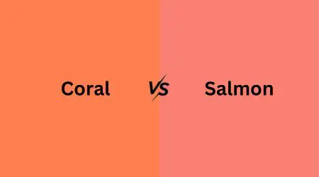
Coral and salmon are two beautiful colors we often see in fashion, design, and nature. In this article, we’ll explore what makes them unique.
Coral is a warm and lively color, like a mix of pink and orange, inspired by coral reefs in the ocean. Salmon, on the other hand, is a softer, pinkish-orange shade named after the fish.
We’ll compare them in terms of their brightness, versatility, and where they come from. By the end, you’ll know the difference between coral vs salmon.
What is Coral Color?
Coral color is a warm, lively hue that’s like a mix of pink and orange. It’s named after the beautiful coral reefs you find in the ocean.
Imagine the feeling of sunshine on a tropical beach – that’s a bit like what coral color brings to mind.
People often use it to add energy and excitement to things like clothes and decorations. It’s like a burst of happiness in color form.
To make coral color, you need to mix pink and orange. You can start with some pink and slowly add a little orange until you get the coral shade you want. It might take a bit of experimenting to get it just right.
If you want more detailed instructions on how to make coral color, check out our article on how to make the color coral step-by-step.
What is Salmon Color?
Salmon color is a softer, pinkish-orange shade. It gets its name from the salmon fish, which has a similar color in its flesh.
When you think of salmon, picture a cozy, peaceful sunset – that’s the vibe salmon color gives off.
It’s a soothing and gentle color, perfect for creating calm and comfy spaces. People love using it in fashion and interior design to make things feel warm and inviting.
Coral Vs Salmon: Head-to-Head Comparison
While they may seem similar at first glance, there are several key differences between these two options. Let’s take a look.
Coral vs Salmon Color: Hue
Hue refers to the core color of a shade. Coral has a hue that’s a mixture of orange and a touch of pink. It’s a vivid and warm color reminiscent of tropical sunsets.
In contrast, salmon’s hue leans more towards a soft pink with a subtle touch of orange. It’s a gentler and more subdued color, often associated with feelings of tranquility.
So, to put it simply, coral has a brighter, orangish hue, while salmon is primarily pink with a hint of orange.
These differences in hue give each color its own unique character and emotional impact. A dark salmon adds depth to the range.
Salmon vs Coral Color: Tone
Tone refers to how light or dark a color appears. Coral tends to have a brighter and more intense tone, making it stand out vividly. It’s like a lively pop of color.
On the other hand, salmon features a softer and more muted tone, which gives it a calm and cozy feel. It’s akin to the soothing comfort of a pastel hue.
In simple terms, coral is a bit brighter and attention-grabbing, while salmon is softer and more relaxing. These tonal differences influence the emotions and ambiance each color can create in various settings.
Salmon Color vs Coral: Versatility
Versatility refers to how well a color fits into different situations. Salmon is known for its versatility, as it easily blends with various color palettes and design schemes.
Its subdued nature allows it to adapt to both casual and formal settings, making it a popular choice in fashion and interior design.
Coral, on the other hand, is more attention-grabbing due to its vibrant and bold character.
While it can add a striking element to a design or outfit, its boldness may limit its versatility in some contexts.
It tends to be a statement color, often used to create a focal point or convey a specific mood.
Coral Color vs Salmon: Origin
The origin of a color tells us where its name comes from. Salmon is a light pink color, and it got its name from the color of salmon fish flesh. Yes, the same fish you might find on your plate.
People noticed that the fish had a soft, pinkish-orange hue, and that’s how the color got its name. The word “salmon” as a color was first officially used in English back in 1776.
Coral, on the other hand, takes its name from the creatures that live in the colorful, tropical ocean reefs. Coral reefs are like underwater gardens, and they come in all sorts of beautiful colors.
Coral’s name comes from these marine invertebrates, which is a fancy way of saying small sea creatures without backbones. So, it’s like coral carries a piece of the ocean’s beauty in its name.
Color Salmon vs Coral: Saturation
Saturation tells us how vibrant or muted a color is. For salmon, it has a hue angle of 6.2 degrees, which means it leans a bit towards orange on the color wheel.
It’s quite saturated, at 93.2%. This means it’s a lively and vivid color, not too muted.
Now, when it comes to coral, it has a hue angle of 16.1 degrees, which places it a bit closer to orange on the color wheel.
Coral is fully saturated at 100%, making it a very intense and bold color. The difference in saturation between salmon and coral highlights their distinct personalities.
Color Coral vs Salmon: Complementary Colors
Complementary colors are like best friends in the world of color. They’re the ones that make each other look even more amazing when they’re together.
For salmon, its complementary colors often include earthy tones like olive green and soft neutrals like taupe.
When paired with these colors, salmon seems to shine even brighter and cozier.
On the other hand, coral has a different set of companions. It pairs wonderfully with cool aqua blue, navy blue, and fresh minty green. These colors contrast beautifully with coral, creating a tropical and energetic vibe.
You would also be interested in learning about peach vs coral vs apricot complementary colors to see how
Coral vs Salmon Shade: Light Reflectance Value (LRV)
Light Reflectance Value, or LRV for short, is like a measure of how much light a color reflects. It helps us understand how bright or dark a color feels in a space.
For salmon, its LRV is a bit higher, around 71.4%. This means it reflects quite a bit of light, creating a feeling of brightness and openness. It’s like having a sunny day inside your room.
Now, coral has an LRV of about 65.7%, which means it reflects a bit less light. This can make a space feel cozier and more intimate, like a warm and inviting atmosphere.
Salmon lets more light bounce around, making things brighter, while coral keeps things a tad more snug and cozy by reflecting a bit less light.
Salmon vs Coral Hue: HEX and RGB Codes
HEX codes and RGB codes are like secret recipes for colors. They help computers and designers recreate the exact color you want.
Salmon’s HEX code is #fa8072. Think of it like a unique code that tells the computer, “Make this color exactly like salmon.”
Its RGB code is a set of numbers (250, 128, 114) that works like a recipe with three ingredients, each representing the amount of red, green, and blue needed to mix the color.
For coral, its HEX code is #FF7F50, and its RGB code is (255, 127, 80). These codes are like color coordinates that make sure coral looks just right, whether on a screen or in print.
Use in Interior Design
1. Color Impact:
- Coral: Adds a bright and lively color punch, like a vibrant painting on the wall.
- Salmon: Gives a softer touch, like a cozy blanket, making rooms feel warm.
2. Center of Attention:
- Coral: Great for making things stand out, like a bold piece of art.
- Salmon: Mixes well with other colors, ideal for a balanced look.
3. Room Size:
- Coral: Works best in bigger rooms with lots of space and light.
- Salmon: Fits nicely in small and large spaces, creating a comfy feel.
4. Mood Setter:
- Coral: Sets an energetic vibe, good for lively spaces.
- Salmon: Makes rooms feel calm and comfy, great for relaxation.
5. Color Partners:
- Coral: Goes well with blue, yellow and green, giving a tropical feel.
- Salmon: Matches with earthy colors like beige and green, creating a soothing atmosphere.
6. Adaptability:
- Coral: Specialized and bold, used for specific design effects.
- Salmon: Flexible and versatile, suitable for various design styles.
Psychological Effects
The colors you choose for your surroundings can affect how you feel. Coral tends to bring energy and enthusiasm to a room, making it a lively and invigorating choice.
It often becomes a favorite color for those who want an uplifting atmosphere.
On the other hand, salmon has a calming and comforting effect, making spaces feel relaxed and cozy. It’s akin to a gentle, soothing presence.
So, if you want to feel more awake and spirited, coral might be your color. If you’re seeking peace and serenity, salmon could be your go-to.
Coral Pink vs Salmon Pink
Coral pink is a brighter and more intense pink-orange, like a lively sunset. It’s vibrant and bold, demanding attention.
Salmon pink, on the other hand, is softer and leans towards a gentle, pastel pink with a touch of warmth. It exudes a soothing and comforting aura.
Coral vs Salmon: A Simple Comparison
| Aspect | Coral | Salmon |
| Hue | Mix of orange and pink | Soft pink with a hint of orange |
| Tone | Bright and vivid | Softer and more muted |
| Versatility | Bold and attention-grabbing | Versatile and adaptable |
| Origin | Inspired by coral reefs | Named after salmon fish |
| Saturation | Highly saturated | Moderately saturated |
| Complementary | Aqua blues and mint greens | Earthy tones like olive and taupe |
| LRV | Reflects a bit less light | Reflects more light |
| HEX Code | #FF7F50 | #FA8072 |
| Use in Interior | Bold statements and accents | Creates warm, inviting spaces |
| Psychological | Energizing and lively | Calming and cozy |
Different Shades of the Color Salmon
Salmon comes in a range of delightful variations. Here are some of its shades:
- Pale Salmon: A gentle, barely-there pinkish-orange, like a soft morning glow.
- Salmon Pink: A classic salmon shade, resembling the fish’s flesh, with a warm and inviting tone.
- Coral Pink: A slightly brighter version, leaning more towards coral, invoking a lively feel.
- Peachy Salmon: A delicate blend of peach and salmon, exuding sweetness and charm.
Different Shades of the Color Coral
Coral offers a diverse spectrum of beautiful hues:
- Coral Orange: A vibrant and bold shade with a strong presence.
- Coral Pink: A softer, more subdued coral with a touch of pink.
- Coral Red: A deeper, reddish coral, reminiscent of sunsets.
- Coral Peach: A blend of coral and peach, creating a warm and cozy atmosphere.
Salmon vs Coral vs Peach
Salmon:
- Color: A gentle pinkish-orange.
- Mood: Calm and inviting.
- Use: Versatile for various design styles.
- Feeling: Cozy and warm.
Coral:
- Color: Vibrant, leaning towards orange.
- Mood: Energetic and lively.
- Use: Ideal for creating focal points.
- Feeling: Bold and attention-grabbing.
Peach:
- Color: Soft and delicate blend of pink and orange.
- Mood: Sweet and charming.
- Use: Creates a warm and inviting ambiance.
- Feeling: Comfortable and soothing.
Explore our article coral vs apricot vs peach to discover how coral compares to other warm hues like peach and apricot. Gain insights into their unique characteristics and see how they interact in various design contexts.
FAQs
Is salmon pink or coral?
Salmon leans more towards pink with a touch of orange, while coral is a mix of warm orange and pink. So, salmon is closer to pink, and coral has more orange in it.
Is coral orange or pink?
Coral is a color that falls between orange and pink on the spectrum, but it often leans more towards orange with a hint of pink.
What is the spiritual meaning of the color salmon?
Salmon represents determination and strength, much like the fish’s journey upstream. It’s a symbol of facing challenges with resilience and purpose.
Conclusion
Coral and salmon each bring their own charm. Coral is bold and lively, like a sunny day at the beach. It’s full of energy.
On the other hand, salmon is gentle and soothing, like a cozy evening by the fireplace. It’s all about comfort. Your choice between these two colors depends on the mood you want to set.
Whether you prefer the zest of coral or the calm of salmon, both colors have their special place in adding warmth and character to your world of design and style.
So, go ahead and paint your world with the color that feels just right for you.






Leave a Reply