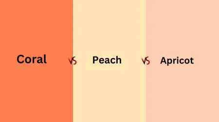
Colors can make the world around us feel more vibrant and alive. In this article, we’re going to talk about three beautiful colors: Coral, Peach, and Apricot.
Even though they might seem similar, each color has its own special qualities. We’ll take a closer look at what makes each color unique, where they come from, and how they’re used.
Whether you’re a fan of fashion, design, or just curious about colors, join us as we explore the wonderful world of Coral vs Peach vs Apricot. It’s a journey through colors that’s sure to brighten your day.
What is Coral Color?
Coral is like a warm hug from the sun. It’s that lovely color that sits somewhere between pink and orange.
Imagine the vibrant shades you see in underwater coral reefs—that’s where it gets its name.
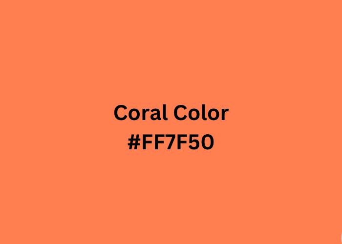
Coral is a color that radiates energy and brings a touch of femininity to the palette. You might have come across this color with its code #FF7F50 in design or fashion.
It’s a shade that often finds its way into clothing, interior decor, and even branding, spreading a feeling of vitality and warmth wherever it appears.
Do you want to learn how to make your own coral paint? Read our article on how to create coral color to learn the techniques.
What is Peach Color?
Peach is like a gentle whisper of color. It’s that soft hue that reminds you of the ripe peaches you’ve ever tasted, with their fuzzy skin and sweet juiciness.
This color falls somewhere between pale orange and light pink. When you see it, it often brings feelings of sweetness, innocence, and charm.
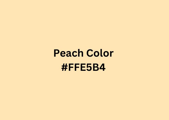
In color codes, Peach goes by #FFE5B4. You’ll find Peach making appearances in fashion, interior design, and various creative projects.
It’s a color that creates a warm and inviting atmosphere, making you feel right at home.
What is Apricot Color?
Apricot is like a delicate ray of sunshine, reminiscent of the warm and inviting hues found in stone fruits.
Unlike peach, it’s a color that shares its name with the ripe apricot fruit, known for its sweet and slightly tangy taste.
This color falls between light yellow-orange and pale orange on the spectrum. When you think of Apricot, imagine the soft glow of a sunset or the blush of a perfectly ripened apricot.
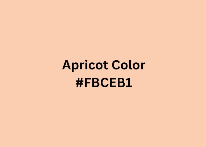
In color codes, Apricot is represented by #FBCEB1. It’s a versatile and warm color that you’ll find gracing everything from fashion to interior décor. Apricot adds a touch of elegance and comfort wherever it’s used.
Coral Vs Peach Vs Apricot: Head-to-Head Comparison
When it comes to colors, Coral, Peach, and Apricot may appear to be close relatives, but they each bring their own unique flair to the palette.
Let’s break down these charming hues and see how they stack up against each other.
Hue
Coral, Peach, and Apricot are all about their unique hues. Coral leans toward a lively blend of pink orange color, creating a vibrant and lively color.
It’s like a burst of energy in the color spectrum. Peach, on the other hand, embraces a gentle mixture of pale orange and soft pink.
It’s the calm and inviting side of colors, reminiscent of the blush of a dawn sky. Apricot, falling between light yellow-orange and pale orange, exudes a delicate warmth. It’s akin to the soft glow of a cozy evening.
These hues, while distinct, share a common thread of warmth and friendliness. They each have a way of infusing spaces and designs with their own personality, making them delightful choices for various creative endeavors.
Whether it’s the vivacity of Coral, the subtlety of Peach, or the understated elegance of Apricot, these hues bring their own special touch to the world of color.
Tone
Coral, Peach, and Apricot each have their own tone, which is all about the feeling they give off. Coral has a lively and warm tone that can make things feel energetic and full of life.
It’s like a cheerful and sunny day. Peach carries a soothing and gentle tone, creating a sense of calm and comfort. It’s like a soft, reassuring hug.
Apricot’s tone is subtle and elegant, adding a touch of warmth without being too overpowering. It’s like a quiet, peaceful evening. These tones help set the mood in design and décor.
Whether you want to create a vibrant and lively atmosphere with Coral, a cozy and comforting space with Peach, or an understated and elegant ambiance with Apricot, these tones play a key role in how colors affect our feelings and experiences.
Versatility
Coral, Peach, and Apricot are versatile colors, meaning they can fit into different situations and styles.
Coral is like a confident friend that can stand out in a crowd. It’s often used to make a bold statement in clothing, accessories, and even interior decor.
You’ll find it adding a lively touch to summer dresses, beach towels, and vibrant home accents. Peach is like a soft, comforting blanket.
It’s a color that can create a warm and inviting atmosphere in various settings. Whether it’s in clothing, bedroom decor, or event themes, Peach can easily adapt and make everything feel cozy.
Apricot is like a subtle and elegant companion. It’s a color that doesn’t demand too much attention but adds a touch of sophistication to whatever it graces.
You might spot Apricot in fashion, subtle home accents, or even artistic projects, where its understated charm shines.
Origin
Coral, Peach, and Apricot get their names from the world around us. Coral takes its name from the vibrant marine life found in natural coral reefs, while Peach is inspired by the sweet and juicy fruit we enjoy.
Apricot, as you might guess, is named after the fruit it resembles. These colors bring a touch of nature into our lives and remind us of the beauty found in the ocean, orchards, and on our plates.
Their names link them to elements of the natural world, adding a bit of warmth and familiarity to our color palette.
Saturation
Coral is vivid and fully saturated, making it rich and intense. Peach carries a hue angle of 39.2 degrees and a saturation of 100%, creating a vibrant and lively appearance.
Apricot, on the other hand, has a saturation level of 57%, offering a more subdued and muted presence.
Saturation affects how vibrant and intense a color appears to the eye, with Coral being the most intense, followed by Peach, and then Apricot, which leans toward a softer and gentler presence.
These saturation levels influence how these colors can be used in design, with Coral making a bold statement, Peach adding vibrancy, and Apricot bringing a more understated elegance to the palette.
Complementary Colors
Complementary colors are like best friends for colors. They are the ones that go perfectly together, creating a harmonious balance.
For Coral, its complementary colors often include shades of turquoise and teal. These colors create a striking contrast and make Coral pop with vibrancy.
Peach, on the other hand, harmonizes beautifully with pastel colors like soft blues, pale pinks, and gentle greens. These combinations create a pleasing and calming effect.
Apricot finds its companionship in earthy tones, such as soft browns and muted grays. These pairings bring out Apricot’s warm and elegant side.
Light Reflectance Value (LRV)
Light Reflectance Value (LRV) is like a measure of how much light a color reflects. It tells us if a color is bright or on the darker side.
Coral often has a higher LRV, which means it reflects more light. It can make spaces feel bright and energetic.
Peach has a moderate LRV. It reflects a decent amount of light, creating a warm and inviting atmosphere without being too bright.
Apricot tends to have a lower LRV. It doesn’t reflect as much light, which can make spaces feel cozy and intimate.
HEX and RGB Codes
Colors in the digital world have their own secret codes. These codes are like fingerprints for colors, helping designers and creators use them accurately.
- Coral is represented by the HEX code #FF7F50 in the digital realm. Its RGB (Red, Green, Blue) values are 255, 127, and 80.
- Peach goes by the HEX code #FFE5B4. Its RGB values are 255, 229, and 180.
- Apricot is known in the digital world as #FBCEB1, with RGB values of 251, 206, and 177.
These codes are like maps that tell your computer exactly which color to display.
So, whether you’re designing a website, creating digital art, or just trying to match colors perfectly, these codes help you get the exact shade you want with just a few clicks or keystrokes.
Use in Interior Design
Colors play a big role in making a space feel just right. Let’s see how Coral, Peach, and Apricot fit into interior design:
- Coral: If you want to add a burst of energy to a room, Coral is your friend. It can be used as an accent wall or in accessories like cushions or artwork. It’s like a lively dance in your living room.
- Peach: Peach is all about creating a warm and cozy atmosphere. You can use it on walls for a soothing bedroom or in soft furnishings for a comforting living area. It’s like a gentle hug for your home.
- Apricot: Apricot brings an understated elegance. It’s perfect for adding a touch of sophistication to dining rooms, home offices, or even as a soft backdrop in bedrooms. It’s like a whisper of luxury in your decor.
Psychological Effects
Colors have a way of affecting our moods and feelings. Let’s see what Coral, Peach, and Apricot bring to the emotional table.
Coral is like a burst of enthusiasm. It can make you feel energetic, warm, and positive. It’s the color of excitement and passion.
Peach is like a calm and friendly presence. It promotes feelings of comfort, calmness, and approachability. It’s the color of gentle reassurance.
Apricot is like a touch of elegance and relaxation. It fosters an atmosphere of subtlety, warmth, and serenity. It’s the color of quiet sophistication.
Coral Vs Peach Vs Apricot: A Simple Comparison Table
| Aspect | Coral | Peach | Apricot |
| Hue | Vibrant pink-orange | Pale orange-pink | Subtle yellow-orange |
| Tone | Lively and warm | Soothing and gentle | Subtle and elegant |
| Versatility | Bold and attention-grabbing | Warm and inviting | Understated elegance |
| Origin | Inspired by coral reefs | Named after the fruit | Resembles apricot |
| Saturation | High | Moderate | Lower |
| Complementary Colors | Turquoise and teal | Pastel shades | Earthy tones |
| LRV (Light Reflectance Value) | High | Moderate | Low |
| HEX Code | #FF7F50 | #FFE5B4 | #FBCEB1 |
| Use in Interior Design | Energetic accents | Warm and soothing | Understated elegance |
| Psychological Effects | Excitement and warmth | Comfort and calm | Subtle sophistication |
Different Shades of the Coral
Coral isn’t a one-size-fits-all color; it comes in various shades and tones. Some shades of coral lean more towards pink, while others have a stronger orange influence.
Here are a few shades you might encounter:
- Salmon Coral: This shade of coral has a bit more pink in it, making it reminiscent of the fish it’s named after. It’s like a softer, pastel version of coral. When comparing coral vs salmon, you’ll notice that salmon coral leans more towards the pink side, while retaining the essence of coral’s warmth.
- Coral Pink: This is a brighter, pinker variation of coral. It’s vibrant and energetic, like a burst of pink sunshine.
- Red-Orange Coral: This shade leans more towards the orange side of the spectrum. It’s bold and fiery reddish hue brings a passionate touch to the coral family.
- Peachy Coral: As the name suggests, this coral shade has a subtle peachy undertone. It’s like a delicate blend of both colors, creating a warm and inviting feel.
- Pastel Coral: A softer, muted coral, this shade has a calming presence. It’s perfect for creating a gentle and elegant atmosphere.
Different Shades of the Peach
Peach isn’t just one color; it comes in various shades, each with its own unique charm. Here are a few shades of peach you might come across:
- Pastel Peach: This shade is soft and delicate, like the petals of a gentle spring flower. It’s a calming and soothing hue.
- Salmon Peach: A bit more vibrant than pastel yellowish orange peach, salmon peach has a hint of pink in its undertone. It’s like a subtle burst of energy.
- Coral Peach: This shade bridges the gap between coral and peach, with a touch of vibrancy and warmth. It’s inviting and friendly.
- Terracotta Peach: With a slightly earthy undertone, terracotta peach has a warm and grounded feel. It’s like a cozy embrace.
- Blush Peach: This shade is the softest of them all, reminiscent of a gentle blush on the cheeks. It’s sweet and romantic.
Different Shades of the Apricot
Apricot, like other colors, comes in various shades, each with its own unique character. Here are a few shades of apricot:
- Light Apricot: This shade is soft and gentle, like the first light of dawn. It has a delicate and calming presence.
- Pale Apricot: A subtle variation, pale apricot is like a whisper of color. It adds a touch of warmth without being overpowering.
- Salmon Apricot: With a hint of pink, salmon apricot is a bit more vibrant. It’s like a friendly and cheerful companion.
- Golden Apricot: This shade leans towards a richer, golden hue. It exudes a touch of luxury and sophistication.
- Terracotta Apricot: A deeper variation, terracotta apricot has earthy undertones. It’s warm and inviting, like the embrace of a cozy space.
FAQs
What is the difference between coral peach and peach?
Coral is a vibrant pink-orange, while peach is a softer, pale orange-pink. The difference lies in their intensity, with coral being more energetic, and peach exuding a calm warmth.
Is peach and apricot the same color?
No, they are not the same. Peach is a pale orange-pink, while apricot is a subtler yellow-orange. Apricot has a touch of yellow, making it slightly different from peach.
Is coral like a peach color?
Coral is related to peach but is more vibrant and includes pink tones. It’s like a lively cousin of peach.
What color is close to coral?
Colors close to coral include salmon, pink-orange, and soft reddish orange. These shades share similarities with coral but have their unique nuances.
Is coral closer to pink or orange?
Coral is a blend of pink and orange, but it tends to lean more towards orange while still carrying a vibrant pinkish orange vibrancy.
Is apricot color yellow or orange?
Apricot is primarily an orange color but has a subtler yellow undertone. It’s like muted orange tones with a touch of warmth.
Conclusion
In conclusion, colors like Coral, Peach, and Apricot bring their own unique vibes to our world. Coral is lively and energetic, while Peach offers a sense of comfort and calm.
Apricot adds a touch of subtle elegance. These colors not only fill our lives with beauty but also influence our emotions and surroundings.
Whether it’s the vibrant warmth of Coral, the soothing embrace of Peach, or the understated charm of Apricot, each color has its place in our hearts and in design.
So, next time you choose a color, remember the feelings it can evoke and the atmosphere it can create.


Leave a Reply