The choice between cream and beige can often make or break the look of a room. While both colors are trendy, neutral tones, they do not necessarily work together in every design scheme.
Some people prefer natural wood grain with cream walls to contrast and tie it all together, while others like the warmth of beige on their walls and furniture for a cosy atmosphere.
In this comparison post, I will explore why these two hues have become popular favorites among interior designers and whether to use cream vs beige color separately within your space.
I guarantee you, you’ll create a timeless décor you’ll love for years.
What is the Difference Between Cream and Beige?
Cream and beige, although similar, have distinct differences. Cream tends to have a warmer undertone, with a hint of yellow or ivory, while beige leans towards a cooler, more earthy undertone. Cream appears lighter and brighter, while beige appears slightly darker and more subdued. Understanding these subtle contrasts can help in selecting the perfect shade for your desired aesthetic.
What Is Cream Color
The use of cream color can be traced back to ancient times, where it was commonly associated with purity, luxury, and wealth. In art history, cream pigments were used by Renaissance artists to depict light and create luminosity in their works.
The history of cream color
Cream color paint has a fascinating history in the realm of interior design and aesthetics. It emerged as a popular choice during the late 18th century, inspired by the desire to create a sense of lightness and elegance within living spaces.
Cream’s soft and neutral tone offered a departure from the boldness of earlier pigments. Its popularity soared during the Victorian era, as cream hues complemented the ornate architecture and opulent decor of the time.
Over the years, cream color paint has evolved, adapting to changing design trends. Today, it continues to evoke a timeless charm, lending warm color and sophistication to modern interiors.
The meaning and symbolism of cream
i. Neutrality and Simplicity
Cream color embodies neutrality and simplicity. It is a subtle and understated hue that brings a sense of calmness and tranquility to a space. Cream can create a clean and uncluttered aesthetic, making it a popular choice for minimalist and contemporary designs.
ii. Elegance and Sophistication
Its light and creamy tones exude a refined and luxurious atmosphere, making it an ideal choice for formal settings and high-end interiors. Cream can add a touch of class and timelessness to any space.
iii. Timeless Classic
Cream color has been used for centuries in various forms of art, design, and fashion, standing the test of time. It can provide a sense of continuity and enduring beauty, making it a reliable choice for long-lasting appeal.
iv. Warmth and Comfort
Cream color evokes a sense of warmth and comfort. Its soft and inviting warm tones create a cozy ambiance, particularly when combined with natural light. Cream can help establish a welcoming and homely atmosphere in both residential and hospitality spaces.
v. Versatility and Adaptability
Cream color is highly versatile and can complement a wide range of color palettes and design styles. It serves as an excellent backdrop for other hues, allowing them to stand out or harmonize harmoniously.

How to use cream
- In interior design, cream is employed as a neutral base color for walls, furniture, or textiles, creating a calm and timeless aesthetic.
- Cream also serves as an accent color, adding a touch of softness and warmth to a space.
- In fashion, cream is often chosen for its classic and understated elegance, making it a popular choice for both casual and formal attire.
Complementary colors of cream
- Darker shades of brown
- Gray
- Blue
What is Beige?
Beige paint is a neutral color that is often described as a pale, sandy or light brown tone. To make beige paint, combine brown, white, and black and pigments.
Its striking resemblance to the nude color adds to the confusion when deciding between nude or beige.
The history of beige color
Beige has been used throughout history, with evidence of its presence in ancient civilizations. In art, beige pigments were utilized by painters during the Renaissance and Baroque periods to achieve a range of effects and create natural skin tones. The popularity of beige as a color choice has continued to evolve over time.
The meaning and symbolism of beige
Beige is associated with simplicity, neutrality, and subtlety. It represents calmness, balance, and a sense of relaxation. Beige can create a soothing and comforting atmosphere, making it a popular choice for creating a serene and timeless ambiance.
How to use beige
i. Interior design
Beige is commonly used as a foundational color in interior design. It serves as a versatile backdrop that complements a variety of design styles and color schemes.
Beige walls, furniture, and accessories can create a warm and inviting atmosphere, allowing for easy integration with other colors and design elements.
ii. Art and aesthetics
Beige can be used in art and aesthetics to convey a sense of simplicity, minimalism, and elegance. For instance, beige wallpaper can serve as a neutral background for highlighting other colors or as a subtle backdrop to enhance the overall visual impact of a piece.
iii. Fashion and style
Beige serves as a neutral base that can be paired with a wide range of colors and patterns. Beige garments and accessories offer a classic and sophisticated look, suitable for both casual and formal occasions.

Complementary colors of beige
- Shades of blue, such as navy or sky blue, create a serene and calming combination with warm beige.
- Green hues, like olive or sage, provide a natural and harmonious contrast.
- Pink tones, from blush to dusty rose, can add a touch of femininity and softness to beige-based palettes.
Explore more neutrals in agreeable gray vs accessible beige for a complete color comparison guide.
Cream Vs Beige: Head To Head Comparison
1. Description and Brightness
Cream: Cream is a soft, light hue with a warm undertone, resembling the color of dairy cream. It is used to create lighter shades compared to beige, often featuring a subtle tint or yellow undertone.
Beige: Beige is a pale, sandy, or light brown color with a neutral undertone created by a white and brown color mix. It is slightly darker and more subdued than cream, leaning towards a cooler, earthy tone.
2. Psychological Effects
Cream: Cream is associated with warmth, softness, and comfort. It creates a welcoming and cozy ambiance, promoting relaxation and tranquility.
Beige: Beige evokes a sense of neutrality, calmness, and simplicity. It can contribute to a balanced and soothing atmosphere, providing a sense of grounding.
Cream: Cream is often associated with elegance, luxury, and refinement. It conveys a timeless and sophisticated aesthetic, representing purity and delicacy.
Beige: Beige is associated with subtlety, versatility, and a natural aesthetic. It symbolizes simplicity, understated elegance, and a connection to the earth.
3. Popularity
Cream: Cream has gained popularity in recent years due to its versatility and ability to create a warm, inviting atmosphere. It is often favored in both interior design and fashion for its classic and timeless appeal.
Beige: Beige has long been a popular choice in various design fields. Its neutrality and compatibility with other colors make it a go-to option for creating a neutral base or complementary tones.
4. History
Cream: The history of cream as a color is intertwined with the use of cream pigments in art, dating back to ancient times. It has been utilized by artists to depict light and create luminosity in paintings.
Beige: Beige has a rich history, with evidence of its use in ancient civilizations and throughout art history. Its popularity has continued to endure, with variations of beige appearing in different cultural contexts.
5. Uses
Cream: Cream is commonly used in interior design for walls, furniture, and textiles. It can serve as a neutral backdrop or as an accent color, adding warmth and softness to a space. Cream is also popular in fashion for its versatility and ability to create sophisticated looks, particularly if you know what colors to mix to make cream.
Beige: Beige finds widespread use in interior design, fashion, and art. It serves as a foundational color, providing a neutral base for various design elements. Beige is often used to create a serene and timeless ambiance.
6. Combinations
Cream: Cream combines well with various colors, particularly darker shades of brown, gray, and blue. These combinations can create depth and balance in a color scheme while enhancing the warmth and elegance of cream.
Beige: Beige pairs harmoniously with shades of blue, green, and pink. These combinations can evoke different moods and aesthetics, ranging from calming and natural to soft and feminine.
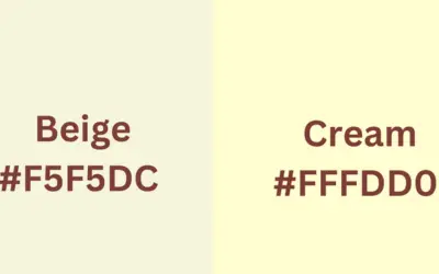
7. HEX and RGB Code
Cream: The HEX code for cream can vary, but it typically falls within the range of #FFFDD0 to #FFEFD5. The RGB code is approximately R: 255, G: 253, B: 208.
Beige: Beige HEX codes can range from #F5F5DC to #D3CDBD, while the RGB code is approximately R: 245-211, G: 245-205, B: 220-189.
8. Versions
Cream: Cream is a specific color, and while shades may vary slightly, there are no distinct versions of cream.
Beige: Beige can have variations such as light beige, dark beige, or cool beige. These versions offer subtle differences in tone and intensity.
Do Cream Vs Beige Match?
Cream and beige are a natural match, as they belong to the neutral color palette. Cream, with its warm undertones, and beige, with its cooler and earthier undertones, create a complementary and harmonious combination.
The subtle contrast between these hues adds depth and dimension to a color scheme.
Their compatibility allows for a versatile and timeless aesthetic that can create a serene and balanced atmosphere.
The cream color can match beige or ivory, making it a versatile choice to create cohesive and harmonious color combinations.
FAQs
Can cream and beige be used together in a color scheme?
Yes, cream and beige can be used together in a color scheme. Both colors belong to the neutral palette, and their subtle differences create a harmonious and sophisticated look. Cream, which has a slightly warmer undertone, can add warmth and softness to a space, while beige, with its cooler undertone, can bring a sense of calmness and neutrality.
Are cream and beige suitable for all seasons?
Yes, cream and beige are suitable for all seasons. These neutral colors provide a versatile backdrop that can be easily adapted to different seasonal themes and styles. In the spring and summer, cream and beige can evoke a light and airy atmosphere, creating a sense of freshness. In the fall and winter, they can create a cozy and warm ambiance when paired with deeper, richer tones.
How do cream and beige compare to other neutral colors?
Cream and beige, as neutral colors, have their own unique characteristics that set them apart from other neutrals. Color cream is often associated with a softer and warmer tone, while beige leans towards a cooler, more earthy undertone. Compared to other neutral colors like white or gray, cream and beige offer a warmer and more inviting feel to a space.
What are some popular alternatives to cream and beige?
Off-white provides a brighter and cooler undertone, while taupe offers a sophisticated grayish-brown option. Greige combines gray and beige for a modern look, ivory adds a touch of luminosity, and sand offers a soft, earthy tone. These alternatives provide a range of choices to suit different preferences and design aesthetics.
Are beige and cream the same color?
While both belong to the neutral palette, beige is a light brown shade with cooler undertones, while cream is a pale yellowish-white with warmer undertones. The distinction lies in the subtle differences in hue and tone, making them separate but complementary colors.
We have made things simple for you by highlighting how to make beige with acrylic paint at home.
Conclusion
The best advice is to compare the shade of each color in person as different shades can have very different feelings when put together. Beige could be the perfect pick if you would like a slightly more muted atmosphere.
However, if a little bit of warmth and life is what you are aiming for, then opt for cream to create an inviting ambience in your home. With these tips, finding the optimal colors to fit your decorating style should not be too difficult.


Leave a Reply