
Colors have an enchanting power to evoke emotions, set moods, and breathe life into our surroundings. Within this vast palette, there exists a subtle shade that exudes elegance and sophistication.
This is the color cream. With its soft allure and versatility, cream holds a special place in various fields, from interior design to fashion.
But have you ever wondered how this enchanting hue is created? In this blog post, I’ll delve into color mixing.
I will unveil the secret behind making cream by blending two colors. Get ready to unlock the artistry and transform your creative endeavors with the mastery of cream.
How to Make Cream Colour by Mixing Two Colours
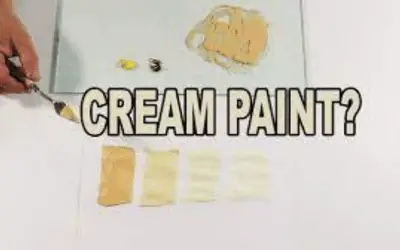
To create a creamy hue by mixing two colors, start with yellow as the base color. Add small amounts of white paint to lighten the yellow and achieve the desired cream shade. Mix the colors for an even blend, and make adjustments as needed. Experiment with different ratios to bring elegance and warmth to your creations.
Color Theory
The color theory explores the principles behind the interaction and combination of colors.
It helps us understand how colors relate to each other and how we can use them in various artistic and design endeavors.
At the core of color theory lies the color wheel, a visual representation of the color spectrum. The color wheel is a circular diagram that organizes colors in a systematic way.
It has primary colors, secondary colors, and tertiary colors.
Primary colors are the fundamental building blocks of color and cannot be created by mixing other colors. They include red, blue, and yellow.
Secondary colors result from mixing equal parts of two primary colors. They are orange (red + yellow), green (blue + yellow), and violet (blue + red).
Tertiary colors are achieved by combining a primary color with a neighboring secondary color.
The color wheel showcases the relationships between these colors. Complementary colors, found across each other on the wheel (e.g., red and green), create a striking contrast when used together.
Analogous colors, located next to each other (e.g., blue and green), produce a harmonious and cohesive effect.
You can also mix colors to create new tints, shades, and tones, offering a wide range of possibilities.
Cream Color Code
Cream color, like any other color, can be represented using different color models and codes. One common model is the RGB (Red, Green, Blue) color model.
The RGB color model is used for digital displays and web design. In the RGB model, cream color is represented by a combination of RGB values that result in a light, off-white shade.
The specific RGB values for cream color may vary depending on personal preferences and the desired shade of cream.
However, a common representation is an approximate RGB value of (255, 253, 208). This means that the red component is set to 255, the green component is set to 253, and the blue component is set to 208.
These values collectively create a soft, creamy appearance on digital displays.
Color perception can differ between devices and platforms, so the exact appearance of cream color may vary.
Sample and adjust the RGB values based on individual needs and the specific color output device or platform you are using.

What Color Is Cream
Cream is a delicate and soothing color that falls within the off-white spectrum. It embodies a light color and subtle tone reminiscent of the creamy texture of milk or the softness of whipped cream.
While cream shares similarities with white, it has a touch of warmth and a hint of yellow undertones.
When it comes to creating the color cream, use yellow and white as the primary colors. Yellow provides the base hue, infusing cream with its gentle warmth.
White serves to lighten and soften the yellow, resulting in the desired creamy shade. By blending these two primary colors, you achieve the delicate and inviting hue that is cream.
The combination of yellow and white allows for a balance between brightness and warmth.
This unique blend makes the cream a popular choice in various design fields. The cream also adds a touch of sophistication and refinement to any palette.
The Meaning of Cream Color
The meaning of cream color can be subjective and context-dependent. It is influenced by personal experiences, cultural connotations, and individual interpretations.
Here are some common associations with the color cream:
1. Neutrality and simplicity. The cream is a neutral color that is calming and soothing. It gives a sense of simplicity, elegance, and timelessness, making it a versatile choice in design and aesthetics.
2. Warmth and comfort. Cream carries a warm undertone, creating a cozy and inviting atmosphere. It can evoke feelings of comfort, serenity, and relaxation, like the feeling of being enveloped in a soft, warm blanket.
3. Purity and innocence. It is associated with purity and innocence, much like the color white. It represents a clean and untarnished state, suggesting simplicity, goodness, and sincerity.
4. Classic and traditional. Cream is a color that transcends trends and stands the test of time. This makes it a popular choice in vintage-inspired designs or timeless aesthetics.
5. Sophistication and elegance. Cream exudes subtle sophistication and elegance. Its soft and muted tones can add a touch of refinement to any setting, conveying a sense of understated luxury.
6. Versatility and adaptability. It is a versatile color that can blend with various color palettes and complement a wide range of hues. It can act as a versatile backdrop or a complementary accent, adapting to different design schemes and styles.
Cream Color in Design
The cream color is a versatile and valuable element in design. It offers a range of possibilities and applications.
It can serve as a subtle and inviting background, providing a softer alternative to stark white. Cream color also excels as an accent or contrasting element.
Because of this, it creates a harmonious balance when paired with bolder colors. Its use of textures and materials adds depth and richness to designs, eliciting a tactile and visual experience.
With its timeless elegance, cream color is a staple in interior design, furniture, and fashion. Cream color acts as a versatile complement, pairing with a wide range of colors to create energetic or serene palettes.
By incorporating cream color, you achieve visual cohesion and continuity, enhancing the overall aesthetics of your creations.

Cream Color Mixing: What Are the Steps in Mixing Yellow and White Paints?
Step 1: Gather the necessary materials
Before you begin mixing yellow and white paints to create a cream color, make sure you have the following materials ready:
- Yellow paint
- White paint
- Mixing palette or surface
- Mixing tool
- Paint containers
Step 2: Start with yellow paint
Yellow paint is the essential base color for creating cream. Begin by squeezing an appropriate amount of yellow paint onto your chosen mixing palette or surface.
This yellow hue will provide the warmth and undertones necessary to achieve the desired cream shade. When selecting the yellow shade, consider the specific cream tone you aim to create.
Opt for a pale or cadmium yellow for a lighter and softer cream. For a richer and warmer cream, add yellow ocher, naples yellow, or golden yellow.
Compare different yellow paint swatches or samples on a white surface to assess how they interact and align with your vision of the cream color.
Step 3: Add white paint gradually
White paint plays a crucial role in lightening the yellow base and achieving the desired cream shade. Add the white paint in small increments to have control over the color intensity and ensure a gradual transition.
To begin, dip your mixing tools, such as a palette knife or a paintbrush, into the white paint. Transfer a small amount of white paint onto your mixing palette or surface next to the yellow paint.
Start with a ratio of about 1 part white paint to 3 parts yellow paint. Adjust as needed based on the specific cream shade you aim to achieve.
Blend the small amount of white paint into the yellow paint. This gradual addition of white allows you to observe and assess the resulting color after each increment.
Ensure that you reach the desired cream shade gradually and avoid over-lightening the mixture.
Continue this process as you mix cream colors until you achieve the desired cream color.
Remember, it’s easier to add more white paint to lighten the mixture than to darken it. So proceed with caution and make adjustments gradually.
Step 4: Mixing colors
Thorough mixing is key to ensuring that the colors merge harmoniously. Emphasize the importance of dedicating sufficient time and effort to achieve an optimal mix.
Use techniques such as circular motions or the folding technique to blend the colors seamlessly. Start from the center and work your way outward, to ensure all areas of the paint are combined.
Take care to scrape any unmixed paint from the edges of the palette or surface. Also, exercise patience and employ proper mixing techniques.
Step 5: Observe and adjust as necessary
After mixing the yellow and white paints, assess the resulting cream color and make any adjustments if needed. Take a moment to step back and observe the color with a discerning eye.
If the cream colors don’t meet your preferences, here are some tips on how to darken or lighten it:
Add small amounts of white paint to lighten it. Mix thoroughly after each addition to ensure an even blend.
If the cream color is too light, add small amounts of yellow paint to deepen the hue. To have a more accurate representation of the color, create test swatches.
Apply a small amount of the cream color mixed onto a test surface, such as a piece of paper or a spare canvas, and allow it to dry. This will give you a better sense of how the color will appear once dried.
What Is the Ideal Ratio of Yellow to White Paint for Making Cream?
The ideal ratio of yellow to white paint for making cream color may vary depending on your desired color. However, a common starting point is to use a ratio of approximately 3 parts yellow paint to 1 part white paint.
This ratio provides a good balance between the warmth of yellow and the lightening effect of white. Color mixing is a subjective process, and you can adjust the ideal ratio based on your desired outcome.
What Are the Benefits of Mixing Yellow and White Paints?
Mixing yellow and white paints offers several benefits in color mixing and artistic endeavors. Here are some advantages of combining these two colors:
Cream color creation. The primary benefit of mixing yellow and white paints is the ability to create a beautiful cream color.
Tonal variations. Mixing yellow and white paints allows you to create a wide range of tonal variations.
Warmth and vibrancy. Yellow is a warm and vibrant color that brings energy and liveliness to a mixture. By incorporating yellow into the mix, you infuse the cream color with a touch of warmth and brightness.
Lightening effect. White paint has the unique property of lightening other colors when mixed. By adding white to yellow, you can soften the intensity of the yellow pigment and create a lighter and more pastel-like shade.
Versatility in color palettes. Cream color, derived from mixing yellow and white paints, is versatile and can complement a wide range of other colors.
How Can You Control the Lightness of the Cream You Make?
Here are some methods to effectively control the lightness of the cream color:
Gradual additions. Start by mixing a small amount of yellow paint with a larger amount of white paint. This will create a lighter color. To darken the cream, add more yellow paint, while to lighten it, add more white paint.
Observing and adjusting. After each addition of paint, mix the colors and observe the resulting cream color. Assess its lightness under the intended lighting conditions. If it doesn’t meet your desired level of lightness, continue making adjustments by adding more yellow or white paint.
Test swatches. Create small test swatches by applying a small amount of the mixed cream color onto a separate surface. Allow it to dry and evaluate the lightness of the dried swatch.
Incremental changes. Remember it’s easier to darken the cream color by adding more yellow paint and more challenging to lighten it once it becomes a dark color. For greater control, add the paint in small increments.
What Happens if You Add Too Much White Paint?
If you add too much white paint when mixing colors to create a cream color, several things can happen:
1. Over-lightening which can lead to a loss of depth and richness, creating a pale and washed-out appearance.
2. Loss of vibrancy making the resulting cream color appear flat and lacking in vitality. It may lose the warmth and subtle nuances that make cream color visually appealing.
3. Lack of contrast. If you add too much white paint, the contrast between the cream color and other elements may diminish.
4. Once an excess amount of white paint is added, it becomes challenging to darken the cream color without starting the mixing process over.
What Are Some Tips for Making Cream with Yellow and White Paint?
When making cream color with yellow and white paints, here are some tips to consider:
- Begin by using lighter shades of yellow and white paint as your base colors.
- If you want to deepen the cream color, gradually add small amounts of a darker yellow or a warm brown shade, such as ochre or raw sienna.
- Experiment with different ratios and proportions of yellow and white paints. Adjusting the amounts of each color can lead to unique shades of cream, ranging from pale ivory to richer, buttery hues.
- Thoroughly mix the yellow and white paints to ensure an even blend and accurate representation of the cream color.
- Consider incorporating shades of blue, soft greens, or even hints of pale pink as accents or background colors to complement the cream.
- Before applying the cream color to your artwork or design, practice on test surfaces such as spare canvases or paper.
Other Ways of Making Color Cream
You can also achieve cream-like shades by incorporating sienna and umber pigments. Here’s an alternative method:
Start with sienna and raw or burnt umber
Instead of yellow paint, begin with sienna and umber paints. Sienna is a warm, earthy brown color, while umber is a darker brown shade.
Mix raw or burnt sienna and umber
Combine sienna and umber in a palette or mixing surface. Adjust the ratio to achieve the desired warmth and richness in the base color.
The exact proportions will depend on your preference and the specific shade of cream you aim to create.
Add white gradually
Just like with the previous method, add small amounts of white paint to the raw sienna and umber mixture. The white paint will lighten the colors and shift the overall hue towards a cream-like shade.
Add the white paint gradually, mixing thoroughly after each addition, until you achieve the desired cream color.
Observe and adjust
Assess the resulting cream color and make any necessary adjustments. If the color is too dark, add more white paint to lighten it further.
If it’s too light, you can introduce small amounts of sienna or umber to deepen the tone slightly.
What is the Difference Between Ivory and Cream?
The difference between ivory and cream lies in their specific shades and undertones. While both colors belong to the off white spectrum, they have distinct characteristics:
Ivory is a warm, pale shade that resembles the color of natural ivory, which is the hard, creamy-white substance found in the tusks and teeth of animals.
It has a slight yellow or beige undertone, giving it a subtle warmth. However, Ivory is less warm than beige and is associated with elegance, sophistication, and vintage charm.
Cream, on the other hand, is a light, soft, and yellowish off-white color. It is a blend of white and yellow, resembling the color of dairy cream.
Cream has a more pronounced yellow undertone compared to ivory. It exudes a sense of warmth, softness, and subtlety.
Ivory tends to have a warmer, beige-yellow undertone, while cream leans more towards a pale, yellowish off-white hue.
The distinction between the two colors may be subtle, and individual interpretations of these shades can vary.
Cream Color Paint Combination
Cream pairs well with various other shades, creating harmonious and elegant color combinations. Here are some color options that complement cream:
- Warm Neutrals. Cream pairs beautifully with warm neutrals such as beige, taupe, and light browns.
- Soft Pastels. Light pastel shades like pale pink, baby blue, lavender, mint green and sage green create a delicate and serene combination with cream.
- Earthy Greens. The cream can be paired with muted or earthy greens, such as military green or olive green. This combination creates a soothing and natural ambiance.
- Warm Grays. Cream and warm gray make a sophisticated and timeless pairing. The softness of cream complements the subtlety of warm gray.
- Gold or Metallic Accents. Cream serves as an excellent backdrop for gold or metallic accents.
- Deep Blues. Cream colors go well with deep blues, such as navy or royal blue.
FAQ
What colors do I need to mix to create a cream color?
To create a cream color, you must make yellow paint and blend it with white. Yellow is the base color, while white lightens the yellow and achieves the desired cream shade. Start by adding small amounts of white paint to the yellow and mix thoroughly. Adjust the ratio of yellow to white until you achieve the desired cream color.
Can I use any shade of white to mix with yellow to make cream?
Yes, you can use any shade of white when making cream but I do not recommend it. Use a pure, bright white shade. This is because pure white allows for better control over the lighting effect and ensures that the resulting cream color remains clean and untainted.
How much of each color do I need to mix to make cream?
You will need approximately 3 parts yellow paint to 1 part white paint. However, the exact amount of yellow and white paint needed to create a cream color can vary depending on the shades you want.
Is there a way to adjust the shade of cream I make by adjusting the ratio of white and yellow?
Yes, there’s a way of adjusting the shade. Do this by varying the proportions, you can achieve different tones and intensities of cream color. If you want a lighter and softer cream, increase the amount of white paint in relation to the yellow.
Can I mix other colors besides white and yellow to make a cream color?
Yes, you can mix other colors besides white and yellow to create cream-like shades. You can mix white and brown and then add touches of raw or burnt umber to make cream. Read about “what color does brown and white make when mixed?”
Does cream and beige go well together?
Yes, cream and beige generally go well together. Cream is a light, warm shade with yellow undertones, while beige is a neutral, sandy color. Their similar tonalities create a harmonious and elegant combination that can add sophistication and calmness to interior design or fashion choices.
Conclusion
I hope you feel inspired and empowered to embark on your own artistic adventures. The process of blending colors and discovering just the right shade is a magical experience.
Remember, color mixing is not just a technical skill. It’s an art form that allows you to express your unique perspective and creativity.
The beauty of cream color lies in its ability to bring a sense of warmth, sophistication, and tranquility to any design or artistic endeavor.
Embrace the surprises that arise along the way. With your newfound knowledge, you have the power to transform blank canvases, interiors, and creative projects.


Leave a Reply