Blue is a versatile and popular color, used in many applications, from art and design to fashion and home decor.
Knowing how to make different shades of blue paint can be valuable for artists and designers, allowing them to create unique color palettes and express their creativity.
In this article, we’ll explore how to make light blue paint and the different aspects of the color blue, including the psychological and cultural associations, the symbolism of blue in various contexts, and how to make different shades of blue paint.
Whether you’re a beginner or an experienced artist, this article will provide valuable insights and tips to help you master the art of making different shades of blue paint.
What Does Blue Mean?

Color has a significant impact on the emotions and perceptions of the viewer.
Blue is known to have a calming and soothing effect on the mind and body, and it’s often associated with feelings of peace, tranquility, and relaxation.
In addition to its psychological associations, blue also has cultural significance in many parts of the world.
In Western culture, blue is often associated with trust, loyalty, and intelligence, and it’s commonly used in corporate branding and logos to convey a sense of professionalism and reliability.
Studies have shown that blue is the most commonly used color in corporate logos.
However, the symbolism of blue can vary depending on the context and culture.
In some Eastern cultures, blue represents immortality and spirituality, while blue was associated with divinity and protection in Ancient Egypt.
In Hinduism, blue is associated with the god Krishna, depicted with blue skin.
Understanding the psychological and cultural associations of blue can help artists and designers use blue hue to convey specific emotions and meanings in their art and design.
The Concept of Color Theory
Understanding color theory is essential for artists and designers to create harmonious and aesthetically pleasing color palettes.
Color theory is based on the concept that colors can be organized into a system that can be used to create balance, contrast, and harmony in art and design.
The color wheel
The color wheel is a visual representation of the relationships between primary, secondary, and tertiary colors.
Primary colors are the building blocks of all colors and cannot be created by mixing other colors. Red, blue, and yellow are the primary colors.
Secondary colors are created by mixing two primary colors, and include green, orange, and purple.
Tertiary colors are created by mixing a primary color with a secondary color, including colors like red-orange and blue-green.
The color wheel is essential for understanding color relationships and creating color schemes.
It is also useful for pigment mixing because it shows how to mix primary colors to create secondary and tertiary colors.
Color harmonies
Color harmonies are combinations of visually appealing colors that create a sense of balance and harmony.
There are several types of color harmonies, including complementary, analogous, and triadic.
Complementary colors are opposite on the color wheel and create a high-contrast effect. For example, blue & orange are complementary colors.
Analogous colors are next to each other on the color wheel, creating a harmonious, cohesive effect. For example, blue and green are analogous colors.
Triadic colors are evenly spaced around the color wheel, creating a dynamic, energetic effect. For example, blue, red, and yellow are triadic colors.
Understanding color harmonies is crucial for creating aesthetically pleasing color palettes in art and design.
The Importance of color theory in pigment mixing
Understanding color theory is also essential for pigment mixing. By knowing which colors to mix together and in what proportions, artists and designers can create an almost endless range of colors.
Different blue pigments have unique compositions that affect the final color produced.
Mixing different blue pigments together makes it possible to create an almost endless range of blue shades.
Understanding color theory and the relationships between colors is crucial for pigment mixing and can help artists and designers achieve their desired results.
What Colors Make Blue?
Understanding what colors make blue is crucial for artists and designers who want to create different shades of blue.
Blue is a primary color, which means it cannot be created by mixing other colors.
However, understanding the primary colors that make up blue and the different blue pigments available can help artists and designers create unique shades of blue.
Primary colors that make up blue
The primary colors that make up blue are red and green. When red and green are mixed in equal proportions, they create a neutral gray.
However, when more red is added to the mixture, the result is a reddish-blue, while adding more green produces a bluish-green.
The proportion of red and green used in the mixture determines the shade of blue produced.
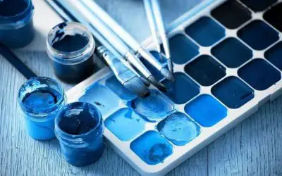
Different blue pigments
Different blue pigments have unique compositions that affect the final color produced.
Some of the most common blue pigments artists use include ultramarine blue, phthalo blue, cerulean blue, and cobalt blue.
Ultramarine blue is a deep blue pigment made from ground lapis lazuli stones. It is known for its excellent lightfastness and opacity and produces a rich, dark blue color.
Phthalo blue is a synthetic pigment that produces a bright, intense blue color. It is popular among artists for its transparency, tinting strength, and ability to mix well with other colors.
Cerulean blue is a cool blue shade that produces a cool, sky-blue color. It is often used in landscapes and seascapes to create a sense of depth and atmosphere.
Cobalt blue is a bright blue pigment popular among artists for its lightfastness and ability to create subtle gradations of blue.
Importance of quality pigments
Quality pigments are crucial for achieving the desired results when making different shades of blue paint.
Cheap or low-quality pigments can produce dull, faded, or uneven colors that are not true to the desired shade.
Using pigments from reputable brands and investing in high-quality paints for the best results is recommended.
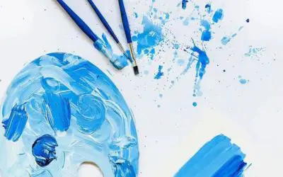
How to Make Light Blue Paint – 5 Methods
As an artist, being able to make light blue paint is an important skill to have.
It allows me to create unique shades that can’t be bought in stores and helps me express my creativity in new and exciting ways.
In this section, I’ll share some popular methods for making light blue paint.
1. White and blue mix method
One of the easiest and most straightforward methods for making light blue paint is to mix white paint with blue paint.
I start by adding a larger amount of white paint to my palette and gradually add small amounts of blue paint until I achieve the desired shade of light blue.
Mixing the paint well ensures an even color.
2. Blue tinting method
I use the blue tinting method if I want a subtler shade of light blue hues.
This involves adding a small amount of blue paint to larger white paint and adjusting the ratio until the desired shade is achieved.
3. Blue and green mix method
Another method I use is the blue and green combination method. Mixing blue and green paint with white paint allows me to create a slightly greenish tint to my light blue paint.
Again, I start with a larger amount of white paint and add small amounts of blue and green paint until I achieve the desired shade of light blue.
4. Pre-made light blue paint method
If I’m looking for a specific shade of light blue, I often turn to pre-made light blue paint from an art supply store.
This method saves time and ensures consistent results. I simply purchase the pre-made light blue paint and use it according to the instructions on the packaging.
5. Experimentation method
Finally, the experimentation method involves trying out different ratios and amounts of paint to create a unique shade of light blue.
This method is useful when I want to create a shade that can’t be achieved by the other methods.
I start by mixing small amounts of paint and adjust the ratios until I achieve the desired shade of light blue.
Remember to test the color on a small area before applying it to your project to ensure the desired result.
Also, keep in mind that the amount of paint used and the ratio of colors can affect the final shade of light blue.
Don’t be afraid to experiment with different ratios and amounts of paint to find the shade of light blue that works best for your project.
How to Make Dark Blue Paint
As an artist or designer, creating custom shades of dark blue paint can add uniqueness and creativity to your artwork.
While pre-made dark blue paint can be purchased from art supply stores, experimenting with different pigments and colors can lead to stunning shades of dark blue paint.
Here are three popular methods for making dark blue paint:
Making dark blue color by adding black paint
Personally, I find the black paint method to be one of the simplest methods for making dark blue paint.
Adding black paint to a base blue color creates a darker, more muted shade of blue.
I usually add the black paint gradually to avoid over-saturating the color, and mix the paint well to ensure an even color.
If you know what colors to mix to make black, this method will be useful for a more neutral, subdued shade of dark blue.
The added black pigment can give the dark blue color a matte finish, making it less shiny and more understated.
This method works well for creating dark blue backgrounds or shading in darker artwork areas.
Making dark blue color by adding complementary paint colors
Another method I enjoy using is the complementary colors method.
Adding small amounts of the complementary color, which is orange in the case of blue, to a base blue color, a dark blue color with warm undertones can be achieved.
The added complementary color can create a more vibrant and dynamic color, making it suitable for creating accents or highlights in an artwork.
This method is useful when looking for a darker, more complex shade of dark blue with a warm touch.
It works well for creating dark blue tones in landscapes or seascapes.
Making dark blue color by adding analogous paint colors
I also like using analogous colors to create darker, more complex shades of dark blue.
Adding analogous colors, which are adjacent to blue on the color wheel, such as purple or green, to a base blue color can create a deep, rich shade of dark blue.
I gradually add the paint and mix well to achieve an even color.
This method is useful when looking for a darker, more complex shade of dark blue with subtle undertones.
It works well for creating unique color palettes or abstract art.
What Colors Make Cyan Paint?
Cyan is a primary color produced by light reflecting off a surface.
In terms of pigment, cyan is typically created by mixing blue and green pigments together.
Adding more blue or green pigments can create different shades of cyan.
Different pigments can produce shades of cyan, such as phthalo blue and phthalo green for a bright shade, or mix ultramarine blue and viridian green for a darker, more muted shade.
It’s important to add pigments gradually to avoid over-saturating the color, and to mix them well for an even color.
High-quality pigments should be used for the best results, as cheaper pigments can produce less vibrant and less consistent colors.
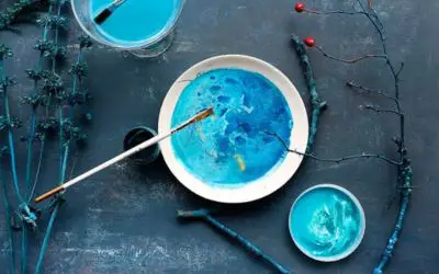
Creating Muted Shades of Blue

As an artist, I’ve found that creating muted shades of blue can add a subtle touch of elegance and sophistication to my artwork or design.
Here are some ways I like to create muted shades of blue:
- One way to create muted shades of blue is to mix them with a small amount of complementary colors. Complementary colors are opposite each other on the color wheel, and when mixed together, they can create muted shades of their respective colors. To create a muted shade of blue, I mix it with a small amount of cadmium orange or orange-brown. This creates a muted blue-green or blue-gray color, depending on the ratio of blue to orange.
- Another way I like to create muted shades of blue is to mix them with gray paint. Gray paint can be added to blue in small amounts to create a muted, desaturated blue color. I adjust the ratio of blue to gray to create different shades of muted blue.
- Using muted shades of blue can add a touch of sophistication and elegance to my artwork or design. They can be used as a neutral color in a color scheme or to tone down brighter colors. Additionally, they can create a calming and serene atmosphere, making them a popular choice in interior design.
How to Create Warm Shades of Blue
While blue is often associated with coolness and tranquility, warm shades of blue can add depth and richness to artwork or design.
Here are some ways to create warm shades of blue:
Using warm-toned pigments to create warm shades of blue
Warm-toned pigments can create a sense of warmth and depth in blue paint.
For example, using a warm-toned blue pigment like ultramarine blue can create a rich, deep blue with a warm undertone.
Mixing in warm-toned pigments like cadmium red or yellow ochre can also help create warm blue shades.
When using warm-toned pigments, it’s important to remember that they can be overpowering and quickly shift the blue to a different hue.
So it’s important to start with a small amount of warm-toned pigment and gradually add more if needed.
Mixing warm and cool-toned pigments to create unique warm shades of blue
Mixing warm and cool-toned pigments together can create unique warm shades of blue.
For example, mixing ultramarine blue with a warm-toned orange or yellow pigment can create a unique warm blue shade.
The ratio of warm to cool-toned pigments can be adjusted to achieve the desired color.
One technique that I find helpful is to start by adding a small amount of warm-toned pigment to the blue paint and then gradually adding more blue or more warm-toned pigment until I achieve the desired hue.
Examples of warm blue shades in art and design
Warm shades of blue can be seen in various art and design applications. For example, the warm blue shades in Vincent Van Gogh’s “Starry Night” painting create a sense of depth and emotion.
In interior design, warm blue shades can create a cozy and inviting atmosphere. When using warm blue shades in art or design, it’s important to consider the context and intended atmosphere of the piece.
How to Create Turquoise Blue Colors
Turquoise is a vibrant and unique shade that combines blue and green tones.
Mixing blue and green pigments together creates turquoise, and the ratio of blue to green can be adjusted to create different shades of turquoise.
Different pigments can also be used to create various shades of turquoise.
For example, combining phthalo blue and phthalo green pigments can create a bright and intense turquoise color.
Adding white pigments can create a lighter and more pastel shade of turquoise, while different ratios of blue and green pigments can create unique shades of turquoise.
Turquoise shades can be seen in various art and design applications. Traditional Southwestern and Native American textiles often use vibrant turquoise shades to create a bold and striking look.
In interior design, turquoise shades can add a pop of color and create a fresh and lively atmosphere.
Creating turquoise-blue colors can be fun and rewarding for artists and designers.
By drawing inspiration from different sources and experimenting with different techniques, artists, and designers can create their own unique shades of turquoise that add a pop of color and energy to their work.
Combining turquoise and cyan paints in a seascape adds a vibrant touch. Turquoise for the deep ocean and cyan for sunlit waves create a captivating coastal scene.
Psychology of the Color Blue
The color blue is often associated with trust, stability, and reliability. It has a calming effect on the mind and body, making it an ideal color for creating a relaxed and tranquil atmosphere.
In design and branding, blue is often used to convey a sense of professionalism, trustworthiness, and reliability.
This is why many financial and legal institutions use blue in their branding.
Blue is also associated with intelligence, wisdom, and authority. It is a popular color for educational institutions, such as universities and colleges.
In fashion and beauty, dark blue shades can create a bold and trendy look.
Lighter shades of blue can evoke feelings of calmness and relaxation, while darker shades can create a more serious and formal atmosphere.
On the other hand, blue can also be associated with sadness and melancholy. This is why it is important to use it thoughtfully and in moderation.
In art and design, blue can convey specific emotions and meanings depending on the context and shades used.
Tips When Mixing Different Shades of Blue
Mixing different shades of blue can be challenging, but it can be a rewarding experience with the right approach.
Here are some tips to help you achieve the perfect shade of blue:
Related: How To Make Sky Blue Paint
Importance of color balance and harmony
When mixing different shades of blue, it’s important to consider color balance and harmony.
This means finding the right balance between cool and warm tones and ensuring the shades complement each other.
You can create a cohesive and visually pleasing color palette by achieving color balance and harmony.
Tips for achieving the desired shade of blue
- Start with a base color and gradually add small amounts of other colors until you reach the desired shade.
- Experiment with different shades and pigments, and keep a record of your mixtures so that you can reproduce them in the future.
- Work with small amounts of paint at a time to avoid wasting resources.
- Use white paint as a base to achieve a lighter shade of blue.
- Use black paint as a base if you want to make blue darker.
- Use complementary colors, such as orange or yellow, to warm your blue mixture.
- Use analogous colors, such as green or purple, to create a more complex shade of blue.
How to avoid common color mixing mistakes
- Avoid adding too much paint, which can result in an oversaturated color.
- Use clean brushes and palettes to avoid introducing unwanted colors into your mixture.
- Allow enough drying time between layers to avoid muddying the colors.
- Use a color wheel to help you choose complementary and analogous colors.
- Use a small brush for precise color mixing.
- Test your mixture on paper or canvas before applying it to your artwork.
How to Make Different Shades of Blue Technically
The following table presents different shades of blue and their corresponding HEX codes, RBG values, and CMYK values.
These technical details can be useful for designers and artists looking to create specific shades of blue in their work.
From navy blue to cerulean blue, this table offers a range of options for those seeking to incorporate this versatile color into their projects.
| Type of Blue | HEX Code | RBG | CMYK |
| Navy Blue | #000080 | (0,0,128) | 100%, 100%, 0%, 50% |
| Denim Blue | #1560bd | (21,96,189) | 61%, 33%, 0%, 33% |
| Oxford Blue | #002147 | (0,33,71) | 100%, 53.5%, 0%, 72.2% |
| Egyptian Blue | #1034a6 | (16,52,166) | 90.4%, 68.7%, 0%, 34.9% |
| Columbia Blue | #9bddff | (155,221,255) | 39.2%, 13.3%, 0%, 0% |
| Azure Blue | #007FFF | (0,127,255) | 100%, 50.2%, 0%, 0% |
| Turquoise | #40e0d0 | (64,224,208) | 71%, 0%, 7%, 12% |
| Cobalt Blue | #0047ab | (0,71,171) | 60%, 60%, 0%, 0% |
| Baby Blue | #89CFF0 | (137,207,240) | 42.9%, 13.8%, 0%, 5.9% |
| Cerulean Blue | #2a52be | (42,82,190) | 98%, 10%, 0%, 20% |
| Prussian Blue | #003153 | (0,49,83) | 100%, 41%, 0%, 67.5% |
Different Types of Blue and Their Uses
Here are some types of blue and their uses:
- Baby Blue: Baby blue is a light, soft blue shade often associated with infants and baby products. It can also be used in clothing and accessories for a fresh and delicate look.
- Turquoise: Turquoise is a vibrant and striking blue-green color often used in jewelry and decorative pieces. It’s also a popular choice for beachy and bohemian home decor.
- Royal Blue: Royal blue is a bright, bold blue shade often used in sports teams and uniforms. It can also add color to any outfit or home decor.
- Powder Blue: Powder blue is a pale, muted blue shade often used in home decor and fashion. It’s a calming color that can create a serene and relaxing atmosphere.
- Cobalt Blue: Cobalt blue is a rich, intense blue shade often used in glassware and ceramics. It can also be used in clothing and accessories for a statement-making look.
- Cornflower blue: Cornflower blue is a soft blue shade often used in floral arrangements and bouquets. It can also be used in fashion for a romantic and feminine look.
- Sky Blue: Sky blue is a light, airy blue shade often used in landscapes and outdoor scenes. It can also be used in home decor for a refreshing and calming effect.
- Navy Blue: Navy blue is a dark blue shade commonly used in uniforms, suits, and formal wear. It’s also a popular color for home decor, particularly in coastal and nautical-themed spaces.
- Midnight Blue: Midnight blue is a deep, mysterious hue resembling the night sky. It exudes elegance and is ideal for adding a touch of sophistication to fashion ensembles or interior decor, creating a captivating ambiance.
Also, read about midnight blue color vs navy blue and Royal Blue Vs Navy Blue.
What Color Does Blue and Green Make?
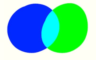
When blue and green are mixed together, they create a shade of teal or turquoise.
This is because blue and green are primary colors that can be combined to create secondary colors.
Blue is one of the three primary colors, along with red and yellow, while green is a secondary color made by mixing yellow and blue.
When blue and green are mixed in equal amounts, they produce a teal shade, a greenish-blue color.
However, the specific shade of teal or turquoise created depends on the proportions of blue and green used in the mixture.
More blue will result in a bluer shade of teal, while more cadmium green will result in a greener shade.
Teal and turquoise are popular colors in art and design due to their soothing and calming qualities.
They are often used in home decor, fashion, and graphic design to create a serene and peaceful atmosphere.
Examples of blue and green shades can be seen in famous paintings like Vincent Van Gogh’s “Starry Night,” where the artist used blue and green to create a dreamy night sky.
FAQs
What colors do you mix to make light blue?
You can mix equal parts of blue and white to make light blue. You can also add a small amount of yellow or light green to create a slightly different shade of light blue.
How do you make light sky blue?
To make light sky blue, you can mix white, blue, and a touch of green. Start with a small amount of each color and gradually add until you achieve the desired shade.
How do you make light blue with acrylic paint?
Mix titanium white and ultramarine blue in equal parts to make light blue with acrylic paint. You can adjust the shade of light blue by adding more white or blue as needed.
Does yellow and green make blue?
No, yellow and green do not make blue. When you mix yellow and blue, you get green. Mixing yellow and green would result in a brighter, more saturated shade of green.
Does light blue and purple match?
Yes, light blue and purple go together. Their combination creates a pleasing contrast, with the cool tones of light blue complementing the depth and richness of purple. This color pairing can be used harmoniously in various design and aesthetic applications to achieve an elegant and visually appealing result.
Read Also: How to make olive green with acrylic paint and how to make aqua green.
Conclusion
As an artist, I hope this article has provided valuable insights into the world of blue colors and how they can be used to create shades and hues.
We discussed the basics of color theory and how different shades of blue can be created by mixing different primary colors.
We also explored the technical aspect of creating shades of blue with the help of HEX codes, RBG, and CMYK values.
Understanding how to make different shades of blue is important for artists and designers as it allows them to add depth and complexity to their work.
By experimenting with different shades of blue, artists can create unique and captivating pieces of art that stand out from the crowd.
In conclusion, I encourage all artists and designers to explore the world of blue colors and experiment with different shades and blue hues.
With the knowledge gained from this article, you can unlock your creativity and take your art to the next level.


Leave a Reply