Create stunning color tones with the aqua hue that blends between blue and green. Not only is this shade of color often associated with tranquility, but it also represents the perfect equilibrium between cold and warm colors.
If you want to add some zest to your design or art project, aqua can be just what your work needs.
In this blog post, I’ll tell you how to make aqua colour using paint varnishes and other mediums.
What is Aqua Colour
Aqua color refers to a shade that resembles the color of water, often described as a light or medium blue-green. On the color wheel, it combines the freshness of blue with the vibrancy of green, resulting in a soothing and tranquil hue. The color is commonly associated with water, nature, and calmness.
How to Make Aqua Colour
To make aqua color, mix equal parts of blue and green paint. Start with a base of blue paint and gradually add green paint until you achieve the desired shade of aqua. Adjust the ratio to create lighter or darker variations. Remember to mix thoroughly for a consistent and accurate aqua color.
The Color Code for Aqua
| Code | Value | HTML/CSS |
| Hex | 00FFFF | #00FFFF |
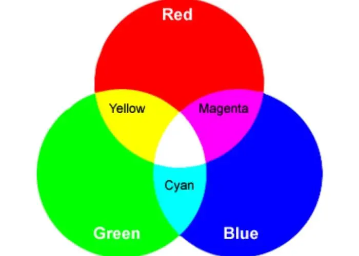
| RGB | 0, 255, 255 | rgb(0, 255, 255) |
| HSL | 180°, 100%, 50% | hsl(180, 100%, 50%) |
| HSV | 180°, 100%, 100% | |
| CMYK | 100, 0, 0, 0 |
What Two Colors Make Aqua
Aqua color is typically achieved by mixing blue and green in specific ratios. The combination of blue and green pigments creates the distinct hue of aqua.
Adjusting the proportions of blue and green gives you varying shades of aqua. It can range from lighter, blue-leaning tones to deeper, green-leaning shades.
How to Get Aqua by Combining Colors
To get the aqua color by combining colors, follow these steps:
Mixing the base color
Start by creating a base color by blending equal parts of blue and green paint or pigments. This mixture lays the foundation for achieving the aqua shade.
Adding blue tint
Gradually add small amounts of blue paint or pigment to the base color. Stir well after each addition and assess the color to determine if it has shifted towards the desired aqua hue. Adjust the amount of blue added based on your desired intensity.
Incorporating green tint
Similarly, introduce small increments of green paint or pigment to the mixture. Blend thoroughly and evaluate the color. Adding green will further refine the aqua tone, balancing the blue-green combination.
Adjusting the intensity and shade
Fine-tune the intensity of the aqua color by adjusting the ratio of blue to green. For a lighter aqua, increase the proportion of blue; for a darker aqua, increase the amount of green. Continuously evaluate and modify the mixture until the desired shade of aqua is achieved.
How to Make Aqua Green Color
Supplies:
- Blue paint or pigment
- Green paint or pigment
- Mixing palette or container
- Mixing tool (brush or palette knife)
Steps:
- Start by preparing your mixing palette or container. Ensure it is clean and free from any traces of other colors.
- Begin with the blue paint or pigment. Squeeze a small amount onto the mixing palette or container. The exact quantity will depend on the intensity and amount of aqua green you wish to create.
- Gradually introduce green paint or pigment to the blue. Start with a small amount and adjust as needed. Remember that green is the key color for achieving the desired aqua green shade.
- Use your mixing tool to blend the blue and green together thoroughly. Make sure to mix until you achieve a consistent and uniform color.
- Assess the resulting mixture. Add more green to intensify the green tone if it appears too blue.
- Continuously evaluate the color as you adjust the ratios of blue and green. Remember that the desired shade of aqua green may vary depending on personal preference or specific project requirements.
- It is ready to use once you achieve the desired aqua green color.
How to Make Aqua Blue Color
Supplies:
- Blue paint or pigment
- Green paint or pigment
- White paint or pigment
- Mixing palette or container
- Mixing tool (brush or palette knife)
Steps:
- Prepare your mixing palette or container, ensuring it is clean and free from any remnants of other colors.
- Start by squeezing a small amount of blue paint or pigment onto the palette or container. This serves as the base for creating aqua blue.
- Gradually introduce green paint or pigment to the blue, starting with a small amount. Mix well with your mixing tool to incorporate the green into the blue.
- Evaluate the resulting color. If it appears too green, mix blue in a larger quantity to balance it. Continue adjusting the ratios of blue and green until you achieve the desired balance.
- Add small amounts of white paint or pigment to the mixture to lighten the aqua blue. This will create a pastel-like tone and enhance the brightness of the color. Mix thoroughly to ensure even distribution.
- Continuously assess the color as you make adjustments, ensuring it aligns with your vision for aqua blue.
- Once you have achieved the desired aqua-blue hue, it will be used in your artwork, design projects, or any other creative endeavors.
Ways To Lighten or Darken the Aqua Color
Lightening Aqua: You can incorporate white or a lighter shade of blue to lighten the aqua color. Gradually add small amounts of white or pale blue pigment to the aqua mixture.
Mixing it well will gradually lighten the color. Increasing the proportion of these lighter shades can achieve a brighter and more pastel-like aqua tone.
Remember that adding white or light blue should be done incrementally to maintain control over the lightening process.

Darkening Aqua: To darken the aqua color, you can introduce deeper shades of blue or a touch of black. Add small amounts of darker blue or black pigment into the aqua mixture.
Stir the mixture thoroughly to ensure an even distribution of the darker pigment.
Increase the proportion of the darker shades to intensify the aqua color, deepening it to the desired level.
Tips for Achieving Desired Aqua Color
You can create a beautiful aqua color in your pool or spa by following some simple tips.
Experimenting with different ratios
When combining blue with green to achieve the desired aqua shade, experiment with different ratios of blue and green pigments.
Adjusting the proportions allows you to fine-tune the color, finding the perfect balance between blue and green. Adding more blue will result in a bluer aqua, while increasing the green will create a greener one.
Using color swatches or references
Utilizing color swatches or references is crucial for accurately achieving the desired aqua color. These references can be paint swatches, color charts, or photographs showcasing the desired aqua shade.
Comparing your mixed color to the references helps ensure it matches the intended hue.
It allows you to make adjustments and corrections as needed, ensuring the final result aligns with your vision.
Testing the color on a small area
Before applying the aqua color on a larger surface, test it on a small area. This step helps you assess how the color appears in the specific lighting conditions of your space.
Testing allows you to evaluate the color’s vibrancy, saturation, and overall visual impact. It also allows for any necessary adjustments or refinements to achieve the desired aqua shade.
Mixing variations of aqua color
To add depth and dimension to your design, consider mixing variations of the aqua color. You can introduce contrast and visual interest by creating lighter or darker shades of aqua.
Lighter aqua shades can bring a soft and ethereal touch, while darker aqua tones add depth and intensity.
Mixing variations expands the creative possibilities, allowing you to incorporate different shades of aqua to achieve a more dynamic and captivating result.
Meaning Aqua Color Portrays
Aqua carries a range of meanings depending on its context. It is associated with calmness, cleanliness, clarity, and balance, as this section explores
Calmness
Aqua color portrays a sense of tranquility and serenity. Its soft and soothing hue creates a calming effect, making it an ideal choice for creating peaceful and relaxing environments.
The sense of tranquility is like calm waters, promoting a serene atmosphere that encourages relaxation and inner peace.
Cleanliness
Aqua color is often associated with cleanliness and purity. Its light and fresh appearance evoke a sense of cleanliness, making it suitable for use in spaces where cleanliness is emphasized, such as bathrooms, spas, or healthcare facilities.
Aqua’s crisp and clear nature gives an impression of cleanliness and adds a touch of hygiene to the overall aesthetic.
Clarity
Aqua color conveys a sense of clarity and transparency. It reflects the clarity of water, appearing bright and transparent. This aqua quality can represent clarity of thought, vision, or emotions in artworks or design concepts.
Aqua’s clean and transparent nature allows it to bring clarity and openness to spaces. This creates an environment that promotes clear thinking and a focused mindset.
Balance
Aqua color represents balance and harmony. It combines the calming qualities of blue with the refreshing qualities of green, striking a harmonious equilibrium.
Aqua’s balance between warm and cool tones creates a sense of visual harmony and equilibrium.
This makes it an excellent choice for achieving a well-balanced color palette in various design applications.
Uses of Aqua Color
Aqua color is used in several applications including the following:
Aqua Color in Artworks
Aqua is frequently used in artworks to evoke a sense of tranquility and serenity. It is employed in paintings, sculptures, and mixed media creations, adding a touch of freshness and calmness to the composition.
Aqua’s soothing nature can be utilized to depict serene landscapes, underwater scenes, or abstract representations of water.
Its vibrant yet peaceful quality allows artists to create visually captivating and emotionally engaging pieces.
Aqua in Décor Pieces
Aqua color is popular in various decor pieces, such as vases, candles, and decorative accents. It’s light and refreshing hue brings a lively and vibrant element to interior design.
Aqua decor can act as eye-catching focal points, adding color to neutral spaces. It works particularly well in coastal, beach-inspired, or bohemian-themed decor styles, infusing a sense of relaxation and whimsy into the overall aesthetic.

Marine Application
Given its association with water, aqua color is extensively used in marine applications. It is often employed in boats, yachts, and marine equipment to create a connection with the ocean and emphasize a nautical theme.
Aqua paint or finishes on marine surfaces enhance their aesthetic appeal while evoking a sense of adventure and a deep connection to the sea. The color choice creates an immersive experience, harmonizing with the marine environment.
Interior and Exterior Wall Painting
Aqua color lends itself well to interior and exterior wall painting, providing versatility in design. Lighter shades of aqua can be used in bedrooms, bathrooms, or living spaces to create a calming atmosphere.
On the exterior, aqua can add a refreshing touch to beachfront properties or homes seeking a vibrant and playful curb appeal.
It complements various colors and can be incorporated as an accent or a main feature, allowing for diverse and personalized design choices.
Decorative Pieces
Aqua is often used to create decorative pieces, such as throw pillows, rugs, and curtains. These elements can transform the ambiance of a room, infusing it with a lively and refreshing vibe. Aqua decorative pieces are versatile and can complement various color schemes and design styles.
Whether as a subtle accent or a bold statement, they bring a touch of vibrancy and visual interest to any space, creating an inviting and dynamic atmosphere.
Main Complementary Colours of Aqua
The main complementary colors of aqua are white and grey. White acts as a high-contrast companion to aqua, creating a crisp and clean look.
The stark contrast between aqua and white enhances the vibrancy and freshness of aqua, allowing it to stand out.
Grey serves as a neutral and calming complement to aqua. It adds depth and sophistication to aqua, creating a more subdued and balanced palette.
Grey tones down the intensity of aqua while maintaining a harmonious color scheme.
What is the Difference: Aqua vs Turquoise vs Teal
Aqua, turquoise, and teal are all colors within the greenish-blue color, but they each have distinct characteristics that set them apart.
Aqua
Aqua is a light to medium blue-green shade, leaning more towards blue. It is reminiscent of the color of water, evoking a sense of tranquility and serenity. Aqua is often associated with beach and coastal aesthetics, bringing spaces a fresh and calming vibe.
It is soft and airy, perfect for creating relaxed and soothing environments. Aqua pairs well with other colors and is versatile enough to be used in various design styles, from modern to traditional.
Turquoise
Turquoise, on the other hand, is a vibrant and energetic blue-green color. It is characterized by its equal balance of blue and green pigments, resulting in a refreshing and lively color.
Turquoise is often associated with tropical waters and exotic destinations, adding a sense of adventure and vibrancy to any setting.
It is a versatile color that can range from more blue-leaning to more green-leaning shades, offering flexibility in design. Turquoise is frequently used in bohemian and eclectic designs, where its playful and free-spirited nature shines.
Teal
Teal, a darker and richer blue-green shade, leans more towards green. It exudes sophistication and depth, making it a popular choice for adding a touch of elegance to spaces. Teal is often described as a deep cyan or turquoise with a sense of richness and luxury.
Its darker intensity creates a bold and striking presence, making it ideal for accent pieces or creating focal points in interiors.
Teal is commonly used in contemporary and modern designs, bringing a sense of refinement and visual interest to various settings.
FAQs
What colors make aqua blue?
Aqua blue can be achieved by mixing blue and green in specific ratios. Typically, combining a larger proportion of blue with a smaller proportion of green creates the desired aqua shade. Adjusting the ratios allows for customization and variations in the resulting aqua tone.
What does blue and green paint make?
Mixing blue and green paint together results in various shades of aqua or turquoise, depending on the proportions used. The combination of blue and green pigments creates a harmonious blend that captures the freshness of blue with the vibrancy of green, producing a range of captivating aqua shades.
Is aqua blue or green?
Aqua color is a combination of blue and green. While it leans more towards blue, it also contains many green pigments. The resulting hue is a light to medium blue-green shade that captures the essence of both colors, reflecting the coolness of water and the vibrancy of nature.
What primary colors are used to make aqua color?
The primary colors, blue and yellow, are mixed to create aqua color. Blue contributes the dominant hue, while yellow paint adds a touch of green. By adjusting the ratios, it is possible to achieve different variations of aqua, ranging from more blue-leaning to more green-leaning shades.
Can I use acrylic or oil paints to make aqua color?
Yes, both acrylic and oil paints can be used to create aqua color. These versatile paint mediums can be mixed together using the appropriate blue and green pigments to achieve the desired aqua shade. However, it’s essential to ensure the pigments are of good quality to obtain accurate and consistent results.
Can I mix aqua color with other paint mediums, such as watercolors or gouache?
Yes, mixing aqua color with other paint mediums, including watercolors and gouache, is possible. By carefully combining the respective pigments, you can also create aqua shades in these mediums. It is important to remember that different paint mediums have their own unique properties, so experimentation and adjusting the ratios may be necessary to achieve the desired results.
Read also: Difference between acrylic and gouache paint
Conclusion: What Colors Make Aquamarine
Creating aquamarine is a science of light and tone. To successfully achieve aqua’s calming effects, you need to combine its colors in the right amount and with the right hues.
Remember that there are no hard rules since hues, shades, and tints can significantly affect how the colors come together- so don’t forget to experiment and be creative.
With some patience and practice, you can also learn to make aqua color that will bring beauty to your home or business.
So whether you plan on using it for an indoor space or outside -you know what you need to do! Great job investigating what colors make aquamarine.








Leave a Reply