Color is integral to our lives, shaping our environment, emotions, and perceptions. But how much do we know about how colors interact?
Take blue and orange, for instance – two bold, vibrant shades that could not be more different. But what happens when they mingle?
Do they clash or compliment? Do they create a whole new hue?
To answer these questions, I have delved into the fascinating world of color theory and explored different color models.
So, let’s embark on this journey of discovery together. Grab your virtual paintbrush and discover what magic blue and orange can create.
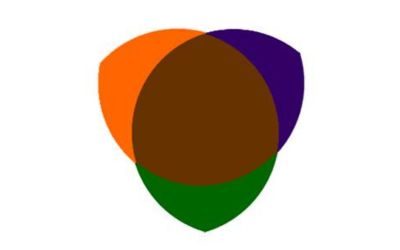
What Color Does Orange And Blue Make When Mixed?
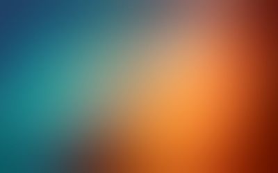
When you mix blue and orange, they produce shades of brown or gray because blue and orange are complementary colors. The specific shade produced can vary depending on the tones of blue and orange used and the medium in which they are mixed.
Understanding Color Models
The RYB color model
RYB standing for Red, Yellow, and Blue. These three are the primary colors in the model. The RYB Color Model is the oldest of all the color models.
They are the building blocks from which all other colors are made. You’ve used the RYB color model if you’ve ever swirled your paintbrush in a grade-school art class.
Artists and designers use RYB because of its straightforward nature and intuitive mixing of pigments. Yet, there are other ways to understand and mix colors.
The RGB color model
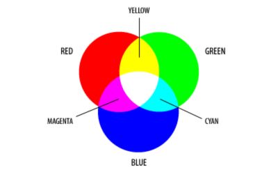
RGB stands for Red, Green, and Blue. It is the color model used for screen displays, such as computer or TV screens.
When all the primary colors of light combine, they create white. Thus, the RGB model is additive – the more color you add, the closer you get to white.
Digital designs often use the RGB model. Mixing red and green light produces yellow, green, and blue light, creating cyan, and combining a red and blue shade gives us magenta.
The CMYK color model
CMYK stands for Cyan, Magenta, Yellow, and Key (black). The CMYK color model is used in print media.
Unlike RGB, the CMYK model is subtractive, meaning the more color you add, the closer you get to black.
It’s called ‘subtractive’ because you subtract brightness from white as you add more color.
For instance, mixing equal amounts of cyan, magenta, and yellow would yield a dark brown, and adding more would result in black.
That’s why black is usually added to improve the depth and detail of the image.
What is Blue Color?
Hex code: #0000FF
RGB code: RGB(0, 0, 255)
CMYK code: C: 100%, M: 100%, Y: 0%, K: 0%
HSL code: H: 240°, S: 100%, L: 50%

Blue is a primary color that is opposite of brown and often associated with calmness, serenity, and tranquility. It is a cool color that can evoke feelings of relaxation and peace.
Blue is found in nature, such as in the sky and bodies of water. It is also a versatile color used in various applications, including art, design, and psychology.
Blue has different shades and tones, ranging from light and pale to deep and vibrant blues.
Its color conveys a sense of trust, stability, and depth, making it a popular choice in many contexts.
What is Orange color?
Hex code: #FFA500
RGB code: RGB(255, 165, 0)
CMYK code: C: 0%, M: 49%, Y: 100%, K: 0%
HSL code: H: 39°, S: 100%, L: 50%

Orange is a secondary color that falls between red and yellow on the color spectrum. It is often associated with warmth, energy, and enthusiasm.
Orange is a vibrant and eye-catching color that evokes excitement and happiness. It is natural in sunsets, autumn leaves, and fruits like oranges.
Orange is also a popular color in design and branding, as it can create a sense of boldness and positivity.
It has shades and tones, ranging from light and pale oranges to deep and vibrant hues.
Mixing Blue and Orange: Basic Mixing Process
Mixing colors is like a fun chemistry experiment, requiring a keen eye, a steady hand, and patience.
When it comes to blending blue and orange, the process is quite straightforward. Here are some steps to guide you:
- Start with Small Amounts: Begin with a small amount of each color. It’s easier to add more paint than to try to remove it.
- Add Blue to Orange: Add blue paint to the orange, as blue is a stronger and more dominant color. Adding blue to the orange allows better control over the color’s intensity, allowing you to adjust it as desired.
- Mix Thoroughly: Use a palette knife or paintbrush to mix the colors. Ensure no streaks of pure blue or orange are left in the mix.
- Evaluate the Color: Look at the color you’ve created. Depending on the specific shades of blue and orange you use, you’ll end up with a form of brown or gray.
- Adjust as Needed: Add more orange if the color is too dark. If it’s too light or too orange, add more blue. Always make adjustments to avoid overshooting your desired color.
Remember, every blue and orange is different, and the lighting conditions affect the resulting color.
So don’t be afraid to experiment and find the best blend for your needs.
Results of mixing blue and orange
In paint and art
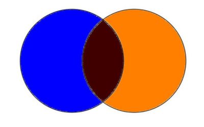
When you mix blue and orange paint, the result is a shade of gray or brown paint, created because blue and orange are complementary colors on the color wheel.
Their mixture neutralizes the intensity of both colors, leading to more subdued hues.
The shade you end up with depends on the exact tones of blue and orange used, the type of paint, and even the lighting in the room.
In lighting
In the world of light, things are different due to the additive nature of the RGB model.
When blue and orange light intersects, the result can be a warmer white light because orange light can be seen as a mixture of red and green light (in the RGB model).
When you add blue light to that, you mix all three primary colors of light—red, green, and blue—which results in white.
In printing
Printing uses the subtractive CMYK model. Mixing blue (close to cyan) and orange (a mix of yellow and magenta) results in a darker color, often a shade of brown or even black, if the colors are intense enough.
Find out what color is created when black and orange are mixed.
The specific result varies depending on the ink shades and the paper used. Doing a test print to ensure the colors come out as expected is always a good idea.
Variations in Mixing
Light blue and orange
When light blue dances with orange on the canvas. Light blue carries a sense of serenity.
Orange is a vibrant and energetic color. The fusion of these two colors yields a balanced and harmonious shade.
It’s like the quiet joy of a sunlit morning. Artists often use this combination for painting calming landscapes or cozy interiors.
Additionally, this shade makes an appealing choice for home decor and clothing.
Baby blue and orange
Mix baby blue with orange and get a charming, versatile light taupe. Baby blue is like a gentle whisper, while orange is a lively chatter.
When they come together, it’s a delightful conversation. The baby blue and orange duo is popular among designers.
It is best to infuse spaces with whimsy without going overboard.
It’s also an elegant pick for branding and graphic design, aiming for professionalism and freshness.
Sky blue and orange
Imagine the endless sky merging with a sunset’s glow. That’s what happens when sky blue is mixed with orange.
The color you get is reminiscent of an earthy, warm beach, a medium-light brown tint with a hint of adventure.
Artists might use it to capture the essence of coastal themes. Making sky blue and orange could be better for creating inviting marketing materials or an energizing workspace.
It captures the spirit of exploration and serenity at the same time.
Mixing darker blue and orange
Let’s take things deeper with dark blue (teal mixed with purple creates dark blue). Mixing dark blue, such as navy or indigo, with orange creates an enigmatic, rich brown or near-black.
The intensity of dark blue collides with the vivacity of orange, like a night sky illuminated by a bonfire.
A mixture of dark blue and orange is versatile – ideal for adding depth to paintings or exuding elegant design.
This combination is best for designers seeking a grounded and captivating shade.
Mixing navy blue and orange
Navy blue and orange create a bold contrast. Navy blue is deep and sophisticated, while orange is vibrant and energetic.
The Navy blue and orange combination grabs attention and creates a design, fashion, and branding statement.
Whether used in home decor, logos, or artwork, navy blue, and orange are powerful and striking choices.
To understand better, we have guidelines on how to make navy blue paint and orange color using acrylics.
How to Fine-Tune the Resulting Color
Striking the right balance between orange and blue colors is key. But how? It’s about understanding their strengths and adjusting proportions. Let’s dive into the specifics.
Adding more orange
Extra orange is like a hug for your mix – it makes things warmer. The more orange you add, the richer and more terracotta-like the brown becomes.
The added warmth in the hue is a nod to the longer wavelengths of orange.
Perfect for artists depicting the golden hour or designers crafting a rustic ambiance.
Adding more blue
Adding blue cools down the blend, producing a slate-like earthy hue. It’s perfect for serene landscapes or for creating an elegant, modern space.
This tweak is a boon for artists seeking to capture the calmness of dusk or for interior designers curating a modern, tranquil space.
A little extra blue might be the calming breath your palette needs.
Popular Hues and Shades
The orange and blue mixture offers many captivating hues and shades. Let’s explore some popular ones:
Burnt sienna (#E97451)
This warm, earthy brown hue combines burnt orange’s richness with a deep blue touch.
It evokes a sense of autumnal coziness. Often used in landscape paintings and interior design.
Teal (#008080)
Teal is a striking blend of vibrant blue and deep orange. It exhibits an exquisite balance.
This blue-green shade is versatile and can add a touch of sophistication to various design projects, from fashion to home decor.
Coral (#FF7F50)
Mixing a vibrant orange with a hint of lighter blue yields the delightful shade known as coral. It exudes warmth and a tropical vibe.
It is often seen in beach-themed designs, summer fashion, and vibrant floral arrangements.
Slate gray (#708090)
By incorporating a cool blue with a tinge of orange, you can create a subtle and sophisticated gray shade known as slate gray.
It’s versatile neutral adds depth and elegance to architectural designs and modern aesthetics.
Aqua (#00FFFF)
This refreshing and vibrant hue combines a light blue with a touch of orange. Aqua evokes a sense of tranquility.
It is used in coastal-inspired designs, swimming pool decor, and beach-themed artwork.
Table: Popular Hues and Shades Resulting from the Mixture of Orange and Blue
| Hue | HEX Code | CMYK Code | RGB Code | Blue (%) | Orange (%) | Color |
| Burnt Sienna | #E97451 | C: 0, M: 62, Y: 66, K: 10 | R: 233, G: 116, B: 81 | 20% | 80% | color |
| Teal | #008080 | C: 100, M: 0, Y: 50, K: 50 | R: 0, G: 128, B: 128 | 50% | 50% | color |
| Coral | #FF7F50 | C: 0, M: 50, Y: 50, K: 0 | R: 255, G: 127, B: 80 | 10% | 90% | color |
| Slate Gray | #708090 | C: 56, M: 43, Y: 33, K: 19 | R: 112, G: 128, B: 144 | 30% | 70% | color |
| Aqua | #00FFFF | C: 100, M: 0, Y: 0, K: 0 | R: 0, G: 255, B: 255 | 50% | 50% | color |
How to Mix Shades and Tints of Brown
Mixing shades and tints of brown allows you to create a spectrum of varied colors within the brown palette.
Here’s a guide on achieving different shades and tints of brown:
Mixing Shades of Brown:
- Start with a base brown color as your foundation.
- Add small amounts of black or a darker shade of brown to your base color to darken the brown. Mix these darker shades until you achieve the desired depth and richness.
- You can mix complementary colors, such as blue or green, into brown to create darker shades with subtle undertones. Experiment with different proportions to achieve your desired effect.
Mixing Tints of Brown:
- Begin with a base brown color.
- Add small amounts of white or a lighter shade of brown to your base color to lighten the brown. Incorporate these lighter tones until you achieve the desired level of lightness.
- Experiment with adding small amounts of other light colors, such as yellow or cream, to the brown to create tints with subtle undertones. Adjust the proportions until you achieve the desired tint.
How to Create Lighter Brown
To create a lighter shade of brown, you have a couple of options:
- Start with a base brown color and mix in small amounts of white. Add the white to achieve the desired level of lightness. It ensures you maintain the warm undertones of the brown.
- You can also mix a lighter shade of brown with your base color. It can be a tan or a lighter brown hue. Adjust the proportions until you achieve the desired level of lightness. Keep retaining the rich essence of brown.
Experiment with different ratios and hues to find the perfect light brown shade for your project.
How to Create Darker Brown
For deeper and darker brown shades, consider the following techniques:
- Start with a base brown color and incorporate small amounts of black or darker brown. Add the darker color, mixing each time until you reach the desired depth of darkness.
- Mix complementary colors like blue or green into your base brown. These hues can create a darker brown with subtle undertones. Experiment with different proportions to achieve the desired level of darkness and undertones.
Adjust the proportions to achieve the perfect darker brown shade for your artistic or design needs.
Combining Brown Shades and Tints
Here are some tips for combining brown shades and tints:
- Tonal Variation: Choose brown shades and tints with similar undertones. It ensures a cohesive look. Pair them with a warm tint if you’re working with warm, reddish-brown shades. It will create a seamless transition.
- Contrast and Balance: Create visual interest by combining darker shades of brown with lighter tints, resulting in a contrast that adds depth and dimension to your design. For instance, you can pair a deep chocolate brown with a subtle beige tint to achieve a balanced composition that captures attention.
- Layering and Gradation: Experiment with layering different shades and tints of brown, as the technique can be particularly effective in artwork or interior design. Blend darker shades into lighter tints to achieve an organic effect.
- Accents and Highlights: Introduce a pop of contrast by incorporating a different shade or tint of brown as a highlight, drawing attention to specific areas or elements in your design.
- Consider the Context: Remember the color scheme and your project’s intended mood or theme, combining brown shades and tints with other colors. Such harmonization ensures a cohesive and balanced visual experience, promoting a harmonious and pleasing outcome.
Meaning of Brown Color
The color brown holds meanings of stability, reliability, and a connection to the natural world.
It represents earthiness and grounding, providing a sense of security.
Brown is warm and comforting, evoking warmth, wholesomeness, and simplicity. It symbolizes durability, dependability, and resilience.
Additionally, brown signifies rootedness and the grounding forces of nature. In design, brown is often used to create warmth and authenticity.
It is a popular choice for natural and rustic themes and for conveying a sense of timeless elegance.
As a color, Brown brings a sense of stability and a strong connection to the natural aspects of life.
How to Use Brown in Painting and Drawing
Here are some tips:
- Natural Elements: Use brown to depict the earth, tree trunks, or animal fur, capturing the essence of nature.
- Shadows and Depth: Brown shades make excellent choices for creating shadows and adding depth to your artwork.
- Contrast and Balance: Pair brown with complementary or contrasting colors to create visual interest and balance in your composition.
- Texture and Details: Use different shades and tints of brown to add texture. Intricate details to your artwork to enhance realism and dimension.
How to Use Brown in Design And Art
Brown can be a versatile and impactful color in design and art. Here are some tips on incorporating brown:
- Warmth and Balance: Use brown to add warmth and create a balanced color palette. It can ground and anchor other vibrant colors, creating a harmonious composition.
- Natural Aesthetics: Brown evokes a sense of nature and organic beauty. Incorporate it in designs and artworks inspired by earthy themes or when aiming for a rustic, cozy atmosphere.
- Textural Depth: Brown can add depth and texture to designs. Brown and blue together can bring about a textural depth in designs by exploring various shades of brown in conjunction with blue.
- Accents and Highlights: Use brown as an accent color to highlight specific elements in your design. It can add emphasis and create focal points.
Best Uses for Blue and Orange Mixes
Blue and orange mixes offer a dynamic color combination. Let’s explore some of the best uses for this captivating duo:
- Graphic Design and Branding: Blue and orange combinations create eye-catching logos. They’re often employed by sports teams, technology companies, and brands seeking a bold and energetic identity.
- Sports and Team Colors: Blue and orange are used in sports. The combination exudes energy, competitiveness, and enthusiasm. Many professional sports teams showcase blue and orange uniforms. They create an impactful presence on the field or court.
- Interior Design and Home Decor: Blue and orange can transform an interior space with complementary charm. Consider incorporating blue and orange accents in pillows, rugs, artwork, and furniture.
- Fashion and Accessories: The blue and orange combination is popular in the fashion industry. This pairing can create stunning outfits. It brings a bold and fashionable edge to any ensemble, making a confident style statement.
- Advertising and Marketing: Blue and orange mixes are used in advertising and marketing campaigns. The contrasting colors capture attention and create an engaging experience for viewers. This combination helps brands stand out and communicate their message.
- Event Decor and Party Themes: Blue and orange mixes can set the stage for memorable events. From weddings to birthdays, this combination adds a festive ambiance. Blue and orange create a vibrant and celebratory atmosphere.
Do Blue and Orange Work Well Together in Designs?
Yes. Blue and orange are excellent pairings in designs. They function as complementary colors on the color wheel.
The result is a vibrant and harmonious visual contrast. Blue’s cool tones complement the warm and energetic hues of orange.
They create a dynamic combination that immediately grabs attention and leaves a lasting impression.
The contrast between the colors adds depth and visual interest to designs, ensuring they remain engaging and memorable.
Incorporating blue and orange offers a versatile and appealing choice for branding projects.
The color combination can evoke a sense of balance, energy, and creativity in your designs.
Mixing Blue and Orange with Other Colors
Blue, green, and orange
Combining blue, green, and orange creates a vibrant color palette.
Blue and green evoke a sense of calmness and nature, while orange adds a pop of energy and warmth.
Blue, orange, and yellow
Combining blue, orange, and yellow produces a bright and cheerful color scheme.
Blue brings a sense of calmness, orange adds vibrancy, and yellow infuses a sunny and joyful vibe.
The combination of blue, orange, and yellow is perfect for designs related to creating an energetic atmosphere.
The mix gives your project a delightful, refreshing color palette, vibrancy, and energy.
Blue, orange, and purple
Blue, purple and orange combination creates a sophisticated color palette. Blue and orange provide a strong visual contrast.
Purple adds depth and richness, while the trio offers a sense of intrigue and elegance, making it an excellent choice for designs with a touch of drama and luxury.
The blend of blue, orange, and purple adds a sense of refinement and visual interest.
Pink, orange, and blue
Orange, pink and blue together bring a vibrant and playful color combination. Pink adds a touch of femininity and sweetness.
Orange injects energy and warmth, while blue offers a calming and cool element.
The trio is perfect for designs targeting a youthful audience, such as event invitations or branding for creative industries.
The pink, orange, and blue blend creates a vibrant atmosphere that captures attention.
Special Cases and Applications of Blue and Orange Colors
Hair coloring with blue and orange
Blue and orange are used in hair coloring to create unique and vibrant looks. Blue provides cool undertones, while orange adds warmth and vibrancy.
Combining these colors creates striking effects like ombre or balayage styles.
Blue and orange hair color combinations are popular among those seeking bold and unconventional looks.
The pairing of blue and orange allows for creative expression, standing out in the crowd.
It’s an excellent choice for individuals who want to make a bold statement with their hair, showcasing their unique style and personality through the dynamic blend of blue and orange shades.
Using blue and orange in the design
Blue and orange have a powerful impact on design, creating engaging compositions.
Blue symbolizes trust, tranquility, and stability, while orange represents energy, enthusiasm, and creativity.
When combined, they create a dynamic contrast that immediately captures attention. Blue and orange can be utilized in various design elements.
Blue and orange can add a vibrant and memorable touch to your work, leaving a lasting impression on your audience.
Combining these colors makes your designs stand out and resonate with viewers, ensuring they are impactful and memorable.
Embrace the power of blue and orange in your design projects to create striking and impactful results.
Understanding Color Meanings
White color meaning
White, is often associated with purity, innocence, and simplicity. It symbolizes clarity, cleanliness, and new beginnings.
In many cultures, white represents purity of spirit. It is worn for significant life events like weddings or religious ceremonies.
It can create a sense of calmness and serenity, making it a popular choice for minimalist designs.
White also serves as a neutral backdrop, allowing other colors to stand out and evoking feelings of freshness and spaciousness.
It is an excellent choice for creating a clean, airy aesthetic in various design applications.
Black color meaning
Black color is often associated with power, elegance, and sophistication.
It represents strength, authority, and mystery. In design, black is often used to create a sense of drama and intensity.
It adds depth and contrast to compositions, making other colors pop. Black is a versatile color used as a primary color.
It is also combined with other hues to create a striking impact. Black is employed in luxury branding and traditional designs to convey a sense of sophistication and exclusivity.
But, balancing black with other colors is essential to avoid a heavy or somber atmosphere and maintain visual interest.
FAQs
Does orange and blue make green?
No, orange and blue do not make green. Green is created by mixing yellow and blue. They create a strong visual contrast that can give the impression of green. This phenomenon is a simultaneous contrast in which our eyes perceive a physical absence of color.
Does blue and orange make brown?
No, blue and orange do not create brown when mixed. Brown is created by combining complementary colors, such as red and green, or mixing shades of orange, yellow, and black. When mixed, blue and orange may produce different shades of gray or muted colors, but not brown.
Why do orange and blue make green?
Orange and blue do not directly make green. When orange and blue are placed next to each other, the contrast between the warm orange and cool blue can create an optical illusion, leading to the perception of green. Our eyes perceive the combined effect of the colors, resulting in the sensation of green.
Does blue and orange make grey?
They can produce various shades of gray when mixed with blue and orange. The exact shade of gray will depend on the specific hues and intensities of the blue and orange used in the mixture. By adjusting the proportions of blue and orange, you can achieve different tones of gray, ranging from light to dark.
Are blue and orange complementary colors?
Yes, blue and orange are complementary colors. Complementary colors are pairs of colors opposite each other on the color wheel. When placed together, blue and orange create a high contrast, striking and complementary.
Does orange cancel out blue?
According to the color wheel, orange is the complementary color of blue. Complementary colors can cancel each other out when combined. Using a product with blue undertones for unwanted blue tones helps neutralize or reduce the blue color.
Conclusion
Blue and orange create a captivating combination. They are complementary colors that add vibrancy and depth to compositions.
Understanding color models, mixing variations, and fine-tuning the resulting colors allows creative expression.
Exploring special applications like hair coloring and design unlocks new possibilities. Embrace the versatility of blue and orange to enhance your projects.
They can make your creations stand out and leave a lasting impression.
Incorporate these colors and let your artistic endeavors and designs shine with their captivating charm.


Leave a Reply