Color mixing is the art of combining different hues to create new shades. Understanding color combinations is essential for various applications, from art and design to everyday life.
Primary colors, like red and blue, play a fundamental role in this process. In this article, we will explore what happens when red and blue are mixed together.
What color does red and blue make when mixed? We will delve into the concepts of additive and subtractive color mixing, examine the resulting shades of purple, and uncover the underlying principles of color perception.
So, let’s embark on this colorful journey of red and blue mixing.
What is Blue Color?
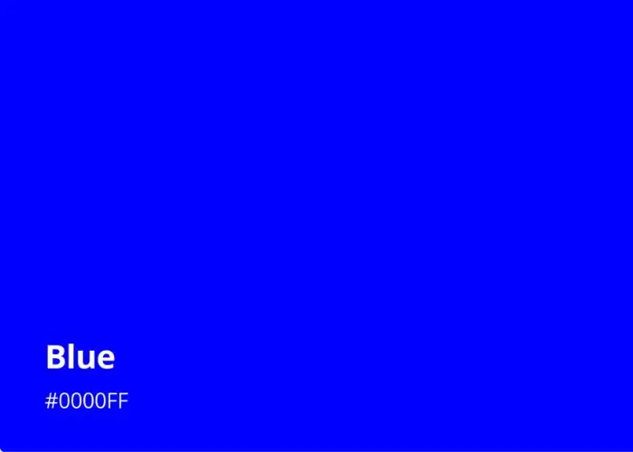
Blue is a primary color opposite brown on the color wheel, commonly associated with the vastness of the sky and the depths of the ocean. It is perceived as a cool, calming hue that evokes feelings of serenity and tranquility.
As a color with a shorter wavelength, blue light scatters more than other colors, which is why the sky appears blue during the day.
Blue has a versatile range of shades, from light baby blue to a deep midnight navy blue color. It is often used to symbolize loyalty, trustworthiness, and stability.
Blue is frequently employed in branding, as it is believed to promote reliability and professionalism.
In art and design, blue can create a sense of depth and distance. Additionally, blue pigments have been utilized for centuries in various forms of artistic expression.
What is Red Color?
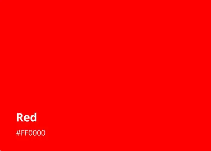
Red is a vibrant primary color that is often associated with intensity, passion, and energy. It is a warm hue that grabs attention and evokes strong emotions.
Red has a longer wavelength compared to other colors, and it is known to be the color that is most visible to the human eye.
Symbolically, red is often linked to love, desire, and power. It can convey both danger and excitement.
In nature, red is found in various elements, such as ripe fruits, fiery sunsets, and vibrant flowers.
In culture, red carries diverse meanings, representing luck, celebration, or warning, depending on the context.
In art and design, red can create a focal point and add a sense of vitality.
Additionally, different shades of red such as cardinal, scarlet, and crimson red shade have been utilized throughout history in paintings, textiles, and decorations.
The distinction between red vs cardinal red lies in the specific hue. Cardinal red possesses a vibrant and deep quality, often with a hint of bluish or crimson undertone, setting it apart from the broader concept of red.
Color Theory: Additive and Subtractive Mixing
Color theory explores the principles and systems behind color mixing. Two fundamental methods of color mixing are additive and subtractive mixing.
Additive color mixing
Additive mixing refers to the process of combining colored light. It is commonly used in electronic displays, such as televisions and computer monitors.
The primary colors in additive mixing are red, green, and blue (RGB). When these colors are combined at full intensity, they create white light.
Mixing different intensities of red, green, and blue can produce a wide range of colors. For example, equal amounts of red and green light create yellow, while combining red and blue light results in magenta.
Also read: magenta and red mixed
Subtractive color mixing
Subtractive mixing, on the other hand, involves mixing pigments or dyes. It is commonly used in traditional printing methods, painting, and mixing physical colors.
The primary colors in subtractive mixing are cyan, magenta, and yellow (CMY). When these colors are combined in equal amounts, they produce a neutral gray or black.
By selectively absorbing certain wavelengths of light, subtractive mixing creates different colors.
For instance, combining equal amounts of cyan and magenta produces blue, while adding yellow to magenta results in red.
Differences between additive and subtractive mixing
Here are the key differences between them:
Definition:
- Additive Mixing. Combining colored light sources to create new colors.
- Subtractive Mixing. Mixing pigments or dyes to create new colors.
Primary Colors:
- Additive Mixing. The primary colors are red, green, and blue (RGB).
- Subtractive Mixing. The primary colors are cyan, magenta, and yellow (CMY).
Color Creation:
- Additive Mixing. Colors are created by adding different intensities of light together. Mixing all primary colors at full intensity produces white light.
- Subtractive Mixing. Colors are created by selectively absorbing certain wavelengths of light. Mixing all primary colors in equal amounts results in black or a neutral gray.
Color Absorption:
- Additive Mixing. No colors are absorbed. Instead, the intensity of each primary color adds up to create the final color.
- Subtractive Mixing. Each pigment or dye absorbs certain wavelengths of light, subtracting them from the visible spectrum. The remaining reflected or transmitted light determines the perceived color.
Application:
- Additive Mixing. Used in electronic displays, such as TVs, computer monitors, and LED screens, where colors are created by combining light sources.
- Subtractive Mixing. Used in printing, painting, and physical color mixing, where colors are created by combining pigments or dyes.
Color Model:
- Additive Mixing. Follows the RGB color model, where adding all primary colors at full intensity produces white light.
- Subtractive Mixing. Follows the CMY color model, where mixing all primary colors in equal amounts produces black or a neutral gray.
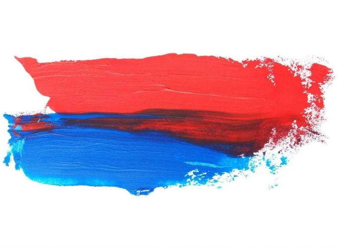
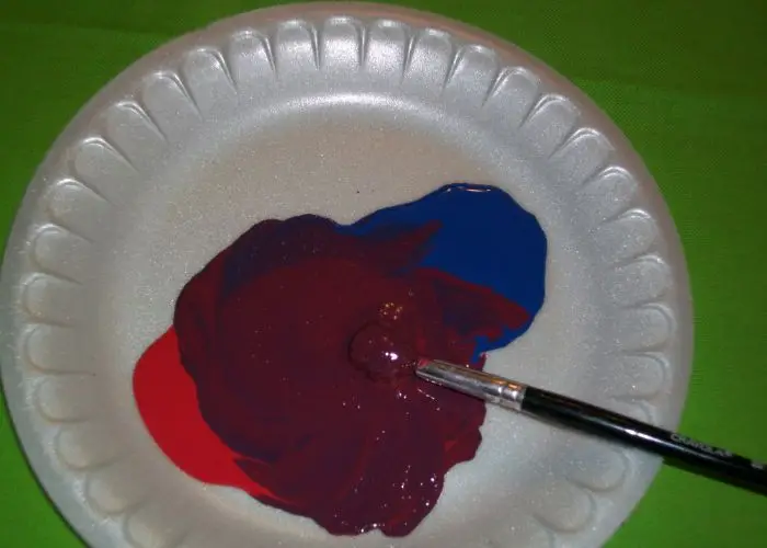
What Color Does Red and Blue Make When Mixed
When red and blue are mixed together, they create the color purple. Mixing these two primary colors results in a secondary color that lies between them on the color wheel.
The specific shade of purple obtained from combining red and blue will depend on the intensity or proportions of each color used in the mixture.
Red and blue are both primary colors in the subtractive color model, which is commonly used in painting, printing, and physical color mixing.
In this model, colors are created by selectively absorbing certain wavelengths of light. Red pigment absorbs green and blue wavelengths, while blue pigment absorbs red and green wavelengths.
When red and blue pigments are mixed together, each pigment absorbs one primary color while reflecting the other. Red pigment absorbs green light, and blue pigment absorbs red light.
As a result, the mixture of red and blue pigments absorbs both green and red light, allowing only the blue light to be reflected. This combination of absorbed and reflected light creates the perception of purple.
It’s important to note that the specific shade of purple can vary based on the exact shades of red and blue used and their relative proportions.
For example, mixing a lighter shade of blue with a deep red may result in a vibrant, intense purple.
While mixing a darker shade of ultramarine blue with a bright red may yield a more subdued, mauve-like purple.
Purple meaning
Purple is a color that carries various symbolic meanings and associations and belongs among secondary colors. Here are some common interpretations of the color purple:
Royalty and Luxury. Historically, purple has been associated with royalty, power, and wealth. In ancient times, purple dyes were rare and expensive, making them a symbol of status and prestige.
Creativity and Imagination. Purple is often linked to creativity, artistic expression, and imagination. It is seen as a color that stimulates inspiration and encourages innovative thinking.
Spirituality and Mysticism. Purple is connected to spirituality, mindfulness, and meditation. It is often associated with the crown chakra.
Balance and Tranquility. Purple can evoke a sense of calmness, balance, and tranquility. It has a soothing effect on the mind and is associated with emotional stability.
Femininity and Romance. Purple is frequently associated with femininity and is considered a romantic color. It can symbolize elegance, grace, and passion.
Individuality and Uniqueness. Purple is often associated with non-conformity and individuality. It represents the desire to stand out and be unique.
Healing and Spirituality. In certain holistic healing practices, purple is associated with healing and spiritual growth. It is believed to have a calming and therapeutic effect on the mind and body.
What Color Does Red and Blue Make With Light?
When red and blue light are combined, they create the color magenta rather than purple. This phenomenon is related to the principles of additive color mixing and the characteristics of light.
Additive color mixing involves the combination of different colors of light spectrum. In this model, red, green, and blue (RGB) are considered the primary colors.
When red and blue light are mixed together, they add up their respective wavelengths, resulting in magenta light.
Unlike the subtractive color mixing used in pigments, additive mixing involves the addition of light, and the combination of red and blue light creates a new color.
To understand why this occurs, we can examine the concept of wavelengths. Different colors of light correspond to different wavelengths within the electromagnetic spectrum.
Red light has a longer wavelength, while blue light has a shorter wavelength. When red and blue light are combined, their wavelengths overlap and create a new color.
In the case of red and blue, the resulting color falls within the magenta range of the spectrum.
Magenta is considered a non-spectral color, meaning it does not have a single corresponding wavelength within the visible spectrum.
Instead, magenta is a combination of red and blue wavelengths that stimulate both the red and blue cones in our eyes, creating the perception of magenta.
This blending of red and blue wavelengths results in a vibrant pinkish-purple color.
Different Shades of Purple
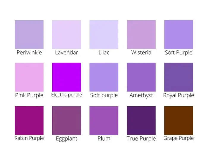
Purple is a versatile color that encompasses a range of shades, each with its own unique charm and character.
Here are some different shades of purple:
1. Purple
Shade Name: Purple
HEX #: #800080
RGB Code: 128, 0, 128
CMYK Code: 0, 100, 0, 50
Purple is a rich and vibrant shade that represents a balance between the coolness of blue and the warmth of red. It is a color associated with creativity, royalty, and luxury.
In the RGB color space, #800080 consists of 50.2% red, 0% green, and 50.2% blue. In the CMYK color space, it consists of 0% cyan, 100% magenta, 0% yellow, and 50% black.
Purple evokes a sense of mystery and elegance. It can be both calming and stimulating, depending on its intensity.
Purple is a versatile color that can be used to create a sense of depth and sophistication in various design contexts, from fashion and art to branding and interiors.
2. Indigo
Shade Name: Indigo
HEX #: #4b0082
RGB Code: 75, 0, 130
CMYK Code: 42, 100, 0, 49
Indigo is a deep and intense shade that blends the richness of blue with a touch of red. It is associated with spirituality, intuition, and inner wisdom.
Regarding what colors make up indigo, in the RGB color space, #4b0082 consists of 29.4% red, 0% green, and 51% blue. In the CMYK color space, it consists of 42% cyan, 100% magenta, 0% yellow, and 49% black.
Indigo is a captivating and mysterious color that carries a sense of depth and intrigue.
It is often used to create a dramatic and sophisticated atmosphere in various design applications, including fashion, graphic design, and interiors.
3. Byzantium
Shade Name: Byzantium
HEX #: #702963
RGB Code: 112, 41, 99
CMYK Code: 0, 63, 12, 56
Byzantium is a deep and rich shade of purple that exhibits both warmth and coolness. It carries an air of mystery and elegance.
In the RGB color space, #702963 consists of 43.9% red, 16.1% green, and 38.8% blue. In the CMYK color space, it consists of 0% cyan, 63% magenta, 12% yellow, and 56% black.
Byzantium is a captivating and enchanting color that can add a touch of luxury and sophistication to various design projects.
It is often used in interior design, fashion, and branding to create a sense of opulence and allure.
4. Mauve
Shade Name: Mauve
HEX #: #e0b0ff
RGB Code: 224, 176, 255
CMYK Code: 12, 31, 0, 0
Mauve is a delicate and subtle shade of purple with a touch of gray. It is a soft and muted color that falls between lavender and lilac. (See the battle of lavender vs lilac colors).
In the RGB color space, #e0b0ff consists of 87.8% red, 69.0% green, and 100% blue. In the CMYK color space, it consists of 12% cyan, 31% magenta, 0% yellow, and 0% black.
Mauve exudes a sense of elegance and femininity. It carries a calm and gentle energy, often associated with romance and nostalgia.
Mauve is a versatile shade that can be used to create a sophisticated and understated atmosphere in various design applications.
5. Mulberry
Shade Name: Mulberry
HEX #: #c54b8c
RGB Code: 197, 75, 140
CMYK Code: 0, 62, 29, 23
Mulberry is a rich and deep shade of purple with hints of reddish-brown. It exudes a sense of sophistication and elegance.
In the RGB color space, #c54b8c consists of 77.3% red, 29.4% green, and 54.9% blue. In the CMYK color space, it consists of 0% cyan, 62% magenta, 29% yellow, and 23% black.
Mulberry is a captivating color that adds depth and warmth to any design. It is often used in fashion, interiors, and graphic design to create a bold and luxurious statement.
6. Orchid
Shade Name: Orchid
HEX #: #da70d6
RGB Code: 218, 112, 214
CMYK Code: 0, 49, 2, 15
Orchid is a captivating and vibrant shade of purple with undertones of pink. It represents grace, beauty, and elegance.
In the RGB color space, #da70d6 consists of 85.5% red, 43.9% green, and 83.9% blue. In the CMYK color space, it consists of 0% cyan, 49% magenta, 2% yellow, and 15% black.
Orchid is an eye-catching color that can add a touch of allure and sophistication to any design. It is often used in floral arrangements, cosmetics, and fashion to create a sense of beauty and refinement.
7. Lavender
Shade Name: Lavender
HEX #: #e6e6fa
RGB Code: 230, 230, 250
CMYK Code: 8, 8, 0, 2
Lavender is a gentle and soothing shade of purple with a touch of pale blue. It evokes a sense of tranquility, relaxation, and serenity.
In the RGB color space, #e6e6fa consists of 90.2% red, 90.2% green, and 98% pure blue. In the CMYK color space, it consists of 8% cyan, 8% magenta, 0% yellow, and 2% black.
Lavender brings a sense of calmness and purity. It is often associated with aromatherapy, spa treatments, and a peaceful environment.
By learning how to make lavender paint, you can see this color in design to create a soothing and harmonious atmosphere, especially in bedrooms and relaxation spaces.
8. Violet
Shade Name: Violet
HEX #: #ee82ee
RGB Code: 238, 130, 238
CMYK Code: 19, 74, 0, 11
Violet is a vibrant and saturated shade of purple with strong pinkish undertones. It represents creativity, spirituality, and individuality.
In the RGB color space, #ee82ee consists of 93.3% red, 51% green, and 93.3% blue. In the CMYK color space, it consists of 19% cyan, 74% magenta, 0% yellow, and 11% black.
With this knowledge of how to make violet with acrylic paints, where can you use it? Violet is a striking color that can evoke a sense of imagination and inspiration. It is often associated with artistic endeavors, mystical experiences, and unconventional thinking.
Violet can be used to add a bold and expressive touch to designs, making a statement that is both vibrant and unique.
9. Amethyst
Shade Name: Amethyst
HEX #: #9966cc
RGB Code: 153, 102, 204
CMYK Code: 29, 47, 0, 20
Amethyst is a deep and enchanting shade of purple with undertones of blue. It is associated with spirituality, wisdom, and inner peace.
In the RGB color space, #9966cc consists of 60% red, 40% green, and 80% blue. In the CMYK color space, it consists of 29% cyan, 47% magenta, 0% yellow, and 20% black.
Amethyst carries a sense of mystery and elegance. It is often used in jewelry and gemstones to symbolize spirituality and enhance the connection to higher realms.
Amethyst can bring a sense of calm and clarity to design, making it a popular choice for interior spaces focused on relaxation and mindfulness.
10. Lilac
Shade Name: Lilac
HEX #: #c8a2c8
RGB Code: 200, 162, 200
CMYK Code: 23, 36, 0, 20
Lilac is a soft and delicate shade of purple with a hint of gray. It embodies sweetness, gentleness, and femininity.
In the RGB color space, #c8a2c8 consists of 78.4% red, 63.5% green, and 78.4% blue. In the CMYK color space, it consists of 23% cyan, 36% magenta, 0% yellow, and 20% black.
Lilac brings a sense of tranquility and harmony. It is often associated with springtime and floral aesthetics.
Lilac can be used in design to create a romantic and dreamy atmosphere, evoking feelings of nostalgia and serenity.
Table: Shades of Purple
| Shade Name | HEX # | RGB Code | CMYK Code | Color |
| Purple | #800080 | 128, 0, 128 | 0, 100, 0, 50 | Purple |
| Indigo | #4b0082 | 75, 0, 130 | 42, 100, 0, 49 | Indigo |
| Byzantium | #702963 | 112, 41, 99 | 0, 63, 12, 56 | Byzantium |
| Mauve | #e0b0ff | 224, 176, 255 | 12, 31, 0, 0 | Mauve |
| Mulberry | #c54b8c | 197, 75, 140 | 0, 62, 29, 23 | Mulberry |
| Orchid | #da70d6 | 218, 112, 214 | 0, 49, 2, 15 | Orchid |
| Lavender | #e6e6fa | 230, 230, 250 | 8, 8, 0, 2 | Lavender |
| Violet | #ee82ee | 238, 130, 238 | 19, 74, 0, 11 | Violet |
| Amethyst | #9966cc | 153, 102, 204 | 29, 47, 0, 20 | Amethyst |
| Lilac | #c8a2c8 | 200, 162, 200 | 23, 36, 0, 20 | Lilac |
The table showcases various shades of purple along with their corresponding hexadecimal (HEX) codes, RGB codes, CMYK codes, and color names.
How to Mix Red and Blue to Make Purple
To mix red and blue and create the color purple, follow these steps:
Step 1: Prepare your materials
- Gather red and blue paint or color pigments.
- Set up a palette or mixing surface.
- Ensure you have the necessary tools for mixing paint colors, such as brushes or mixing tools.
Preparing your materials is essential for a smooth color mixing process. Having the right supplies, including red and blue paint or pigments, a palette, and appropriate tools, will set you up for success.
Take a moment to gather everything you need before proceeding to the next steps.
Step 2: Start with equal amounts of red and blue
Measure or visually estimate equal amounts of red and blue paint or pigments. Place the measured or estimated amounts side by side on your palette or mixing surface.
Starting with equal amounts of red and blue is crucial for achieving a balanced mixture. This ensures that both colors have an equal influence on the final result.
By using the same quantity of each color, you lay the foundation for an accurate color blend in the subsequent steps.
Step 3: Mix the colors
Using a brush or mixing tool, mix blue and red together. Ensure that both colors are thoroughly combined to create a uniform mixture.
Stir the colors in a circular or back-and-forth motion, making sure there are no visible streaks or patches of red or blue.
The goal of this step is to achieve a homogeneous blend, where the red and blue are well incorporated.
Take your time to ensure a smooth and consistent mixture before proceeding to the next steps.
Step 4: Gradual blending
Begin by gently stirring the colors together to initiate the blending process. Use a brush or mixing tool to carefully mix the red and blue pigments.
Make sure to blend the colors gradually and avoid vigorous stirring to prevent splattering or creating air bubbles.
The purpose of gradual blending is to create a smooth transition between the red and blue colors.
By slowly incorporating the pigments, you allow them to merge gradually, ensuring a more seamless and even color mixture. Take your time and be patient during this step to achieve the desired results.
Step 5: Observe the initial result
Take a moment to carefully observe the color you have obtained from the initial blend of red and blue. Look closely at the shade of purple that has been created.
Consider its hue, saturation, and overall appearance. By observing the initial result, you can assess whether the color matches your desired shade of purple.
Pay attention to any variations in intensity or undertones that may be present. This step serves as a visual checkpoint to evaluate the progress of your color mixing process and determine if any adjustments need to be made.
Step 6: Adjust proportions if necessary
Based on your observation of the initial result, determine if any adjustments to the proportions of red and blue are needed.
If the shade of purple is not matching your desired outcome, you can fine-tune it by adding more red or blue pigment.
To darken the purple, add a small amount of blue. For bright purple, incorporate a touch of alizarin crimson. Gradually introduce the additional pigment and mix it thoroughly into the existing mixture.
Continuously assess the color as you make adjustments until you achieve the desired shade of purple.
Remember, making slight proportional changes allows you to have more control over the final result. Take your time and make adjustments gradually to achieve the perfect balance and hue.
Step 7: Continue mixing
After making any necessary adjustments to the proportions of red and blue, it’s time to continue mixing the colors.
Use your brush or mixing tool to blend the pigments together once again, ensuring that any added pigment is thoroughly incorporated.
Continue mixing in a circular or back-and-forth motion until the colors are well combined and there are no visible streaks or patches. The goal is to achieve a consistent and uniform shade of purple throughout the mixture.
Take your time during this step to ensure thorough mixing, as it contributes to the overall quality and appearance of the final purple color you’re striving to create.
Step 8: Assess color intensity
At this stage, it’s important to assess the intensity of the mixed color. Evaluate the saturation and vibrancy of the purple shade you have achieved by visually comparing it to your desired outcome.
Consider whether the color appears too bold or too muted. If you find the color too intense, you can adjust the intensity by adding small amounts of white or a lighter shade of purple to tone it down.
Conversely, if the color appears too dull, you may introduce a touch of a more vibrant red or blue to enhance the intensity.
Make gradual adjustments, mixing thoroughly after each addition, until you achieve the desired level of color intensity.
Pay attention to your personal preferences and the purpose of the mixed color in your specific project or application.
Step 9: Fine-tune the shade
During this step, you will fine-tune the shade of purple to achieve the precise color you desire. Small incremental changes can make a significant difference in the final result.
To darken the shade, add a minute amount of black or a deeper hue of purple. For a lighter tone, incorporate a touch of white or a lighter purple.
Mix the added pigment thoroughly into the existing mixture, ensuring it is well blended. Continuously assess the color as you make adjustments, comparing it to your desired shade of purple.
Take your time and make subtle modifications until you achieve the exact hue you envision.
Remember, achieving the perfect shade of purple may require multiple iterations of fine-tuning. Patience and attention to detail will help you achieve the desired result.
Step 10: Test and evaluate
In the final step, it’s essential to test and evaluate the mixed purple color. Apply a small sample of the color onto the intended surface or material to see how it appears in the desired context.
This will give you a better understanding of how the color looks under different lighting conditions and alongside other elements.
Observe the color in different lighting conditions and angles to ensure it meets your expectations. If necessary, make additional adjustments based on your evaluation.
Repeat the process of mixing and testing until you achieve the desired shade of purple that harmonizes with your project or purpose.
Understanding Color Perception
Color perception refers to the way in which our eyes and brain interpret and process different wavelengths of light to create the visual experience of color.
It is a complex process influenced by biological, physiological, and psychological factors.
Role of human vision in perceiving colors
Our visual system plays a crucial role in color perception. It consists of the eyes, which detect and gather light, and the brain, which processes the signals received from the eyes.
Together, they enable us to perceive and differentiate various colors in our environment.
Explanation of color perception and the human eye
The human eye contains specialized cells called cones, which are responsible for color vision.
These cones are sensitive to specific wavelengths of light and are most responsive to red, green, and blue light. The combined activation of these cones allows us to perceive a wide range of colors.
Color perception and the brain
Once the cones in our eyes detect light, the information is transmitted to the brain for processing. The brain analyzes the signals from different cones and interprets them as specific colors.
It also takes into account factors such as lighting conditions, background colors, and individual differences in color perception.
Factors influencing color perception
Color perception can be influenced by various factors, including cultural and societal influences, personal experiences, and individual variations in color vision.
Different people may perceive colors differently due to variations in the number and sensitivity of cones in their eyes.
Color perception and optical illusions
Optical illusions can demonstrate how color perception can be influenced by surrounding context and contrast.
Illusions like the famous “color constancy” phenomenon show that the perceived color of an object can be affected by the colors surrounding it.
Why Does Mixing Red and Blue Not Always Make Purple?
While it is commonly understood that mixing red and blue produces purple, there are instances where this may not always hold true.
The reason for this inconsistency lies in the variations of color systems, pigments, and lighting conditions.
Here are a few reasons why mixing red and blue may not always result in a clear and distinct purple:
Color Systems
Different color systems, such as additive and subtractive mixing, may yield different results. In the additive color system, red and blue light combine to create purple.
However, in the subtractive color system, the specific shades of red and blue used can affect the outcome.
Pigment Variations
The specific shades of red and blue used for mixing can impact the resulting color. Different pigments have varying levels of transparency, saturation, and undertones.
Depending on the pigments used, the mixture may result in a range of colors such as purple and violet.
Color Mixing Principles
Color mixing is influenced by the principles of color theory. Altering the proportions or intensity of red and blue can lead to different color outcomes.
Red and purple mixed together can yield varying shades. More red creates reddish-purple or magenta, while increased blue shifts the result towards bluish-purple. The final hue depends on the proportions of each color in the mixture.
Lighting Conditions
The lighting under which colors are observed can affect our perception. Colors appear differently under various lighting sources, such as natural daylightor incandescent light.
The presence of other surrounding colors and ambient lighting can also influence how we perceive the mixture of red and blue.
Individual Perception
Color perception is subjective and can vary from person to person. Factors such as personal color preferences, and cultural influences differences can impact how someone perceives the mixed colors.
Sky Blue + Red = What Color
When sky blue, which is a light shade of cerulean blue, is mixed with red, the resulting color is a reddish-purple.
The presence of the red pigment adds a warm, reddish undertone to the blue, resulting in a purple hue that leans towards the reddish side.
The specific shade of reddish-purple will depend on the intensity of the red and the exact hue of the sky blue used in the mixture.
The proportion of red to sky blue will also affect the final color outcome. Experimenting with different ratios of the two colors will allow you to achieve the desired reddish-purple shade.
Related post: Which two colors make sky blue?
Dark Blue + Red = What Color
When dark blue and red pigments are mixed together, the resulting color will typically be a shade of purple or a dark violet.
The exact shade will depend on the specific hues and intensities of the dark blue and red being combined.
The mixture may lean more toward a deep purple if a blackish red color is used or a shade closer to a burgundy.
Conversely, if the red used is brighter or leans towards a lighter crimson tone, the resulting color may be a rich dark violet.
What Color Does Red and Teal Make?
What does red and teal make? When red and teal are mixed together, they create a unique and intriguing color.
The specific result will depend on the proportions of each color used. Generally, the combination of red and teal produces a rich and deep shade of brown.
The vibrant red undertones blend with the coolness of most color chart shades of teal, resulting in a warm and earthy hue.
Experimenting with different ratios can yield a range of beautiful and unexpected color variations.
What Color Does Blue and Yellow Make?
When blue and yellow are mixed together, they create the color green. Mixing blue and yellow pigments or light wavelengths results in the subtractive color mixing process.
Blue pigment absorbs the longer wavelengths of light, which are associated with red and green, while yellow pigment reflects those wavelengths.
As a result, the combination of blue and yellow subtracts the red light and leaves behind the green light, leading to the perception of green blue.
The specific shade of green obtained may vary based on the intensity and proportions of the blue and yellow used in the mixture.
FAQs
Why does blue and red make purple?
Red and blue paints make purple when mixed due to the way our eyes perceive and interpret different wavelengths of light. The combination of red and blue pigments or light results in the absorption and reflection of specific light wavelengths that our brain interprets as the color purple.
Does mixing red and blue make brown?
Mixing blue and red paints does not typically create brown. You will get brown if you mix orange and blue or combine multiple primary colors, such as red, yellow, and blue, in specific proportions. The resulting mixture of red and blue usually produces shades of purple instead.
Does mixing red and blue make black?
No, mixing red and blue in equal amounts does not create black. Black is the absence of color and is typically achieved by using black pigments or dyes. When red and blue are mixed together, they usually result in shades of purple or dark violet, but not true black.
What three colors make black?
In the subtractive color mixing model used in painting and printing, black color is achieved by combining three primary colors. But what colors do you mix to make black paint? They are cyan, magenta, and yellow, which, when mixed together in equal proportions, absorb all visible light and produce a perceived black color.
Does mixing blue and brown make red?
No, mixing blue and brown does not produce red. When you mix brown and blue together, you’ll typically get a darker shade of brown or a muted, earthy tone. Red combines primary colors, such as red and yellow, or through other color mixing techniques.
Conclusion
When red and blue are mixed together, they create the color purple. The specific shade of purple obtained depends on the intensity and proportions of the red and blue used.
Mixing red and blue pigments or light in various color models can result in different hues, but purple remains the common perception.
Understanding the principles of color mixing, as well as the characteristics and interactions of red and blue, allows us to explore the fascinating world of colors and create captivating visual experiences.


Leave a Reply