Have you ever found yourself captivated by the delicate beauty of lavender fields? Or mesmerized by the soft hues dancing in the gentle breeze?
Lavender, with its enchanting charm and soothing aura, has a way of captivating our senses. Now imagine harnessing this captivating color and infusing it into your creations or home decor.
Fortunately, you’re in luck. In this guide, I’ll teach you how to make lavender color. This skill will allow you to bring a touch of serenity into your life.
So, let’s embark on this journey and unlock the art of making lavender color.
How to Make Lavender Color
To make the lavender color, start with a base of blue paint, preferably a soft or pastel shade. Add small amounts of red paint to the blue, blending them together. Mix the warm purple color with a white color to achieve your desired shade of lavender.
Color Theory
Color theory is a set of principles and guidelines that explore the ways in which colors interact, combine, and affect each other.
It’s a fundamental aspect of art, design, and aesthetics providing a framework for understanding and using colors.
At its core, color theory examines the three primary colors (red, blue, and yellow). It also explains their relationships with secondary colors (orange, green, and violet).
There are also tertiary colors that are formed by combining a primary color with a neighboring secondary color.
The color theory also delves into concepts such as saturation, hue, and value.
Hue refers to a specific color, such as red, blue, or yellow, while saturation describes the intensity or purity of a color.
Value is the lightness or darkness of a color, often represented on a grayscale from black to white.
The color theory explores various color harmonies and relationships. These include analogous colors, complementary colors, and triadic colors.
Complementary colors are opposite each other on the color wheel and create a vibrant contrast when used together.
Analogous colors sit next to each other on the color wheel and produce a harmonious and cohesive effect.
Triadic colors are spaced on the color wheel and offer a balanced and dynamic combination.
Understanding the color theory helps us make better decisions in color selection.

All About the Lavender Color
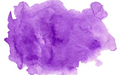
The lavender color was named after the fragrant lavender flower. It is a captivating hue that embodies a delicate balance of calmness, elegance, and serenity.
It lies on the spectrum between violet and purple. It has a pale, light shade with a slight blue undertone. (Here’s how to get violet color by mixing different shades).
Lavender has qualities such as grace, femininity, refinement, and tranquility. It evokes a sense of relaxation and harmony, making it a popular choice in design and fashion.
In interior design, graphic design, or fashion, lavender promotes feelings of peace and mindfulness.
Complementary colors that harmonize well with lavender include mint green, pale yellow, soft pink, and light gray.
Understanding the characteristics and symbolism of lavender will help you harness its serenity and elegance in various creative endeavors.
Lavender Color Codes
The lavender color code percentage represents the dominance of lavender in the overall color composition. 0% indicates no lavender influence and 100% indicates pure lavender.
The RGB codes represent the red, green, and blue values that make up each color. HEX codes are alphanumeric codes used to represent colors in web design and graphics software.
Here’s a table showcasing the shades of lavender along with their HEX codes, RGB color codes, and lavender color code percentage:
| HEX code | RGB color code | Lavender color code (%) | |
| Lilac | #C8A2C8 | 200, 162, 200 | 40 |
| Floral lavender | #B57EDC | 181, 126, 220 | 80 |
| Web lavender | #CDA4DE | 205, 164, 222 | 70 |
| Lavender blush | #FBAED2 | 251, 174, 210 | 50 |
| Light lavender | #E6E6FA | 230, 230, 250 | 90 |
| Languid lavender | #9370DB | 147, 112, 219 | 60 |
| English lavender | #B48395 | 180, 131, 149 | 60 |
| Soft lavender | #F6E5F6 | 246, 229, 246 | 70 |
| Pink lavender | #DBB2D1 | 219, 178, 209 | 50 |
| Pastel lavender | #D3BDE6 | 211, 189, 230 | 75 |
| Dusty lavender | #AFA8BA | 175, 168, 186 | 55 |
| Mauve | #E0B0FF | 224, 176, 255 | 85 |
| Periwinkle | #CCCCFF | 204, 204, 255 | 80 |
| Dark lavender | #734F8F | 115, 79, 143 | 65 |
| Royal lavender | #7851A9 | 120, 81, 169 | 70 |
| Silver lavender | #C0C0C0 | 192, 192, 192 | 50 |
What Colors Make Lavender
The colors that make lavender are blue, red, and white. Use a soft or cool blue as your base color.
Add small amounts of cool red, blending it with the blue to shift toward the purple spectrum. Add white to achieve the desired lavender hue.
The key is to mix the colors until they blend well, ensuring an even distribution of blue and red. Take the time to observe the resulting color and make adjustments if needed.
Add more red if it appears too blue, or include a touch of warm blue if it leans too pink or purple. The best red to use to create lavender is alizarin crimson, quinacridone magenta, or primary red.
White lightens and softens other colors, so incorporating it into the color purple mixture will dilute the intensity of the blue and red tones.
Lavender Color: A Brief History
The history of the lavender color is closely tied to the lavender plant and its significance. The color got its name from the plant’s purple flowers and pleasant scent.
In the past, lavender was linked to nobility and was often worn by kings and queens. During the Victorian era, it became popular in fashion and home decor, reflecting a romantic and delicate style.
Lavender also holds spiritual and healing symbolism. In modern times, it has gained recognition as a symbol of LGBTQ+ pride.
Today, many people use lavender in design and fashion to create a sense of calmness, elegance, and femininity. Its timeless appeal and diverse meanings make it a beloved color choice for many.
The lavender color will always captivate and inspire.

Lavender Symbolism
Lavender holds symbolic meaning across various cultures and contexts. Here are some common symbolisms associated with the color lavender:
Tranquility and calmness
Lavender is a symbol of serenity, peace, and relaxation. It represents a soothing and calming presence, evoking a sense of tranquility and emotional balance.
Spirituality and healing
Its gentle color is linked to meditation, mindfulness, and the quest for inner harmony. Lavender is believed to promote mental clarity, emotional well-being, and spiritual growth.
Grace and elegance
Lavender’s soft and delicate hue represents gentle beauty, sophistication, and timeless charm.
Lavender is frequently used in fashion, interior design, and events to evoke a sense of grace and style.
Femininity and romance
Lavender is a color with feminine qualities. It oozes femininity, gracefulness, and romanticism.
This is why many people love it at weddings, bridal showers, and other romantic occasions to convey a sense of love and tenderness.
Creativity and imagination
I link lavender to the realm of creativity, artistic expression, and imagination. Its ethereal and dreamy quality can inspire creative thinking, intuition, and a sense of wonder.
Most artists, writers, and designers choose lavender for this reason.
How To Make Lavender Color?
Step 1: Gather the necessary materials
To make the lavender color, you will need the following materials:
- Blue paint or pigment
- Red paint or pigment
- Mixing palette or surface
- Palette knife or brush
- Mixing container or palette paper
- Water
Also, remember to protect your working surface with a protective sheet or a piece of old cloth to prevent stains.
Step 2: Start with blue paint
Blue is the base color for creating lavender because it’s a cool color and forms the foundation for achieving different shades of dark purple.
When combined with the right amount of red, blue transforms into a beautiful lavender color.
To select the right shade of blue, opt for a soft blue hue like cobalt blue. These lighter shades work well as a base because they have less intensity and allow the red to blend in well.
Avoid using deep or dark blues, as they may overpower the mixture and produce a different color outcome.
Consider experimenting with different shades of blue to find the one that best suits your desired lavender shade. A good starting point is to choose a blue that leans towards the purple side of the color spectrum.
This will ensure that when you add red, it transitions into the lavender color you are aiming for.
Step 3: Add red paint gradually
Now begin adding the red paint gradually to the blue base color. Red brings warmth and depth to the blue, transforming it into a lavender-purple hue.
Add small amounts of red paint at a time. This allows for better control over the color mixture.
Start with a small dab or drop of red paint, then mix it into the blue.
As you mix, observe the changes in color. The blue will begin to shift towards purple, and the lavender tones will emerge.
Take note of the color intensity and adjust the amount of red paint accordingly.
If you want a lighter lavender shade, add less red. For a deeper lavender, gradually increase the amount of red paint.
Step 4: Mix thoroughly
Mix the paint colors to achieve an even blend and obtain a consistent lavender color. Mixing red and blue well will result in well-combined pigments.
One effective technique is to use small circular motions when blending the colors together. Another helpful technique is to scrape and fold the mixture.
If you’re using a palette knife, scrape the mixture from one side of the palette to the other, then fold it back onto itself.
This action helps incorporate all the pigments and creates a more consistent blend.
Layering the paints is another technique you can use. This method promotes better integration of the pigments, resulting in a more cohesive lavender color.
Take your time during the mixing process in any areas where the colors might not be fully incorporated.
Mix until you achieve a uniform purple paint without any visible streaks or patches of blue or red.
Step 5: Add white paint
To form a lavender color, mix purple with white. Adding white paint allows you to create different tints and variations of lavender.
Mix well after each addition to ensure a uniform blend. The white paint will lighten the color, creating a softer and more delicate lavender shade.
Keep in mind that the amount of white paint you add will determine the level of lightness in the final color. If you prefer a pale lavender shade, add more white paint.
For a deeper and richer lavender, use less white paint or omit it altogether.
Step 6: Observe and adjust as necessary
Once you have mixed the blue, red, and white paints to create your lavender color, observe the resulting shade and make any necessary adjustments.
Evaluating the color allows you to fine-tune it to meet your preferences and the desired outcome.
Remember, making adjustments to the lavender color is a gradual process. Add small amounts of paint or dilute the mixture to avoid drastic changes.
Take your time, mix well, and reassess the color after each adjustment.

Tips and Tricks for Mixing Colors
Mixing colors can be a fun and creative process. Here are some tips and tricks to help you achieve desired color combinations:
- Use a fresh and clean mixing surface to avoid any residual color influencing your mixtures.
- Start with a few primary colors, such as red, blue, and yellow, along with white, black, and maybe a few secondary colors.
- Start with small quantities of each color to have better control over the intensity and shade of the resulting color.
- Add colors in small increments and mix between each addition.
- Adjust the ratio of colors to create different hues and shades. For example, adding more ultramarine blue to a mixture will result in a cooler tone, while adding more red will create warmer tones.
- Keep a record of the colors and ratios used in your mixtures. This way, you can reproduce specific colors later or make adjustments if needed.
- Use color charts or swatches as a reference to understand how different colors interact and mix.
- Embrace experimentation and allow yourself to discover unique color blends.
How to Make Dark or Light Purple
Here are the methods for achieving dark or light purple:
Making dark purple
Start with a deep shade of purple as your base color. You can use pre-mixed dark purple paint or create it by blending blue and red in higher proportions.
Incorporate a small amount of black paint into the base color. Black will deepen the purple tone, creating a darker shade.
Add it slowly and mix thoroughly until you achieve the desired darkness.
Making light purple
Begin with a light shade of purple or lavender as your base color. You can use pre-mixed light purple paint or create it by combining blue and red with more white added to lighten the mixture.
Add white paint to the base color gradually. White will dilute the intensity and brightness of the purple, resulting in a lighter shade.
Mix well after each addition and assess the color to determine if you need more white. Adjust the amount of white paint until you achieve the desired lightness.
Lavender Color Combination: What Colors Go with Lavender in Design?
Lavender pairs with various other shades. Here are a few color combinations that work well with lavender in design:
Yellow and lavender
The cheerful and sunny nature of yellow complements the softness of lavender. This combination brings a sense of energy and positivity to designs, making them ideal for cheerful projects.
Mint and lavender
Mint green and lavender create a fresh and calming color palette. The coolness of mint harmonizes with the tranquility of lavender, producing a serene and soothing effect.
I associate this combination with nature and a peaceful and rejuvenating atmosphere in designs.
Pink and lavender
Pink and lavender form a gentle and feminine color duo. The softness of pink complements the delicate tones of lavender, resulting in a romantic and elegant combination.
What Two Colors Make Lavender
The two colors that make lavender are blue and red. By combining these two colors in the right proportions, you achieve a shade of lavender.
Blue is the base color, while red adds warmth and depth to create the desired lavender hue. Observe and adjust the proportions as needed to achieve the perfect balance.
To get a good lavender shade, I prefer using phthalo blue, cobalt blue, or cerulean blue.
Lavender vs Lilac
The difference between lavender and lilac lies in their specific shades within the purple color family.
Lavender is a pale, light purple color with a slight bluish tinge, often associated with calmness and relaxation.
On the other hand, lilac is a slightly deeper and more vibrant shade of purple with a pinkish undertone.
While they share similarities in pastel and soft, lavender tends to be more grayish-blue, while lilac leans towards pinkish hues.
Their subtle distinctions make them distinct yet complementary choices for various design and decor applications, each bringing elegance and charm.
How is a Color Warm or Cool?
Colors are categorized as warm or cool based on their temperature or psychological associations. This concept is derived from the natural associations we make with our environment.
Warm colors, such as red, orange, and yellow, are associated with warmth, heat, and energy. These colors evoke feelings of passion, vitality, and intensity.
Warm colors are visually stimulating and can create a sense of excitement and liveliness in an artwork or design.
Cool colors, including blue, green, and purple, represent coolness, calmness, and tranquility. These colors are reminiscent of natural elements like water and foliage.
Cool colors often evoke a sense of serenity, relaxation, and introspection. They can create a soothing and peaceful ambiance in an artwork or design.
The perception of warm and cool colors is subjective and influenced by personal experiences and cultural backgrounds. Also, the context and combination of colors can also affect their perceived warmth or coolness.
For example, a cool blue color may appear warmer when matched with cooler shades of green or purple.
FAQs
How to make lavender color acrylic paint
To make lavender color with acrylic paint, mix blue paint as the base and red paint until you achieve the desired lavender shade. Mix thoroughly to ensure an even blend.
What two colors make light lavender?
To make light lavender, you can mix white and a small amount of purple. Start with a base of white paint and add purple or blue, mixing it until you reach the desired light lavender shade. Adjust the proportions of white and purple to achieve the perfect balance of lightness in your lavender color.
What colors make bright lavender?
Purple and white paint make bright lavender. Start with a base of purple paint and incorporate an equal amount of white paint into the mixture. Mix until you achieve the color you want.
What colors make lavender with food coloring?
Blue and red food coloring make lavender. Add a few drops of blue food coloring to a mixing bowl or container, then add a small amount of red food coloring, drop by drop. Keep adding the red food coloring until you achieve the desired lavender shade.
How do you make lilac color?
To make a lilac color, mix equal parts of purple and white. Start with a base of purple paint or dye and add an equal amount of white paint or dye into the mixture. Mix until the colors are well blended. Adjust the proportions as needed to achieve the specific hue of lilac you desire.
What color do blue and orange make?
Blue and orange make the color brown when mixed. The combination of blue, a primary color, and orange, a secondary color made by results in a mixture of all three primary colors (red, blue, and yellow), produces brown. The specific shade of brown will vary depending on the intensity and proportions of the blue and orange you have used in the mixture.
What color do blue and brown make?
Blue and brown mixed together make a dark and muted color. The resulting color can vary depending on the specific shades of blue and brown used. The mixture of blue and brown produces a color that leans towards a deep, earthy tone, often resembling a dark shade of green or gray.
What colors do blue and green make?
Blue and green make a color known as teal. The specific shade of teal can vary depending on the proportions of blue and green you use in the mixture.
What colors do yellow and blue make?
Yellow and blue make the color green. Yellow is a primary color, and blue is also a primary color. Mixing these two primary colors results in the secondary color green.
Conclusion
The journey to creating the captivating lavender color is a delightful exploration of color blending. Remember to mix well, observe, and make small adjustments if necessary to achieve the perfect shade.
Lavender opens the doors to a realm of creativity, allowing you to infuse your art, design, or crafts with its soothing presence.
Making the lavender color is rewarding whether you’re seeking to add a calming touch to a painting or creating a lavender-themed party decor.
So, let your creativity bloom, and immerse yourself in the captivating world of lavender. May your artistic endeavors be filled with the gentle allure and tranquility of this magnificent hue.


Leave a Reply