
Color matters. It influences mood, evokes emotions, and drives actions. Right color combinations can change the game, from personal attire to brand identity.
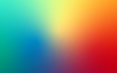
Let’s focus on an intriguing duo – blue and orange. The cool tranquility of blue marries the fiery vibrancy of orange, creating a visual delight. A stark contrast yet a complementary spectacle.
Through this exploration, we journey into various applications, from art to design, celebrating the stunning interplay of blue and orange.
Let’s learn about contrast transforming into harmony and making the unexpected appealing.
Do Blue And Orange Go Together?
Blue and orange go together. They create a dynamic duo, sitting directly opposite each other on the color wheel. The complementary relationship becomes vivid in saturated hues like red-orange and indigo blue. This unique pairing delivers aesthetic balance.
Understanding Blue Color

Blue, a primary color, captivates with its range from soft sky blue to deep sea hues. The energy of blue light is paradoxical.
In its pure form, it’s high-energy light in the visible spectrum, yet it imparts a sense of calm and tranquility.
Psychologically, blue signifies trust, loyalty, and wisdom. It can also stimulate clear thought and reduce stress. Its emotional impact is soothing, fostering a sense of peace.
Blue’s natural associations evoke a sense of vastness and serenity. Understanding its complexities enriches our perception and use.
Understanding Orange Color

Orange, a blend of red’s energy and yellow’s cheerfulness emanates warmth and vitality.
Its light carries a natural warmth, reminding us of glowing sunsets or autumn leaves.
The color orange stimulates activity, appetite, and socialization. Psychologically, it represents enthusiasm, happiness, and creativity.
It encourages risk-taking and symbolizes health and vitality. Thus it instils in us a sense of optimism.
Orange’s emotional impact is potent. Orange can uplift, rejuvenate, and stimulate emotional energy.
In nature, we see orange in the golden hues of a setting sun evoking feelings of joy, warmth, and a vibrant zest for life.
Do orange and blue go together in different settings?
Orange and blue are complementary colors on the color wheel, which means they are opposites and can create a strong visual contrast when used together.
This can result in a harmonious and balanced look when used properly.
Here’s a table that breaks down how and when they might be used together:
| Context | How Orange and Blue Can Be Used Together |
|---|---|
| Fashion | A blue dress with orange accessories or an orange tie on a blue shirt can create a bold yet balanced look. |
| Interior Design | Blue walls with orange accent pillows or vases. A bedroom with blue bedding and orange wall art. |
| Graphic Design | Orange call-to-action buttons on a blue background. Blue text on an orange banner for emphasis. |
| Art | Using orange and blue together can create visual interest and contrast in a painting or sculpture. |
| Web Design | A blue header with an orange logo. Orange icons on a blue navigation bar. |
| Photography | Capturing natural scenes where blue and orange appear together, such as a sunset over the ocean. |
| Film & Television | Orange and blue lighting can set a specific mood or highlight important elements in a scene. |
In all these cases, the key is to find the right balance and not to let one color overpower the other unless that’s the intended effect.
Exploring blue and orange match
Pairing blue with orange might seem a bold choice, but it’s captivating. They sit as opposites on the color wheel, signifying their complementary status.
The calmness exuded by blue finds balance in the vibrant energy of orange. It’s a dynamic mix, embodying both tranquility and vibrancy.
Art and design use this color combination to stunning effect. These two hues together show how contrasts can create harmonious unity.
When you mix blue and orange, it sparks a delightful interplay. It’s a study of contrasts, proving that opposites attract and create remarkable harmony.
The duo of blue and orange is a visual feast. Blue has a calming influence, and orange offers a warm, energetic burst. They create a striking contrast.
This vibrant divergence commands attention, establishing a balanced, appealing, and arresting interplay.
Blue and orange can add depth and dynamism to any design as accent colours.
The combination is flexible and versatile. It works well in bold, saturated shades or softer, muted tones.
All in all, blue and orange represent an exciting contrast, a harmonious balance, and a visual delight.
What color goes with blue and orange
Neutrals colors, especially gray or beige, brings out their inherent vibrancy.
Expert designers often incorporate bright whites, creamy corals, and light wood tones to masterfully harmonize with the blue-orange spectrum, achieving a refined, cohesive palette for any design venture.
Other combinations include;
Orange, electric blue, and pink
Imagine a palette of sunset colors mixing with the night sky. Orange, electric blue and bright pink create this striking contrast.
The bold orange and electric blue offer a dynamic interplay. Bright pink acts as an accent color, adding an extra layer of depth. This combination works well in eclectic interior designs.
Orange, peacock blue, and yellow
Blend the vibrancy of a tropical bird with a warm sunrise. That’s the essence of orange, peacock blue, and yellow.
The darker shades of peacock blue balance the brightness of orange and yellow. This combination evokes energy, perfect for a bright living room.
Terra cotta, navy, and brown
Mixing terra cotta, navy blue, and brown brings an earthy and grounded feel. The brightness of terra cotta contrasts with the deep, calming navy.
Brown acts as a bridge between the two, creating a harmonious flow. It’s an excellent choice for a sophisticated study room.
Rust, pale blue, and cream
Picture a rustic country home. The combination of rust, pale blue, and cream creates this imagery.
Rust’s rich, warm tone complements the coolness of pale blue. If you know how to make cream paint from white, the cream softens the mix, perfect for a cozy, inviting space.
Papaya orange, Ice blue, and gray
Visualize a cold fruit sorbet on a summer day. Papaya orange, ice blue, and gray combine to create a refreshing palette.
Gray is a neutral backdrop for the vibrant orange and cool blue, ideal for a modern, minimalist interior.
Muted orange, slate blue, and black
Consider a modern loft with industrial charm. Muted orange, slate blue, and black capture this style.
The muted orange offers a subtle warmth against the cool slate blue. Black anchors the scheme, adding depth and sophistication.
Peach, turquoise, and white
Imagine a beach house with white walls and colorful throw pillows. Peach, turquoise, and white create a relaxed, breezy aesthetic.
The soft peach and vibrant turquoise pop against the clean white backdrop. It’s a lovely choice for a sunny, beachy vibe.
Orange, blue, and gold
Picture an opulent oriental setting. The combination of orange, blue, and gold evokes this sense of luxury.
Gold accentuates the richness of orange and blue, offering a touch of glamour. This combination works well in decadent, lavish interiors.
Burnt orange, blue, and Wood tones
Think of a cozy cabin nestled in autumn woods. The mix of burnt orange, blue, and wood tones captures this rustic charm.
The warm burnt orange and cool blue balance each other. Wood tones are natural, perfect for a cozy, earthy ambience.
Peach, powder blue, and lavender
Visualize an English garden in spring. Peach, powder blue, and lavender create this soft, romantic palette.
The soft peach and blue mix with the touch of lavender. It’s a delicate combination, ideal for a peaceful bedroom.
Orange, blue, and kelly green
Imagine a vibrant jungle scene. Orange, blue, and Kelly green evoke this lively ambience.
The bright shades of orange and blue contrast with the fresh Kelly green, perfect for an energetic, nature-inspired space.
Understanding Color Theory
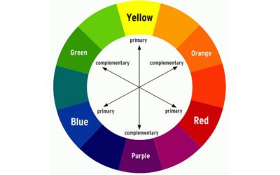
The RYB color model and the color wheel
At the heart of color theory is the RYB Color Model, which includes red (R), yellow (Y), and blue (B) as primary colors.
The model illustrates the color spectrum in a wheel format. It provides a visual framework to understand the interactions among various hues.
The color wheel guides us in creating pleasing color combinations. It reveals the complex and fascinating world of colors. Thus allowing us to see how different hues harmonise or contrast.
It, therefore, helps designers and artists create balanced works.
Primary, secondary, and tertiary colors
The RYB color model starts with three primary colors: red, yellow, and blue. They are the building blocks of all other colors.
By mixing two primary colors, we get secondary colors. Red and yellow create orange, yellow and blue to form green, and blue and red produce purple.
Tertiary colors result from mixing primary and secondary colours, creating six intermediate colors.
These include red-orange, yellow-orange, yellow-green, blue-green, blue-purple, and red-purple.
Understanding these color tiers allows us to manipulate and use colors more effectively.
Complementary colors and their significance
Complementary colors are pairs of colors that cancel each other out when combined or placed side-by-side, creating a strong contrast.
They lie opposite each other on the color wheel. Some examples are; red and green, blue and orange, or yellow and purple.
The contrast can ignite a vibrant appeal when leveraged at full saturation.
Such pairings yield visual tension and equilibrium. Therefore, they prove to be potent tools in design and art.
Colors that go well with blue
White: White’s purity pairs well with blue, providing a crisp contrast. The duo exudes tranquility, often reminiscent of clear skies on a sunny day.
Yellow: When you mix yellow and blue together, you find a color that bursts with vitality. Yellow’s sunshine-like warmth contrasts with the cool serenity of blue. It creates an energetic and cheerful pair.
Gray: Gray and blue together create a palette of sophistication. Gray’s neutrality accentuates the vibrancy of blue, crafting a balanced and elegant design.
Pink: When combined with blue, pink adds a soft, delicate touch. Pink mix with blue evokes the tenderness of spring, a perfect blend of cool blue skies and warm pink blossoms.
Orange: In contrast to blue on the color wheel, orange creates a striking, energetic mix. The orange’s liveliness and the blue’s calming effect create an exciting contrast.
Green: Pairing blue with green creates a natural, calming harmony. It reflects the earth’s and sky’s colours, evoking a sense of tranquility and balance.
Purple: Purple has a rich, regal connotation. It contrasts with blue to create a luxurious and vibrant palette. Purple mix with blue is a combination that speaks of elegance and creativity.
Brown: Pairing earthy brown with cool blue gives a warm, inviting feel. Its blend suggests stability, comfort, and a touch of rustic charm.
Red: Red, the color of passion, creates a bold, eye-catching combination with blue. This pairing is vibrant, stirring, and energetic, ideal for designs that need to stand out.
Gold: Pairing blue with gold adds a touch of luxury and glamour. The cool tones of blue contrast well with the warm, metallic sheen of gold. It creates a rich, opulent palette.
Silver: Silver provides a cool, metallic contrast to the blue. This duo speaks of sophistication and modernity, perfect for a sleek, contemporary aesthetic.
Coral: Coral and blue create a playful, lively pairing. The soft warmth of coral offsets the coolness of blue, bringing a fresh, vibrant look to any design. When considering color options, you might also want to explore the differences between coral color vs salmon.
Cream: Cream offers a soft, elegant combination with blue. The duo is perfect for creating a relaxed, welcoming environment. The creamy tones enhance the calming effect of blue.
Teal: Teal, a blend of blue and green, offers a refreshing contrast with blue. This vibrant pairing is soothing and energizing. It is a striking choice for a lively, inviting palette.
Navy: Combining navy with other shades of blue results in a sophisticated look. The deep tones of navy highlight the lighter shades of blue, creating a palette of cool elegance.
Colors that go well with orange
Blue: Blue provides a vibrant, energetic contrast to orange. This pair calls to mind a sunset over a serene sea, creating a sense of balance and invigoration.
Yellow: Pairing yellow with orange yields a sunny, cheerful combination. The radiant warmth of this duo evokes feelings of joy and optimism.
Brown: Brown’s earthy tones complement orange, crafting a cozy, autumnal palette. This blend suggests a sense of warmth and comfort.
Green: Orange and green together evoke a fresh, natural harmony. Think of a citrus grove in full bloom, symbolizing growth and vitality.
Pink: Paired with orange, pink brings a playful, feminine touch. Pink mix with orange results in a vibrant and energetic combination that exudes warmth and a sense of enthusiasm.
Purple: Offering a rich, regal contrast, purple and orange mix bring an exotic flair. This vibrant duo evokes a sense of luxury and creativity.
White: White provides a clean, crisp backdrop for orange, allowing the bold hue to shine. It creates a refreshing, modern palette with a vibrant punch.
Gray: Gray adds a sophisticated, neutral contrast to orange. This balanced combination helps mute the intense energy of orange. It results in a classy, modern look.
Red: Combining red with orange leads to a bold, fiery palette. This pairing is daring, passionate, and energetic, perfect for designs that demand attention.
Turquoise: Turquoise and orange create a bright, coastal vibe. This duo captures the essence of a beach getaway, lively and relaxing at the same time.
Gold: Gold brings a touch of glamour and luxury to orange. The warm, metallic tones of gold highlight the richness of orange, resulting in an opulent and chic palette.
Coral: Coral and orange together create a lively, vibrant combination. This duo feels energetic, fresh, and exciting, perfect for a playful, summer-inspired theme.
Cream: Pairing cream with orange creates a soft, elegant palette. The creamy hues temper the boldness of orange, providing a calming, sophisticated balance.
Olive: Olive green and orange offer an earthy, natural harmony. This pair is reminiscent of fall foliage. It is a warm, comforting blend perfect for a rustic, homely vibe.
Read also: army vs olive green color
Teal: Teal brings a cool, modern contrast to orange. This combination offers a fresh and balanced palette. It is perfect for designs that need a dynamic yet harmonious look.
Creating Color Schemes with Blue and Orange
Blue and orange can make striking color schemes. There’s more to it than their combination. Analogous and monochromatic schemes add more options.
In an analogous color scheme, colors sit next to each other on the color wheel. Try blue with blue-violet and blue-green.
Or, pair orange with red-orange and yellow-orange. These schemes offer a smooth blend. They are easy on the eye and bring a sense of serenity.
Monochromatic color schemes are another option. Here, you play with shades, tints, and tones of one color. You could blend sky blue, baby blue, midnight blue and navy blue.
Or, combine burnt orange, apricot, and peach. These schemes give a subtle and unified look. Each combination creates a unique visual impact.
Analogous schemes are vibrant but harmonious. They catch the eye without being overbearing. Monochromatic schemes are subtle but striking.
They bring depth and sophistication. These schemes can boost the visual appeal of any design or decor.
Read also: violet vs indigo
FAQs
Does blue and orange complement each other?
Blue and orange are complementary colors. They sit opposite each other on the color wheel, creating an intense visual appeal. These colors balance, making them popular for various designs and art forms.
Why do blue and orange go together?
Blue and orange harmonize because they are complementary colors on the color wheel. The cool calm of blue counterbalances the warm vitality of orange. This contrast provides a dynamic interplay that is interesting to the viewer’s eye.
What color goes well with orange?
A wide array of colors pairs well with orange. These include its complementary color, blue, and neutral shades, such as orange mixed with black and white. Even some shades of green can complement orange. The ultimate choice depends on the particular shade of orange and the desired visual effect.
What colors go well with bright orange?
Bright orange can harmonize with a variety of colors. Different shades of blue, like turquoise and sky blue, work well. Neutral colors like white, gray, and darker shades like charcoal can also provide a stunning contrast. Certain dark greens can balance out the brightness of orange, offering a lively and balanced palette.
Does orange and navy blue match
Absolutely, orange and navy blue are a classic pairing. Navy blue’s deep, muted tones create a perfect backdrop for the vibrant and lively hue of orange. This combination evokes contrast and balance, often used in fashion, interior design, and graphic arts. Their complementary nature creates a dynamic visual interest, making them an excellent choice for a sophisticated and modern aesthetic.
Final thoughts on do blue and orange go together.
Blue and orange are a match made in color heaven. Their position as complementary colors on the wheel explains their magnetic attraction.
From adding zing to your living room with throw pillows to creating masterpieces in paintings, this combo works. It’s a mix of calm and energy.
It’s versatile, vibrant, and visually stunning. Don’t shy away from experimenting with shades, tints, and color schemes. Let blue and orange breathe life into your creations.


Leave a Reply