Colors have a fascinating way of captivating our senses and influencing our emotions. But what happens when blue and yellow mix?
In this blog post, I’ll explore the intriguing world of color theory to uncover the result. By understanding how colors interact and blend, we gain insights into the vast possibilities of the color spectrum.
I’ll also delve into the basics of color mixing, from primary colors to additive color blending.
Join me in discovering the emergence of a secondary color when blue and yellow converge.
What Color Does Blue and Yellow Make When Mixed?
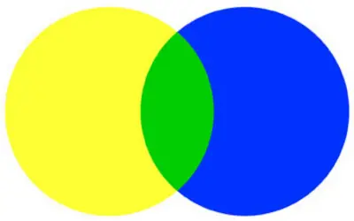
Blue and yellow make the color green when mixed. This vibrant combination brings the refreshing essence of nature, invoking images of lush green landscapes and blooming meadows. Green symbolizes growth, renewal, and harmony, making it a color that captivates and soothes.
Understanding Color Blue and Yellow
Characteristics and symbolism of the color blue
Blue, the opposite of brown on the color wheel, encompasses a wide range of characteristics and symbolism. It is often associated with calmness and serenity, invoking a sense of tranquility similar to a clear blue sky or a calm ocean.
Blue also symbolizes depth and stability, representing trust, reliability, and loyalty. It’s also linked to communication and intellect, stimulating clear thinking, logic, and honest expression.
In certain cultures, blue holds spiritual significance, symbolizing higher consciousness and spiritual awakening.
The emotions evoked by blue vary depending on its shade. This ranges from feelings of tranquility and harmony with lighter shades to mystery or sadness with darker tones.
Blue is represented by HEX code #0000FF, RGB values (0, 0, 255), and CMYK values (100%, 100%, 0%, 0%).
Understanding the characteristics and symbolism of blue, with its HEX, RGB, and CMYK codes, allows us to appreciate its impact on our lives and the array of emotions it can elicit.

Characteristics and symbolism of the color yellow
Yellow, a vibrant and cheerful color, possesses distinctive characteristics and carries a variety of symbolic meanings.
It is known for its brightness and radiance. Often associated with the sun, it represents warmth and light.
The color exudes a sense of positivity, happiness, and joy. It has a way of uplifting moods and creating a cheerful atmosphere.
With its vibrant energy, yellow symbolizes optimism and encourages a positive outlook on life.
In terms of symbolism, yellow represents various concepts and emotions. It embodies energy, vitality, and enthusiasm, evoking a sense of liveliness and zest.
The color is linked to creativity and innovation. It stimulates imaginative thinking and inspires new ideas.
Yellow also symbolizes communication, as it captures attention and can stimulate conversation and social interaction.
In addition to its symbolic meanings, yellow has its own color codes. The HEX code for yellow is #FFFF00, indicating its specific shade in the digital color space.
In the RGB color model, yellow is represented by the values (255, 255, 0), signifying the intensity of red, green, and blue channels.
In the CMYK color model, yellow is expressed through the values (0%, 0%, 100%, 0%), which represent the levels of cyan, magenta, yellow, and black.

Basics of Color Mixing
Primary colors and their significance
Primary colors play a fundamental role in color theory and form the building blocks of color mixing. These colors are considered pure and cannot be created by mixing other colors together.
The three primary colors are red, blue, and yellow. Each primary color possesses unique properties and significance in the color spectrum.
Red: Red is a powerful and intense color associated with strong emotions. Mixing red and yellow creates orange; when mixed with blue, it produces purple. Red is crucial in creating warm tones and adding energy to color compositions.
Blue: Blue is a cool and calming color that evokes feelings of serenity and tranquility. Blue mixed with red and white, forms purple, and when combined with yellow, it produces green. Blue is essential for creating a range of cool shades and establishing a sense of depth in color schemes.
Yellow: Yellow is a bright and vibrant color that symbolizes happiness and optimism. When mixed with red, it produces orange, and when mixed with blue, it forms green. Yellow helps in creating warm and cheerful tones, adding brightness and vibrancy to color palettes.
The concept of additive and subtractive color mixing
The concepts of additive and subtractive mixing help us understand how colors mix in different contexts.
Additive color mixing
This is the process of combining different colored lights to produce new colors. This concept is used in digital displays, such as computer screens and televisions, where pixels emit light to create images.
The primary colors in additive mixing are red, green, and blue (RGB). When these colors combine at full intensity, they create white light.
Additive color mixing works on the principle that when different colors of light overlap, their wavelengths combine, resulting in new colors.
For example, when red and green light combine, they create yellow light. Adding blue to yellow light produces white light.
By varying the intensity of the primary colors, you can achieve a wide range of hues.
Subtractive color mixing
This involves mixing pigments or dyes, such as in traditional painting or printing processes. It works on the principle that objects absorb certain wavelengths of light and reflect others.
The primary colors in subtractive mixing are cyan, magenta, and yellow (CMY). When these colors mix together in equal proportions, they create black.
Subtractive color mixing starts with a surface or material that reflects or transmits certain colors while absorbing others.
For example, yellow paint reflects yellow light and absorbs blue and red light.
When yellow paint and blue paint mix, the blue pigment absorbs the red wavelengths. This results in a mixture that appears green.
In practical applications, subtractive color mixing is used in processes like color printing. To achieve true black, a key (K) color, often black, is added to the CMY model.
What Color Do Yellow and Blue Create in Painting?
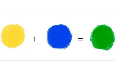
When you mix blue and yellow paint, you will create the color green. Green is a secondary color that comes from combining the primary colors of yellow and blue.
The resulting green can vary in shade, from vibrant to more muted tones. Artists use this mixture to depict various green elements in their artwork, such as landscapes and foliage.
What Color Do Yellow and Blue Create in Printing?
In printing, yellow and blue combine to create the color green. This applies to the CMYK color model.
When yellow and cyan pigments are mixed together, they reflect green light and produce various shades of green in printed materials.
The exact shade of green achieved depends on the specific proportions and qualities of the yellow and cyan inks used in the printing process.
What Color Do Yellow and Blue Create in Lighting?
In lighting, yellow and blue combine to create white light. This applies to the additive color mixing system, where yellow and blue are the primary colors.
Yellow light (with a longer wavelength) and blue light (with a shorter wavelength) additively mix to produce white light.
This phenomenon is observed in electronic displays, such as computer screens and televisions.
How to Mix Blue and Yellow
To mix blue and yellow, follow these simple steps:
Start with separate portions of blue and yellow paint or pigments on a palette or mixing surface.
Use a clean brush or palette knife to take a small amount of blue paint.
Place the blue paint next to the yellow paint on the palette, leaving some space between them.
Take a small amount of yellow paint with a different brush or palette knife.
Mix the blue and yellow together using gentle brush strokes or by folding the paints over each other with the palette knife.
Continue mixing until the blue and yellow are well blended. Adjust the proportions of blue and yellow as desired to achieve the desired shade of green.
If the mixture appears too dark or intense, you can lighten it by adding a small amount of white paint or diluting it with a bit of water.
Once you are satisfied with the resulting green color, you can use it for your artwork, painting, or any other creative project.
Exploring the Result: Green
Green meaning
Green is a color associated with various meanings and symbolism. Here are some common interpretations of the color green:
Nature and growth. Green is connected to the natural world, representing the lushness of plant life, forests, and landscapes. It symbolizes growth, renewal, and fertility.
Harmony and balance. Green is often associated with balance and harmony. It brings a sense of calmness and tranquility, promoting relaxation and well-being.
Freshness and vitality. Green is linked to a sense of freshness and vitality. It is energizing and rejuvenating, evoking feelings of youthfulness and vibrancy.
Healing and renewal. Green has been associated with healing and renewal, both physically and emotionally. It’s used in healthcare and wellness contexts to convey a sense of restoration and rejuvenation.
Prosperity and abundance. In some cultures, green symbolizes wealth, prosperity, and abundance. It is associated with good fortune and financial success.
Environmental awareness. Green is closely tied to environmental movements and sustainability. It represents ecological consciousness, reminding us of the importance of preserving and caring for our planet.
Color green perception and the human eye
The perception of the color green and the human eye are closely related. Green is one of the primary colors in the visible light spectrum, along with red and blue.
The human eye has specialized cells called cones that are responsible for detecting and perceiving color.
There are three types of cones, each sensitive to a different range of wavelengths of light. The cones that are most sensitive to green light are known as medium-wavelength cones.
When light enters the eye, it interacts with these cones and triggers a response that the brain interprets as the perception of color.
The green light has a wavelength of around 495-570 nanometers. The medium-wavelength cones are most responsive to this range of wavelengths.
As a result, the human eye is particularly sensitive to green light.
The perception of color is also influenced by other factors such as the surrounding colors and lighting conditions.
For example, a green apple will still appear green to us even if the lighting changes.
The perception of color also varies between individuals due to differences in the number and sensitivity of cones in their eyes.
Some individuals may have color vision deficiencies, such as red-green color blindness, which affects their ability to distinguish between certain shades of red and green.
The emergence of green as a secondary color
The emergence of green as a secondary color is an interesting concept. However, in the traditional color model, green is a primary color, along with red and blue.
In the additive color model used in light, green is created by combining equal parts of blue and yellow light. In the subtractive color model used in pigments and dyes, green is created by mixing equal parts of blue and yellow pigments.
In certain contexts, green is a secondary color. Secondary colors are created by mixing two primary colors together.
For example, if we consider the primary colors to be red, blue, and yellow, combining blue and yellow would produce green, making it a secondary color.
The perception and interpretation of colors can vary in different fields and applications. In some artistic or design contexts, variations of color models or artistic theories may label green as a secondary color.

Different Shades of Green
Green is a versatile color with a wide range of shades and variations. Here are some commonly recognized shades of green:
Lime green: A bright, vibrant shade of green with a yellowish undertone, reminiscent of the color of a lime fruit.
Emerald green: A rich, deep shade of green with a hint of blue, resembling the color of an emerald gemstone.
Forest green: It’s a dark, earthy shade of green, like the color of tree leaves in a dense forest.
Olive green: A grayish-green hue inspired by the color of olives. It often has a subdued and earthy quality.
Chartreuse: A bright, yellowish-green color that falls between green and yellow on the color spectrum.
Mint green: A light and pale shade of green, similar to the color of mint leaves.
Sage green: A muted and soft green shade, like the color of sage leaves.
Here is our blog post on sage vs mint color.
Hunter green: A dark, deep green color often associated with hunting attire.
Seafoam green: A pale and tranquil green shade reminiscent of the color of sea foam.
Kelly green: A vivid, intense shade of green, often associated with Irish culture and St. Patrick’s Day.
You may also want to read about olive vs sage to note the difference between these two variations of green.
Table Summary of Shades of Green
| Shades | HEX codes | RGB codes | CMYK codes | Color |
| Lime green | #00FF00 | 0, 255, 0 | 100, 0, 100, 0 | color |
| Emerald green | #008000 | 0, 128, 0 | 100, 0, 100, 50 | Color |
| Forest green | #228B22 | 34, 139, 34 | 76, 0, 76, 45 | color |
| Mint green | #00FFBF | 0, 255, 191 | 100, 0, 25, 0 | color |
| Olive green | #808000 | 128, 128, 0 | 0, 0, 100, 50 | color |
| Chartreuse | #7FFF00 | 127, 255, 0 | 50, 0, 100, 0 | color |
| Sage green | #BCB88A | 188, 184, 138 | 0, 2, 27, 26 | color |
| Hunter green | #355E3B | 53, 94, 59 | 44, 0, 37, 63 | color |
| Seafoam green | #00FFFF | 0, 255, 255 | 100, 0, 0, 0 | color |
| Kelly green | #00FF00 | 0, 255, 0 | 100, 0, 100, 0 | color |
How to Create Different Shades and Tints of Green?
To create different shades and tints of green, you can adjust the saturation and brightness, or add a touch of other colors to the base green color.
Here are a few methods you can use:
Adjusting saturation
To create darker shades of green, decrease the saturation by adding black or a darker blue to the base green.
To create lighter tints of green, increase the saturation by adding white or a lighter color to the base green.
Adjusting brightness
To create darker shades of green, decrease the brightness by adding black or a darker color to the base green.
Conversely, making lime green or other lighter tints requires adding white or a lighter color to the base green.
Mixing complementary colors
To create darker shades of green lights, mix a small amount of a darker color, such as a deep blue or purple, into the base green.
To create lighter tints of green, mix a small amount of a light yellow or white, into the base green.
Using a color wheel
The color wheel can help you find complementary colors to create shades and tints. Complementary colors are opposite each other on the colour wheel.
To create shades, mix a small amount of the color opposite green (such as red or purple) into the base green. To create tints, mix a small amount of the color next to green (such as yellow or blue paint) into the base green.
How to Make Olive Green
Making olive green paint is easy to do with some basic colors and just a few drops of other colors. Here’s what you need:
Step 1: Start with a base green. Begin with a mid-tone green as your base color. This can be a shade of green that you already have or one you mix by combining yellow and blue in equal amounts.
Step 2: Add yellow. Olive green has a warm undertone, so you’ll need to add a touch of yellow to your base green. Start by adding small increments of yellow to the green until you achieve the desired warmth. Mix well after each addition and check the color.
Step 3: Add a touch of red or orange. Olive green has a slight reddish or orangish tint. To achieve this, add a tiny amount of red or orange to your green and yellow mixture. Be cautious with the amounts, as a little goes a long way. Mix well and assess the color after each addition until you reach the desired olive green hue.
Step 4: Adjust darkness or lightness. Depending on whether you want a darker or lighter olive green, you can adjust the darkness or lightness of the color. To darken the shade, add a small amount of black or a darker green. To lighten the tint, add white or a lighter green shade. Make sure to mix well and check the color as you go.
Alternatively, you can make olive green color using a gray and yellow color scheme.
Making Green With No Use of Yellow
Creating a green color without the use of yellow can be achieved by mixing blue and a small amount of cyan. Begin with a blue base.
Ensure it’s a pure blue color. Do this by using blue paint or pigment as your starting point.
Next, add a touch of cyan to the blue base. (Here’s how to make cyan blue).
By incorporating a small increment of cyan into the mixture, the hue will shift toward green. Add the cyan gradually, mixing well and assessing the color after each addition.
Repeat this process until the desired green shade is achieved.
If you wish to adjust the darkness or lightness of the green color, you can introduce small amounts of black or white. Adding black will darken the shade while adding white will lighten it.
Real-World Applications of Blue and Yellow Mixing
The mixing of blue and yellow can result in various shades of green, but it also has several real-world applications beyond color mixing. Here are a few examples:
Printing and color reproduction
In the field of printing and color reproduction, the mixing of blue and yellow is essential. The primary colors in the subtractive color model used in printing are cyan and yellow.
By mixing yellow and cyan in varying proportions, you can achieve a wide range of colors.
Paint mixing
Blue and yellow are commonly used in art and painting to create various shades of green. Artists often mix different ratios of blue and yellow paints to achieve the specific green hue they desire.
This applies to various mediums, such as acrylics, oils, watercolors, and more.
Color theory and design
Understanding the principles of color mixing, including the combination of blue and yellow, is crucial in graphic design, interior design, fashion design, and other creative fields.
Education and science
The mixing of blue and yellow is taught in educational settings to illustrate color theory concepts to students.
It helps students understand how primary colors combine to form secondary colors. This allows for a better comprehension of the color spectrum and color relationships.
Branding and marketing
Blue and yellow are often used together in branding and marketing strategies. This combination can create a sense of balance, trustworthiness (blue), and optimism (yellow).
Various companies and brands incorporate blue and yellow in their logos, packaging, and promotional materials to convey specific messages.
Interior Designing
Mustard yellow and blue form a captivating match in interior design, especially the mustard yellow color combinations.
Complementary and versatile, they bring warmth, tranquility, and a vibrant ambiance to any space.

Colors That Complement Green
Colors that complement green can vary depending on the specific shade of green and the desired effect. However, here are some colors that complement green:
Red. Red is the complementary color to green on the color wheel. This combination creates a vibrant and energetic contrast, making red an excellent choice to pair with green. It creates a visually striking and dynamic effect.
Pink. Lighter shades of pink can complement green nicely, especially when aiming for a softer and more delicate color palette. The contrast between the coolness of green and the warmth of pink creates a harmonious and visually pleasing combination.
Purple. Different shades of purple, such as violet or lavender, can provide an interesting contrast to green. The cool tones of purple will balance the warm tones of green, resulting in a visually appealing and balanced color scheme.
Read also: what color does blue and purple make when mixed?
Orange. Another complementary color to green is orange. The combination of warm green hues with vibrant oranges creates a lively and eye-catching contrast. This combination is often used in autumn-themed or tropical-inspired designs.
Yellow. While yellow is a primary color that can be mixed with blue to create green, it can also complement certain shades of green. Lighter shades of green can pair well with brighter yellows.
Neutral colors. Neutral colors, such as beige, gray, or brown, can serve as subtle complements to green. These neutral tones provide a grounding effect, allowing the green to stand out as the focal point.
Factors Influencing Color Mixing Outcomes
Several factors can influence the outcomes of color mixing. Here are some key factors that can affect how colors mix:
Pigment characteristics
The properties of the pigments or dyes you use play a crucial role in color-mixing outcomes. Different pigments have varying levels of transparency, opacity, saturation, and tinting strength.
Color theory and color models
Color theory can guide color mixing. Understanding the primary colors, secondary colors, and color harmonies will help achieve desired mixing outcomes.
Factors like color temperature, hue, and value also come into play when combining colors.
Mixing medium or mediums
The medium used for color mixing can influence the results. Paints, inks, digital tools, or other mediums, have unique characteristics that affect color mixing.
Some mediums may have a higher viscosity, altering how colors blend, while others may have drying times that impact the final color appearance.
Mixing techniques and tools
Brushwork, layering, blending, and various application methods can influence the way colors interact and merge.
Tools like brushes, palette knives, or airbrushes may also impact the precision and control of color mixing.
Lighting conditions
Lighting conditions can influence color perception. The same color mixing may appear different under different lighting sources.
The color temperature and intensity of the light can alter the perceived color, affecting how you perceive mixed colors.
Personal perception and subjectivity
Color perception can be subjective and influenced by individual preferences and experiences.
Perception of color mixing outcomes vary from person to person, leading to different interpretations and preferences.
Why is Mixing Green Paint so Hard?
Mixing green paint can be challenging due to several factors.
One reason is the color bias of green pigments. Certain pigments lean towards yellow or blue, affecting the resulting mixtures.
Achieving a balanced green is difficult without adjusting the pigments or using many pigments. The transparency and opacity of green pigments can vary.
This makes it challenging to achieve smooth and consistent color blends.
The limited range of primary pigments available also impacts the range of green shades. Mixing green as a complementary color to red can be tricky, as complementary colors tend to neutralize or dull each other when mixed.
Lastly, the perception of greens can be subjective. This makes it challenging to meet specific expectations and achieve a shared understanding when mixing green paint.
Can I Make Yellow and Blue Paint?
Yes, you can make yellow and blue paint by mixing appropriate pigments together. Here’s how you can do it:
Yellow paint
To make pure yellow paint, you’ll need a yellow pigment and a binder or medium. Choose a yellow pigment such as cadmium yellow, Hansa yellow, or any other yellow pigment of your preference.
Place a small amount of the yellow pigment on a palette or mixing surface. Add a binder or medium suitable for the type of paint you are using (such as acrylic medium or oil medium) to the pigment.
Mix the pigment and binder together until you achieve a smooth and consistent yellow paint.
Adjust the ratio of pigment to the binder as needed to achieve the desired hue and consistency.
Blue paint
To make plain blue paint, select a blue pigment such as ultramarine blue, phthalo blue, cerulean blue, Prussian blue, or any other blue pigment of your choice.
Place a small amount of the blue pigment on a palette. Add the appropriate binder or medium to the pigment and mix well until you achieve a consistent blue paint.
Adjust the pigment-to-binder ratio if necessary to achieve the desired hue and consistency.
Note: Follow safety guidelines and work in a well-ventilated area when handling pigments and binders. The specific pigments and mediums you choose may depend on the type of paint you are working with.
FAQs
Does yellow and blue go together?
Yes, yellow and blue go together. They are complementary colors, which means they are located opposite each other on the traditional color wheel. Complementary colors often create a pleasing and harmonious contrast when used together.
Does blue and yellow make black?
No, blue and yellow do not make black when mixed together. When you mix blue and yellow paint, they combine to create green. The exact shade of green will depend on the specific pigments and their ratios used.
What does the color yellow and blue mean?
The color yellow means positivity, energy, happiness, and warmth. It symbolizes sunshine, joy, and optimism. Yellow is also linked to intellect, creativity, and communication. The color blue is associated with calmness, stability, serenity, and tranquility. It can evoke feelings of peace, trust, and reliability. Blue is often linked to depth, wisdom, and loyalty.
What colors do green and yellow make?
Green and yellow make a color called “yellow-green” or “chartreuse.” It is a vibrant color that has elements of both green and yellow.
Blue and orange make what color?
When combined, orange and blue make the color brown. Blending these vibrant shades results in a rich earthy tone commonly found in natural elements like soil and tree bark. The blue and orange combination brings forth the warm and inviting hue known as brown.
Read also:
What Color Does Red and Blue Make When Mixed
Conclusion
In the realm of color mixing, the marriage of blue and yellow reveals an enchanting secret, green. This delightful union births a kaleidoscope of greens, each with its own charm and character.
From vibrant and lively shades to serene and tranquil tones, the blending of blue and yellow opens up a world of possibilities.
Green, with its connections to nature, growth, and harmony, captivates our senses and invites us to explore its soothing allure.
So, let us celebrate the magical fusion of blue and yellow, as it paints our world in a symphony of greens.


Leave a Reply