Curious minds have long pondered the outcome when two powerful colors, red and yellow, intertwine. The combination of these vibrant hues holds the promise of a new shade.
One that embodies energy, warmth, and endless creative possibilities. In this brief blog post, we embark on a journey of color exploration.
Discover the enchanting result that arises when red and yellow merge. I’ll delve into the chemistry of color mixing, and uncover the cultural and psychological associations of these colors.
I’ll also explore the practical applications of this vibrant fusion. Prepare to unlock the secret of this dynamic union.
What Does Red and Yellow Make When Mixed?
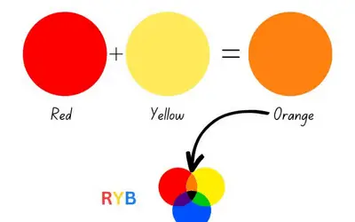
Yellow and red make the color orange when mixed together. Red and yellow are primary colors, and their combination produces a secondary color known as orange. Mixing red and yellow in varying proportions allows for a range of orange shades. The resulting color is often associated with energy, warmth, and vibrancy.
Understanding the Color Red
Red is a primary color that you cannot create by mixing other colors together. It stands alongside blue and yellow as one of the three primary colors.
In the RGB color model, red is produced by combining full-intensity red light (255, 0, 0) with no green or blue. In the CMYK color model, red is achieved by mixing magenta and yellow pigments.
Throughout history, red has held cultural significance and has been used in various civilizations. It has been derived from natural sources like plants, insects, and minerals.
Red has a presence in prehistoric cave paintings. In ancient Egypt, it symbolized life, victory, and fertility.
In ancient China, red represented good luck and prosperity. Over time, red has been used in religious ceremonies, royal garments, and as a symbol of power and passion.
Psychologically, red is associated with intense emotions and carries a range of meanings. It’s linked to love, passion, energy, power, and excitement.
Red can evoke strong physical responses, such as increased heart rate and blood pressure. In certain cultures, red symbolizes luck, good fortune, and happiness.
However, it can also convey negative emotions such as anger, aggression, and danger.
In color combinations, you can pair red with various other colors to create different visual effects and moods. Red goes well with white, blue, yellow, black, and gold.
The HEX code for pure red is #FF0000. In the RGB color model, red is represented by the code (255, 0, 0), indicating full-intensity red with no green or blue.
The CMYK code for red is (0%, 100%, 100%, 0%), signifying the absence of cyan and black, and full-intensity magenta and yellow.
The most common shades of red are scarlet, alizarin crimson, ruby, cherry, burgundy, mahogany, carmine, raspberry, and maroon.

Understanding the Color Yellow
Yellow is a vibrant color that falls between green and orange in the visible spectrum. It is the opposite color of purple on the color wheel. It’s a primary color in subtractive color mixing, such as paint or ink, and a secondary color in additive color mixing, like light.
The color yellow has a high luminosity and is associated with brightness and warmth. Throughout history, yellow pigments have been used by humans for thousands of years.
Ancient civilizations created yellow pigments using natural materials like ochre and saffron. Yellow also holds cultural significance in various societies.
For example, in ancient Egypt, it was associated with the sun god Ra and represented eternity and divinity. The color yellow carries psychological associations and symbolism as well.
It’s often linked with positive emotions and concepts. Most people associate it with happiness, joy, optimism, and energy. Its bright and sunny nature evokes feelings of warmth, cheerfulness, and vitality.
Yellow is also connected to creativity, intellect, and enlightenment, as it stimulates mental activity and imagination. However, excessive use of yellow can sometimes evoke caution or anxiety.
You can pair yellow with various other colors to create different effects. Some options are gray, blue, green, and white.
Related search: what color does yellow and gray make when mixed?
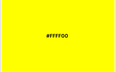
The HEX code for yellow is #FFFF00. This code represents the RGB values of Red: 255, Green: 255, and Blue: 0.
In the CMYK code, yellow is represented as 0% Cyan, 0% Magenta, 100% Yellow, and 0% Black. These codes are used to define and reproduce the color yellow accurately across various mediums.
Some common shades of yellow include lemon, yellow ochre, canary, sunflower, goldenrod, butter, dandelion, mustard, and corn.
Read also: colors that match mustard yellow.
Color Theory
The color theory explores how colors interact, combine, and impact our perception. Its principles help us understand how colors are organized, combined, and how they affect emotions.
One fundamental aspect of color theory is the color wheel. The color wheel is a circular diagram that organizes colors based on their relationship to one another.
It consists of primary, secondary, and tertiary colors. Primary colors, such as red, blue, and yellow, are the building blocks of all other colors.
Secondary colors, like orange, green, and purple, result from mixing two primary colors. Tertiary colors are created by mixing a primary color with a neighboring secondary color.
Color harmony is another essential concept in color theory. It refers to the pleasing arrangement and combination of colors in a composition.
There are different methods to achieve color harmony. These are complementary colors, analogous colors, and triadic colors.
Color temperature is another aspect of color theory. It refers to the perceived warmth or coolness of a color.
Warm colors, such as reds, oranges, and yellows, represent heat, energy, and excitement. Cool colors, like blues, greens, and purples, evoke a sense of calmness, tranquility, and serenity.
Color psychology is also related to color theory. Different colors can evoke various emotions and moods.
Basics of Color Mixing
Color mixing is the process of combining different colors to create new colors. Understanding the basics of color mixing is essential in various fields.
These include art, design, and even everyday life.
There are two primary methods of color mixing: additive color mixing and subtractive color mixing.
Additive color mixing
Additive color mixing is the process of combining colored light to create new colors. It’s the method used in electronic displays such as televisions, computer screens, and projectors.
In additive color mixing, the primary colors are red, green, and blue (RGB). When you combine these three primary colors at full intensity, you will get a white light.
By adjusting the intensity of each primary color, you can achieve different colors. For example, mixing red and green light produces yellow, while mixing red and blue light creates magenta.
Subtractive color mixing
Subtractive color mixing involves combining pigments or dyes to create new colors. It’s commonly used in traditional art mediums, printing, and mixing paints.
The primary colors in subtractive color mixing are cyan, magenta, and yellow (CMY). When you mix equal parts of cyan, magenta, and yellow together, you will get a black color.
However, in practice, this mixture often appears as a dark brown or gray due to impurities in the pigments.
To create a true black, the subtractive color model includes an additional key color, represented by the letter “K” in the CMYK model used in printing.
Color Models
Color models, such as RGB and CMYK, are systems used to define and represent colors in digital displays and printing.
RGB
The RGB is an additive color model used in electronic displays. In the RGB model, colors are created by combining different intensities of red, green, and blue light.
The RGB model uses values ranging from 0 to 255 to represent the intensity of each color channel.
CMYK
The CMYK is a subtractive color model used in printing processes. In the CMYK model, colors are created by subtracting specific amounts of cyan, magenta, yellow, and black ink from white paper.
Unlike the additive RGB model, which starts with black and adds light, the CMYK model starts with white and subtracts color while adding darker shades.
The combination of all four inks results in black. The absence of all colors is represented as white.
CMYK values are represented as percentages. They indicate the amount of each ink used in the color mixture.
For example, pure red in the CMYK color wheel is represented as (0%, 100%, 100%, and 0%), indicating the absence of cyan and black, and full-intensity magenta and yellow.

What Color Do Red and Yellow Make When Mixing Paint?
Red and yellow paint makes the warm color known as orange. Mixing these two primary colors results in the formation of a secondary color.
The exact shade of orange achieved will depend on several factors.
These include the specific shades of red and yellow, the intensity or saturation of the pigments, and the proportions in which they are mixed.
If you mix equal amounts of red and yellow paint, you will achieve a balanced and vibrant orange. Adjusting the ratio of red to yellow can produce different shades of orange.
Adding more red to the mix will result in a deeper, more reddish-orange color. Adding more yellow will create a lighter, more yellowish-orange hue.
What Color Do Red and Yellow Make When Mixing Lights?
When red and yellow lights are mixed together, they produce the color orange.
Mixing red light, which is at the longer wavelength end of the visible light spectrum, and yellow light, which is in the middle of the spectrum, results in the perception of orange light.
This is due to the additive color mixing principle, where the combination of a few different colors of light adds up to create new colors.
The combination of red and yellow light stimulates the red and green receptors in our eyes, resulting in the perception of orange.
Mixing 25% Red and 75% Yellow
When mixing 25% red and 75% yellow paint, you create a color that resembles vermilion. Vermilion is a vivid reddish-orange shade, historically associated with the mineral cinnabar and used as a pigment in art.
To achieve this mixture, you would need to adjust the proportions of red and yellow accordingly. Start by measuring out 25% red paint and 75% yellow paint. You can do this by volume or weight, depending on the measuring method you prefer.
Once you have the appropriate amounts of red and yellow paint, together. The resulting color should have a reddish-orange hue reminiscent of vermilion.
Mixing 50% Red and 50% Yellow
When you mix 50% red and 50% yellow, you will make a perfect flush orange. You can achieve this by using a palette knife or brush to mix equal parts of red and yellow paint on a palette or any other suitable mixing surface.
By combining equal parts of red and yellow, you should get a balanced and vibrant orange hue.
However, the actual shade of orange may vary depending on the specific shades of red and yellow used. The opacity and intensity of the pigments will also affect the shades.
Mixing 75% Red and 25% Yellow
When mixing 75% red and 25% yellow paint, you can create the color amber. Amber is a warm, brown orange color with hints of orange and brown.
Mix the red and yellow paints together until they are well combined. The resulting color should have a warm, golden-yellow tone with a touch of red, resembling the appearance of amber.
Interesting read: What color does orange and purple make when mixed?
How to Mix Color Red and Yellow
Follow these steps to mix red and yellow:
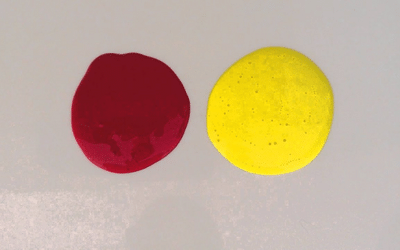
Step 1: Prepare your materials. Gather red and yellow paint or pigments, along with a palette or mixing surface, paintbrushes, and any desired mixing tools.
Step 2: Start with a clean palette. Ensure that your palette or mixing surface is clean and free from any previous colors. This will help prevent unwanted color contamination.
Step 3: Dispense the colors. Squeeze or place a small amount of red paint or pigment onto your palette. Do the same with yellow paint or pigment, keeping them separate from each other.
Step 4: Mix the colors. Using a paintbrush or a palette knife, start by dipping it into the red paint. Then, pick up a small amount of red and transfer it to a clean area of your palette.
Next, dip the brush or knife into the yellow paint and transfer a small amount of yellow next to the red on the palette.
Step 5: Begin mixing. With the two colors side by side on your palette, start mixing them together using gentle strokes. You can use a brush or palette knife to blend the colors. Continue mixing until the red and yellow are well combined.
Step 6: Observe and adjust. As you mix, observe the resulting color. If the mixture appears too red, add a touch more yellow. If it appears too yellow, add a bit more red. Adjust the proportions until you achieve the desired shade of orange.
Step 7: Test the color. Once you are satisfied with the mixture, test the resulting orange hue on a separate surface or piece of paper. This will allow you to see the color more accurately and make any necessary adjustments if needed.
Why is Mixing Orange Paint Difficult?
Here are a few reasons why mixing orange paint can be more difficult compared to other colors:
Pigment properties. Some pigments used to create orange paint may have low tinting strength or opacity. This means that they may require a larger amount of pigment to achieve the desired intensity.
Color bias. Different red and yellow pigments can have inherent color biases. For example, certain red pigments may have a bluish or purplish undertone. Some yellow pigments may have a greenish or brownish undertone. When you mix these pigments, their biases influence the resulting orange.
Mixing ratio. Finding the right ratio of red and yellow pigments is crucial in creating a desirable orange. A slight imbalance in the proportion of red and yellow can result in a different shade of orange or honey blonde, specifically if you understand how to make the color blonde. Achieving the desired hue requires experimentation.
Transparency and opacity. Some red and yellow pigments have varying levels of transparency or opacity. Mixing transparent pigments may result in a different visual effect compared to mixing opaque pigments.
Shades of Orange
Shades of orange refer to the various tones and variations that can be achieved within the orange color spectrum.
From vibrant and intense hues to softer and more muted tones, the range of shades allows for diverse expressions and moods. Here are some common orange colors:
| Color | HEX code | RGB code | CMYK code | Shade |
| Vermilion | #FF4E00 | 255, 78, 0 | 0, 69, 100, 0 | color |
| Tangerine | #FFA500 | 255, 165, 0 | 0, 35, 100, 0 | color |
| Burnt orange | #CC5500 | 204, 85, 0 | 0, 58, 100, 20 | color |
| Peach | #FFDAB9 | 255, 218, 185 | 0, 15, 28, 0 | color |
| Coral | #FF7F50 | 255, 127, 80 | 0, 50, 68, 0 | color |
| Apricot | #FBCEB1 | 251, 206, 177 | 0, 18, 29, 2 | color |
| Pumpkin | #FF7518 | 255, 117, 24 | 0, 54, 91, 0 | color |
| Terracotta | #E2725B | 226, 114, 91 | 0, 50, 60, 11 | color |
How to Shades and Tints of Orange
To create shades and tints of orange, you can follow these steps:
Making lighter orange
Start with your base orange color.
- Take a small amount of the base orange color and place it on your palette.
- Add white paint or pigment to the base orange color, a little at a time.
- Mix orange and white colors using a brush or palette knife.
- Add small amounts of white until you achieve the desired lighter shade of orange.
- Test the tinted orange on a separate surface or piece of paper to ensure it matches your desired result.
Making darker orange
Begin with your base orange color.
- Take a small amount of the base orange and place it on your palette.
- Add small amounts of black paint or pigment to the base orange color.
- Mix the black and orange thoroughly, ensuring there are no streaks or uneven patches.
- Add black gradually to achieve the desired darker shade of orange.
- Test the shaded orange on a separate surface to verify the result.
When adjusting the shade or tint of orange, add the additional colors gradually and mix well. This allows for better control over the color and helps prevent over-saturation or undesired effects.
Does Orange Have a Meaning?
Yes, the color orange does have various meanings and associations. Here are some common interpretations and symbolic representations of the color orange:
Energy and enthusiasm. Orange is often associated with energy, enthusiasm, and excitement. It’s a vibrant and lively color that can evoke feelings of warmth and stimulation.
Joy and creativity. Orange is also connected to joy, creativity, and playfulness. It’s a cheerful and uplifting color that can inspire a sense of optimism and creativity.
Social interaction and communication. The color orange is a social color that encourages communication and social interaction. It has some aspects of extroversion, friendliness, and sociability.
Vitality and wellness. Orange can symbolize vitality and well-being. It’s associated with physical energy and good health, representing an active and vibrant lifestyle.
Success and ambition. In some contexts, orange is linked to success, ambition, and determination. It’s a color that motivates and drives individuals to achieve their goals.
Courage and confidence. Orange is often associated with courage and confidence. It is seen as a color that can inspire individuals to take risks, be bold, and overcome challenges.
Warmth and comfort. Orange is a warm color that can create a sense of coziness and comfort. It is often used in interior design to add warmth and create inviting spaces.
Applications of Orange
Orange is a versatile color that finds applications in various fields. Here are some common applications of orange:
Art and design. Orange is used in art and design to add energy, vibrancy, and warmth to compositions. It can be applied as a dominant color or as an accent to create focal points or evoke specific emotions.
Advertising and branding. Orange is often utilized in marketing and branding to grab attention, promote enthusiasm, and convey a sense of excitement.
Sports and safety. Orange is employed in sports equipment, uniforms, and signage for high visibility and safety purposes. Its brightness makes it easy to spot in outdoor settings, making it suitable for sports gear, safety vests, cones, and traffic signs.
Seasonal themes. Orange is associated with autumn, as it reflects the warm and vibrant colors of changing leaves. It’s used in seasonal decorations, harvest festivals, and Halloween-themed designs.
Food and beverages. Orange is often linked to appetite stimulation. This makes it popular in the food and beverage industry. It’s used in packaging and branding for citrus fruits, juices, snacks, and other related products.
Interior design. Orange can be used in interior design to create energetic and lively spaces. It can be incorporated through accent walls, furniture, accessories, or artwork, adding warmth and a sense of playfulness to the environment.
Health and wellness. With orange comes positivity, creativity, and optimism. This makes it suitable for wellness centers, spas, and yoga studios.
Signage and warnings. Due to its high visibility, orange is often used for signage and warning symbols. It’s used in construction zones, traffic cones, safety barriers, and cautionary signs to indicate potential hazards.
Can You Mix Colors to Make Yellow and Red?
Yes, you can mix colors to create yellow and red. Here are the methods for achieving each color:
Yellow
Yellow is a primary color in the subtractive color model used for mixing paints, dyes, and pigments. To create yellow, mix equal parts of primary colors red and green.
By combining red and green in equal proportions, the subtractive color mixing process results in the perception of yellow.
Red
Red is also a primary color in the subtractive color model. To create red, you can mix equal parts of primary colors magenta and yellow.
Magenta is a primary color that lies between red and blue, and by mixing it with yellow color, you can achieve a balanced red hue.
There are also darker shades of red such as the color cardinal, crimson and burgundy.
If you want to know what two colors make dark red, read this article.
FAQs
Does red and yellow make pink?
No, red and yellow do not make pink. Pink is a lighter shade of red, often achieved by adding white to red pigments. Mixing red and yellow together will result in the creation of orange, not pink.
What color does red and yellow make?
When red and yellow are mixed together, they create the color orange. Red and yellow are the primary colors in the subtractive color model. Their combination results in the production of a secondary color, which is orange.
Is red and yellow a good combination?
Yes, red and yellow are a good combination. Together, they create a strong contrast and can evoke energy and warmth. This combination is often associated with themes like enthusiasm, excitement, and positivity. However, the perceived “goodness” of the combination depends on personal preference.
What is the Ryb color code?
RYB stands for Red, Yellow, and Blue, which are the primary colors used in the subtractive color model. The RYB color wheel is different from the RGB color model used for electronic displays. The RYB model does not have specific color codes like the hexadecimal (HEX) codes used in RGB. Instead, it relies on the mixing of physical pigments or dyes to create colors.
What Color Does Pink and Orange Make When Mixed?
Pink and orange mix to create a captivating color known as peach. This vibrant blend combines the sweetness of pink with the energetic nature of orange, resulting in a hue that evokes images of tropical sunsets and blooming flowers.
Conclusion
When you mix yellow and red, you create the vibrant and energetic color of orange. This blending of primary colors results in a striking secondary color.
The combination of red and yellow is a classic pairing that evokes warmth, enthusiasm, and excitement. Whether in art, design, or everyday life, understanding the color-mixing process will give you endless creative possibilities.
So, the next time you mix red and yellow, remember that you’re bringing forth the dynamic and invigorating essence of orange. A color that can ignite your imagination and leave a lasting impression.


Leave a Reply