You are standing in front of a blank canvas, armed with a paintbrush and a palette of colors, ready to unleash your creativity. As you ponder which hues to combine, your gaze settles on pink and orange, two colors that evoke familiar emotions and memories.
But have you ever wondered what happens when these two beloved colors merge? In this blog post, I’ll embark on an exploration of the color spectrum.
I’ll delve into the magical world of pink and orange blending. I am not just talking about paint on a canvas, I am talking about the emotions, experiences, and nostalgia that these colors evoke.
Prepare to discover the beauty and excitement of these colors.
What Color Does Pink and Orange Make When Mixed
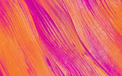
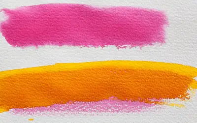
Pink and orange mix to form a captivating color peach. The vibrant blend of pink’s sweetness and orange’s energy gives birth to a hue reminiscent of tropical sunsets and blooming flowers.
Color Wheel and Color Theory
The color wheel and color theory are essential tools if you want to understand the principles behind color harmony.
The color wheel is a visual representation of the relationships between colors. It showcases their arrangement and how they interact with one another.
The color theory explores the way colors mix, combine, and contrast. This helps to provide a framework for creating visually pleasing compositions.
It delves into concepts such as primary, secondary, and tertiary colors. It also explains to us the complementary and analogous color schemes and the psychological and emotional impact of different hues.
By comprehending the color wheel and color theory, you gain the power to choose colors wisely.
What Color Does Pink and Orange Make in Paint?
When you mix orange and pink paint, you create the color peach.
This delightful blend combines the softness of pink with the warm vibrancy of orange, creating a hue reminiscent of the flesh of a ripe peach.
The exact shade of peach will vary depending on the specific shades of pink and orange used and the ratio of each color in the mixture.
Experiment with different proportions of pink and orange paint to allow you to achieve your desired shade of peach.
What Color Do Orange and Pink Make in Lights?
Orange and pink lights make a color known as salmon. This color resembles the flesh of a salmon fish.
The specific shade of salmon produced by the combination of orange and pink lights may vary depending on the intensity and proportions of each color.
The interplay between these two hues in the realm of light creates a striking and unique color experience, perfect for setting a warm and inviting ambiance in various lighting scenarios.
Understanding Color Pink and Orange
Color pink
Pink is a delicate and soothing color that falls within the red color family. Many people link it with femininity, romance, tenderness, and compassion.
I perceive it as a gentle, nurturing color that can evoke feelings of sweetness, innocence, and sensitivity. It ranges in shades from pale pastel pinks to deeper, vibrant pinks, each conveying its own distinct mood and atmosphere.
Pink is a tint of red, created by adding white to the base color. The primary components of pink are red and white. It complements well with copper, and its pastel shade is often used in the interior design of houses. (Here’s how to make copper color paint).
You can adjust the intensity and saturation of pink by increasing the amount of white in the mixture.
Pink can also be influenced by the undertones it carries. For instance, some pink shades may have cooler blue undertones, resulting in a cooler or more purplish pink.
Other pinks may have warmer orange undertones, creating a warmer or peachier pink.
Color orange
Orange is a warm and energetic color that falls between red and yellow on the color spectrum. I associate it with vitality, enthusiasm, creativity, and warmth.
Orange can range from vibrant and intense shades to softer, more subdued tones, each carrying its own distinct personality.
Orange is a color that can command attention and create a sense of excitement. It exudes a lively and energetic vibe, often associated with sunsets, autumn leaves, and citrus fruits.
It is a color that can inspire creativity, promote a positive outlook, and stimulate enthusiasm.
To make orange, combine red paint and yellow, two primary colors. The exact proportions of red and yellow will determine your shade and intensity of orange.
By increasing the amount of red in the mixture, the resulting orange will lean towards a more reddish or burnt orange hue. A higher proportion of yellow will yield a more yellow-orange or vibrant tangerine shade.
If you need other ways how to make orange color without yellow, you can mix red and white paint to create a lighter shade of orange, or combine red and a touch of brown for a deeper, earthy orange tone.
The complementary color of orange is blue; blue and orange combined create a visually striking and harmonious color combination.
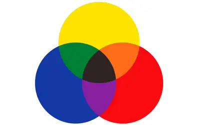
Understanding the RYB Color Model
The RYB color model, also known as the artist’s color wheel, is a traditional color model used in art and painting. It is based on three primary colors: red, yellow, and blue.
The RYB color model is a subtractive color model, meaning that colors are created by subtracting certain wavelengths of light.
In the RYB color model, the primary colors are positioned equidistant from each other on a color wheel. When you mix these primary colors in various combinations, you create secondary and tertiary colors.
For example:
- Mixing red and yellow creates orange
- Mixing yellow and blue creates the color green
- Mixing blue and red creates purple
To create tertiary colors, mix a primary color with an adjacent secondary color. For example:
- Red and orange create red-orange
- Orange and yellow create yellow-orange
- Yellow and green create yellow-green
- Green and blue create blue-green
- Blue and purple create blue-purple
- Purple and red create red-purple.
The RYB color model provides a basic understanding of color mixing and serves as a foundation for achieving color harmony in their artwork.
The RYB color model is not as precise as the modern RGB (Red, Green, Blue) or CMYK (Cyan, Magenta, Yellow, Black). These two are used in digital media and printing.
How Do Our Eyes Perceive Color?
Our eyes perceive color through a complex process involving light, specialized cells, and the brain. Here’s a simplified explanation of how it works:
Light and wavelengths. Color is a visual sensation created by different wavelengths of light. When light hits an object, it absorbs certain wavelengths and reflects others. The reflected light enters our eyes, allowing us to see the colors of objects.
The role of the retina. The retina, located at the back of our eyes, contains specialized cells called cones and rods. Cones are responsible for detecting color, while rods are more sensitive to low light levels.
Three types of cones. Humans have three types of cones, each sensitive to a specific range of wavelengths. These cones are most responsive to short, medium, and long wavelengths of light. By detecting the intensity of these wavelengths, the cones send signals to the brain, allowing us to perceive different colors.
Color processing in the brain. Once the cones detect the wavelengths, the information is transmitted to the brain via the optic nerve. The brain’s visual cortex interprets these signals and combines them to create our perception of color.
Color perception and color mixing. Our brain can perceive a wide range of colors by interpreting the varying levels of stimulation received from the cones.
NOTE: Color perception can vary between individuals due to genetic factors and differences in the number and sensitivity of cones. Cultural and personal experiences can also influence our interpretation of different colors.
Fundamentals of Color Mixing Theory
Color mixing theory is a fundamental concept in art and design that explores how different colors combine to create new colors.
Understanding the basics of color mixing theory allows artists to create harmonious compositions and achieve desired color effects. Here are some key principles:
Primary colors
The primary colors are the foundation of color mixing. In the additive color model (used in light), the primary colors are red, green, and blue (RGB).
In the subtractive color model (used in pigments and dyes), the primary colors are cyan, magenta, and yellow (CMY). These primary colors cannot be created by mixing other colors.
Secondary colors
Secondary colors are created by mixing equal parts of two primary colors. In the additive model, red + green = yellow, green + blue = cyan, and blue + red = magenta.
In the subtractive model, cyan + magenta = blue, magenta + yellow = red, and yellow + cyan = green.
Tertiary colors
Tertiary colors are created by mixing a primary color with a neighboring secondary color.
For example, mixing red with orange creates red-orange, mixing yellow with green creates yellow-green, and mixing blue with purple creates blue-purple.
Color wheel
The color wheel is a visual representation of the relationships between colors. It organizes colors in a circular format, showing the progression from primary to secondary to tertiary colors.
The color wheel helps artists understand color relationships, such as complementary colors or analogous colors.
Color mixing techniques
You can mix colors through various techniques. These include mixing colors physically, optically, or digitally.
You can experiment with different proportions and techniques to create specific shades, tints, and hues.
Color properties
Colors have properties such as hue, value, and saturation. Understanding these properties will help you create visual balance and contrast in your artwork.
Color Mixing Basics
Color mixing basics involve understanding how different colors interact and combine. It starts with primary colors, which are the basic colors that cannot be created by mixing other colors.
In the additive color model, the primary colors are red, green, and blue (RGB). In the subtractive color model, the primary colors are cyan, magenta, and yellow (CMY).
By mixing primary colors, secondary colors are created, such as yellow, cyan, and magenta. Tertiary colors are formed by mixing primary colors with adjacent secondary colors.
The color wheel represents these relationships. Understanding color properties like hue, value, and saturation further enhances color mixing skills.
By mastering these basics, you can combine colors, create harmonious palettes, and unlock a world of creative possibilities.
How to Mix Color Pink and Orange
To mix the color pink and orange, follow these steps:
Step 1: Start with the base color
Begin by selecting a base color that leans towards either pink or orange. This will serve as the dominant color in your mixture.
Consider the specific shades of pink and orange you have available, and choose the one that best represents the desired outcome.
Step 2: Adjust the proportions
Depending on the desired shade and intensity, vary the proportions of pink and orange in your mixture. For a more dominant pink hue with a hint of orange, start with a larger amount of pink and add small increments of orange.
For a more dominant orange hue with a touch of pink, begin with a larger amount of orange and add small amounts of pink until the desired shade is achieved.
Step 3:Mix gradually
Mix the two colors together to ensure that the colors blend evenly. Use a palette knife or a brush to combine the colors on a palette or any suitable mixing surface.
Blend and assess the color to achieve the desired result.
Step 4: Test and adjust
After mixing the colors, test the resulting shade by applying a small amount of the mixture onto a white surface or canvas. Assess the color and make any necessary adjustments.
If the color appears too pink or too orange, add more of the opposing color to balance it out until the desired shade is achieved.
Making Peach Lighter or Darker
To make the color peach lighter or darker, you can adjust its shade by following these steps. If you are interested in making peach color lighter, add small amounts of white paint or pigment to the base peach color.
Mix the colors after each addition to ensure a consistent blend. By adding white, you will achieve a lighter and softer shade of peach.
If you desire a darker peach hue, incorporate small amounts of black paint or pigment. You can even add a darker color like deep red or brown, into the base peach color.
Again, mix well to ensure an even distribution of color. Test the modified shade on a small surface or canvas to assess the result and make further adjustments if needed.
Mixing Color Pink and Orange
Additive color mixing
Additive color mixing is the combination of light. In additive color mixing, the combination of pink and orange creates a vibrant and energetic color.
Pink is a lighter shade of red, while orange is a blend of red and yellow.
When you mix these colors additively, you’ll end up with a peach hue that is a mixture of the two. The resulting color will depend on the specific shades of pink and orange that you’re working with.
If the pink shade has a high level of red and the orange shade leans towards the reddish side, the resulting color will likely be a warm, coral-like tone.
Read also: mix of green and pink
Subtractive Color Mixing
Subtractive color mixing is relevant to pigments, paints, and dyes. In subtractive color mixing, the primary colors are cyan, magenta, and yellow (CMY).
When you mix these colors together, they absorb or subtract certain wavelengths of light, resulting in different colors.
When you mix pink and orange using subtractive color mixing, you would be mixing red and white pigments with yellow and red pigments.
This is because pink is a lighter shade of red, while orange is a blend of red and yellow.
The exact outcome will depend on the specific shades and proportions of the pigments used.
Factors Affecting the Resulting Color when Mixing Pink and Orange
When mixing pink and orange, several factors can affect the resulting color. Here are some key factors to consider:
Color intensity
The intensity or saturation of the warm pink orange color used in the mixture will influence the resulting color.
If both colors are highly saturated, the resulting color will be vibrant and intense. If the colors are less saturated, the resulting color will be more muted or toned down.
Proportions
The ratio or proportion of pink to orange in the mixture will impact the resulting color. Adjusting the amount of each color will yield different outcomes.
Adding more pink will lean the mixture toward a pinkish hue while adding more orange will shift it towards an orangish tone.
Color temperature
Pink is a cool color, while orange is a warm color. The temperature of the colors used in the mixture can influence the resulting color.
More pink will impart a cooler undertone, while more orange will add warmth to the mixture.
Color undertones
Pink and orange can have different undertones. For example, pink may have blue or red undertones, while orange may have yellow or red undertones.
The specific undertones in the colors shift it towards the dominant undertone.
Pigment characteristics
The specific pigments or dyes used in the pink and orange colors can affect the resulting color.
Different pigments have varying properties and interactions, which can influence how they blend and combine. Consider the characteristics of the pigments used in the mixture.
Lighting conditions
The lighting conditions under which the mixed color is viewed can also affect its appearance. Different lighting sources, such as natural daylight or artificial light, can alter the perception of color.
Usage of Color Pink, Orange and Peach in Different Fields
Pink, orange, and peach are versatile colors that find applications in various fields. Here are some common uses of these colors:
Fashion and design
Pink, orange, and peach are beautiful when used in clothing, accessories, and interior design. They add vibrancy, playfulness, and warmth to designs.
These colors are often seen in spring and summer collections, as they evoke feelings of energy and happiness.
Graphic design and advertising
These colors are attention-grabbing colors that are used in marketing and advertising to create a bold and memorable impact.
They convey youthful and exciting messages, making them popular choices for branding, logos, and promotional materials.
Weddings and events
Most people love incorporating these colors in weddings and events to create a romantic, joyful, and festive atmosphere.
I associate pink with love and femininity, while orange and peach can bring a touch of warmth and elegance to decor and floral arrangements.
Interior design
Pink, orange, and peach are used in interior design to add a pop of color and create a lively and inviting space.
These colors work well in children’s rooms, as they can create a playful and energetic environment. In other areas of the home, you can use them as accent colors to add warmth and personality.
Health and beauty
Pink is a color of femininity, beauty, and wellness. It’s used in the beauty industry for cosmetics, skincare products, and packaging.
Orange and peach can also be seen in beauty and wellness brands, as they can convey feelings of vitality, health, and rejuvenation.
Branding and logos
Companies often use pink, orange, and peach in their branding to evoke specific emotions and associations. Pink is often used to target a female audience or convey a sense of gentleness and care.
Orange is associated with energy, enthusiasm, and creativity. Peach can represent a softer and more delicate version of orange, evoking feelings of warmth and approachability.
Symbolic Meanings of Color Pink, Orange, and Peach
Color symbolism varies across different cultures and contexts. Here are some common symbolic meanings associated with the colors pink and orange:
Color pink
Love and romance- Pink is a color of love, affection, and romance. It represents sweetness, tenderness, and nurturing qualities.
Femininity- Associated with femininity, pink represents girls, women, and all things feminine.
Compassion and empathy- Pink is also associated with compassion, understanding, and empathy. It represents a caring and nurturing nature.
Innocence and playfulness- Pink can evoke feelings of innocence, youthfulness, and playfulness. It’s used in contexts related to children or childlike joy.
Calm and relaxation- Light pink can have a soothing and calming effect. They are often used in environments where relaxation and tranquility are desired.
Color orange
Energy and vitality- Orange symbolizes enthusiasm, excitement, and vitality. It evokes feelings of warmth and passion.
Creativity and expression- Orange is a color of creativity, artistic expression, and originality. I love it as it creates imagination and inspiration.
Social interaction and warmth- Orange represents sociability, friendliness, and extroversion. It can create a sense of warmth and approachability.
Optimism and positivity- Orange is often associated with optimism, positivity, and a zest for life. It can uplift moods and bring about a sense of joy and happiness.
Adventure and courage- Orange symbolizes adventure, courage, and taking risks. It is used to represent a sense of adventure and exploration.
Color peach
Warmth and comfort- Peach is a warm and comforting color that evokes feelings of coziness and contentment. It brings comfort, like the feeling of a warm blanket.
Serenity and tranquility- Peach has a calming and soothing effect, similar to lighter shades of pink. It is used to create a serene and peaceful atmosphere.
Romance and intimacy- Peach, like pink, symbolizes love, romance, and intimacy. It also looks beautiful in wedding themes and romantic settings.
Gentleness and grace- Peach is a color of gentleness, grace, and softness. It represents a more subdued and subtle form of beauty
Nurturing and supportive- Peach conveys a sense of nurturing, care, and support. It represents qualities like kindness, compassion, and understanding.
Elegance and sophistication- Peach is an elegant and sophisticated color. It can add a touch of refinement and class to designs and settings.
Eye-Catching Shades of Pink, Orange, and Peach Colors
Pink shades
| Shade | HEX code | RGB color code |
| Shocking pink | #FC0FC0 | 252, 15, 192 |
| Electric pink | #FF69B4 | 255, 105, 180 |
| Flamingo pink | #FC8EAC | 252, 142, 172 |
| Raspberry pink | #B00149 | 176, 1, 73 |
| Candy pink | #FF63B1 | 255, 99, 177 |
| Peachy pink | #FFDAB9 | 255, 218, 185 |
| Neon pink | #FF6EC7 | 255, 110, 199 |
| Hot magenta | #FF1DCE | 255, 29, 206 |
| Rose pink | #FF66CC | 255, 102, 204 |
| Barbie pink | #E819B7 | 232, 25, 183 |
| Watermelon pink | #FF507F | 255, 80, 127 |
Orange shades
| Shade | HEX code | RGB color code |
| Sunset orange | #FF4500 | 255, 69, 0 |
| Blaze orange | #FF6700 | 255, 103, 0 |
| Pumpkin orange | #FF7518 | 255, 117, 24 |
| Tiger orange | #FF8C00 | 255, 140, 0 |
| Neon orange | #FF6D01 | 255, 109, 1 |
| Safety orange | #FF6600 | 255, 102, 0 |
| Fire orange | #FF2400 | 255, 36, 0 |
| Coral orange | #FF7F50 | 255, 127, 80 |
| Apricot orange | #FBCEB1 | 251, 206, 177 |
| Burnt sienna | #E97451 | 233, 116, 81 |
Peach shades
| Shade | HEX code | RGB color code |
| Peach | #FFCBA4 | 255, 203, 164 |
| Light Peach | #FFD8B1 | 255, 216, 177 |
| Pale peach | #FFE5B4 | 255, 229, 180 |
| Coral peach | #FF9F84 | 255, 159, 132 |
| Apricot peach | #FFC085 | 255, 192, 133 |
| Salmon peach | #FF9C7C | 255, 156, 124 |
| Peachy pink | #FFDAB9 | 255, 218, 185 |
| Blush peach | #FFD3B5 | 255, 211, 181 |
| Rosy peach | #FFC9A8 | 255, 201, 168 |
| Burnt peach | #FF9157 | 255, 145, 87 |
FAQs
Is it possible to make orange from pink?
No, it is not possible to create the color orange by mixing pink alone. Orange is a secondary color created by mixing red and yellow. Pink is a lighter shade of red or a tint of red mixed with white. While pink contains some red tones, it lacks the necessary yellow component to create orange.
What colors does pink and yellow make?
When pink and yellow are mixed together, they create a shade of orange or peach color. The exact result will depend on the specific shades of yellow and pink used in the mixture; therefore, you must know how to make different shades of yellow.
What does orange and magenta make?
When orange and magenta are mixed together, they create a rich and vibrant shade of red. Magenta is a primary color in the subtractive color model. Orange is a secondary color created by mixing red and yellow. When you mix these two colors, you will yield a reddish hue. The resulting color may have variations depending on the specific shades of orange and magenta used.
What color does orange and white make?
Orange and white make the color creamsicle. This hue is a soft, light shade of orange that emits a refreshing aesthetic. While retaining the warmth and vibrancy of orange, the addition of white tempers it. This results into a harmonious and delightful color that evokes a pleasant sensation.
What color does orange an purple make?
Mixing purple and orange results in a shade of brown or brownish-orange. The exact hue and intensity of the resulting color will depend on the specific shades of orange and purple used, as well as the ratio of the two colors in the mixture.
What color does orange and black make?
Black and orange mixed together create a type of brown. Usually, when you mix black with another color, it creates a shade that is a darker version of that color. So, brown is a shade of orange. This is just one of many ways to create brown by mixing paints.
Can orange and pink make a teal color?
No, orange and pink cannot create a teal color. Teal blends blue and green, while orange and pink are not primary colors that can combine to form teal. Mixing orange and pink will result in a shade of reddish-orange or coral. But what color does pink and teal make when mixed? Read this article to find out.
What does magenta and pink make?
Magenta and pink mixed together create a vibrant and intense shade of pinkish-purple. Combining these two colors results in a bold and striking hue that falls between magenta and pink on the color spectrum. The specific shade obtained depends on the ratio of magenta to pink used in the mixture.
What color do red and pink make?
Red and pink do not combine to create a new color. When you mix these two colors, they maintain their individual characteristics. The result is often a combination of pink and red, rather than a distinct new color.
Conclusion
Now that you have known the intriguing results of mixing pink and orange, a world of possibilities awaits. This captivating blend of colors unlocks a realm of creativity and expression.
With its playful and radiant nature, it breathes life into home decor, fashion, and art. It will definitely invite a sense of excitement and vibrancy.
This fusion also inspires us to embrace bold choices and discover beauty in unexpected color combinations.
So, armed with the knowledge of this enchanting hue, let your imagination soar. Infuse the world with warmth and celebrate the kaleidoscope of colors that surrounds you.


Leave a Reply