Colors have incredible power, stirring our senses and painting vibrant emotions. Among them, copper stands out with its warm, earthy radiance.
But what hues compose the mesmerizing palette that brings copper to life? Join me as I delve into the art and science behind copper’s enchanting shades.
Explore the depths of color theory and the interplay of light and matter. Witness the magical fusion of pigments that form copper’s signature hues.
This blog post will immerse you in a realm where artistry meets chemistry. Discover the magical fusion of pigments that form copper’s signature hues.
This exploration promises to unveil the mysteries behind copper’s alluring shades. Embark on this journey to answer the simple question: What colors make copper?
What Colors Make Copper?
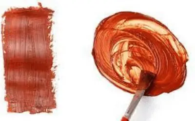
The primary colors that make the copper shades are orange, brown, and red. Mixing orange and brown paints can produce a lighter shade of copper. Combining red and brown results in a darker copper hue. However, achieving the perfect copper color goes beyond basic color mixing.
Introduction to To Color Theory
Understanding the principles of color theory is essential for creating captivating hues. When it comes to exploring the basic hues that make copper, delving into the depths of color theory becomes more intriguing.
Color theory is a framework that unravels the science behind the visual spectrum. It provides a systematic approach to understanding how colors interact.
By grasping the fundamentals of color theory, we can understand what brings copper to life.
At its core, color theory revolves around the concept of the color wheel. This circular arrangement showcases the primary, secondary, and tertiary colors.
For copper, the only basic hues involved are orange, brown, and red.
Hue, saturation, and value are fundamental aspects of color theory. Hue refers to a specific color family, such as orange or brown.
Saturation determines the intensity or purity of a color. The value represents the lightness or darkness of a color, influencing the range of copper shades we can achieve.
Understanding color theory empowers you to mix and manipulate colors with intention. it will help you know how to combine the right proportions of orange, brown, and red.

Cool Vs. Warm Colors
The concept of cool and warm colors plays a significant role in creating visual harmony and emotions. When exploring the colors that make copper you need to understand this distinction.
Cool tones, such as blues, greens, and purples, bring tranquility, serenity, and calmness. These hues create a soothing and peaceful atmosphere.
While cool colors are not the primary players in copper’s palette, they provide a backdrop that enhances the warm radiance of this metal.
Warm colors, such as reds, oranges, and yellows bring vibrancy, energy, and a sense of coziness. These hues catch our attention and evoke feelings of warmth and excitement.
Warm colors take center stage in the creation of copper shades. They emulate the earthy, radiant tones that are characteristic of this captivating metal.
In the context of copper, warm colors like orange, brown, and red form the foundation of its palette. The infusion of these hues brings copper to life.
To harness the power of contrast and balance in copper, you need to understand the interplay between warm and cool colors.
What A Copper Color Is?
Copper, both a metal and a color, possesses a fascinating and captivating hue. Understanding what a copper color is allows us to appreciate its characteristics.
I will describe copper as a warm and earthy shade that embodies the essence of the soft metal itself. It exhibits a range of hues that evoke images of antiquity, warmth, and natural beauty.
Copper colors encompass a spectrum that spans from deep reddish-browns to vibrant oranges and golden tones.
The metal’s reddish-brown appearance when freshly exposed to air, serves as a foundation for its broader range of shades.
As copper weathers and oxidizes over time, it develops a distinct patina that adds depth and character.
The copper color goes beyond a single shade or tone. It encompasses a collection of hues that evoke a sense of earthiness, warmth, and timeless elegance.
The color code for copper can vary depending on the color system being used. In the RGB color model, the approximate color code for copper is (184, 115, 51).
In hexadecimal notation, the color code for copper is #B87333. These values represent the combination of red, green, and blue channels that, when combined, create the copper color.
The specific shade of copper can vary, so these values serve as a general representation.
By utilizing various shades within the copper spectrum, we evoke a sense of nostalgia, warmth, and organic elegance.
So, as we explore the colors that make copper enchanting, let us embrace the essence of its earthy radiance.
How Can You Tell If It Is Copper?
To determine if a color matches the appearance of copper, you can consider the following characteristics:
- Reddish-brown hue. Copper has a distinct reddish-brown color. Look for a color that has a warm, earthy tone with a reddish or orange undertone.
- Metallic sheen. Copper has a metallic luster. It exhibits a shiny, reflective surface that may appear polished or oxidized with a slight patina.
- Richness and depth. Copper color has depth and richness, with a certain vibrancy to it. It should not appear flat or dull.
- Warmth. Copper is associated with warmth. Look for a color that evokes a sense of warmth and richness, similar to the feeling of being near a fire or basking in the glow of a sunset.
What Colors Make A Copper Colored Paint?
Creating a soft copper glaze involves mixing various hues to achieve the desired shade. Here are a few methods you can use to mix copper paint:

Mixing orange and brown to create light copper
Mixing cadmium orange and brown can result in a color that closely resembles light copper. Here’s how you can achieve this mix:
1. Start with orange paint or pigment as your base color. Choose a bright orange shade, preferably one that leans towards the warmer side of the color spectrum.
2. Add small amounts of brown paint or pigment to the orange. Brown is created by mixing complementary colors, such as red and green or blue and orange. Adding brown will help shift the bright orange towards a more subdued, copper-like tone.
3. Mix and adjust the ratio of orange to brown until you achieve the desired light copper color. Keep in mind that the specific amounts will depend on the intensity and shade of orange and brown you’re working with.
4. Test the color by applying it to a small surface or creating a swatch. Assess the result and make further adjustments if necessary. Add more orange for a brighter copper or more brown for a deeper, richer copper tone.
Note: Start with small amounts of paint or pigment and gradually build up the mixture to control the color’s intensity.
Mixing red and brown to create dark copper
To create a dark copper color by mixing red and brown, you can follow these steps:
1. Start with a rich, warm red paint or pigment as your base color. Look for a deep red shade that leans towards the darker side.
2. Add brown paint or pigment to the red. Choose a brown that has a reddish undertone to complement the copper tone you are aiming for. This can be a medium to dark brown shade.
3. Mix cadmium red and brown thoroughly, ensuring that the colors blend evenly. Keep adding small amounts of brown and adjust the ratio until you achieve the desired dark copper color. The exact amounts will depend on the specific red and brown shades you are working with.
4. Test the color by applying it to a small surface or creating a swatch. Evaluate the result and make any necessary adjustments by adding more red for a brighter copper or browner for a deeper, darker copper tone.
Other methods of mixing copper paint
When using alternative methods for mixing copper paint, experiment, adjust ratios, and test the color on a small surface before applying it to your project.
This way, you can fine-tune the mixture to achieve the specific copper shade and metallic effect you desire. Some other methods of making copper paint include:
Mixing yellow, red, and metallic brown
Begin with cadmium yellow paint or pigment as your base color. Add small amounts of red to create an orange hue.
Then, mix burnt sienna, brown paint, or pigment. The metallic brown will provide a shimmering effect and enhance the copper-like appearance.
Here’s our guide on how to make a dark red color.
Gold and brown
Start with gold paint or pigment as your base color. The mixing colors that make gold give it a metallic tone that can resemble copper.
Mix in brown paint or pigment to deepen the color and achieve a more nuanced copper shade.
Copper powder or pigment
Instead of mixing paint colors, you can opt to use copper powder or pigment directly. Copper powder is available in art supply stores.
You can mix it with a clear medium or varnish to create a custom copper paint. This method allows for greater control over the metallic and reflective properties of the copper color.
Kinds Of Copper Colors
There are various shades and variations of copper colors, each with its own unique characteristics. Here are some common types of copper colors:
- Bright copper- This shade represents the natural, polished color of pure copper.
- Antique copper- This is the color that copper develops over time due to oxidation and the formation of a patina
- Burnished copper- To achieve this, apply heat to the copper.
- Rose gold- This is a combination of copper with a higher proportion of gold, resulting in a pinkish orange color (Here’s how to get rose gold to avoid confusion)
- Coppery brown- This shade leans more towards a medium to dark brown tone.
- Copper hair dye (copper hair color trend)- This is a warm, reddish-brown shade that resembles the color of copper. It combines a medium to light brown base with vibrant copper undertones.
- Copper orange. This shade falls on the brighter, more orange end of the copper spectrum.
- Copper brown- It has a warm, earthy appearance and can range from medium to dark brown with hints of red or orange.
- Copper mahogany- Combines the warmth of copper with the deep, reddish-brown tones of mahogany wood.
- Copper rust- Inspired by the rusty patina that copper develops over time, copper rust is a weathered and rustic shade.
- Copper verdigris. Verdigris is the greenish-blue patina that forms on copper surfaces when exposed to air and moisture.
- Copper penny. Copper penny refers to the bright, metallic shade reminiscent of the color of U.S. pennies.
- Kenyan copper
- Unadulterated copper

Factors Influencing Copper Color Variations
Consider these factors when working with copper colors as they contribute to the dynamic nature of copper. Let’s explore each factor in more detail:
Lighting conditions and reflective surfaces
Lighting conditions affect the color’s brightness, shine, and appearance. Copper colors appear different under various lighting conditions.
Natural sunlight, incandescent lighting, or fluorescent lighting influence perception.
The reflective properties of copper play a role. Polished surfaces reflect light differently than textured or oxidized surfaces.
Changes in lighting can affect the brightness, shine, and appearance of copper colors. Reflective surfaces enhance the depth and dimension of copper by creating shadows and highlights.
Texture and application techniques
Texture and application techniques have a significant impact on copper color variations. The texture of a copper surface, whether smooth or textured, plays a crucial role in how the color copper appears.
A smooth surface reflects light more, while a textured surface creates shadows and highlights. This adds depth and dimension to the color.
Application techniques such as brushing or stippling create unique patterns and textures that affect the color’s appearance.
Layering copper paint or patina allows for color depth and richness. This also results in variations in intensity and saturation.
Additionally, specific techniques to induce oxidation or develop a patina can create different color variations.
Environmental conditions
Exposure to moisture, humidity, chemicals, and pollutants can lead to color variations over time. For example, prolonged exposure to moisture can speed up the development of a greenish patina.
Exposure to chemicals or pollutants can cause discoloration or tarnishing. Different environmental conditions can affect the rate and extent of these changes.
Is Copper An Orange Color?
No, copper is not an orange color. Copper is a metallic element with a reddish-brown color.
While copper does have warm undertones, it is not classified as an orange color. The natural color of copper is a result of its unique chemical composition and oxidation properties.
When exposed to air, copper forms a thin layer of copper oxide on its surface, which gives it a characteristic reddish-brown hue.
This color is associated with copper and is distinct from the true orange color. Therefore, while copper has warm tones, it is not orange.
How Do You Make Acrylic Paint Look Like Copper?
Follow these steps to make acrylic paint look like copper:
1. Apply a base coat of a reddish-brown color to your surface using acrylic paint. This will serve as the foundation for the copper effect.
2. Mix metallic copper acrylic paint with a small amount of brown or black paint to darken the shade. Apply this mixture in thin layers over the base coat, allowing each layer to dry before adding the next. Apply multiple layers to build up the copper effect gradually.
3. To enhance the appearance of aged copper, you can create texture and patina effects. Use a dry brush technique by dipping a dry brush into blue green acrylic paint. This will simulate the patina that forms on weathered copper.
4. Add highlights and shadows to create depth. Mix a lighter metallic gold or yellow paint with a small amount of white to create highlights.
5. Once your copper effect is complete and dry, apply a clear sealant or varnish to protect the paint and give it a polished finish.
Colors That Go Well With Copper Shades
When working with copper shades, there are several colors that complement and harmonize well with them. Here are some colors that go well with copper shades:
- Earth warm tones
- Neutrals
- Deep reds
- Warm oranges
- Deep greens
- Teal or turquoise
- Navy blue
How are Copper and Bronze Different from Each Other?
Copper and bronze are distinct from each other in several ways. Copper is a pure metal, represented by the symbol Cu on the periodic table.
It is reddish-brown in color and highly conductive to electricity and heat. This is why it is used in electrical wiring, plumbing, and various industrial applications.
Bronze is an alloy of copper and other metals such as tin, zinc, and aluminum. Depending on its composition, bronze can range in color from golden to yellowish-brown, or even develop a greenish patina over time.
Bronze is stronger, harder, and more resistant to corrosion than copper. This makes it suitable for applications that require durability and toughness.
Historically, copper has been used for thousands of years due to its abundance and versatility. Bronze played a significant role during the Bronze Age, revolutionizing warfare and craftsmanship.
Related posts:
FAQ
What color stands out against metal copper?
A color that stands out against metal copper is white. Other colors that can stand out against copper include deep blues, such as navy or royal blue, and vibrant oranges or reds. The specific color choice will depend on the desired visual impact and aesthetic you want to achieve.
How do I achieve the orange color?
To achieve the color orange, mix equal amounts of cadmium red light and yellow paint on your palette. Blend the colors until incorporated. Knowing how to make dark orange or its lighter version might also be helpful. Add more yellow for a brighter tone or more red for a deeper hue.
Does copper and gold go well with other colors?
Yes, copper and gold go well with a variety of other colors, creating visually pleasing and harmonious combinations. Some colors that work well with gold and copper are brown, beige, tan, and terracotta. Neutrals like ivory, cream, gray, or white also provide a subtle backdrop that allows the metallic accents to stand out.
How do you protect copper paints?
To protect copper paints and preserve their appearance, allow the copper paint to dry. Also, coat the surface with a sealant. Allow sufficient curing time for the sealant to fully dry and harden.
How do you use acrylics to paint copper?
To paint copper with acrylics, apply a base coat of deep, reddish-brown color. Then, layer thin glazes of lighter and darker shades to create depth and texture. Use dry brushing or stippling techniques with metallic copper paint to add highlights and a metallic sheen. Finish by sealing the painting with a clear varnish to protect the acrylic paint and enhance the metallic appearance.
What colors make brass?
The colors that make brass are zinc and copper. The specific proportions of zinc and copper determine the shade and properties of the brass alloy. Copper contributes the reddish color, while zinc adds strength and durability to the material.
What colors make bronze?
The colors that make bronze are red, white, and brown. The color can vary depending on the specific composition. To achieve a bronze color in painting, mix various shades of brown, yellow, and some red or orange to capture its characteristic appearance.
What color is pure copper?
Pure copper is orange-red. It has a distinct reddish-brown hue with warm undertones. The specific shade of orange-red can vary depending on the lighting conditions and surface finish of the copper. Otherwise, it falls within the range of warm orange to deep reddish-brown.
What color do orange and blue make?
Orange and blue make the color brown. The specific shade of brown will depend on the proportions of orange and blue used in the mixture. The complementary nature of orange and blue, being opposite each other on the color wheel, causes them to neutralize each other and result in a muted, earthy tone.
What color do amber and blue make?
Amber and blue make a color closer to a greenish or turquoise hue, rather than a traditional brown. The specific shade will depend on the intensity and proportions of the amber and blue used.
Conclusion
The quest to discover the colors that make copper unveils the magic of artistic alchemy. It is a symphony of hues where orange dances with brown and red intertwine with warmth.
Through experimentation and mixing, we can unlock the essence of copper, capturing its timeless allure. These colors embody elegance and sophistication.
So, let your creativity soar in the enchanting palette of copper, where vibrant possibilities await.
May your artistic endeavors shine with the radiant spirit of copper’s captivating colors.


Leave a Reply