Colors are more than just visual sensations. They can evoke emotions, express creativity, and communicate messages.
In this post, I will delve into color theory, exploring an often overlooked aspect: color opposites.
Have you ever wondered what sits across purple on the color wheel? Or why do certain color combinations seem to ‘pop’?
That’s the magic of a complementary or opposite color at work. Complementary colors, play a critical role in everything from art and design to fashion.
It influences how we perceive and engage with color. Buckle up and prepare for an illuminating journey through the spectrum of color opposites.
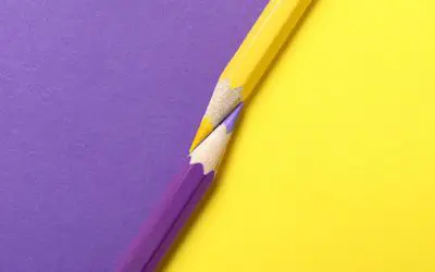
Whats The Opposite Of Purple?
In traditional color theory, the opposite of purple is yellow. Based on the subtractive color model, this relationship creates a striking contrast often used in art and design. However, the precise opposite can vary depending on the shade and tone of color purple.
Understanding Color Opposites
The color wheel
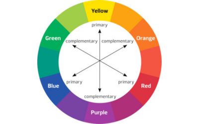
When it comes to color theory, one of the most valuable tools at our disposal is the color wheel.
The color wheel, a circle showcasing a spectrum of colors, is a fundamental guide for understanding how colors relate.
It can be as simple as a 12-color circle or as complex as a color sphere, showing countless hues and tones.
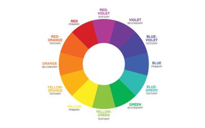
The Basics: Primary, Secondary, and Tertiary Colors
At the core of every color wheel, we encounter the three primary colors; red, blue, and yellow.
They are the original gang, unable to be created by mixing other colors.
Then comes the second generation – the secondary colors. Mix the primaries in pairs, and you get green (blue + yellow), orange (red + yellow), and purple (red + blue).
Mix these primary colors and get the secondary ones: green, orange, and purple.
Finally, mix a primary color with its neighboring secondary color.
You’ll get a tertiary color, like red-orange, blue-green or blue-violet. Each is a testament to the endless possibilities of color mixing.
Understanding complementary colors
The concept of complementary colors, or color opposites, becomes quite interesting.
Complementary colors sit directly opposite each other on the color wheel.
This opposition creates a dynamic visual contrast, making each color seem more vibrant when paired together.
For instance, the complementary color red and green make combinations that produce the most striking contrast imaginable.
Complementary colors don’t just oppose – they enhance, balance, and enliven each other.
That’s the backbone of many visual compositions we encounter daily.
When utilized together, complementary colors spawn an unmatched visual discordance.
Why are these color combinations so captivating to our gaze? The answer lies in the fascinating science at work within our own eyes.
Identifying the Opposite of Purple
The opposite color, in general
Color opposites arise from our eyes’ perception of colors. When our gaze shifts from a specific color to a white surface, we see an afterimage of the opposite color.
This phenomenon, known as color opposition, occurs as our eyes balance colors by seeking contrast and harmony.
Finding the opposite of purple requires consideration of color models and perception.
Traditional color theory suggests yellow as the opposite of purple. But, different color models, such as RGB or CMY, may propose other colors.
This determination involves a complex interplay of light, perception, and personal and cultural factors.
Opposite colors in different color models
Opposite of Purple in RGB
The RGB (Red, Green, Blue) color model is an additive color model used in digital displays.
In this model, the opposite of purple is often approximated as greenish-yellow
RGB creates colors through light emissions, with purple being a mix of red and blue light. Its opposite comprises the remaining primary color, green.
Opposite of Purple in CMY
The CMY (Cyan, Magenta, Yellow) model is subtractive and used in color printing.
Here, colors are formed by subtracting (or absorbing) light from a white background.
In this model, the opposite of purple (or, more accurately, magenta) is green, resulting from subtracting magenta from white light.
Opposite of Purple in RYB
The traditional RYB (Red, Yellow, Blue) model is often taught to children and used in art and design.
Here, the opposite of purple (or violet) is yellow due to the color wheel created by these primary colors.
Each color’s opposite is created by mixing the other two primaries.
Exploring Opposites to Different Purple Hues
Lavender purple
Lavender purple, a delicate shade, finds it’s opposite in pale shades of yellow or yellow-green. These opposite colors form a harmonious palette.
It creates a feeling of tranquillity and calm. This color combination is often applied in designs intending to evoke the freshness of natural landscapes.
Lilac
Lilac, a pinkish hue of purple, pairs well with its opposite, light green. The contrast between these colors is vibrant and balanced, making them an ideal pairing for spring motifs.
Flowers may use this color combination for its inherent freshness and vitality.
Violet
The deep and slightly blue shade of violet has its direct opposite in yellow on the color wheel.
An energizing and dynamic color contrast is created when yellow is used alongside violet.
This bold color pair is popular for its striking visual impact in various creative and artistic applications.
Also read: purple vs violet color
Burgundy
Burgundy is a dark red-purple and a rich hue. It finds its opposite in light, somewhat yellowish-green.
The contrast between burgundy’s depth and the freshness of light green generates a robust, earthy color scheme.
This complementary pair is often used in designs aiming for depth and sophistication.
Magenta
Magenta, a vibrant purplish-red hue, stands opposite green on the color spectrum.
Mix red and blue colors to make magenta, creating a visually striking and high-contrast color scheme.
This combination is favored in modern designs requiring bold, standout color contrasts.
The freshness of magenta’s opposite, green, coupled with the vibrancy of magenta, offers a powerful visual punch.
Grape
Grape is a vibrant and slightly reddish-purple hue. It can be paired with pale shades of yellow-green or light yellow as its opposite colors.
This combination creates a striking contrast and a lively atmosphere. The rich, intense tone of grape purple enhances the energy of the contrasting pale hues.
This color scheme is often utilized to add vibrancy and excitement to designs. The contrasting colors can make a bold statement and create visual interest.
Indigo
Indigo is a deep and dark purple shade leaning towards blue. It finds it’s opposite in pale shades of orange or light peach.
This contrasting palette creates a sense of balance and intrigue.
The rich and intense nature of indigo complements the softness of the pale orange or peach tones.
The result is a visually captivating combination. This color scheme is commonly employed in interior design or artistic compositions.
The contrasting hues can evoke a sense of depth and create a dynamic visual experience.
Mauve
Mauve is a greyish-purple color with a touch of pink. It can be contrasted with pale shades of lime green or light chartreuse. Speaking of which, have you ever wondered what makes lime green?
This pairing generates a harmonious and serene ambiance. The muted and dusty appearance of mauve finds balance and freshness in the softness of the contrasting pale green hues, in case you didn’t know what colors make dusty mauve.
This color combination is often used in decor or branding design.
It conveys a sense of elegance and sophistication. Mauve also offers a touch of natural vibrancy and tranquillity.
Dark purple
Dark purple is a shade teeming with depth and saturation. It contrasts well with bright yellow.
The resulting color scheme is bold and dramatic. It is often employed in designs aiming for a sense of mystery, luxury, or richness. It’s a visually arresting duo that commands attention.
Read also: what is the opposite of brown on the color wheel?
The Relationship Between Yellow, Purple, Blue, and Green
Understanding color relationships
Color relationships play a pivotal role in harmonious design. The color wheel, a tool for understanding these relationships, depicts colors circularly.
Primary colors sit equidistant from each other, with secondary and tertiary colors filling in the spaces between.
Opposite colors on this wheel are considered complementary. For instance, yellow and purple sit across from each other, as do blue and orange.
Green, a secondary color formed by blue and yellow, sits opposite red. These relationships create a natural balance, vital in effective design.

Factors Influencing the Opposite of Yellow
Depending on specific color models, the opposite of yellow can vary between purple and blue.
In the basic color wheel based on subtractive color mixing (RYB model), purple is considered the opposite of yellow.
But, in more modern, additive models (like RGB used in digital screens), the opposite of yellow is blue.
This difference arises from how colors mix and the light conditions they are observed.
Thus, determining the opposite of yellow requires considering the context. It illustrates the importance of understanding color models and their applications.
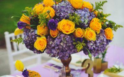
Popular Uses of Purples and Their Opposite Colors
Art and design
Purple and its opposite colors play key roles in art and design due to their psychological and aesthetic implications.
Purple, a blend of calm blue and energetic red, often symbolizes creativity, luxury, and mystery. Complementary to this, yellow brings warmth, optimism, and clarity.
The balance makes the pair popular in graphic design, interior decoration, and branding.
For instance, artists might use purple and yellow contrast to create dynamic compositions.
Likewise, interior designers may introduce yellow accents in purple to create visual interest and balance.
Fashion and styling
In fashion and styling, purple and its opposites are used for their emotional impact and visual appeal.
Purple, associated with elegance and extravagance, often features in luxury fashion. Its opposite, yellow, brings freshness and vibrancy to outfits.
Pairing these colors can lead to unique and eye-catching ensembles. For instance, a purple dress might be accessorized with a yellow belt or bag for a pop of contrast.
A lilac blouse could be paired with a light green skirt to create a soft, harmonious look.
Understanding these color relationships empowers fashion enthusiasts to create impactful and harmonious outfits.
Graphic design and branding
Graphic design and branding are essential in creating a cohesive identity for a company or product.
In graphic design, purple, and its opposite colors play a significant role. They establish a brand’s personality and evoke emotions while creating visual contrast.
Purple is often associated with qualities like creativity, luxury, and spirituality.
Its opposite colors provide a striking contrast, enhancing brand visibility. It as well communicates a sense of balance.
Also, graphic designers can create impactful brand identities by incorporating the vibrant combination of purple and teal mixed.
This pairing and its opposites can be utilized in logo design, color schemes, and marketing materials to evoke a harmonious balance of creativity and professionalism.
Photography and visual arts:
Purple and its opposite colors are usually explored in photography and visual arts. They offer a captivating subject matter and create impactful compositions.
The contrasting combination of purple and its opposites creates striking and dynamic images.
Photographers and artists experiment with color harmonies and explore the interplay between purple and complementary shades.
The dynamic effects achieved through these combinations add depth and visual interest to the artwork.
Through careful consideration and skillful execution, photographers and artists create captivating visuals.
These visuals evoke emotions and leave a lasting impression on the viewers.
Event planning and decor
Incorporating purple and its opposite colors add flair and visual impact. Here are tips for using these hues in event themes and decor.
First, select a dominant shade of purple and pair it with its opposite color for a striking contrast.
Use purple linens, lighting, and floral arrangements to create a cohesive theme.
Stress with complementary hues through centerpieces, table settings, and signage.
Incorporate purple and its opposites in drapery and furniture upholstery for an elegant touch.
Event settings and decorations showcase the effective use of purple and complementary shades. They create a memorable experience for attendees.
Floral arrangements
Purple and its opposite colors add depth, contrast, and visual interest.
Purple flowers, such as lavender, lilac, or violet blooms, bring elegance, tranquillity, and mystery.
Pairing these purple hues with opposite colors creates balanced arrangements. Complementary color combinations provide a pleasant visual experience.
The thoughtful incorporation of purple and its opposite colors elevates the aesthetics of floral arrangements.
FAQs
Is purple the opposite of green?
On the traditional color wheel, the opposite color of green is not purple but red. However, various hues of green can be complemented by colors in the purple to red-violet range. For instance, yellow-green might pair well with a color from the purple and green color spectrum.
Is red the opposite of purple?
No, red is not the opposite of purple. On a traditional color wheel, the direct opposite of purple is yellow. The specific opposite can vary depending on the exact shade of purple. A light shade of purple, like lavender, may have a different complementary color.
Is yellow the opposite of purple?
Yes, yellow is the opposite of purple on traditional color wheels. It is due to the subtractive color mixing theory. Mixing purple and yellow leads to a neutral color. This relationship between purple and yellow is often used in design for high-contrast visuals.
Why is the opposite of yellow on color wheels, sometimes purple and sometimes blue?
The opposite of yellow varies between purple and blue due to different color models. On traditional color wheels, the opposite of yellow is purple. However, blue is the direct opposite of yellow in the RGB color model used in digital screens. The choice depends on the medium and purpose.
What is the opposite of blue?
In traditional color theory, the opposite of blue is orange. A yellow-orange is often the nearest matching color for true blue. They produce a neutral color.
What is the opposite of pink?
In color theory, light green is the opposite of pink (a light shade of red). When these colors are paired together, they create a new and energetic contrast. The balance between pink and light green is often used in various designs for its soothing and harmonious feel.
What is the opposite of dark purple?
In complementary colors, the opposite of dark purple is a shade of yellow or gold. It is based on the traditional color wheel, which operates on the subtractive color model. But, the precise shade of yellow can vary depending on the specific hue and tone of the dark purple. Gold and silver mixed together create a visually striking effect.
What is the opposite of orange?
Blue is the opposite of orange in the traditional color wheel. The complementary colors, are directly across from each other. The pairing of orange and blue creates a striking visual contrast often utilized in art, design, and visual communication.
Conclusion
Exploring color opposites is an intricate task. For instance, yellow-orange is blue’s direct opposite in the subtractive color model.
Meanwhile, the complementary color of dark blue can lean towards a green light.
The color yellow presents another complexity. Depending on the codel, its opposite can be either purple in use.
The nearest matching color name for an opposite color needs a good understanding of the modern color theory.
In essence, exploring color opposites is not just about their beauty.
It’s about their role in creating balanced, visually appealing designs. Each discovery is an added tool for our artistic expression.


Leave a Reply