Colors fascinate us. They stimulate our senses, trigger our emotions, and influence our decisions.
But have you ever wondered what happens when you blend colors? What captivating hue emerges when you mix the calming tranquillity of blue with the mystical depth of purple?
In this article, I will take you on a delightful journey through the prism of color theory, where I’ll unravel the magic of mixing blue and purple.
I will also delve into the stunning shade these colors create together. Ready to indulge your curiosity?
Let’s dive in.
What Color Does Blue And Purple Make When Mixed?
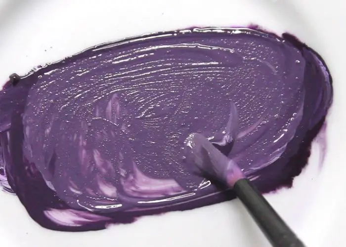
When blue and purple are mixed, they create a stunning color: violet or blue-purple. This hue combines the calming qualities of blue with the richness of purple, resulting in a mesmerizing shade. The specific tone of violet may vary based on the ratios of blue and purple. It evokes creativity, spirituality, and an enchanting atmosphere.
Understanding Color Basics
Primary colors
The primary colors are the building blocks of all other colors. These colors cannot be created by mixing others. They are red, blue, and yellow.
Think of them as the pillars of the color universe – essential and irreplaceable.
Secondary colors
When primary colors hold hands, secondary colors are born. Mix two primary colors, and you’ll get a secondary color: green (blue + yellow), orange (red + yellow), or purple (red + blue).
They’re the harmonious offspring of the primaries’ union.
Tertiary Colors
Tertiary colors are the next generation, formed when a primary color dates a secondary color. The result? Colors like red-orange, yellow-green, or blue-purple.
They create a rich shade tapestry that adds depth and complexity to our color palette.
The color wheel

The color wheel is a vibrant, circular display. It presents all colors — primary, secondary, and tertiary — in a clear, accessible manner.
Think of it as a rainbow bent into a full circle. In a dynamic palette, colors flow seamlessly from one to another.
But the color wheel is more than just a spectrum. It tells a visual story of the relationships between colors. It shows us how different hues blend, contrast, and harmonize.
In essence, it’s the Rosetta Stone of the color world. Artists, designers, and color enthusiasts use it as a crucial tool. It helps decode the complex language of hues and makes sense of color interactions.
What is the Color Blue?
Color: Blue
RGB Code: (0, 0, 255)
Hexadecimal Code: #0000FF
CMYK Code: (100%, 100%, 0%, 0%)
HSL Code: (240, 100%, 50%)

Blue is the color of serene oceans and vast skies, epitomizing tranquillity and stability. It can invoke calmness and serenity, taking us on a peaceful mental journey.
Blue is the opposite color to brown and is often linked with qualities like depth and wisdom, representing loyalty as constant as the sky above.
So, every time you meet the cloudless sky or tranquil sea, remember the calming charm of blue.
What is the Color Purple?
Color: Purple
RGB Code: (128, 0, 128)
Hexadecimal Code: #800080
CMYK Code: (50%, 100%, 0%, 50%)
HSL Code: (300, 100%, 25%)

Purple is a vibrant color that graces twilight skies and amethysts. It embodies mystery, creativity, and royalty.
Color purple merges the fierce energy of red with the tranquil charm of blue, striking a perfect balance between opposite forces.
Purple symbolizes luxury, spirituality, and introspection. Its scarcity in nature only enhances its mystical allure.
What Color Does Blue And Purple Make When Mixed?
When you mix purple and blue, they birth a captivating color known as blue-purple or purplish-blue.
The Blue-purple hue is a harmonious blend of the depth and richness of purple with the calming qualities of blue.
The resulting color varies depending on the specific shades and proportions used in the mixture.
It often falls within the range of violet or lavender. Blue-purple showcases an appealing combination of blue and purple pigments.
Mixing these two colors creates a unique shade encapsulating the tranquillity of blue and the enchantment of purple.
How to Mix Blue and Purple
To mix blue and purple, follow a simple process:
- Start with your base blue color. Use a paint palette or mixing dish to ensure accurate measurements.
- Gradually add small amounts of purple to the blue color. Begin with a small quantity to control the intensity of the resulting mixture.
- Mix the colors thoroughly using a palette knife or a brush. Blend them until you achieve the desired shade of blue-purple.
- Adjust the proportions as needed. If the mixture appears too blue, add more purple. If it looks too purple, add a touch of blue.
- Continuously assess and refine the color until you achieve the perfect blend of blue and purple that satisfies your artistic vision.
Factors affecting the resulting color
Here are some key considerations:
- Proportions: The ratio of blue to purple will determine the dominance of each color in the mixture. Adjusting the proportions shift the resulting color towards a more blue or purple hue.
- Intensity: The intensity of the blue and purple colors will impact the resulting blend’s vibrancy. Mixing saturated colors will yield a more vivid blue-purple. Using more muted or pastel shades will result in a softer tone.
- Pigments and Paints: Different paints may have colour properties variations. Experimenting with different brands or types leads to different results.
- Lighting Conditions: Lighting influence how we perceive colors. Lighting conditions affect the perceived appearance of the blue-purple blend.
Different Shades and Tints of Blue-Purple
Indigo
Hex: #4B0082
RGB: (75, 0, 130)
CMYK: (42, 100, 0, 49)
This intense shade of blue-purple mirrors the mysterious allure of the night sky. It exudes a sense of depth and sophistication.
Navy blue
Hex: #000080
RGB: (0, 0, 128)
CMYK: (100, 100, 0, 50)
Like the vast expanse of a midnight ocean, the navy brings a sense of depth and peacefulness to blue-purple. Its dark and velvety tones evoke a sense of mystery and elegance.
Cobalt blue
Hex: #0047AB
RGB: (0, 71, 171)
CMYK: (100, 58, 0, 33)
Vibrant and vivid, cobalt blue-purple commands attention. It emanates a brilliant radiance electrifying the senses. The cobalt blue shade adds a pop of energy to the blue-purple spectrum, infusing it with dynamism.
Royal blue
Hex: #4169E1
RGB: (65, 105, 225)
CMYK: (71, 53, 0, 12)
Regal and majestic, royal blue-purple exudes an aura of grandeur and luxury. Its deep, rich hue combines the nobility of blue with the allure of purple.
If you want to work with this shade well, know what colors make royal blue to explore different tones.
Periwinkle
Hex: #CCCCFF
RGB: (204, 204, 255)
CMYK: (20, 20, 0, 0)
With its delicate charm, periwinkle blue-purple captures the essence of blooming flowers. This light and subtle shade bring a sense of tranquillity and grace, evoking images of gentle petals dancing in the breeze.
Lavender
Hex: #E6E6FA
RGB: (230, 230, 250)
CMYK: (8, 8, 0, 2)
Pale and serene, lavender adds a touch of quietness to blue-purple. This gentle tint creates a calming effect, evoking a sense of serenity akin to a blooming lavender field.
Lilac
Hex: #C8A2C8
RGB: (200, 162, 200)
CMYK: (20, 36, 0, 22)
Soft and light, lilac infuses blue-purple with a delicate hint of pink. Reminiscent of blossoming lilac flowers, the tint radiates a sense of grace and elegance, adding a whimsy touch to the color palette.
Sky blue
Hex: #87CEEB
RGB: (135, 206, 235)
CMYK: (42, 12, 0, 8)
Sky blue’s delicate and light tint blends the freshness of blue with a subtle hint of purple. It evokes a sense of open skies and vast horizons, filling the blue-purple spectrum with fresh air.
(Here is a guide on how to make sky blue color).
Mauve
Hex: #E0B0FF
RGB: (224, 176, 255)
CMYK: (12, 31, 0, 0)
With its muted and dusty undertones, mauve adds a vintage charm to blue-purple. This understated tint exudes subtle sophistication. It also captures a sense of nostalgia and refined elegance.
Powder blue
Hex: #B0E0E6
RGB: (176, 224, 230)
CMYK: (23, 2, 0, 10)
This delicate tint imparts a soothing and serene quality to blue-purple. It evokes a sense of comfort and tranquillity, akin to the gentle touch of a soft breeze or the subtle hue of a morning sky.
Table: Shades Resulting from Blue and Purple Mixed
| Shade Name | Hex # | RGB Code | CYMK Code | Color |
| Indigo | #4B0082 | (75, 0, 130) | (42, 100, 0, 49) | color |
| Navy blue | #000080 | (0, 0, 128) | (100, 100, 0, 50) | color |
| Cobalt blue | #0047AB | (0, 71, 171) | (100, 58, 0, 33) | color |
| Royal blue | #4169E1 | (65, 105, 225) | (71, 53, 0, 12) | color |
| Periwinkle | #CCCCFF | (204, 204, 255) | (20, 20, 0, 0) | color |
| Lavender | #E6E6FA | (230, 230, 250) | (8, 8, 0, 2) | color |
| Lilac | #C8A2C8 | (200, 162, 200) | (20, 36, 0, 22) | color |
| Sky blue | #87CEEB | (135, 206, 235) | (42, 12, 0, 8) | color |
| Mauve | #E0B0FF | (224, 176, 255) | (12, 31, 0, 0) | color |
| Powder blue | #B0E0E6 | (176, 224, 230) | (23, 2, 0, 10) | color |
Other Color Combinations with Blue and Purple
Color combinations with blue and purple are endless. Here are some ideas to consider:
Blue and Purple with Pink
Pairing blue and purple with pink create a delightful blend of cool and warm tones.
The combination range from soft and delicate pastels to vibrant and bold contrasts.
This energetic color scheme adds a touch of femininity and vibrancy to designs.
Blue and Purple with Turquoise
Combining blue and purple with turquoise results in a refreshing color palette. These cool tones create a serene atmosphere reminiscent of tropical waters.
It brings a sense of tranquillity and relaxation to any design.
Blue and Purple with Teal
Mixing teal and purple with blue results in a dynamic and balanced palette, where the vibrant presence of teal enhances the coolness of blue and purple.
This blend evokes a sense of depth and sophistication while infusing a touch of energy and intrigue into any design or setting.
Blue and Purple with Green
Mixing blue and green with purple evoke a connection to nature and the great outdoors. This combination represents a balanced palette.
It captures the essence of lush gardens and landscapes. Whether using soft pastel shades or rich jewel tones, it creates a harmonious blend of cool and earthy tones.
Does Blue-Purple Have a Meaning?
Blue-purple color, carries symbolic meanings associated with its constituent colors: blue and purple.
Blue represents tranquillity, stability, and depth, while purple symbolizes mystery, creativity, and royalty.
Blue-purple represents a harmonious balance of calmness, depth, and creativity with a touch of regality.
It is an ideal color choice to convey a sense of calm creativity and add elegance and sophistication to visual designs.
Creating Different Shades of Blue-Purple
Techniques for making blue-purple lighter
Dilution: To achieve a lighter blue-purple shade, add white or a lighter shade of blue to the base color. Mix it in small increments until the desired lightness is achieved. This method allows for precise control over the lightening process.
Tinting: Incorporate a small amount of a light pastel color, such as pale pink or lavender, into the blue-purple. Experiment with different proportions to achieve the desired level of lightening. Tinting adds a subtle touch of another hue while maintaining a blue-purple tone.
Layering: Apply a translucent layer of white or a lighter shade of blue-purple over the base color. This technique allows the underlying hue to show, creating a lighter appearance. Layering provides depth and dimension to the blue-purple shade.
Methods for making blue-purple darker
Mixing: introduce small amounts of dark purple paint or darker shades of blue to the base color. Adjust the proportions until the desired darkness and intensity are achieved. Mixing offers flexibility in customizing the depth of the blue-purple shade.
Glazing: Apply thin layers of a dark blue or purple glaze over the blue-purple base. Build depth and richness, allowing the underlying color to shine through. Glazing adds depth and a subtle sheen to the blue-purple hue.
Toning: Incorporate a small amount of black or dark complementary colors, such as dark green or deep red, into the blue-purple mixture. Adjust the proportions to achieve the desired darkening effect. Toning creates a more intense and moody variation of blue-purple.

Understanding Color Models
Color models provide a systematic approach to representing and manipulating primary and secondary colors. Here are three commonly used color models:
RYB (Red, Yellow, Blue)
RYB is a traditional color model used in artistic contexts. It is based on the primary colors of red, yellow, and blue.
Mixing these colors produces secondary colors: orange, green, and purple. RYB color model is intuitive for traditional artistic techniques.
RGB (Red, Green, Blue)
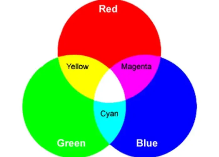
RGB is an additive color model used in digital media and displays. It is based on the primary colors of red, green, and blue. The RGB model creates colours by combining different intensities of these primary colors.
Mixing RGB colors at varying intensities can achieve a wide spectrum of colors. RGB is used in computer screens, televisions, and digital imagery.
CMYK (Cyan, Magenta, Yellow, Key/Black)
CMYK is a subtractive color model used in printing and graphic design. It is based on the primary colors of cyan, magenta, and yellow, with the addition of black (Key).
In CMYK, colors are subtracted from white light to create different hues. Mixing these colors subtracts wavelengths of light, resulting in a broader color range.
CMYK is used in printing to achieve a full range of colors.
Note:
These color models influence color perception and mixing in several ways. They provide a standardized framework for color representation.
They also allow for consistency in color reproduction across different devices and media.
Understanding color models helps communicate color specifications between various systems and industries.
Each model follows specific color mixing rules. For example, mixing red and green in RGB produces yellow.
In CMYK, combining cyan and magenta produces blue. Understanding these color-mixing principles helps achieve desired color outcomes.
Color models can influence the limitations of each color perception. RGB has a wider color gamut.
It can produce more vibrant and intense colors suitable for digital displays.
CMYK has a narrower gamut, and certain colors may appear different when translated from RGB to CMYK for printing.
Perception of Color by The Human Eye
The perception of color by the human eye is complex. It involves the interaction between light, the eye’s structure, and the brain’s interpretation.
When light enters the eye, it passes through the cornea. The cornea helps focus the light onto the retina, which contains cells called cones. These cones are responsible for detecting color.
The cones in the retina are sensitive to three primary light colours: red, green, and blue.
Each color corresponds to a specific type of cone: red cones, green cones, and blue cones.
The brain processes the information when light stimulates these cones in different combinations and intensities. As a result, we perceive various colors.
The brain also considers factors such as lighting conditions, surrounding colors, and individual differences in color perception.
These factors influence how colors are perceived and interpreted by different individuals.
It’s important to note some people may have color vision deficiencies, known as color blindness.
These deficiencies affect the perception of certain colors. They also affect the ability to distinguish between certain hues.
Violet vs Purple: What’s the Difference?
Violet and purple are often used interchangeably. They have distinct characteristics setting them apart.
Violet color occupies a shorter wavelength range in the visible light spectrum. It is closer to blue and has a higher frequency.
Violet is a deep and vibrant hue, ranging from rich purples with blue undertones to lighter shades with a pinkish tint. It is often associated with elegance, creativity, and spirituality.
Purple is a broader term that encompasses a wider range of colors. It is created by combining blue and red.
Purple includes shades from light lavenders to deep, dark violets. It is often associated with royalty, luxury, and power.
While violet is a specific color within the spectrum, purple is a broader category. It includes shades created by combining different colors.
In essence, violet is a subset of purple. But, the distinction between the two can be subjective.
They may vary depending on cultural interpretations and personal preferences.
Also read: indigo vs violet color
Read this article to learn What colors to make violet.
Designing with Blue and Purple
Designing with blue and purple allows for many creative possibilities. Here are some tips and ideas to consider:
Balance the intensity: Blue and purple can be bold and captivating colors. Ensure a balanced composition by considering the intensity of each shade.
You can pair a vibrant blue with a softer purple or vice versa to create visual harmony.
Create contrast: Combine blue and purple with contrasting colors to make them stand out. Yellow, orange, or green contrast strikingly, creating a dynamic and eye-catching design.
Experiment with different combinations to find the right balance of contrast and harmony.
Mood and symbolism: Blue is often associated with calmness, tranquillity, and reliability. Purple represents creativity, mystery, and royalty.
Select shades of blue and purple according to the mood and symbolism you want to convey in your design.
Color proportions: Determine the proportions of blue and purple in your design based on the desired visual impact.
A dominant blue with accents of purple creates a serene and balanced composition.
A dominant purple with hints of blue adds depth and intrigue to your design.
Use gradients and transitions: Blend shades of blue and purple in transitions to create a smooth visual effect.
This technique can be particularly effective in backgrounds, illustrations, or digital designs.
Consider the context: Consider how your design will be used. Blue and purple evoke different emotions and perceptions in various contexts.
Consider the target audience, purpose, and environment to ensure your design communicates its intended message.
FAQs
Does purple and blue go together?
Yes, purple and blue make a good combination. They are both cool colors and can create a serene and calming color combination. These colors often share similar tonal qualities and create a cohesive and blended effect. The blue’s coolness and the purple’s depth complement each other.
What is the color blue-violet?
Blue-violet is a shade between blue and violet on the color spectrum. It combines the coolness of blue with the vibrancy of violet. The tertiary color, blue-violet, possesses qualities of both colors. It offers a striking, unique blend that can evoke a sense of depth and intensity.
Do light blue and purple go together?
Yes, light blue and purple can go together in a design. The softness of light blue creates a gentle and soothing backdrop. Including gentle purples like lilac or lavender can enhance the dreamy and youthful aesthetic. This combination evokes a sense of tranquillity and creates a calming and serene palette.
Does purple and red make blue?
Purple and the primary colors red do not make blue when mixed. The combination of purple and red produces a color called magenta. Magenta is a vibrant purplish-red hue that falls between the two colors on the color spectrum. It has distinct characteristics and is not equal to the color blue. Purple mixed with red results in shades of purplish-red or magenta rather than blue.
Does blue and purple make pink?
No, blue and purple do not make pink when mixed. The combination of blue and purple results in shades of blue-purple, not pink. Pink is created by mixing red and white. Blue and purple produce a range of cool-toned colors within the blue-purple spectrum. If you desire a pink hue, mix red with white rather than relying on a combination of blue and purple.
What color does blue and pink make?
When blue and pink are mixed, they create various shades of purple. The exact shade of purple obtained will depend on the specific proportions of blue and pink used in the mixture. The combination of blue and pink combines the cool tones of blue with the warm tones of pink.
What color does blue, red, and purple make?
Combining blue, red, and purple creates a complex blend of various colours. They depend on the proportions used. It can result in various shades of purplish-red or magenta, with undertones of blue. The final color obtained will depend on the mixture’s specific shades and quantities of blue, red, and purple.
Conclusion
The captivating colors blue and purple can be used individually or in combination to create appealing designs.
They offer a wide range of shades and tones. They thus bring depth, tranquillity, and elegance to artistic endeavors.
Understanding color models enhances the design process, allowing you to unleash your creativity.
Experiment with different shades, combinations, and proportions of blue and purple to unlock their potential.
Let these colors be your artistic companions, guiding you towards stunning and impactful creations.
Embrace the beauty of blue and purple in your designs and let your creativity soar.




Leave a Reply