When it comes to the world of colors, the blending of hues often sparks curiosity and intrigue.
Among the countless combinations, the question of what color pink and blue create when mixed arises.
The fusion of these two colors unlocks a realm of possibilities. In this blog post, I’ll embark on a journey to explore the magic that occurs when pink and blue intertwine.
I’ll also cover a bit of color mixing theory and color models. So, let’s unravel the mystery and discover the answer to the question “What color does pink and blue make when mixed?”
See: What color does green and pink make when mixed ?
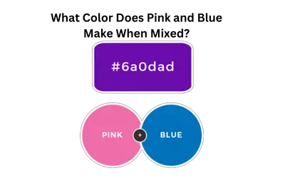
What Color Does Pink and Blue Make When Mixed?
Pink and blue make the color purple when mixed. However, the resulting color will vary depending on the specific shades used. The intensity of the pink and blue hues and the proportions in which they are mixed can influence the exact shade of purple achieved.
Understanding the Color Pink
Pink, a color often associated with femininity, tenderness, and romance, holds a special place in the visual spectrum.
Let’s explore the color composition and origin of pink, as well as its representation in various color models.
Color composition and origin
To make pink, mix red with varying amounts of white. It’s a tint or a pastel color.
The specific shade of pink can range from pale and delicate to vibrant and intense.
In digital design and web development, to identify what two colors make pink paint, the colors are often represented using HEX codes, RGB codes, and CMYK codes.
The HEX code for pink is #FFC0CB. This code represents the combination of red (FF), green (C0), and blue (CB) in the RGB color model.
In the RGB color model, pink is created by combining red, green, and blue light in specific intensities.
The RGB code for pink is (255, 192, 203), with each value representing the intensity of the respective color component on a scale of 0 to 255.
In print and graphic design, colors are often represented using the CMYK color model. This stands for Cyan, Magenta, Yellow, and Key (black).
The CMYK code for pink varies depending on the specific shade, but it involves a combination of magenta and white.
The most popular shades of pink are light pink, bubblegum pink, coral pink, dusty pink, fuchsia, rose pink, magenta and hot pink.
See: How to make pastel colors
Psychological associations and symbolism
Often associated with femininity, pink evokes feelings of tenderness, nurturing, and compassion. It represents qualities such as gentleness, sensitivity, and empathy.
This is why many people link it to emotions and relationships. Pink also symbolizes love, romance, and affection, evoking feelings of sweetness and intimacy.
Its soft and calming nature can create a sense of relaxation and soothe the mind.
Pink is often associated with youthfulness, innocence, and playfulness, reminding us of the carefree and joyful spirit of childhood.
Additionally, pink promotes feelings of self-love, self-care, and emotional well-being. It can be used to convey a sense of positivity, optimism, and warmth.

Understanding the Color Blue
Color composition and origin
Blue is a primary color, meaning it is not created by mixing other colors together. It is often associated with the vastness of the sky and the depth of the ocean.
Blue is the opposite color of brown on the color wheel, and they are, therefore complementary colors.
From light baby blue, mint blue to deep navy, blue comes in a wide range of shades and tones.
The HEX code for blue varies depending on the shade, but a common representation is #0000FF.
This code signifies the combination of red (00), green (00), and blue (FF) in the RGB color model.
In the RGB color model, blue is created by combining different intensities of the RGB colors. The RGB code for pure blue is (0, 0, 255), with the blue component having the highest intensity.
In print and graphic design, colors are often represented using the CMYK color model. The CMYK code for blue depends on the specific shade.
Generally, it involves a combination of cyan, magenta, and black (key) in varying proportions.
Blue’s soothing and cool nature makes it a versatile color that is used across different industries, including technology, healthcare, and finance.
The common shades of blue are: baby blue, sky blue, navy blue, cobalt blue, ultramarine blue, powder blue, and royal blue (We have a detailed guide for you on how to make a royal blue color).
Psychological associations and symbolism
Blue carries a myriad of psychological associations and symbolism. This shapes our perception and emotional response to this captivating color.
Often associated with feelings of calmness, peace, and tranquility, blue has a soothing effect on the mind and body.
It evokes a sense of serenity and stability, offering a respite from the chaos of daily life.
Blue is also linked to trustworthiness, reliability, and professionalism. Now you know why it’s a popular choice in corporate settings.
Its associations with the vastness of the sky and the depths of the ocean evoke feelings of expansiveness, freedom, and exploration.
Blue also enhances focus, concentration, and intellectual pursuits. It is also associated with feelings of loyalty, sincerity, and integrity.

Color Models
Color models are systems that define and organize colors, enabling us to capture and reproduce them.
These models provide a structured way to describe and represent colors using a set of parameters or components.
RGB color model
The RGB color model is a system used to represent colors on electronic displays and in digital imaging. It stands for Red, Green, and Blue, which are the primary colors used in this model.
The RGB color model is based on the additive color mixing principle. This is where different intensities of red, green, and blue light combine to create a wide range of colors.
In the RGB model, each color channel (red, green, and blue) is represented by an intensity value ranging from 0 to 255.
A value of 0 means no intensity or absence of that color. 255 represents the maximum intensity of that color channel.
By varying the intensities of red, green, and blue, you achieve different colors.
For example, pure red is represented as (255, 0, 0), indicating the maximum intensity of red and no intensity of green and blue. Pure green would be (0, 255, 0), and pure blue would be (0, 0, 255).
Combining these primary colors in varying intensities allows for the creation of secondary colors.
CMYK color model
The CMYK color model, also known as the four-color model, is a subtractive color model used in printing and graphic design.
CMYK stands for Cyan, Magenta, Yellow, and Key (Black), which are the primary colors in this model.
The CMYK model begins with white and subtracts ink to achieve colors. It’s based on the principle that when you apply different colored inks in layers, they absorb or subtract certain wavelengths of light.
In the CMYK model, each color is represented by a percentage value ranging from 0 to 100. The percentage value indicates the amount of ink coverage for each color channel.
A value of 0 means no ink coverage or absence of that color, while 100 represents maximum ink coverage.
By combining different percentages of cyan, magenta, yellow, and black, you can achieve a wide range of colors.
For example, to create red, combine magenta and yellow inks. To make green mix cyan and yellow.
By varying the proportions of each ink, you get different hues and shades.
The black channel, known as the Key color, is added to the CMY colors to improve contrast, and detail, and to create a deeper black. It’s commonly used in printing to enhance text and line art.
The CMYK color model is essential in print production as it ensures accurate color representation. It also allows designers to preview how colors will appear on the final printed materials.
How Do Our Eyes Perceive Color?
The perception of color is a fascinating phenomenon, tied to the workings of our eyes and our brain.
Our eyes contain cells called cones that help in color vision. These cones are sensitive to three primary colors of light: red, green, and blue.
When light enters our eyes, it interacts with these cones, that send information to the brain for interpretation.
The three types of cones, often referred to as red, green, and blue cones, respond to different wavelengths of light.
Red cones are most sensitive to longer wavelengths, green cones to medium wavelengths, and blue cones to shorter wavelengths.
By analyzing the combined signals from these cones, our brain can determine the specific color we perceive.
The perception of different colors arises from the relative activation and stimulation of these cones.
For example, when we see a red object, the red cones in our eyes are most strongly stimulated, while the green and blue cones are less active.
Our eyes and brain work together to process and interpret the signals received from these cones. This allows us to distinguish an extensive range of colors.
Additionally, our visual system also takes into account factors such as brightness, contrast, and context to enhance our perception of color.
Remember, color perception varies among individuals. This may be due to factors like color blindness, which occurs when one or more types of cones are deficient or absent.
Color Mixing Theory
Color mixing is the process of combining different colors to create new colors or achieve desired hues. It’s a fundamental concept in art, design, and visual perception.
Two primary methods of color mixing are additive color mixing and subtractive color mixing. Each has its own principles and applications.
Additive color mixing
Additive color mixing is based on the principle of adding colored lights together to create new colors. It’s used in electronic displays, such as computer screens, televisions, and stage lighting.
In this model, the primary colors are red, green, and blue (RGB). When you combine red, green, and blue light at full intensity, you create a white light.
By adjusting the intensity of each primary color, you achieve different shades and hues.
For example, mixing red and green light at full intensity produces yellow light, while red and blue light creates magenta light.
Additive color mixing is referred to as “additive” because the more light is added, the brighter the resulting color becomes. This principle is the basis for the RGB color model used in digital devices.
Subtractive color mixing
Subtractive color mixing involves combining pigments or dyes to achieve different colors. It’s commonly used in traditional painting, printing, and mixing physical colorants.
In this model, the primary colors are cyan, magenta, and yellow (CMY).
When you mix cyan, magenta, and yellow pigments at full intensity, they absorb all wavelengths of light, resulting in a black color.
By selectively subtracting certain wavelengths of light, different colors are produced.
For example, mixing cyan and yellow pigments creates green, while combining magenta and yellow pigments results in red.
Subtractive color mixing is referred to as “subtractive” because each pigment absorbs certain wavelengths of light. The subtractive color model is used in printing processes.
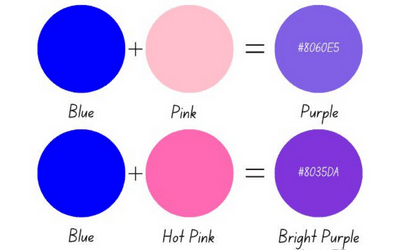
What Color Do Blue and Pink Make in Paint?
Blue and pink make the color purple when mixed in paint. The exact shade of purple obtained will depend on the specific shades of blue and pink used and the proportions in which they are mixed.
Blue is a primary color, and pink is often created by mixing red and white. When you combine these colors, the blue contributes its cool undertones, while the pink adds warmth.
The resulting mixture is a blend of the two colors, creating various shades of purple ranging from light lavender to deep violet.
Experiment with different ratios and shades to yield a range of beautiful purple hues.
What Color Do Blue and Pink Make in Lights?
Blue and pink make the color magenta or purplish-pink when mixed in light.
In the additive color model, blue is associated with shorter wavelengths of light, while pink is associated with longer wavelengths.
When these two colors combine, blue light stimulates the blue-sensitive cones in our eyes, while pink light stimulates the red-sensitive cones.
The overlapping stimulation of these cones results in our perception of a purplish-pink color.
The specific shade of magenta or purplish pink will depend on the intensity and proportions of the blue and pink lights used in the mixture.
How to Mix Blue and Pink
Here are the steps to follow when mixing blue and pink:
Step 1: Start with the base colors. Prepare separate portions of blue and pink paint. Have a palette or mixing surface where you can easily blend the colors.
Step 2: Mix the colors. Begin by adding a small amount of blue paint to the pink paint. Use a palette knife, brush, or any mixing tool to blend the colors together.
Start with a small quantity of blue to gauge the desired shade.
Step 3: Observe the resulting color. As you mix pink and blue, observe the color that forms. The exact shade of purple or violet will depend on the specific hues of blue and pink used, as well as the ratios and intensity of each color. (Here’s how we can make violet color).
Step 4: Adjust as needed. If the resulting color is not what you desire, you can make adjustments. Add more blue paint for a deeper purple or pink for a lighter shade.
Keep mixing and experimenting until you achieve the desired hue.
Step 5: Test and evaluate. Apply a small amount of the mixed color to a surface or paper to see how it looks. Test the color in different lighting conditions to get a better understanding of its appearance.
Making Tints and Shades of Purple
Creating lighter and darker variations of purple involves adjusting the intensity or value of the color. Here’s how you can mix lighter and darker shades of purple:
Mixing lighter purple
Start with your base purple color. Begin with the shade of purple you want to lighten. This could be a deep purple or a medium purple.
Add white gradually. Take a small amount of your base purple color and gradually mix in small increments of white paint. Mix thoroughly after each addition to ensure a smooth blend.
Assess the color. Continuously evaluate the color as you add white. Keep adding white until you achieve the desired lighter shade of purple.
The more white you add, the lighter the tint of purple will become.
Test and adjust. Apply a small amount of the mixed color to a surface or paper to see how it looks. If it’s not light enough, continue adding white until you achieve the desired tint of purple.
Mixing darker purple
Begin with your base purple color. Start with the shade of purple you want to darken. This could be a medium or light purple.
Introduce a darker hue. To get a rich purple, you can add a small amount of a darker color like blue or black to your base purple. Start with a small quantity and mix it in, ensuring a thorough blend.
Evaluate the color. As you add the darker hue, assess the color to see if it’s becoming the shade of darker purple you desire.
Adjust the amount of the darker color based on your preferences and the intensity you wish to achieve.
Test and refine. Apply a small amount of the mixed color to a surface or paper to see how it appears. Make any necessary adjustments by adding more of the darker color until you achieve the desired shade of darker purple.
History of Purple
Purple has a captivating history that stretches back centuries. In ancient civilizations, purple dye extracted from mollusks was a coveted luxury.
It symbolized wealth and power. Throughout time, purple became associated with royalty.
The Roman emperors and medieval nobility adorned themselves in purple garments.
The color also holds religious significance, representing penance in Christianity and divine authority in Byzantine culture. Today, purple is still regarded as a color of elegance, creativity, and spirituality.
Its rich history and cultural associations make purple a hue that continues to captivate and inspire.
Shades of Purple
Here are a few examples of the many shades of purple that exist. Each shade has its unique characteristics and can evoke different moods and emotions.
| Shade | HEX code | RGB code | CMYK code | Color |
| Lavender | #E6E6FA | 230, 230, 250 | 8, 8, 0, 2 | color |
| Lilac | #C8A2C8 | 200, 162, 200 | 0, 19, 0, 22 | color |
| Mauve | #E0B0FF | 224, 176, 255 | 13, 31, 0, 0 | color |
| Amethyst | #9966CC | 153, 102, 204 | 25, 50, 0, 20 | color |
| Violet | #8F00FF | 143, 0, 255 | 44, 100, 0, 0 | color |
| Orchid | #DA70D6 | 218, 112, 214 | 0, 49, 2, 15 | color |
| Plum | #DDA0DD | 221, 160, 221 | 0, 28, 0, 13 | color |
| Eggplant | #614051 | 97, 64, 81 | 0, 34, 16, 62 | color |
| Magenta | #FF00FF | 255, 0, 255 | 0, 100, 0, 0 | color |
| Grape | #6F2DA8 | 111, 45, 168 | 34, 73, 0, 34 | color |
| Mulberry | #C54B8C | 197, 75, 140 | 0, 62, 29, 23 | color |
| Royal purple | #7851A9 | 120, 81, 169 | 29, 52, 0, 34 | color |
| Byzantium | #702963 | 112, 41, 99 | 0, 63, 11, 56 | color |
| Heather | #B487B2 | 180, 135, 178 | 0, 25, 1, 30 | color |
| Wisteria | #C9A0DC | 201, 160, 220 | 9, 27, 0, 14 | color |
Here’s how to make the lavender color.
Purple Meaning
Purple is a color-rich in symbolism and holds various meanings across cultures and contexts. Here are some common meanings associated with the color purple:
- Royalty and power
- Spirituality and mysticism
- Creativity and imagination
- Wisdom and dignity
- Individuality and uniqueness
- Transformation and spirituality
- Femininity and romance
Purple vs. Violet
Violet and purple have distinct differences that stem from their origin and perception. The key distinction is the fact that violet is a true color whereas purple is a secondary color.
True colors, such as the three primary colors (red, blue, and yellow), cannot be obtained by mixing other colors. In contrast, purple is formed by a mixture of red and blue pigments.
Another difference lies in how we perceive these colors on the visible light spectrum. The visible light spectrum comprises a range of colors, including red, yellow, green, violet, orange and blue colors.
Our eyes have cones, which help us detect colors accurately, and they are sensitive to short, medium, and long wavelengths of light.
Short wavelengths are perceived as blue, medium wavelengths as green, and long wavelengths as red.
Violet, as a spectral color, falls within the visible light spectrum at a wavelength of around 380 nanometers.
Purple is not part of the visible spectrum but is a result of our brains interpreting a mixture of blue and red light.
So, while violet is a standalone color with a specific wavelength, purple is a secondary color.

Application of Color Purple
The color purple has various applications and can be used in different contexts. Here are some common applications of the color purple:
Art and design. Purple creates visual interest, evokes emotions, and conveys specific meanings. It can be used as a dominant color or as an accent to add depth and contrast to a composition.
Fashion and clothing. Purple is a versatile color in the realm of fashion. It can be found in a range of clothing items, accessories, and footwear.
Branding and marketing. Purple is often used in branding and marketing to create a distinctive and memorable identity. It is commonly associated with qualities such as creativity, innovation, and sophistication.
Interior design. Purple can be incorporated into interior design to create different atmospheres and moods. Lighter shades of purple can add a soft and soothing touch to a space. Dark purple shades create a sense of richness and opulence.
Psychology and healing. Some believe that colors, including purple, can have psychological and healing effects. Purple is associated with qualities such as spirituality, introspection, and balance.
Why is it Difficult to Mix a Perfect Purple?
Mixing a perfect purple color can be challenging due to a few reasons:
Color perception: The perception of color varies from person to person. This makes it difficult to agree on what forms a “perfect” purple.
Color mixing theory: Purple is a secondary color, created by mixing equal parts of blue and red. Achieving a true purple can be challenging because the colors used for mixing may have variations.
Slight differences in the shades of blue and red used can result in a different shade of purple.
Pigment quality: The quality and characteristics of the pigments used can affect the outcome of mixing colors. Some pigments may have inherent biases towards certain hues.
Transparency and opacity: Different pigments have varying levels of transparency and opacity. When mixing colors, the transparency or opacity of the pigments can influence the final result.
This can make it challenging to achieve a consistent and uniform shade of purple.
Lighting conditions: The lighting under which colors are viewed impacts their appearance. Colors can appear different under various lighting conditions. This variability in lighting can make it difficult to perceive and reproduce a “perfect” purple.
Color mixing techniques: The way colors you mix colors can also affect the outcome. Mixing colors too vigorously or inadequately can result in uneven blending and a less desirable shade of purple.
An Easier Method for Mixing Purple
An easier method for mixing purple involves using pre-mixed purple pigments or using a primary color mixing approach. Here’s a step-by-step guide:
1. Pre-mixed purple pigments
One of the easiest ways to achieve a consistent purple color is by using pre-mixed purple pigments available in art supply stores.
These pigments are specifically formulated to create a stable and reliable shade of purple.
2. Primary color mixing
If you prefer to mix your own purple color using primary colors, follow these steps:
a. Start with equal amounts of red and blue paint on your palette. Use a palette knife or brush to ensure equal proportions.
b. Gradually mix the red and blue together using gentle strokes.
c. Assess the resulting color and make adjustments as needed. If the mixture appears too blue, add a small amount of red and mix it in.
If it appears too red, add a touch of blue and blend again. Continue adding small amounts of red or blue until you achieve the desired shade of purple.
d. Remember to observe the color under consistent lighting conditions to ensure accuracy.
Can You Mix Colors to Make Blue and Pink?
Yes, you can mix colors to create blue and pink. Here’s how you can achieve each color:
Blue
To create blue, you need to mix the primary colors cyan and magenta. Here’s a step-by-step guide:
1. Start with equal amounts of cyan and magenta paint or pigment on your palette.
2. Gradually mix the cyan and magenta together using gentle strokes. The resulting mixture should yield a shade of blue.
3. Assess the color and make adjustments as needed. If the mixture appears too greenish, add a touch more cyan. So, first, know how to make cyan color paint in enough supply.
If it appears too purplish, add a little more magenta. Experiment until you achieve the desired shade of blue.
Pink
You can create pink by mixing white with a small amount of red. Here’s how to create hot pink:
1. Start with white paint or pigment on your palette.
2. Add a small amount of red to the white. Start with a little red and gradually increase the amount until you achieve the desired shade of pink.
3. Mix the red and white thoroughly until the color is evenly blended.
4. Assess the color and adjust as needed. If the pink appears too light, add more red. If it appears too saturated, add a touch more white.
Cool Colors and Warm Colors: What’s the Difference?
Cool colors, such as blue, green, and purple, are known for their association with coolness, calmness, and serenity.
They have a visual effect of creating a sense of depth and can make objects appear to recede.
Cool colors evoke feelings of relaxation, tranquility, and introspection. They are often connected to elements like water, nature, and healing.
Warm colors like red, yellow, orange and pink are associated with warmth, energy, and excitement. They visually advance and can make objects appear closer.
Warm colors evoke emotions of passion, enthusiasm, and happiness. They are often linked to fire, sunlight, and creativity.
Blue and Pink Combined with Other Colors
When blue and pink are combined with other colors, they can create various color combinations and visual effects. Here are a few examples:
- Blue and pink with white
- Blue and pink with gray
- Blue and pink with green
- Blue and pink with purple
- Blue and pink with yellow
FAQs
What color does blue and green make when mixed?
Blue and green make the color cyan when mixed together. Cyan is a bright, vibrant color that lies between blue and green on the color wheel. Cyan is often described as a blue-green color or a light, bright shade of turquoise.
Can pink and blue go together?
Yes, pink and blue can go together quite well. Pink and blue create a harmonious and pleasing color combination. The contrast between the warm tone of pink and the cool tone of blue can create a visually striking and balanced effect.
What color does yellow and blue make when mixed?
Yellow and blue make the color green when mixed. Yellow is a primary color, and blue is one of the primary colors, so their combination results in a secondary color, which is green.
What colors can I mix with pink?
You can mix pink with various other colors to create different shades and tones. Some common colors that you can mix with pink include white, red, and gray. You can also combine hot pink and teal to create visually striking colors.
What color does purple and pink make?
Purple and pink make different shades of magenta or violet. This depends on the specific hues of purple and pink used in the mixture. The resulting color will vary based on the proportions of each color and the specific shades involved.
Does blue and red make purple?
Yes, blue and red make the color purple. Blue is a primary color on the cool side of the color spectrum, while red is a primary color on the warm side. When these two primary colors are combined in the right proportions, they produce various shades of purple.
Conclusion
The blending of pink and blue yields a captivating color that mesmerizes the eyes and stirs the imagination. The enchanting result of this mixture is none other than purple.
This delightful combination of warm and cool tones creates a harmonious fusion. The marriage of pink’s vibrancy and blue’s tranquility gives birth to a shade that symbolizes creativity, mystery, and regality.
Whether in art, design, fashion, or even the realm of emotions, purple holds the power to captivate and inspire.
So, the next time you ponder the wonders of color mixing, remember the magical transformation that occurs when pink and blue unite.
Embrace the creative possibilities that emerge from this vibrant blend and let your imagination soar.


Leave a Reply