Pastel colors are charming and relaxing. They also evoke the feeling of joy and optimism.
As a result, they easily find their way into the interior decor and fashion design industries. In addition, pastel shades are popular branding colors.
The best part is that you can easily make pastel colors for your next project.
I explain how to make pastel colors using primary and secondary colors in this detailed guide.
First, I explain the step-by-step process for making pastel hues with acrylic paints, then do the same for watercolors.
Finally, I explain how to use pastel colors in interior decor and general design.
How to Make Pastel Colors with Acrylic
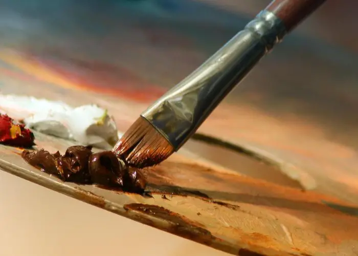
You need your main color and white to make pastel colors with acrylic paint. First, place the white acrylic paint on a palette. Then add small amounts of the colored paint until you achieve the desired pastel shade. For clarification, adding grey to solid colors doesn’t make pastels. Instead, it makes a “pale” shade of the original color.
What are Pastel Colors?
Pastel colors are muted, less bright shades of primary, secondary, and tertiary colors.
You can easily create one by adding white to a bright color. Alternatively, adding a little gray makes beautiful pastel colors.
The two main differences between pastels and vibrant colors are brightness and chroma.

Color brightness (value) refers to luminance, tint, or shade. Solid pastel colors have a higher luminance than traditional primary and secondary colors.
Meanwhile, chroma (or saturation) describes the color intensity. Low chroma colors are duller, while high chroma colors are more vibrant.
Thus, pastel colors are high-luminance, low-chroma colors. That’s why adding white to the given color is the easiest way to create a pastel.
Some painters call them tints because they are muted versions of the original color.
Pastel colors are most common among creatives, who call them HSV colors. HSV stands for “hue, saturation, and value.”
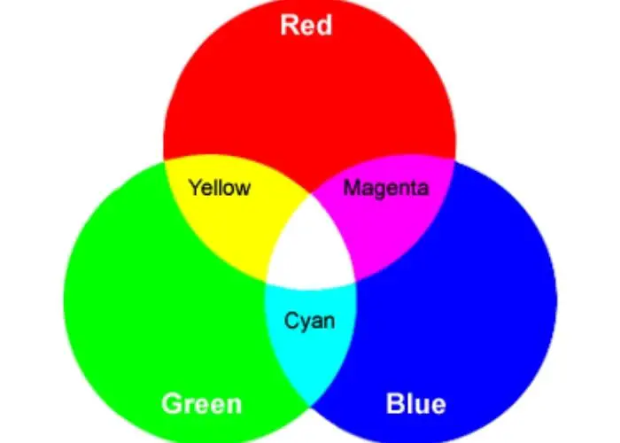
It’s a slightly different format to RGB (Red, Blue, Green) color charts which refer to specific color names.
A Brief history of pastel paint colors
Pastel colors have a long but not-so-glamorous history. The most memorable thing about them is that the society’s who and whos often wore high-chroma (intensely colored) clothes while those in the lower social classes wore grey and brown colors.
Why? Because fabric dye is expensive. Therefore, laborers and the society’s poor cannot afford colored clothes.
Later, in the 18th century, the wealthiest social classes later discovered that pastel dyes were even more expensive.
So, they switched to pastel color palettes, combining them with sculptured moldings and ornamental architecture to stand out.
Famous individuals who popularized the trend include Madame de Pompadour and Marie Antoinette, the two most famous King Louis XV mistresses.
Both loved pastel pinks, though Marie-Antoinette loved pastel blue too.
Then came the “holiday” trend during the Victorian period. Pastel colors defined the holiday period in Italy, France, and England.
Everyone heading to the beach wore pastel mint, pink, or lemon. The beach huts were in pastel colors too.
For instance, pink huts littered Mersea Island, Norfork town beach, and Essex.
Pastels were the unofficial holiday colors and instantly put friends and families in a vacation mood.
Two centuries later, pastel colors found another meaning, this time in the sports industry.
Suddenly, every athlete and sportsperson wore muted shades of bold colors. Pastel pink and pastel blue polo shorts were particularly common.
Then pastel suits became the norm throughout the industry. It defined the college culture.
You may have also noticed that pastels dominate kids’ colors. It’s for a good reason.
Pastel colors are softer, evoking a feeling of calm and peacefulness. They are also happy and romantic colors.
Above all, pastel colors evoke a feeling of joy and playfulness.
As a result, pastel colors perfectly suit babies and young children. They make the perfect choice for baby showers and are excellent decoration colors for kids’ rooms.
Again, pastel blue and pastel pink are the most common, complemented mainly by copper shades. However, before complimenting the colors, first, know what two colors make copper.
The warm, metallic tones of copper contrast nicely with the soft, feminine hues of pink.
Finally, pastels are the color of choice in industries and professions where a sense of empathy and optimism is critical.
For instance, doctors and nurses wear soft blue uniforms for a good reason. It puts patients and their loved ones at ease and gives hope.
Indeed, soft blue colors form a large part of most hospitals’ branding colors.
What Common Colors Are Considered Pastels?
Pink and lilac are the most common pastel colors. Both are low-chroma, high-saturation colors created by adding white to brighter primary or secondary colors.
Unsurprisingly, they aren’t the only pastel colors. For instance, the paint world is full of pastel products under different names.
For instance, there are also dozens of colored pencil pencils from various brands. Marker pen makers also use pastels.
Common pastels in the two industries are the pastel color creamy mint, antique white, periwinkle, misty rose, Nyanza, and pale spring bud.
We’ll learn more about the various pastel colors and discover new ones shortly.

Components of Pastel Colors
Pastels are named after crayon-like artistic media from paint pigment and binding agents. The sticks are traditionally less saturated than the original pigment.
In the factories, manufacturers combine finely ground pigment, a binder (typically gum Arabic or any other vegetable gum), and a dry filler (plaster, chalk, or kaolin) to make pastels.
The three ingredients form a paste that hardens into a crayon-like painting stick.
The filler concentration determines the pigment’s opacity. For instance, a higher filler proportion creates lighter hues, from pearl grays to pink.
Meanwhile, a lower filler concentration creates deeper, darker pastel colors, including indigo, Prussian blue, and lampblack.
Pastel Color Codes
Unfortunately, there are dozens of pastel colors. We can’t list all of them. Nevertheless, the following are the most common colors and their pastel hex codes.
- Pastel millennial pink: Millenial pink is heavily associated with millennials. It first became popular in 2010 when Tumblr adopted it as its primary brand color. Later, several celebrities picked up on this pink shade, and it soon dominated the fashion industry. The hex code is #f3cfc6. Meanwhile, the RGB code is 243% red, 207% green, and 198% blue, while the CMYK code is 0% cyan, 15% magenta, 19% yellow, and 5% black.
- Pastel pistachio green is a refreshing and vibrant version of the traditional green. It’s a yellow-green shade, almost similar to the pistachio nut. The hex code is #a9d39e. Meanwhile, the RGB pastel color code is 169%, 211%, and 158%, while the CMYK pastel color code is 20%, 0%, 25%, and 17%.
- Pastel yellow: Also known as lemon, pastel yellow is a vibrant yellow shade. Many people confuse it with lemon chiffon. But chiffon is much softer and much paler. The hex code is #fdfd96. Meanwhile, the RGB values are 253%, 253%, and 150%, and CMYK values are 0%, 0%, 41%, and 1%.
- Pastel color baby blue: This is a slightly lighter shade of blue commonly associated with baby boys’ clothes and bedrooms. The hex code for baby blue is #89cff0, the RGB values are 137%, 207%, and 240%, and the CMYK values are 43%, 14%, 0%, and 6%.
- Pastel baby pink: Pastel pinks are commonly associated with baby girls. It’s a playful, kind, and loving color with the hex code #f4c2c2. Meanwhile, the RGB code is 244%, 194%, and 194%, while the CMYK code is 0%, 20%, 20%, and 4%. Other pastel pink colors include millennial pink and pale pink.
- Pastel creamy pink: First created in 2006, this is a shade of pink with yellow undertones. The pastel hex code is #c8f3cd, the RGB code is 200%, 243%, 205%, and the CMYK code is 18%, 0%, 16%, and 5%.
- Pastel light seafoam: This is a light shade of green. Its characteristic blue undertones make blending with other green and blue shades easy. The hex code is #9fe2bf, the RGB code is 159, 226, 191, and the CMYK code is 30, 0, 15, 11.
- Pastel peach: The pastel color peach is a light orange shade. It gets its name from the flesh of the citrus fruit and can be enjoyable to work with, especially alongside blue, green, and white shades. The hex code is #ffe554, the RGB code is 255, 229, 180, and the CMYK code is 0, 10, 29, 0.
- Light azure: Azure is the color of a beautiful clear sky. It is located between cyan and blue on the visible light spectrum, appearing as a soft light blue. The hex code is #74bbfb, the RGB code is 116%, 187%, and 251%, and the CMYK code is 54%, 25%, 0%, and 2%.
Finally, you may occasionally come across the pastel color lavender. It’s a light pink-purple color resembling the lavender flower. With the idea of what two colors make lavender, you can easily mix up a lavender color of your own
As with the others, pastel lavender has a relaxing feel associated with calmness and comfort.
The hex code is #967bb6, the RGB code is 150, 123, 182, and the CMYK code is 18, 32, 0, 29.
How to Make Pastel Colors
The best way to make a pastel color depends on your project. Below, I explain how I make pastels using primary colors, watercolor, and acrylic.
How to make pastel colors with primary colors
Making pastel tones from primary colors is easy. But you must proceed cautiously. Otherwise, you may end with the wrong shade.
The first step is to decide on the right primary colors. Do you prefer red, yellow, and blue, or cyan, magenta, and yellow?
Both will give you wonderful pastel colors. But cyan, magenta, and yellow (CMY) create the most vivid pastels.
Nonetheless, I used blue, red, and yellow for this project.
The next step is to decide on the desired pastel color. For instance, do you want pastel orange or pastel yellow?
Alternatively, do you want a mint or lavender pastel? I want to explain how to make pastels from orange.
I begin by mixing yellow and red to make orange. Then, I mix the orange with the opposite color on the RGB color wheel to desaturate it.
The color sitting opposite orange on the color wheel is blue. It creates a beautiful dark brown color.
Only add a bit of blue, as too much blue makes the paint too gray. If it’s too pale, add more orange.
Finally, add white to lighten the value. It creates a beautiful light orange shade.
Alternatively, you can add white first to lighten the paint, then a few drops of the complementary color to desaturate it.
How to make pastel color palettes with watercolors
I easily make watercolor pastels by mixing opposite colors on the color wheel and adding water to make the pastel color light.
So, the process is similar to creating pastels with regular paint, except that I use water instead of white paint to make the colors lighter.
For instance, to make a pastel blue purple, mix blue and red to make purple. Alternatively, mix cyan and magenta.
Then mix the purple color with the opposite color on the color wheel (yellow) to desaturate it. Finally, add a few drops of water at a time for a lighter value.
However, note that pastel watercolor manufacturers add white instead of water. Therefore, the pastels aren’t as translucent as those you make yourself.
How to Make Specific Pastel Colors with Acrylic Paint
Let’s now look at how to make common pastel colors using acrylic paint. It’s the same for making other pastels.
But you must be careful when desaturating and lightening the pastels. Also, the sequence matters. Do you desaturate then lighten, or vice versa?
How to Make a Blue Pastel Color
The best approach when making blue pastel colors depends on the desired pastel blue shade.
For instance, do you desire pastel baby blue or a regular soft blue shade? Below, I explain how to make baby blue pastels from scratch.
The project requires regular blue, white, and orange acrylic paints.
- Add several drops of white acrylic paint to the blue paint. Then mix the two thoroughly. It forms a bright blue shade.
- Add drops of orange (blue’s complementary color) to the light blue paint to desaturate the color. The result is a lovely soft-blue shade. Add more white for an extra-soft blue tone.
How to Make Pastel Yellow
A quick way to make pastel yellow is to mix the ochre yellow with white. It creates a bright, soft shade of yellow.
But I prefer the long approach that combines yellow with white and purple (its complementary color) to subdue the intensity.
A few drops of the complementary color are sufficient.
- Add drops of white acrylic paint to yellow acrylic paint to make a lighter shade of yellow. You can add more yellow or white to darken or brighten the color slightly.
- Add a few drops of purple acrylic paint to the bright yellow color to make a softer pastel.
How to make pastel red colors
You need red, white, and green acrylic paint to create a pastel red acrylic paint. Proceed as follows;
- Add drops of white to the red paint to make it lighter. It forms a paler version of red. Add more red if the color looks too light in value.
- Add small amounts of green to desaturate the red color. Ideally, you want to pick the green color directly opposite your red shade from the color wheel. It forms a softer tone of red leaning towards pink.
- Add more white or green as necessary to adjust the shade further. Adding a few drops at a time ensures maximum accuracy.
How to make pastel purple colors
You need purple, yellow, and white paints to create a pastel purple acrylic paint color.
Alternatively, you can work with primary colors alone. In that case, you mix red and blue to make purple, then work with the resulting color to make a lighter shade.
- Mix blue and red colors to make purple shade. I prefer to mix equal parts of the two paints for a balanced purple color.
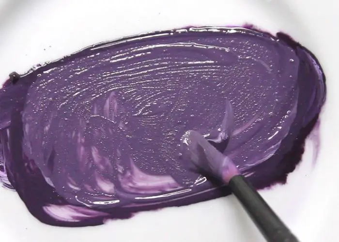
- Add tiny drops of white acrylic paint to the purple paint for a light pastel purple. Mix the two thoroughly at each stage and only add more white if necessary.
- Add yellow acrylic paint (purple’s complementary color) to desaturate the purple color. Again, work one drop at a time.
How to make orange pastel colors
Making pastel orange requires orange, white, and blue acrylic colors.
Alternatively, you can make orange from the primary colors red and yellow. I prefer the latter as it allows me to make the perfect orange.
- Mix equal parts of red and yellow acrylic paints to create an orange color. Adding more red creates a more intense shade of orange, while more yellow makes it brighter.
- Add white acrylic paint to the mix to create a lighter shade of orange. A few drops are enough, but a few more drops make an even lighter shade of orange.
- Add blue acrylic paint to the mixture to desaturate the color. Add more white or blue as needed to attain the best pastel shade.
How to make green pastel colors
Unfortunately, making vibrant pastel green isn’t as easy as many painters wish. Mixing green and white gives a muted green shade.
But it’s a dirty green. Indeed, it wasn’t until the late 1800s that painters began using pastel green in their projects.
Nonetheless, you can make a basic pastel green color by mixing blue and yellow to form a basic green color and then adding white and red.
The ideal proportions depend on the desired pastel green shade. Either light green, tea green, mint blue and mint green. Here’s how to proceed;
- Mix equal parts of yellow and blue acrylic paint colors to make a standard green shade. Add more blue for a darker green shade and more yellow for a brighter shade.
- Add white acrylic paint to brighten the green paint. You may need a few more drops of white when working with darker greens.
- Add green’s complementary color (red) to the mix to desaturate the green pigments. Do you like the outcome? If not, adjust it further.

How to make pastel colors in digital media
You can easily create digital pastel colors by typing the hex values. As we’ve already seen, the hex code is a 6-digit code with a hash (#) at the beginning.
The code comprises three 2-symbol elements, representing the values of red, blue, and green.
The first two letters or numbers represent red, the next two represent green, and the final two refer to blue.
When working on digital projects, determine the hexadecimal value for the desired pastel color and type it to display the selected color.
For instance, the hexadecimal value for misty rose is #FFE4E1.
Creating a pastel color scheme in photoshop
Photoshop has default pastel colors that you can access from the color library. The easiest way to access the pastels is via the Color Picker tool.
Click on Foreground Color and select Color Libraries. Then select Book to access the pastels.
However, you can create your pastels within Photoshop if you wish. To do so, go to the ANPA color library, select the base color (the one you wish to make lighter), then use the color picker to add swatches.
Adjusting the color value is as easy as changing the saturation. I recommend adjusting the saturation to around 10% to 20% while keeping the color value between 90% and 100%.
Creating pastel colors in procreate
If you’re working in Procreate, you can create palettes of your favorite colors by capturing the colors from images via the Color Panel.
First, open the Color Panel and locate the Palettes tab. Doing so reveals the available palettes.
Click on the “+” sign at the top right in the palettes tab and, under photos, select “New.” This takes you to the photos app.
Select any photo from the list to automatically generate palettes from the colors in that photo.
These palettes are originally named “Palette from Image.” However, you can rename the files as you wish.
How to make pastel color with food coloring
Pastels make beautiful food colors. For instance, pastel-colored icing is perfect for birthdays and baby showers.
Also, you can use pastels on candies and other snacks. Fortunately, making food color pastels doesn’t take too much time.
For instance, mix lemon yellow and golden royal blue food colors to get a soft, light yellow color.
You can readily find the base colors at the store. Meanwhile, Kelly green and royal blue food colors create a tantalizing light green color.
Other wonderful combinations are violet and rose to form a pastel purple color, orange and red-red to form a pastel orange, and royal blue plus rose food colors to form a pastel pink.
(We have a quick guide on how to make violet color paint to simplify things for you)
How to make pastel palette without white
Making pastel colors without white is easiest when using watercolors. Simply replace the white paint with water.
Both lighten the value, creating a brighter shade of the original color.
Unfortunately, it’s a bit challenging when mixing acrylic paints. One of the best alternatives is yellow.
A few drops of yellow create a slightly lighter hue than the original shade.
Alternatively, consider modern gray. It gives a slightly duller pastel. But it’s better than most alternatives.
Finally, you can avoid white by starting your project with a lighter version of the desired color.
For instance, use light blue base colors instead of darker shades to make pastel blue.
The supplementary color desaturates the light blue color creating a beautiful pastel.
How to mix holographic pastels
You may notice that some pastels are shinier than others. Though all the colors appear at the end of the spectrum, some have a higher sheen.
Shinier colors are known as holographic colors or holos.
You can get holographic pastel colors from the shop if you’re short on time. However, I prefer making my holos. Fortunately, it’s easy to make pastels shiny.
The first option is adding a glossy top coat when finishing the project.
Alternatively, mix your pastels with an iridescent medium before applying them to the canvas.
Finally, creating highlights with thinned white paint also creates a holographic impression.
The rest of the process is the same as other pastel colors. For instance, what 3 colors make orange pastel? Mix orange, white, and a blue to make an orange pastel.
Meanwhile, mix red, white, and a few drops of green to make pastel pink.
How to create a pastel color palette
You need the three primary colors to create a full pastel color palette. I begin by swatching the colors to avoid mixups.
Place yellow on top, blue on the right, and red on the left. Leave one or more spaces between every two primary colors.
Next, create the secondary colors by mixing the primary colors. The resulting secondary color goes between the primary colors.
Then mix the primary colors with the adjacent secondary ones one at a time to create the tertiary colors. Again, place them in the correct slots to avoid mixups.
From there, mix each color with white and then the opposite color on the color wheel to make a pastel.
Measure the proportions accurately for the perfect pastel color palette.
Uses and Applications: How to Use Pastel Shades in Design and Interior Decor
Pastel colors are excellent for interior decor and general design. The soft, calm tones make quiet, inviting spaces, modern fabrics, and enchanting designs.
The following are a few ways to use common pastels.
What are the best pastel color combinations?
The best pastel color combinations depend on the project. Generally, complementary colors form the best combinations.
For instance, pastel green sits directly opposite pastel red on the color wheel. Therefore, the two colors pair wonderfully.
Nevertheless, you can use many other combinations to create beautiful interiors and art pieces.
For instance, bright pink, Rajah, and Sunray are beautiful next to each other. Similarly, light coral +apricot + melon form a strong combination.
How to combine lilac, white, and pastel yellow
Lilac, soft whites, and pastel yellow are unique interior design colors that instantly transform spaces. But you must use them properly.
I like to use natural or soft white pastels to define the background. Then I bring in grey furniture and complete the set with pastel yellow and lilac accent colors.
A few items to consider for accents include lampshades, pillows, and throws. Alternatively, consider a houseplant with yellow flowers.
Other than yellow, you can use pastel lilac alongside different shades of purple. It also works excellently next to neutrals.
How to combine a pastel pink color with blue
Pastel blue and pink are among the most popular pastel colors, and not just among kids.
They are soothing colors that create quiet and calming interiors. Moreover, the two playful colors are perfect for kids’ rooms.
But again, you must use the colors wisely. Ideally, you should balance the blue and pink pastels with selected neutral colors.
For instance, add a little beige and cream to the background to make the pastel colors stand.
Cream colors also work well, especially if you use blue and pink as accents rather than the main color.
How to mix and match pastel colors
If you wish to use more than two pastel colors at a go, you must know how to mix and match them. But it’s not too difficult.
For instance, suppose you desire a colorful headboard as a focal point in the bedroom.
Adding colorful accessories allows you to brighten the room further without overpowering the focal point.
Pillows and throws are excellent for this purpose. Then use texture and patterns to add depth.
Consider gray and white base colors to help the soft pastels stand out. Then decide whether to paint or use fabrics to introduce new hues.
Pro Tips for Using Pastel Colors
The following are a few extra professional tips for incorporating pastels into your painting or design project.
- Work with a color scheme: A color scheme helps you balance the bright and dark shades. Use pastel colors as the base. Then combine them with complementary colors from the opposite side of the color wheel. You can use primary or secondary colors as complementary colors. But you’ll get even better results by pairing pastels with pastels.
- Incorporate contrast: If you don’t appreciate the faded look of pastel on pastel, consider layering your pastel background with color contrast. For example, use a saturated color for the lettering on a web page with a pale yellow background. It makes the letters stand out. Some of the best dark colors to consider here are navy blue, dark green, and magenta.
- Consider Accents: Adding accents to your color template creates a more dramatic look. Your softer pastels amplify the brighter colors for a more vibrant outlook. I specifically recommend primary colors for accents. They readily stand out against pastels without overpowering the softer shades.
- Metallic shades add a sense of intrigue: If you’ve worked with metallic colors before, you’ll appreciate their ability to add excitement to a painting or design project. For instance, gold and silver are attention-grabbing colors that attract eyeballs against softer pastels. Test various metallic colors, from bronze to copper, to determine the best choice.
FAQs
What colors do you mix to make a pastel color palette?
To make a pastel color palette, mix the primary pastel colors with white, one at a time, to make secondary pastels. Then mix the secondary pastels with the adjacent primary colors to make tertiary pastel colors. After that, mix each color with white to lighten it and the complementary color to desaturate the paint.
What colors do you mix to make pastel pink?
To make pastel pink, you need to mix red and white. Keep adding white until you attain a pink tone. The final pastel pink shade depends on the original red color. Alternatively, use a light shade of yellow instead of white. For instance, cadmium lemon yellow plus red makes beautiful pink pastels.
How can I make pastels?
The easiest way to make pastel colors is by mixing bold primary, secondary, and tertiary colors with white to lighten the shade. Next, add a few drops of the complementary color to desaturate the pastel. Keep adjusting the color until you achieve the desired pastel shade.
What are the components of pastel colors?
Pastels are near-pure colors. They comprise three key elements, i.e., a fine-color pigment, a filler, and a binder. The three are mixed with water to form a paste. Then manufacturers shape and dry the paste into a crayon-like painting tool.
Which two pastel colors pair well?
Any two pastels from opposite sides of the color wheel mix exceptionally. But that’s not all. For instance, mix various pastels or use them alongside bolder primary and secondary colors for a more dramatic look. Alternatively, use it next to neutrals like soft gray or other pastels like lilac.
How do you make a green pastel color with acrylic paint?
I mix green and white acrylic paints to make pastel green. Keep adding white until you achieve the desired shade. Then add the complementary acrylic paint color (red) to desaturate the pastel. Another option is to make green from scratch using yellow and blue. Then add white and red to make a green pastel.
Summary
It’s not too difficult to make pastel colors. For the perfect outcome, mix the main color with white to brighten it.
Then add drops of the complementary to desaturate the pastel. Alternatively, add a few drops of yellow if you cannot find white paint.
Light gray is another great substitute for white paint.

Leave a Reply