Ever pondered the subtle art of hues in the natural world? Today, let’s dive into a refreshing palette – Mint Blue and Mint Green.
These siblings in the color family often spark curiosity.
What sets them apart? How do they play with emotions and decor?
Sit back as I unravel the mystique of these two colors. This guide serves a hearty plate of knowledge from history to psychology, fashion to interior design.
Buckle up for an enlightening journey through shades that calm souls and breathe life into spaces.
Get set.
Mint Blue Vs Mint Green
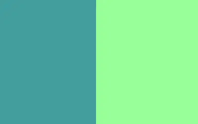
Mint blue and mint green differ in hue and vibe. Mint blue leans toward blue with a vibrant splash, while mint green has a yellowish touch, evoking new leaves. The former’s extra saturation bestows a lively spark, while the latter exudes calm.
What is Mint Blue Color?

Mint blue captures the essence of a serene sky reflected on tranquil waters. It’s a blend – the coolness of blue kissed by a hint of lively green.
Lighter and softer than turquoise, mint blue is often linked to freshness, creativity, and peace.
Its subtle charm makes it ideal for interiors, textiles, or any space craving crisp ocean air.
Mint blue color resides in the cool region of the color wheel, positioned between blue and green.
It embodies a refreshing and vibrant quality, evoking a sense of calmness and clarity.
The History of Mint Blue Color?
Mint blue’s roots stretch back to the vibrant 1950s and 60s. It was a time when pastels began to charm the world.
The shade is a nod to retro diners and classic cars. Over time, it evolved and carved its niche in modern design and fashion.
Mint blue’s timeless grace still captivates. It infuses spaces and outfits with refreshing elegance.
The Meaning of Mint Blue
Mint blue symbolizes clarity, tranquility, and renewal. Imagine a gentle breeze clearing your thoughts – that’s the essence of mint blue.
It encourages open communication and reflection, often associated with creativity and emotional balance.
In design, it whispers of fresh starts and open spaces, making it a go-to for invigorating environments.
Mint Blue Pros and Cons
Pros
- Invokes calmness and clarity.
- Lends a fresh, airy vibe to spaces.
- Enhances creativity and communication.
- Pairs well with different shades.
- Conveys a modern yet timeless elegance.
Cons
- It may feel too cold in certain settings.
- Light shade might appear washed out.
- Not ideal for creating a dramatic or bold statement.
- It can be perceived as overly feminine by some.
- It might require careful balancing with other colors to avoid a bland appearance.
What is Mint Green Color?

The shades of green that create mint green are akin to the first sign of spring – tender and full of promise.
Picture the delicate mint leaves, with their subtle fragrance and gentle touch.
Mint green is a blend where green’s vitality meets the softness of white. It’s like a whisper in a bustling crowd, subtle yet impossible to ignore.
Interiors, fashion, and branding embrace its soft and rejuvenating presence. The hue is magic, turning the mundane into a rejuvenating sanctuary.
To know what colors to mix to make mint green, the color sits between green and cyan on the color wheel. It’s a cool, refreshing hue that leans towards green while incorporating a touch of blue.
The History of Mint Green Color?
Mint green paints history with its quiet charm. Since ancient times, it has been a symbol of fertility and renewal in various cultures.
In the 18th century, it was a favorite among royalty and the elite. The 1950s saw a revival in pastels, with a shade of green taking center stage.
Nowadays, it’s an outstanding choice for modern aesthetics, vintage recreations, and anything that seeks an infusion of calm and freshness.
The Meaning of Mint Green
Mint Green speaks volumes about renewal, harmony, and growth. Think of leaves sprouting in spring. This color stands for blossoming new beginnings.
It’s connected to balance, both emotional and physical. In spaces, it casts a calming aura. Branding often flags sustainability and wellness.
The essence of mint green is nurturing. It’s a tender, harmonious shade. It’s a choice that forms bridges – between us, nature, and inner balance.
The colors that complement mint green are tan, cream, beige, and white. These subtle colors provide contrast without being too distracting. We have simplified your work by showing you how to make some of these colors, for instance, making tan color.
Mint Green Pros and Cons
Pros
- Promotes a sense of calm and relaxation.
- Evokes feelings of freshness and renewal.
- Versatile in pairing with other hues.
- Associated with sustainability and wellness.
- Light and airy, it adds spaciousness to the interiors.
Cons
- It may not suit spaces requiring bold statements.
- It can be too subtle for some tastes.
- Lighter shades lack depth.
- It may need careful color balancing to avoid monotony.
- It can sometimes be perceived as nostalgic or vintage.
Color Conversion: Hex Codes and RGB Color Space
| Color | Hex Code | RGB Code | Hue | Saturation | Lightness |
| Mint Blue | #00BFFF | 0, 191, 255 | 196° | 100% | 50% |
| Mint Green | #98FF98 | 152, 255, 152 | 120° | 100% | 78% |
Comparing Mint Blue and Mint Green
Description and brightness
Mint blue shines like the ocean under a clear sky. It’s energetic, embracing the vibrancy of a refreshing breeze.
Mint green, in contrast, is the essence of a peaceful garden. It’s more subdued, like the gentle touch of morning dew on the grass.
The shades of blue capture the brightness and clarity of coastal scenes.
The green pigment envelops in the tender luminosity of an early spring morning. They both illuminate but with different whispers.
Psychological effects
Mint blue feels like a cool splash on a hot day. It invigorates the mind and triggers creative sparks.
It’s the color of renewed focus. Mint green calms like a lullaby. It’s akin to a stroll through lush greenery. It brings peace and emotional stability.
Mint blue offers an energetic mental uplift. Mint green offers solace and a soothing embrace. They both cater to different aspects of well-being.
Associations
Mint blue is associated with clarity, serenity, and open spaces. It’s the breath of fresh air in a bustling city.
It’s freedom. Mint green is rooted in nature, growth, and renewal. It’s the scent of rain-soaked earth or leaves rustling in the breeze.
The blue hue evokes feelings of boundless horizons and new possibilities.
The green hue is a return to roots and life’s simple pleasures. They connect in harmony but sing different tunes.
Popularity
Mint blue is popular in modern and coastal interiors, painting a fresh, contemporary look. It’s the darling of summer and spring fashion.
Mint green, meanwhile, steals hearts in wellness and health spaces. It is a staple in vintage decor, resonating with nostalgia.
While mint blue is the taste of the adventurous, mint green is the comfort of the familiar. Both grace palettes, with their charm, cater to diverse aesthetics.
Uses
Mint Blue excels in beach-themed decors, chic outfits, and spaces that seek invigoration. It’s a whisper of the waves in design.
Mint green is a muse for spa-like environments, garden-themed spaces, and eco-friendly branding.
It’s the earth singing through color. In wardrobes, mint blue adds a splash of refreshing chic. Mint green infuses a calming, earthy vibe.
They’re both versatile, each weaving its magic. Whether you seek the thrill of the ocean or the calm of a forest, they deliver.
Difference Between Mint Blue and Mint Green
| Category | Mint Blue | Mint Green |
| Description and Brightness | -Shines like the ocean under a clear sky -Energetic, embracing the vibrancy of a refreshing breeze | -Essence of a peaceful garden -More subdued, like the gentle touch of morning dew on the grass |
| Psychological Effects | -Feels like a cool splash, triggers creative sparks | -Calms like a lullaby, brings peace and emotional stability |
| Associations | -Clarity, serenity, open spaces | -Nature, growth, renewal |
| Popularity | -Popular in modern and coastal interiors | -Steals hearts in wellness spaces, vintage decor |
| Uses | -Beach-themed decors, chic outfits, invigorating spaces | -Spa-like environments, garden-themed spaces |
Do Mint Blue and Mint Green Match?
Yes. Imagine the gentle waves of the ocean kissing a lush, bright green shoreline. The coolness of mint blue marries with the earthy warmth of mint green.
Together, they create a symphony of serenity and freshness. Perfect for interiors seeking a tranquil vibe or a wardrobe that’s all about harmony.
It’s like bringing an idyllic landscape into your space or attire. Mint blue and mint green complement and enhance each other’s qualities.
Whether you want to add a splash of tranquility to your living room or assemble a calming ensemble, this duo is a winning match.

Contrasting Mint with Similar Colors
Mint vs seafoam
Mint is like a chorus of fresh leaves; seafoam echoes the foam of gentle waves. Mint has an earthy touch, while seafoam boasts an aquatic whisper.
Seafoam is a paler blend of green and blue, exuding a dreamy, oceanic vibe.
Mint, with its richer tone, brings gardens to mind. Pick mint for nature’s embrace and seafoam for a seaside lullaby.
Mint vs celadon
Mint radiates with youthful freshness, while celadon carries an air of subtle elegance.
Celadon is a muted green, akin to ancient pottery and sophisticated decor.
Mint has a spicy and spirited character. The distinction lies in their personalities: mint for a vibrant touch, celadon for understated grace.
Choose based on the mood – festive refreshment or refined serenity.
Mint vs spring green
Mint is the whisper of new buds; spring green is their cheerful song. Spring green is brighter, like a meadow in full bloom.
Mint offers a more subdued and tender hue. Mint casts a soft shadow in spaces, while spring green bursts with life.
Mint for tranquil corners, spring green for spaces that sing. They both celebrate nature at different volumes.
Exploring Color Combinations
Matching mint blue with other colors
Mint Blue and White: Pair mint blue with white for airy elegance. It’s a cloudless sky that meets pristine sands. Spaces breathe easy. Outfits exude freshness. It’s perfect for clean, open designs. Minimal yet invigorating.
Mint Blue and Coral: Mint blue with coral creates a tropical fiesta. Imagine sea waves playing with coral reefs. The pairing is vibrant, full of life. Ideal for energetic spaces and lively wardrobes.
Mint Blue and Gold: Mint blue with gold whispers opulence. The cool mint meets the warmth of golden hues. It’s a royal embrace. Picture regal interiors and rich attire. Elegance redefined.
Mint Blue and Gray: Mint blue and gray are sophisticated and in sync. They’re a gentle rain over calm seas. Understated, modern, chic. Perfect for contemporary interiors and sharp fashion.
Mint Blue and Blush Pink: Mint blue and blush pink are floral bouquets. It’s springtime in colors. Tender, romantic, soft. Ideal for whimsical designs and gentle fashion statements.
Mint Blue and Navy Blue: Mint blue meets navy blue or royal blue for depth and contrast. It’s the ocean’s shades in harmony. Rich, cool, mysterious. Great for focused interiors and confident outfits.
Matching mint green with other colors
Mint Green and Peach: Mint Green and Peach are fruit orchards in bloom. Fresh, juicy, and inviting. Think of garden parties and sunlit rooms. Sweet and energizing.
Mint Green and Lavender: Mint green with lavender is soothing and ethereal. It’s a calming herbal tea. Enveloping, aromatic. Spaces become sanctuaries. Attires, a comforting embrace.
Mint Green and Rose Gold: Mint green and rose gold are luxuries with a heart. They are champagne with fresh mint. Dazzling, warm, lush. For spaces and wardrobes that glow. (Here is our guide on how to make rose gold color and mint green).
Mint Green and Ivory: Mint green and ivory are classic and pure. It’s an old book in a meadow. Timeless, serene, cultured. Ideal for sophisticated simplicity.
Mint Green and Champagne: Mint green and champagne are a muted celebration. Bubbly meets fresh sprigs. Elegant, festive, subtle. Perfect for celebrations or to bring cheer into every day.
Mint Green and Lilac: Mint green with lilac is a spring breeze. Picture wisterias and fresh leaves. Delicate, dreamy, light shade. They bring spaces and outfits into full bloom.
Teal vs aqua vs mint vs. turquoise: similarities explained
Teal, aqua, mint, and turquoise are siblings often used in color printing, blending green and blue hues.
They embody the essence of seas and skies with their interplay of three colored lights and the CMYK color space.
Each conjures images of tranquil waters and fresh foliage. They’re beloved for the calm and refreshing atmosphere they create. They all straddle the line between green and blue.
Key differences between teal, turquoise, aqua, and mint
The Teal is slightly darker, with bluer. Turquoise has an equal mix of blue and green, bright and vibrant.
Aqua leans towards blue but is lighter than turquoise. Mint is the lightest, with a gentle green touch.
Teal evokes depth, turquoise is the tropical sea, aqua is a clear sky, and mint is fresh spring leaves. Each offers a different mood and intensity.
Read also: Sage green vs mint green color
FAQs
Is mint blue or green?
Mint is a color that dances between blue and green. Think of it as a chameleon in the color spectrum. Mint blue has a subtle blue touch, while mint green boasts a gentle green hue. It’s a refreshing breeze with a hint of ocean or a fresh leaf.
Is mint blue considered a cool or warm color?
Mint Blue is a cool color. It’s like taking a dip in a refreshing lagoon. Unlike warm tones, cool colors often evoke thoughts of water, sky, and foliage. Mint Blue does that with finesse. It’s calming and serene, like a tranquil lake or a clear winter sky. It’s often used in design to create a soothing and relaxed ambiance.
Is mint green considered a warm or cool color?
Mint green is on the cooler side of the spectrum. It’s reminiscent of new leaves in the spring or a cool mojito. It has a touch of warmth from the green but is predominately cool. In interiors and attire, mint green breathes freshness and calm. It’s like having a cool, refreshing garden at your fingertips.
Conclusion
Mint blue and mint green bring fresh air to our lives. Mint Blue evokes a sense of clarity and creativity with its vibrant shade and cool tones.
Mint green offers a calming and soothing ambiance reminiscent of nature’s tranquility.
Both colors have made their mark in various realms, from interior design to fashion.
Whether you prefer the lively zest of mint blue or the serene embrace of mint green, these hues effortlessly infuse spaces and wardrobes with a touch of rejuvenation and harmony.
Embrace mint’s soft blue-green color and green pigments, breathing new life into your world.


Leave a Reply