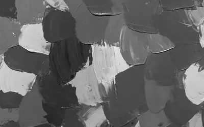
The interplay of black and white is a visual dance that has long fascinated creative minds and sparked endless speculation. When these polar opposites collide, a captivating transformation occurs.
The result is an admirable hue. In this article, I will embark on a quest to unravel the mystery of what color emerges when black and white intermingle.
Join me as I journey into the realm where monochromatic forces converge, where shades merge, and where secrets lie within the enchanting art of color mixing.
Brace yourself for a concise yet intriguing glimpse into the elusive palette of black and white.
What Color Does Black and White Make When Mixed?
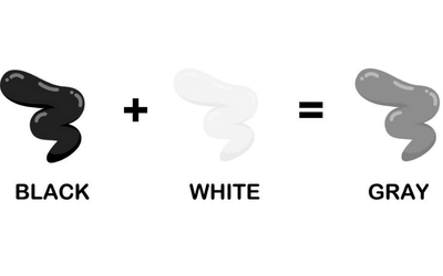
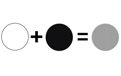
Black and white make the color grey when mixed. This enigmatic combination unveils a world of nuance and depth, where the boundaries between light and darkness blur. Mixing black and white is like capturing the essence of duality, where opposites unite to form a captivating harmony.
Color Theory
Color theory is a field of study that examines how colors interact and how we can mix them to create pleasing compositions.
It explores the principles and concepts behind color and provides a framework for understanding and using color.
When talking about the color theory, we cannot miss to mention the following:
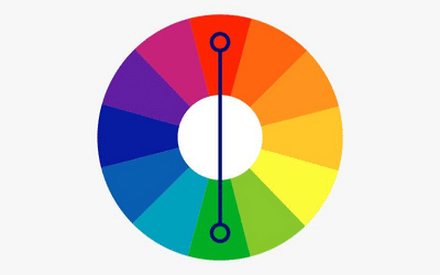
The color wheel
The color wheel is a visual representation of colors arranged in a circular format. It’s a fundamental tool in color theory that helps in understanding the relationships between different colors.
The color wheel consists of twelve colors, including the primary, secondary, and tertiary colors.
Primary colors. These are the three basic colors that you cannot create by mixing other colors. They are red, blue, and yellow. All other colors are derived from these primary colors.
Secondary colors. These are the colors obtained by mixing equal parts of two primary colors. The secondary colors are green, orange, and purple.
Tertiary colors. These are the colors you create by mixing equal parts of a primary color and a neighboring secondary color. Tertiary colors include variations like red-orange, yellow-green, and blue-purple.
Color value and saturation
Color value and saturation are important aspects of color theory that influence how colors are perceived.
Color value. Value refers to the lightness or darkness of a color. Adding black to a color creates shades, which are darker in value while adding white creates tints, which are lighter in value. Value plays a significant role in creating contrast and depth in composition.
Color saturation. Saturation, also known as intensity or chroma, refers to the purity or vividness of a color. A highly saturated color appears vibrant and pure, while a desaturated color appears dull or muted.
Saturation can be adjusted by adding gray or complementary colors to a hue.
Color harmonies
Color harmonies are pleasing combinations of colors that work well together. They create a sense of unity and balance in a composition.
Some common color harmonies include:
Complementary colors. These are the colors that are opposite each other on the color wheel. They create a strong contrast and can be used to make elements stand out.
Analogous colors. The colors adjacent to each other on the color wheel, such as blue and green or orange and yellow are known as analogous colors. They create a harmonious and cohesive look, often found in nature.
Triadic colors. Triadic colors are evenly spaced on the color wheel, such as red, yellow, and blue. They provide a balanced and vibrant color scheme.
Monochromatic colors. Monochromatic color schemes use variations of a single color by adjusting its value and saturation. This creates a unified and elegant appearance.
Understanding Color Black
The color black has a fascinating history and origin. In ancient times, it was used in cave paintings.
It’s made through the absence or absorption of light and can be represented by various color codes.
In the RGB model, black is denoted by the hexadecimal code #000000 or the RGB code (0, 0, 0). In the CMYK model, it’s represented as 0% cyan, 0% magenta, 0% yellow, and 100% black (K).
Black holds significant meanings across cultures, symbolizing power, elegance, mourning, mystery, and rebellion.
It finds wide application in fashion, design, branding, photography, typography, and art. This is because it adds depth, contrast, and sophistication to various creative expressions.
Understanding Color White
White, a color with a profound history, represents purity, light, and transcendence. Ancient cultures associated it with divine protection and purity.
White is made by the reflection or combination of all visible light. In the RGB color model, its hexadecimal code is #FFFFFF.
In the CMYK model, it is represented by 0% cyan, magenta, yellow, and black.
White signifies purity, innocence, and cleanliness. It is linked to light, enlightenment, and spiritual awakening.
The color conveys simplicity, minimalism, and peace, creating a sense of harmony and serenity. White is extensively used in fashion, design, and branding due to its versatility and timelessness.
White finds applications in architecture, interiors, medical and hygiene products. It’s also used in advertising and branding.
Its associations with purity and simplicity make it a popular choice. Whether in fashion, design, or religious and cultural practices, white’s significance endures.
Color white has other shades like pure white, cool white, warm white, extra white and high reflective white, all of which have unique qualities and characteristics.
Why Are Black and White Not on the Color Wheel?
Black and white are not included on the traditional color wheel because they do not possess specific wavelengths of light like other colors.
The color wheel represents the visible light spectrum of colors as perceived by the human eye.
It’s based on the three primary colors and their mixtures. These mixtures create secondary and tertiary colors.
The color wheel focuses on hues and their relationships, rather than including shades of black and white.
Black is the absence or absorption of light, while white is the presence of all visible light. They are considered achromatic or neutral colors.
However, in some variations of the color wheel, you may find a grayscale section or a gray color represented. This is a way of acknowledging the presence of black and white in the color spectrum, albeit not as hues.
These grayscale sections are used to demonstrate the tonal range of various shades of gray. While black and white are not on the traditional color wheel, they are still crucial elements in color theory and design.
What Color Do Black and White Make in Paint?
In paint, black and white creates gray. This is because paint follows the subtractive color mixing model.
In the subtractive color model, the primary colors are cyan, magenta, and yellow. Black is added as an additional color for practical purposes.
When you mix these colors in varying amounts, they absorb specific wavelengths of light. This results in the perception of different colors.
Black paint contains a mixture of pigments that absorb most or all of the visible spectrum. White paint is made using titanium dioxide, which reflects most of the light that falls on it.
When you mix black and white paint, the black pigment absorbs a part of the light, while the white pigment reflects a considerable amount. The result is a color that is a mixture of the two, appearing as shades of gray.
The exact shade of gray obtained depends on the specific pigments and the concentrations in the black and white paints.
Here’s an interesting read: is gray and silver the same color?
What Color Do Black and White Make in Lights?
When it comes to light, black and white behave differently compared to how they interact in the realm of pigments or physical colors.
In light, black and white do not create a new color but represent the absence or presence of light.
White light is a combination of all visible colors of light in the spectrum. It contains equal amounts of red, green, and blue light, which are the primary colors of light.
When white light passes through a prism, it splits into a spectrum of colors known as a rainbow. Black is the absence of light.
It occurs when no light is present or when all wavelengths of light are absorbed or blocked. When an object appears black, it means that it is not reflecting or emitting any light in the visible spectrum.
Therefore, in the realm of light, black and white do not mix to create a new color but rather represent the absence or presence of light itself.
Color Mixing Theory
Color mixing theory refers to the principles and models that explain how different colors can be combined to create new colors. There are two primary color mixing theories:
Additive color mixing
Additive color mixing involves combining colored lights to create new colors. It’s used in technologies such as computer screens, televisions, and stage lighting.
The primary colors in additive color mixing are red, green, and blue (RGB). By varying the intensities of these three primary colors, you create different hues.
When you combine all three primary colors at full intensity, they form white light. Various combinations of these colors can create a wide range of shades and hues.
Subtractive color mixing
Subtractive color mixing involves combining pigments or dyes to create new colors. It’s used in traditional painting, printing, and color mixing with physical materials.
The primary colors in subtractive color mixing are cyan, magenta, and yellow (CMY). When these three primary colors are combined at full intensity, they produce black.
In practice, a true black is difficult to achieve, so a fourth color, black (K), is added to the CMYK model.
How to Mix Black and White
Step 1: Prepare your workspace
Set up a clean and flat surface as your workspace, such as a palette or mixing tray. Gather your black and white paints, palette knife, and a clean brush.
Step 2: Start with black paint
Squeeze or scoop a small amount of black paint onto your palette. Use the palette knife to create a small pile or area for the black paint.
Step 3: Add white paint
Squeeze or scoop a small amount of white paint next to the black paint on the palette. Keep the white paint separate from the black paint, allowing space for mixing.
Step 4: Load your brush or palette knife
Dip a clean brush or palette knife into the black paint, picking up a small amount. Make sure the brush or knife is evenly coated with the black paint.
Step 5: Mix black and white paint
Bring the loaded brush or palette knife to the white paint on the palette. Start by adding a small amount of black paint to the white paint.
Step 6: Gradually adjust the mixture
Begin mixing the black and white paints together using gentle back-and-forth or circular motions. Observe the color as you mix and add more black paint to darken the mixture or more white paint to lighten it.
Continue mixing and adjusting until you achieve the desired shade of gray.
Color white appears in almost every step, so you may be interested in what two colors make white to use in your project.
Common Shades When Black and White Mix
When black and white are mixed, they can create a range of shades of gray. Here are some common shades:
Platinum
Platinum is a light gray shade that brings elegance and luxury. It can be used in various design applications to create a sophisticated and refined look.
- Percentage: Around 10-20% black, 80-90% white
- HEX Code: #E5E4E2
- RGB Code: (229, 228, 226)
- CMYK Code: (0%, 0%, 1%, 10%)
Light gray
Light gray is a versatile shade that is used in design and aesthetics. It can provide a subtle contrast and create a sense of calmness and neutrality in various applications.
- Percentage: 25-40% black, 60-75% white
- HEX Code: #D3D3D3
- RGB Code: (211, 211, 211)
- CMYK Code: (0%, 0%, 0%, 17%)
Ash gray
Ash gray is a muted and understated shade that is often associated with a natural and organic feel. It can be used in interior design, fashion, and graphic design to evoke a sense of tranquility and harmony.
- Percentage: About 40-50% black, 50-60% white
- HEX Code: #B2BEB5
- RGB Code: (178, 190, 181)
- CMYK Code: (6%, 0%, 5%, 25%)
Spanish gray
Spanish gray is a medium gray shade that can add depth and sophistication to various design projects. It’s commonly used in architecture, textiles, and product design to create a modern and timeless aesthetic.
- Percentage: Approximately 50-60% black, 40-50% white
- HEX Code: #989898
- RGB Code: (152, 152, 152)
- CMYK Code: (0%, 0%, 0%, 40%)
Gray
Gray is a neutral shade that is widely used in design and visual communication. It serves as a versatile backdrop for other colors.
This makes them stand out while providing balance and harmony in various applications.
- Percentage: 50% black, 50% white
- HEX Code: #808080
- RGB Code: (128, 128, 128)
- CMYK Code: (0%, 0%, 0%, 50%)
Granite gray
This is a dark gray shade with a slight tinge of black. It’s used in architecture, interior design, and product design to create a sophisticated and modern look.
It can add depth and solidity to design projects.
- Percentage: 80-90% black, 10-20% white
- HEX Code: #676767
- RGB Code: (103, 103, 103)
- CMYK Code: (0%, 0%, 0%, 60%)
Davy’s gray
Davy’s gray is a medium-dark gray shade. It’s commonly used in painting, graphic design, and digital art to create shadows, depth, and contrast.
It can add a sense of drama and intensity to artworks.
- Percentage: 75-85% black, 15-25% white
- HEX Code: #555555
- RGB Code: (85, 85, 85)
- CMYK Code: (0%, 0%, 0%, 67%)
Jet
Jet black is a dark shade of black with a minimal hint of white. It’s often used in fashion, typography, and to create a bold and striking visual impact.
It adds a sense of sophistication and elegance to designs.
- Percentage: 95-98% black, 2-5% white
- HEX Code: #343434
- RGB Code: (52, 52, 52)
- CMYK Code: (0%, 0%, 0%, 80%)
Eerie black
Eerie black is a dark and almost pure black shade. It brings mystery, darkness, and the supernatural.
Many people use it in Halloween-themed designs, horror movies, and gothic aesthetics to create an eerie and ominous atmosphere.
- Percentage: Approximately 98-100% black, 0-2% white
- HEX Code: #1B1B1B
- RGB Code: (27, 27, 27)
- CMYK Code: (0%, 0%, 0%, 89%)
Table: Shades of Gray
| Shade | HEX code | RGB code | CMYK code | Color |
| Platinum | #E5E4E2 | 229, 228, 226 | 0%, 0%, 1%, 10% | color |
| Light gray | #D3D3D3 | 211, 211, 211 | 0%, 0%, 0%, 17% | color |
| Ash gray | #B2BEB5 | 178, 190, 181 | 6%, 0%, 5%, 25% | color |
| Spanish gray | #989898 | 152, 152, 152 | 0%, 0%, 0%, 40% | color |
| Gray | #808080 | 128, 128, 128 | 0%, 0%, 0%, 50% | color |
| Granite gray | #676767 | 103, 103, 103 | 0%, 0%, 0%, 60% | color |
| Davy’s gray | #555555 | 85, 85, 85 | 0%, 0%, 0%, 67% | color |
| Jet | #343434 | 52, 52, 52 | 0%, 0%, 0%, 80% | color |
| Eerie black | #1B1B1B | 27, 27, 27 | 0%, 0%, 0%, 89% | color |
Factors that Influence the Resulting Color
When mixing black and white paint, several factors can influence the resulting color. Here are some key factors to consider:
Pigment intensity. The intensity or saturation of the black and white pigments used can impact the resulting color. Different brands or types of paint may have variations in pigment intensity, which can affect how the colors mix together.
Proportions. The proportion of black and white paint used in the mixture plays a significant role in determining the resulting shade of gray. Adding more black paint will darken the mixture while adding more white paint will lighten it.
Mixing technique. The technique you use to mix the black and white paint can affect the final color. Gentle back-and-forth or circular motions will help blend the colors. More vigorous mixing may create a mottled or streaky appearance.
Paint consistency. The consistency of the paint can influence the final color as well. If the black and white paints have different consistencies it will impact how they blend together and the appearance of the mixed color.
Lighting conditions. The lighting conditions under which you observe the mixed color can alter perception. Different lighting environments can affect how colors appear, so consider the lighting conditions.
Pigment transparency. Some black and white pigments may have varying levels of transparency. Transparent pigments allow light to pass through, while opaque pigments block light. The transparency of the pigments can influence how they interact and affect the resulting color.
Making Gray Lighter or Darker
To make lighter gray or darker gray, adjust the value of the gray color by adding either white or black paint. Here’s how:
Tints of gray
Tints of gray refer to lighter variations of the gray color. By adding white paint to gray, you create tints that keep the undertones of gray while appearing lighter and softer.
Tints of gray can be used to add a sense of brightness, subtlety, and delicacy to your artwork or design.
To do this:
- Start with your base gray color.
- Add small amounts of white paint to the gray, mixing well after each addition.
- Observe the color as you mix to achieve the desired level of lightness.
- Keep adding white paint until you achieve the desired tint of gray. The more white you add, the lighter the gray will become.
Shades of gray
Shades of gray are darker variations of the gray color. By adding black paint to gray, you create shades that maintain the essential qualities of gray while appearing deeper and richer.
Shades of gray add depth, drama, and contrast to your compositions, providing a grounding and sophisticated effect.
To make shades of gray:
- Add small amounts of black paint to the gray, mixing well each time.
- Observe the color as you mix to achieve the desired level of darkness.
- Continue adding black paint until you achieve the desired shade of gray. The more black you add, the darker the gray will become.
Gray Color Meaning
Gray is a color often associated with neutrality, balance, and practicality. Its meaning can vary depending on the context and cultural interpretations.
Here are some common meanings associated with the color gray:
Neutrality
Gray is often seen as a neutral color, falling between black and white. It does not draw much attention to itself and can serve as a backdrop or complementary color, allowing other colors to stand out.
Its neutrality can convey a sense of objectivity and impartiality.
Sophistication
Gray is frequently associated with sophistication, elegance, and refinement. It’s used in high-end fashion, interior design, and branding to create a sense of understated luxury.
Gray adds a touch of elegance and class to various visual compositions.
Practicality
Gray is a practical and pragmatic color. It’s associated with functionality, simplicity, and efficiency. In industrial and minimalist design, gray is used to create a clean and uncluttered look.
Balance and stability
Gray is a stable and grounding color. It can bring a sense of calmness and stability to visual composition. In color psychology, gray is seen as a color that promotes emotional stability and can help create a sense of balance and composure.
Maturity and wisdom
Gray is sometimes associated with maturity, wisdom, and experience. It’s a color that reflects wisdom gained over time.
Gray hair is often associated with aging and maturity, adding to the symbolic meaning of gray as a color of wisdom and knowledge.
What Colors Warm Up Gray?
To warm up gray, you can introduce warm colors into the mix. Here are a few options for warming up gray:
- Adding red
- Incorporating orange
- Infusing yellow
- Using earth tones
- Warm glazes or washes
What Colors to Use To Create A Cool Gray Color?
To create cool shades of color gray, you will have to:
- Add ultramarine blue
- Introduce phthalo green
- Infuse purple
- Use cool gray pigments
Can You Make Black and White Paint?
Yes, you can make black and white paint by mixing various pigments. Here’s a general guide on how to create black and white paint:
To make black paint
To make black, use a dark-colored pigment as your base, such as blue, red, or green. These colors that make black will provide a deep color foundation for the black paint.
Add small amounts of black pigments, such as carbon black or lamp black, to the base color. These black pigments are concentrated and will darken the mixture.
Stir the pigments well using a palette knife or paintbrush until the color is rich. Adjust the ratio of black pigment to achieve the desired shade of black.
To make white paint
To create white paint, use a white pigment as the base, such as titanium white or zinc white. These pigments are commonly available and will serve as the foundation for the white paint.
If you want to adjust the brightness or tone of the white, you can add a small amount of another light-colored pigment, such as zinc oxide or flake white.
Mix the pigments together until you achieve the desired shade of white. Adjust the ratio of pigments as needed to achieve the desired brightness or undertones.
How Do Our Eyes Perceive Color?
Our eyes perceive color through a fascinating process that begins with light. When light enters our eyes, it passes through the cornea and lens, which help focus it onto the retina at the back of the eye.
The retina contains specialized cells called photoreceptors which are responsible for color vision. Cones are most active in bright light conditions and are sensitive to different wavelengths of light.
When the light of a particular wavelength stimulates these cones in different combinations and intensities, our brain interprets the signals as various colors.
This process, known as trichromatic vision, allows us to perceive the multitude of colors in our environment. The information from the cones is then processed by the brain, enabling us to perceive a vast spectrum of colors.
Do Black and White Exist in CMYK?
In the traditional CMYK color model, black (K) and white (W) do not exist as separate colors.
CMYK stands for Cyan, Magenta, Yellow, and Key (Black). It’s a subtractive color model, where colors are created by subtracting light wavelengths from white light.
In this model, the combination of cyan, magenta, and yellow inks is used to produce a wide range of colors.
Black (K) is included in the CMYK model as a separate channel to improve the reproduction of darker colors. By adding black ink, the depth, and richness of dark tones can be enhanced.
White (W) is not included in the CMYK model since it represents the absence of color or ink. In printing, the color of the paper or substrate is used to represent white areas.
How to Use Black and White in Designs
Black and white are powerful elements in design that can create a range of effects and enhance visual impact. Here are some ways to effectively use black and white in designs:
- Contrast and emphasis
- Simplicity and minimalism
- Texture and depth
- Timelessness and classic appeal
- Mood and emotion
- Balance and harmony
Why is Mixing White and Black Tricky?
In traditional color theory, primary colors are used to create a wide range of colors, but they are not used to make black.
The primary colors used in the subtractive color model are cyan, magenta, and yellow. When you mix these primary colors together at full intensity, they theoretically produce a dark brown or grayish color, but not a pure black.
To achieve a true black color, use a separate black ink or pigment. In the CMYK color model, the “K” (Key) channel represents black.
By adding black ink, the depth and darkness of shadows and darker tones can be enhanced in the printed material.
Using Primary Colors to Make Black
In traditional color theory, primary colors are used to create a wide range of colors, but they are not used to make black. The primary colors used in the subtractive color model are cyan, magenta, and yellow.
When you mix these primary colors together at full intensity, they theoretically produce a dark brown or grayish color, but not a pure black.
To achieve a true black color, use a separate black ink or pigment. In the CMYK color model, the “K” (Key) channel represents black.
By adding black ink, the depth and darkness of shadows and darker tones can be enhanced in the printed material.
FAQs
Does black and white make brown?
No, mixing black and white does not create brown. When black and white are mixed, the result is a range of shades of gray. Brown paint is made by mixing complementary colors, such as crimson red and green or cadmium orange and light blue.
What happens if you add black and white to a color?
Adding black to a color will darken it and make it appear more muted or subdued. The amount of black added determines the depth of the shade. Adding white to a color, on the other hand, creates a lighter or pastel version of that color. The resulting shade will have a higher value and be less intense than the original color.
What colors make gold?
Yellow ochre and a small amount of brown or orange can make a shade of gold. Adding touches of metallic paints or using gold pigments can further enhance the effect and give a shiny and reflective appearance to the color.
Conclusion
In a world filled with vibrant hues and bold palettes, it’s easy to overlook the understated beauty of black and white. Yet, when these opposite colors intertwine, they give birth to a captivating realm of shades of gray.
Mixing black and white is like stepping into a mysterious dance. In such a marriage, balance and precision hold the key to unlocking an array of possibilities.
Though it’s a delicate art that challenges our perception and tests our control, it rewards us with an enchanting symphony of subtlety.
So, the next time you find yourself seeking the allure of simplicity or the allure of complexity, remember the transformative power that lies within black and white.
Embrace the adventure, explore the depths, and let the shades of gray whisper their captivating tale in your creative endeavors.


Leave a Reply