Have you ever wondered how to make maroon color by mixing two colors? This guide will take you on an exciting journey to discover the secrets of crafting the perfect maroon shade.
I’ll explore the realm of color theory and tips on selecting and blending pigments. I’ll also look into the versatility of maroon, exploring its symbolism and applications in various design projects.
With this article, you’ll gain the confidence to master the art of creating maroon.
Now, let the magic of maroon unfold before your eyes.
How to Make Maroon Colour by Mixing Two Colours
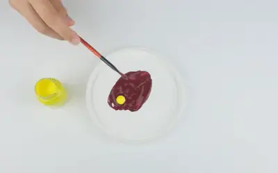
To make the maroon color, blend red and blue in a 5:1 ratio. Adjust the shades of red to find the perfect undertone. Then, introduce a touch of yellow to deepen the richness. Observe the resulting color and make necessary adjustments to achieve the desired shade.
Understanding Color Theory
Color theory is a concept in the world of art, design, and aesthetics. It explores the principles behind how colors interact, blend, and create visual harmony.
By understanding color theory, you can choose and combine colors to achieve specific effects and convey desired emotions.
At its core, color theory revolves around the color wheel. This is a visual representation of the primary, secondary, and tertiary colors.
The primary colors are red, blue, and yellow. These are the colors you cannot create by mixing other colors.
Secondary colors include orange, green, and purple. To form secondary colors, blend two primary colors.
Tertiary colors are the result of mixing a primary color with a neighboring secondary color.
The color theory also encompasses concepts like hue, saturation, and value.
Hue is the basic color itself, while saturation is the intensity or purity of a color. Value is the lightness or darkness of a color.
Understanding complementary colors is another essential aspect of color theory. Complementary colors are those that are opposite each other on the color wheel, such as red and green or blue and orange.
When you place complementary colors together, you create a strong contrast and enhance each other’s visual impact.
Color theory will guide you in selecting color palettes, creating harmonious compositions, and evoking certain moods or emotions.
By grasping these principles, you make informed decisions on mixing colors and creating pleasing designs.
Two Broad Ways of Understanding Color
There are two broad ways of understanding color: the CMYK model and the RGB model.
CMYK model
The CMYK model is used in printing and stands for Cyan, Magenta, Yellow, and Key (Black). In this model, colors are created by combining different percentages of these four ink colors.
The more ink is applied, the darker the color becomes. The CMYK color space is subtractive, meaning that when all the colors are combined at their maximum intensity, they create a neutral or black color.
This model is ideal for producing printed materials, such as magazines, flyers, and posters. It ensures accurate color representation and allows for precise control over ink usage.
It is based on the principle that pigments absorb or subtract light to create the desired color.
RGB Model
The RGB model is widely used in digital displays and stands for Red, Green, and Blue. In this model, colors are created by combining different intensities of these three primary colors.
By varying the intensity of each color channel, you achieve a wide spectrum of colors. The RGB model is additive, meaning that when all three colors are combined at their maximum intensity, they create white light.
This model is used in digital applications such as computer screens, televisions, and digital artwork.
It allows for vibrant and dynamic color representations, making it well-suited for multimedia and digital design.
The RGB model is based on the principle that different intensities of light wavelengths combine to produce different colors perceptible to the human eye.

Color Mixing Basics
Color mixing is an essential aspect of art, design, and everyday life. You need to understand the basics of color mixing to create infinite possibilities and captivating compositions.
By combining different colors, we can produce an entire spectrum of new hues, shades, and tones.
Primary colors cannot be created by blending other colors together and are used to produce all other colors in the color wheel.
When you mix primary colors, you create secondary colors. Mixing primary and secondary colors leads to the creation of tertiary colors.
You can achieve color mixing through different techniques and mediums. These include paint, digital tools, and natural phenomena like the blending of light.
Maroon Color Code
A color code is a numerical representation used to identify a specific color in digital and design applications.
The maroon color code is represented in the hexadecimal (hex chart) system, which consists of a combination of six alphanumeric characters.
In the hex color chart, each digit represents an intensity level of the three primary colors.
The maroon color code is #800000. The first two characters (80) represent the intensity of red, and the remaining four characters (0000) represent the intensity of green and blue.
In the maroon color code, the intensity of red is set to its maximum value, while green and blue are absent (set to 0). This combination results in a darker red with a slight brownish or purplish undertone, representing the classic Maroon color.
Using the maroon color code will help you reproduce the color in digital graphics, websites, and other visual mediums. This ensures consistency and accuracy across different platforms.
History of Maroon
The history of maroon is traced back to ancient times when it was derived from natural sources. Originally associated with a type of chestnut tree and its color, the term “maroon” evolved to describe a dark reddish-brown hue.
Ancient civilizations obtained maroon dye from plants, minerals, and insects, using substances like the madder plant or cochineal insects.
Throughout history, maroon has held various symbolic meanings, representing power, wealth, passion, and strength. It has been used by renowned painters and fashion designers to add depth and sophistication to their works.
Maroon also carries a revolutionary significance, linked to communities of escaped slaves known as Maroons, who sought freedom and independence.
Today, maroon remains a popular color choice in design, branding, and sports, embodying luxury, elegance, and warmth.
Maroon Symbolism
Maroon carries symbolic meaning and associations that have evolved over time. Here are some common interpretations and symbolism associated with the color maroon:
Power and nobility. Maroon is associated with power, wealth, and nobility. Its deep and rich appearance conveys a sense of grandeur and luxury.
Passion and intensity. Maroon represents intense emotions and passion. It is often linked to strong feelings of love, desire, and energy.
Groundedness and stability. It is a color that symbolizes stability, groundedness, and a connection to the Earth. It evokes a sense of security and reliability.
Sophistication and elegance. Maroon is sophisticated and elegant. It has a timeless quality that adds a touch of refinement to various contexts, including fashion, art, and design.
Strength and resilience. Maroon symbolizes strength and resilience, as it is a deep and enduring color. It represents the ability to withstand challenges and persevere.
Revolution and empowerment. In certain historical contexts, maroon is associated with revolutionary movements and acts of resistance. It symbolized freedom, empowerment, and the fight against oppression.
What Does the Color Maroon Look Like?
The color maroon is deep reddish brown in appearance. It is a dark, warm, and intense hue.
Maroon shares similarities with burgundy color, but it has a reddish tone. When you visualize maroon, imagine a velvety red wine or the deep petals of a rose.
It’s a color that exudes elegance, sophistication, and a sense of depth. Maroon possesses a timeless quality that adds a touch of luxury and refinement to any setting.
Though the shades of maroon can vary depending on the context or application, it falls within a deep, dark red hue with undertones of brown or purple.
Also read: How to make burgundy paint.

What Colors Make Maroon Paint?
To create maroon paint, you will need the primary colors of red, blue, and a touch of yellow. These three colors work together to produce the rich and distinctive hue of maroon.
Mix a base of red paint and incorporate small amounts of blue paint into it. Add warmth and achieve the characteristic brownish undertones of maroon.
Then, introduce a touch of yellow paint to the mixture. Be cautious with the amount of yellow, as even a small quantity can impact the final color.
How to Make Maroon Color
Materials needed
To make the maroon color, you will need the following materials:
- Red paint
- Blue paint
- Yellow paint (optional)
- Mixing palette or container
- Mixing tools
- Paper or canvas
Step 1: Mix blue and red
Red plays a vital role as the primary color in creating maroon. To begin, select a suitable shade of red paint and place it on your mixing palette or container.
Introduce small amounts of blue paint into the red. Mix the colors together after each addition.
The addition of blue helps deepen the red pigment, allowing you to achieve the desired maroon shade. Throughout the mixing process, assess the resulting color and make adjustments as needed.
When selecting the right shades of red and blue, opt for a deep and intense red pigment and a dark blue shade such as ultramarine or phthalo blue.
Experiment with different proportions to create the maroon color that aligns with your vision.
Remember, the choices of red and blue will impact the final outcome, so take your time in selecting the right shades for your desired maroon hue.
Step 2: Add yellow paint
Adding a touch of yellow paint contributes to the richness and depth of the color. Once you have achieved a balanced mixture of red and blue, proceed to incorporate yellow into the mix.
Place a small amount of yellow paint on your palette or container next to the existing mixture of red and blue. Start with a conservative amount of yellow, as even a little can have a significant impact on the final color.
Using a brush or palette knife, introduce the yellow paint into the red and blue mixture. Blend the colors together well and ensure the pigments are well incorporated.
Observe the resulting color and assess the influence of the yellow. It adds warmth and contributes to the brownish undertones that are characteristic of maroon.
Depending on your preference, you can adjust the amount of yellow paint added. Keep in mind that a small quantity can go a long way, so proceed with caution.
Step 3: Observe and adjust
Once you have mixed your red, blue, and yellow paints to create your maroon color, observe the resulting shade and make any adjustments to achieve your desired outcome.
Take a step back and evaluate the color you have achieved. Observe its richness, depth, and overall appearance.
Consider if it aligns with the maroon shade you envisioned. This initial assessment will guide you in determining whether you need any modification.
If the maroon shade is too dark for your liking, lighten it by incorporating small amounts of white paint. Assess the color as you go along until you achieve the desired level of lightness.
If the tone is too light and you desire a deeper tone, add a darker color. Either use black or a darker shade of blue.
Make adjustments in small increments, as a little can go a long way in altering the color. Step back and reassess the color as you make modifications, ensuring you are moving closer to your desired maroon shade.
What Colors Go Well with Maroon?
Maroon pairs well with various other colors, allowing for diverse and appealing combinations. So, what color compliments maroon?
1. Gold- The rich, warm tones of gold complement maroon, creating an opulent and elegant aesthetic.
2. Cream or beige- These neutral shades provide a subtle and sophisticated backdrop to maroon. Allow it to stand out while maintaining a balanced and harmonious look.
3. Navy blue- The deep and bold nature of navy blue creates a striking contrast.
4. Olive green- The earthy and muted tones of olive green create a calming and natural pairing with maroon, evoking a sense of depth and richness.
5. Mustard yellow- When paired with maroon, mustard yellow creates a lively and energetic contrast.
6. Soft pink- The delicate and gentle tones of soft pink create a feminine and romantic pairing, offering a soft and elegant aesthetic.
7. Silver- The cool and metallic tones of silver provide a contemporary and sleek contrast that adds a touch of modernity and sophistication.
Different Shades Of Maroon
| HEX code | RGB color code | Maroon color code (%) | |
| Burgundy | #800020 | 128, 0, 32 | 50 |
| Wine | #8B0000 | 139, 0, 0 | 55 |
| Mahogany | #C04000 | 192, 64, 0 | 75 |
| Crimson | #DC143C | 220, 20, 60 | 86 |
| Plum | #660066 | 102, 0, 102 | 40 |
| Garnet | #831f1d | 131, 31, 29 | 51 |
| Rust | #B7410E | 183, 65, 14 | 72 |
| Merlot | #6C0B1B | 108, 11, 27 | 42 |
| Brick | #B22222 | 178, 34, 34 | 70 |
| Chestnut | #954535 | 149, 69, 53 | 58 |
| Cranberry | #9F1D35 | 159, 29, 53 | 62 |
| Cordovan | #893F45 | 137, 63, 69 | 53 |

Applications of Maroon Color
Maroon is a versatile color that can add depth, warmth, and sophistication to various design projects. Here are some examples of how maroon you can use maroon:
Artwork
You can use maroon as a focal color or as a part of a color palette in paintings, illustrations, and mixed media artworks.
It adds a sense of richness and intensity, enhancing the visual impact and creating a captivating atmosphere.
Home Decor
Maroon makes beautiful and elegant home decor. You can use it on walls, furniture, or accent pieces like curtains, pillows, and rugs.
Fashion
Maroon is a popular color in fashion. It creates a timeless appeal. Use in clothing, accessories, and footwear to create stylish and sophisticated looks.
Graphic design
You can employ maroon in graphic design projects. These include logos, branding materials, and promotional materials. It conveys a sense of elegance, professionalism, and durability.
Wedding themes
Most people use maroon as a theme color for weddings. Maroon adds a touch of romance and elegance.
You can use it in various aspects of the wedding, such as invitations, floral arrangements, bridesmaid dresses, and table decorations.
Maroon Color Mixing Tips
When mixing maroon color, here are some tips to achieve the desired shade:
Start with red and blue. Mix equal parts of red and blue paint to create a base for the maroon. Adjust the proportions to achieve the desired intensity and undertones.
Use a warm red. Opt for a warm-toned red, such as cadmium red or crimson, as the primary red color. These red shades have more orange undertones, which contribute to the richness and warmth of maroon.
Experiment with different blues. Try different shades of blue, such as ultramarine blue or Prussian blue. Adding more blue will result in a cooler-toned maroon, while less blue will yield a warmer tone.
Add a touch of yellow. Incorporating a small amount of yellow paint into the mixture to give maroon its characteristic brownish tinge. Be cautious with the amount of yellow, as too much can shift the color towards a different hue.
Observe and adjust. Assess the resulting color as you mix. If the shade is too bright or lacks depth, add a touch of a darker color like brown or black to deepen it. Lighten the shade by adding a small amount of white or a lighter shade of red.
Keep a record. When you achieve your desired maroon shade, make note of the proportions and colors used. This way, you can recreate the color in the future or adjust it as needed.
NOTE: Remember, achieving the perfect maroon color requires some trial and error. The shade may be influenced by various factors such as the specific shades of red, brown, and blue used, as well as the proportions and intensity of each.
FAQs
Can red and green make maroon?
No, red and green cannot make maroon. Maroon is made by combining red and blue and adding a touch of yellow. Mixing red and green will result in a different color altogether, as they are complementary colors that do not create maroon.
What colors do I mix to get maroon?
To get maroon, you need to mix red and blue paint together. Start with equal parts of red and blue, and adjust the proportions to achieve the desired shade of maroon. Additionally, adding a touch of yellow gives maroon its characteristic brownish tinge.
What two colors make dark red?
To make a dark red color, mix red with a small amount of black. Start with a base of red and add a small quantity of black paint to darken the shade. The amount of black you add will depend on how dark you want the red to be. Mix the colors gradually and test the resulting shade until you achieve the desired dark shade.
How to make yellow with acrylic paint
Making yellow paint requires two primary colors; green and blue mixed with white. The proportions of green and blue will determine the shade of yellow you achieve. For a lighter yellow, add more white to the mix, while for a darker yellow, use equal parts of the primary colors. Experiment with different ratios until you achieve the desired shade of yellow.
Does brown and red make maroon?
Yes, the red and brown mix also creates a maroon color. Maroon is a deep, reddish-brown shade often associated with richness and elegance. Combining these two colors results in the distinct and beautiful hue known as maroon.
Which color goes well with maroon, army green or olive green?
Both army green and olive green go well with maroon. The choice between the two depends on personal preference and the specific shade of maroon. Olive vs army green; Olive green has a slightly yellow undertone, while army green is darker and has more gray or brown undertones.
Conclusion
Mastering the art of creating maroon opens up a world of creative possibilities. By mixing red, blue, and a touch of yellow, you can unlock the depths of this captivating color.
The versatility of maroon allows you to complement a wide range of colors. Its rich and sophisticated nature adds depth and a touch of luxury to your creations.
Its symbolic associations of power, passion, and resilience make it even more meaningful. So, don’t hesitate to experiment and explore the different shades of maroon.
Let this alluring color breathe life into your artistic endeavors.
Interesting Read: Maroon vs Burgundy


Leave a Reply