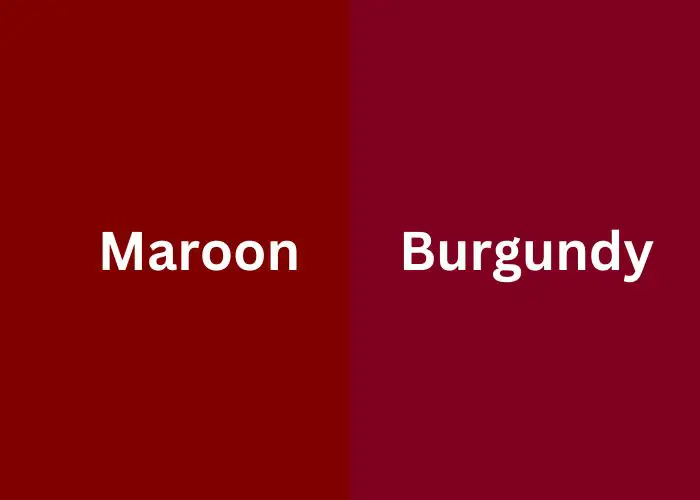
Maroon and burgundy are captivating colors that often evoke a sense of sophistication and richness. In this article, we will delve into the similarities and differences between these two hues.
Maroon, a deep reddish-brown shade, carries a history steeped in cultural significance. On the other hand, burgundy, a darker shade of red with purple undertones, boasts its own unique allure.
By exploring their origins, meanings, and practical applications, we aim to unravel the distinct characteristics of maroon and burgundy.
Join us as we embark on a journey to discover the captivating world of Maroon vs Burgundy.
What is Maroon Color
Maroon is a dark, reddish-brown color often described as a deep shade of red. It takes its name from the French word “marron,” which means chestnut.
So, what colors mixed together make maroon? It is created by mixing red with brown or black pigments, creating a rich and intense hue.
The history and meaning of maroon color
Maroon color has a rich history and carries significant meanings across different cultures.
Originally, the word “maroon” referred to a group of runaway slaves in the 17th and 18th centuries, particularly in the Americas.
The color became associated with their struggle for freedom and resilience. Over time, maroon developed symbolic connotations such as strength, endurance, and independence.
In various cultures, it represents courage, power, and the ability to overcome challenges. Today, maroon is also associated with elegance, sophistication, and a timeless appeal.
Its historical and symbolic roots add depth and character to this captivating color.
Pros and cons of maroon
Pros of Maroon Color
- Maroon color exudes a sense of sophistication and refinement.
- It can be used as a bold focal point or a subtle accent color.
- Maroon evokes feelings of warmth, comfort, and stability.
- It pairs well with neutrals, metallics, and other deep tones.
- Maroon is a classic color that transcends trends and remains relevant.
Cons of Maroon Color
- Too much maroon can create a heavy or somber atmosphere.
- Maroon is inherently a darker shade, which may not suit every setting.
- In some cultures, maroon may carry specific meanings that need to be considered in certain contexts.
- Maroon is often associated with autumn and winter, which may limit its usage in certain seasons or themes.
How to use maroon color
Here are some tips on how to effectively use maroon color:
- Use maroon as an accent color to add depth and visual interest to a space or design.
- Create a focal point by painting one wall in a room with maroon color.
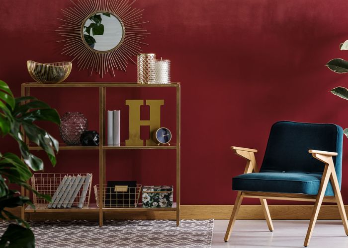
- Pair maroon with complementary colors such as gold, cream, beige, or navy blue.
- Incorporate maroon through textiles like curtains, rugs, or upholstery.
- Maroon can be used to convey a sense of luxury, tradition, or sophistication in branding and marketing materials.
- Incorporate maroon into your wardrobe through clothing, accessories, or footwear.
Different shades of maroon
Scarlet Maroon
This shade combines the vibrancy of scarlet with the deep richness of maroon. It exudes energy and intensity, with its HEX code #9C0B0E.
Scarlet Maroon adds a striking and bold element to designs, making it suitable for creating focal points or eye-catching accents.
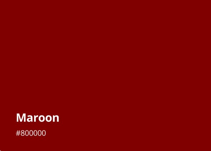
Crimson Maroon
With a HEX code of #800000, Crimson Maroon possesses a deep and luxurious quality. It showcases a slightly reddish undertone, evoking a sense of passion and elegance.
This shade of maroon is often associated with sophistication and can add a touch of drama and refinement to various applications.
Dark Red Maroon
As the name suggests, Dark Red Maroon leans towards the darker side of the color spectrum. Its HEX code is #8B0000. This shade embodies depth and intensity, offering a sense of mystery and allure.
Dark Red Maroon is ideal for creating a bold and captivating atmosphere in interior design or making a strong statement in branding.
Firebrick Maroon
Reminiscent of the color of fire bricks, Firebrick Maroon combines earthy brown undertones with a deep maroon hue.
Its HEX code is #B22222. This shade brings warmth and rustic charm to designs, evoking a cozy and inviting ambiance.
Firebrick Maroon works well in creating a comforting atmosphere in interior spaces or adding an earthy touch to fashion and accessories.
Claret Maroon
Claret Maroon represents a refined and elegant variation of the color. With a HEX code of #7F1734, it draws inspiration from the rich red tones found in fine wines.
Claret Maroon exudes sophistication and timelessness, making it a popular choice in high-end fashion, interior design, and branding where a sense of luxury and exclusivity is desired.
Oxblood Maroon
Oxblood Maroon is a deep, dark shade that leans towards brown, resembling the color of dried blood. Its HEX code is #4A0807.
This intense and slightly muted hue adds a touch of drama and edginess to designs. Oxblood Maroon is often used to create a bold and captivating look in fashion, interior decor, and graphic design.
Carmine Maroon
Hex code #960018 belongs to Carmine Maroon, a vivid and intense shade that incorporates purple undertones. This hue exudes a rich and luxurious feel, reminiscent of carmine red.
Carmine Maroon offers a sophisticated and unique option for creating striking visuals and evoking a sense of opulence.
| Shade | HEX Code | Color |
| Scarlet Maroon | #9C0B0E | Vibrant |
| Crimson Maroon | #800000 | Luxurious |
| Dark Red Maroon | #8B0000 | Alluring |
| Firebrick Maroon | #B22222 | Earthy |
| Claret Maroon | #7F1734 | Refined |
| Oxblood Maroon | #4A0807 | Intense |
| Carmine Maroon | #960018 | Opulent |
Maroon complementary colors
Complementary colors are those that are opposite to each other on the color wheel. For Maroon, the following colors can be considered complementary:
- Gold. The warm, rich tones of gold create a stunning contrast when paired with Maroon. This combination adds a touch of elegance and luxury to a design.
- Olive Green. The earthy, deep shades of olive green complement Maroon beautifully. This pairing creates a harmonious and sophisticated color scheme.
- Blush Pink. The soft and delicate tones of blush pink offer a gentle and romantic complement to Maroon. This combination creates a subtle and elegant color palette.
- Cream or Beige. Neutral tones like cream or beige provide a calming and balanced contrast with Maroon. This pairing creates a timeless and refined look.
- Teal or Turquoise. The cool, vibrant hues of teal or turquoise create a striking and modern complement to Maroon. This combination adds a fresh and contemporary touch to designs.
- Copper or Bronze. The warm metallic tones of copper or bronze create a rich and luxurious contrast with Maroon. This pairing adds depth and a touch of glamour to a design.
What is Burgundy Color
Burgundy is a deep, dark red color. It resembles the shade of red wine from the Burgundy vineyards of France.
It is formed by mixing red with a touch of deep purplish red color or blue, resulting in a sophisticated and luxurious hue. Here’s more on how to make burgundy color.
The history and meaning of burgundy color
Burgundy color has a rich history and carries significant meanings across different cultures.
The name “burgundy” originated from the Burgundy wine produced in the Burgundy region of France.
The color gained popularity during the 19th century and became associated with the luxurious and vibrant red shades found in the renowned wine.
Symbolically, burgundy is often associated with power, wealth, and sophistication. Its deep and intense hue represents opulence and grandeur.
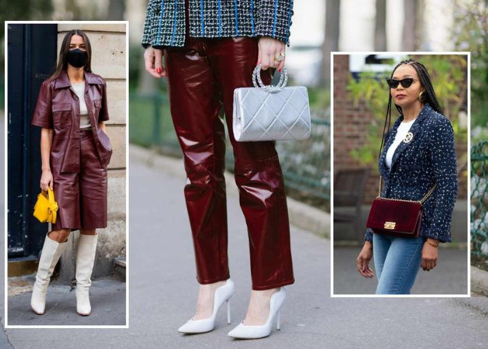
In fashion, burgundy has been a staple color, conveying elegance and a sense of refined taste.
It has also been used in interior design to create a sense of warmth and richness in spaces.
Pros and cons of burgundy color
Pros of Burgundy color
- Rich and deep hue
- Evokes elegance and sophistication
- Creates a sense of warmth and coziness
- Versatile and complementary to many color schemes
- Adds a pop of color and visual interest
Cons of Burgundy color
- Can be overpowering if used excessively
- May appear dark in poorly lit spaces
- Limited compatibility with certain color palettes
- Might not be suitable for every design style
- Can create a somber or heavy ambiance if not balanced with lighter tones
How to use burgundy color
Here are some tips on how to effectively use burgundy color:
- Incorporate burgundy through accent pieces such as throw pillows, curtains, or rugs.
- Create a focal point by painting a single wall in a room with burgundy.
- Pair burgundy with neutral colors like beige, cream, or light gray. This combination creates a sophisticated and balanced look.
- Explore complementary colors that work well with burgundy, such as gold, mustard yellow, or deep greens.
- Incorporate burgundy into your wardrobe through clothing, accessories, or footwear. Wear burgundy dress to have a sophisticated look.
- Utilize burgundy in branding and graphic design to convey a sense of luxury and sophistication.
Different shades of burgundy
Blackberry Burgundy
With a HEX code of #4c3938, Blackberry Burgundy captures the deep, dark essence of ripe blackberries.
This shade brings a sense of richness and mystery, adding a touch of sophistication and depth to designs.
Bruised Burgundy
Bruised Burgundy, with a HEX code of #5b4148, embodies the color of a deep bruise.
It showcases a mix of burgundy and purplish tinge, offering a unique and slightly edgy variation. This shade adds a sense of depth and intrigue to creative projects.
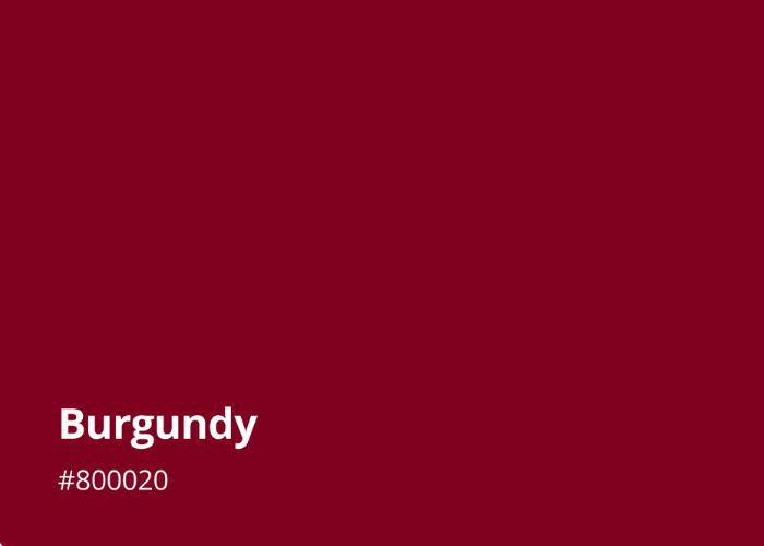
Burgundy
The classic Burgundy shade, represented by the HEX code #900020, exudes elegance and luxury.
This deep and intense hue embodies the essence of the Burgundy wine it is named after. Burgundy is a refined and timeless color that evokes sophistication and high-end aesthetics.
Burgundy Wine
Resembling the rich hue of Burgundy wine, this shade carries a HEX code of #6c403e. It showcases a distinctive red shade with subtle brown undertones.
Burgundy Wine conveys a sense of indulgence and refinement, making it a popular choice in fashion, interior design, and branding.
Vivid Burgundy
As the name suggests, Vivid Burgundy, represented by the HEX code #9f1d35, offers a bold and intense variation. This shade stands out with its vibrant red tones and commands attention.
Vivid Burgundy adds a striking and captivating element to designs, making it suitable for creating focal points or creating a high-impact visual statement.
Vulcan Burgundy
With a HEX code of #5f3e42, Vulcan Burgundy exhibits a deep and earthy quality. This shade combines rich burgundy tones with hints of brown, resembling the color of volcanic soil.
Vulcan Burgundy brings warmth and a grounded feel to designs, adding a touch of natural elegance.
| Shade | HEX Code | Color |
| Blackberry Burgundy | #4c3938 | Deep, Dark Purple-Red |
| Bruised Burgundy | #5b4148 | Burgundy with Purple Undertones |
| Burgundy | #800020 | Deep Red with Brown Undertones |
| Burgundy Wine | #6c403e | Rich Wine Red |
| Vivid Burgundy | #9f1d35 | Bright and Intense Burgundy |
| Vulcan Burgundy | #5f3e42 | Earthy Brownish Burgundy |
Burgundy complementary colors
Complementary colors are those that are opposite to each other on the color wheel. For Burgundy, the following colors can be considered complementary:
- Olive Green. The deep, rich tones of olive green create a striking contrast when paired with Burgundy. The combination of these colors adds depth and sophistication to a design.
- Gold. The warm and luxurious hue of gold complements Burgundy beautifully. This combination exudes a sense of opulence and elegance, often seen in high-end designs.
- Cream or Beige. Soft and neutral tones like cream or beige create a balanced and harmonious pairing with Burgundy. This combination offers a timeless and sophisticated look.
- Navy Blue. The deep, cool tones of navy blue complement Burgundy by creating a striking and bold visual impact. This pairing is often used to create a sophisticated and refined color scheme.
- Mustard Yellow. The vibrant and warm tones of mustard or golden yellow paint can create an energetic and lively contrast with Burgundy. By understanding how to make mustard color paint to use, you create a modern touch to designs.
- Rose Pink: The soft and delicate hue of rose pink offers a subtle and romantic complement to Burgundy. This pairing creates a harmonious and gentle color palette.
Maroon vs Burgundy: Head-by-Head Comparison
Here’s a head-to-head comparison between Maroon and Burgundy:
1. Psychological Effects
Maroon and Burgundy both evoke psychological responses due to their deep, intense nature. Maroon is associated with emotions such as warmth, strength, and passion.
It can create a cozy and inviting atmosphere. On the other hand, Burgundy conveys elegance, sophistication, and a sense of luxury. It elicits feelings of richness and indulgence.
2. Associations
Maroon is often associated with tradition, resilience, and even rebellion. Historically tied to the Maroon communities of runaway slaves, it symbolizes strength, freedom, and determination.
Burgundy, influenced by the color of Burgundy wine, carries associations of opulence, refinement, and prestige. It is frequently linked to high-end fashion, fine wines, and luxury goods.
3. Uses
Both Maroon and Burgundy find extensive use across various domains. Maroon is a popular choice in interior design, fashion, and branding.
It can be employed as an accent color or a dominant hue, adding depth and character to a space or design.
Burgundy, known for its timeless appeal, is often used in fashion, home decor, graphic design, and marketing materials to create a sense of sophistication and elegance.
4. HEX and RGB Codes
In terms of HEX and RGB codes, Maroon is typically represented as #800000 or RGB(128, 0, 0).
Burgundy, on the other hand, is commonly defined as #800020 or RGB(128, 0, 32). These codes serve as standardized references for digital color representation.
5. Saturation
Maroon and Burgundy differ in saturation. Maroon tends to have a lower saturation level, giving it a deeper and more muted appearance.
Burgundy, with its slightly higher saturation, exhibits a richer and more intense quality.
6. Brightness

When comparing brightness, Maroon often have darker shades than Burgundy. Maroon’s deeper shade with brownish tinge creates a subdued and velvety look.
Burgundy, with its hints of purple or blue, possesses a slightly brighter and livelier quality.
7. Warmth/Coolness
Maroon leans toward warm tones due to its red and brown color components. It radiates a cozy and inviting warmth.
Burgundy, with its purple or blue undertones, exhibits a cooler aspect while still retaining a sense of richness and depth.
8. Metallic Appearance
Both Maroon and Burgundy can have a metallic appearance when used in specific finishes or textures.
This characteristic enhances their elegance and adds a touch of glamour to the colors, especially when employed in metallic sheens or iridescent finishes.
9. Symbolic Meaning
Maroon’s symbolic meaning encompasses strength, resilience, and freedom. It represents the courage to break free from oppressive situations.
Burgundy, on the other hand, symbolizes luxury, refinement, and indulgence. It signifies opulence and sophistication.
10. Popularity
In terms of popularity, both Maroon and Burgundy have gained recognition for their timeless and captivating qualities.
Maroon has been embraced in various cultures and industries for its versatility and emotional impact Burgundy has become a sought-after color in fashion, design, and marketing, representing elegance and luxury.
FAQs
Is wine red maroon or burgundy?
Wine red is often associated with both maroon and burgundy. Depending on the specific shade and context, it can fall within the spectrum of either color. Wine red typically shares similarities with both maroon and burgundy, exhibiting deep red tones with hints of brown or purple.
Is maroon the same as dark red?
Maroon and dark red are similar but not exactly the same. Maroon is a specific shade of dark red that has a deeper, reddish-brown hue. Dark red can encompass a broader range of shades, including variations that are closer to true red or have different undertones.
Is maroon a shade of purple?
Maroon is not considered a shade of purple. It is primarily a shade of red with brown undertones. While it may appear to have subtle hints of purple in certain lighting or with specific variations, maroon is primarily classified as a dark, reddish-brown color.
Is burgundy and wine color the same?
Burgundy and wine color are closely related but not exactly the same. Burgundy is often associated with the deep red color found in Burgundy wine. It typically has a dark, rich red tone with hints of purple or blue. Wine color, on the other hand, can encompass a broader range of red hues, including shades that may be lighter, brighter, or have different undertones.
Conclusion
When comparing Maroon and Burgundy, we find two captivating colors with different qualities.
Maroon is a deep, reddish-brown shade representing strength and tradition. While Burgundy embodies elegance and luxury.
Both colors are timeless and used in fashion, design, and branding. Maroon feels warm and resilient, while Burgundy gives a sophisticated and indulgent vibe.
Choosing between them depends on the desired mood and meaning. Whether you want a cozy and traditional feel or a fancy and refined look, Maroon and Burgundy offer versatile options that bring depth and charm to various creative settings.


Leave a Reply