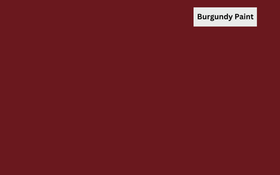
Turn your decorating dreams into a reality with the help of this guide to making burgundy paint. Custom burgundy paint is the perfect choice if you’re looking for an exciting way to add a unique, stylish flair to your home.
It will give your space that extra touch of sophistication and glamour, and it’s also surprisingly simple to make.
With just a few basic tools and regular household items, you can have beautiful burgundy walls quickly.
Read on for more information on how to make burgundy paint. Creating your one-of-a-kind burgundy paint could be easier than you think.
About Burgundy Color
Burgundy color, often referred to as a shade of red, has a rich history and origin. The term “burgundy” originated from the region of Burgundy in France, renowned for its wine production. Burgundy is derived from the deep, dark red shades commonly found in Burgundy wine.
The use of burgundy as a color can be traced back to the late 19th century when it gained popularity in fashion and design. It became associated with elegance, sophistication, and luxury, often used to create a sense of opulence and refinement.
Burgundy’s distinctive red shade with undertones of purple or blue gives it a unique character and distinguishes it from other shades of red.
Over the years, burgundy has remained popular in various applications, including fashion, interior design, and art. It has become a staple color for formal events, symbolizing sophistication and prestige.
In contemporary times, burgundy continues to be celebrated for its timeless appeal and versatility. Its association with the wine-producing region and its deep, alluring tone have cemented its place as a classic, elegant color that captures attention and evokes a sense of refinement.
How To Make Burgundy Paint
To make burgundy paint, start with a base of red paint. Gradually add small amounts of blue paint while mixing thoroughly until the desired shade is achieved. Adjust the ratio of red to blue to achieve different variations of burgundy.
Shades of Burgundy
The four common shades of burgundy are Vivid Burgundy, Old Burgundy, Bruised Burgundy, and Schauss Pink.
Vivid Burgundy
Vivid burgundy is a vibrant and intense shade of burgundy characterized by its deep and saturated red tones. It is a bold and eye-catching color that commands attention. The vividness of this shade adds energy and liveliness to any design or fashion application.
Old Burgundy
Old burgundy is a more subdued and aged variation of the classic burgundy color. It leans towards a darker and more brown paint, resembling the color of aged wine.
This shade exudes vintage charm and sophistication, evoking a timeless and nostalgic aesthetic.
Bruised Burgundy
Bruised burgundy is a unique and intriguing shade within the burgundy spectrum. It combines dark reds with hint of blue and purple shade, resembling the color of a healing bruise. In burgundy color scheme, this shade has a mysterious and moody quality, evoking a sense of depth and complexity.
Schauss Pink
Schauss pink is a vibrant and intense pink hue similar to burgundy. It is a deep and rich shade of pink with strong red undertones. While it may not fall within the traditional burgundy color range, the resemblance in depth and intensity creates an interesting connection between the two colors.
Composition of Burgundy Color
Burgundy is typically composed of a base color of red combined with varying amounts of blue and/or purple.
The primary component is red, which provides the foundation for the deep and rich hue. It also has blue and/or purple pigments that contribute to the undertones that give burgundy its distinctive character.
What Two Colors Make Burgundy
Burgundy is typically made by combining various shades of red with a touch of blue or purple. The exact combination may vary depending on the desired shade of burgundy.
Generally, burgundy is created by adding a darker or deeper red pigment to a base of red and incorporating a small amount of blue or purple to give it its characteristic undertones.
The specific proportions of red, blue, and purple will determine the exact shade of burgundy, allowing for a range of variations within the color family.
DIY Steps to Make Burgundy Color at Home
Step 1: Scope ultramarine blue, cadmium red, and true black paint with a palette knife. These three colors will serve as the base for creating the burgundy shade.
Step 2: Mix the ultramarine blue and cadmium red in a plastic can. Start with equal parts of each color and blend them thoroughly until you achieve a rich purple hue. This serves as the foundational undertone for the burgundy color.
Step 3: Once the purple undertone is achieved, introduce a small amount of true black to the mixture. This helps deepen the color and adds richness. Add the black incrementally, mixing well after each addition until you reach the desired darkness and intensity.
Step 4: Continuously evaluate the color as you mix and adjust. If the shade is dark blue, add more red to balance it out. If it appears too dark or muddy, add more blue or red to restore the desired burgundy tone.
Step 5: After achieving the desired burgundy color, thoroughly mix the paint to ensure a consistent hue. Test the color on a small area or piece of paper to see how it appears when dry.
Make and Use Different Shades of Burgundy Red
While making a variety of shades of burgundy, understand the right color combinations needed to achieve a desired shade. You can darken a burgundy shade or make it lighter using the following procedures:
How to lighten burgundy shade
To lighten a burgundy shade, start by adding small amounts of a lighter red or pink pigment to the burgundy mixture. Mix well and assess the color.
Increase the proportion of the lighter pigment until the desired lightness is achieved. Keep in mind that the addition of lighter pigments should be done incrementally to maintain control over the lightening process.
Continuously evaluate and adjust until the burgundy shade reaches the desired level of lightness, creating a lighter and more vibrant variation of burgundy.
How to darken burgundy shade
The easiest way to create a dark burgundy color is to mix black and red paint until you get the desired color. Start with equal parts of red and black pigment, then add more black for a darker hue.
You can also try adding a bit of brown or purple tint to your base color if you need a slightly different tone.
Burgundy Color Code
The hexadecimal color code for burgundy is #800020. This code represents the specific combination of red and blue values that create the deep and rich hue of burgundy. The code can be used in various design applications to ensure accurate reproduction of the color.
| Code | Value | HMTL/CSS |
| Hex | 800020 | #800020 |
| RGB | 128, 0, 32 | rgb(128, 0, 32) |
| HSL | 345°, 100%, 25% | hsl(345, 100%, 25%) |
| HSV | 345°, 100%, 50% | |
| CMYK | 0, 100, 75, 50 |
Colors that go with Burgundy
If you wish to pair burgundy with colors to create a beautiful look, there are many options that you can choose from. Here are some of the colors that work well with burgundy:
White
White is a classic and timeless color that pairs well with burgundy. The crispness of white creates a striking contrast against the richness of burgundy, enhancing its depth and elegance. The combination of burgundy and white exudes a sense of sophistication and balance, whether it’s in fashion, interior design, or wedding decor.
Black
Black and burgundy create a bold and dramatic color scheme. The deepness of black complements the intensity of burgundy, resulting in a visually striking combination. The contrast between the dark tones adds depth and a sense of mystery.
Black can be used as an accent color alongside burgundy or as a dominant color with burgundy accents, creating a modern and sophisticated aesthetic.
Cream
Cream, with its soft and warm undertones, offers a subtle and delicate pairing with burgundy. The lightness cream color combination provides a gentle contrast to the richness of burgundy, creating a harmonious and refined color palette.
The combination of burgundy and cream evokes a sense of warmth, comfort, and elegance, making it ideal for creating a cozy and inviting atmosphere.
Gold
Gold adds a touch of luxury and opulence to burgundy. The shimmering and metallic qualities of gold beautifully complement the deep tones of burgundy, creating a regal and glamorous ambience.
This blend of burgundy and gold is often associated with elegance and richness, making it a popular choice for formal events, festive decorations, and upscale design elements.
Dark Green
Dark green and burgundy create a lush and sophisticated color scheme inspired by nature. The deep green tones offer a complementary contrast to the richness of burgundy, resulting in a harmonious and earthy combination.
This pairing evokes a sense of natural beauty and tranquillity, making it well-suited for rustic or botanical-themed designs.
Tan
Tan, with its warm and neutral undertones, provides a soft and balanced pairing with burgundy. The earthiness of tan complements the depth of burgundy, creating a cozy and inviting atmosphere.
This mix offers a sense of warmth and comfort, making it suitable for both casual and formal settings. The contrast between the warm tan and deep burgundy adds depth and visual interest to the overall color palette.
Applications of Burgundy
You can use Burgundy for a variety of applications. Some of the most common applications include the following:
Fashion and Apparel
Burgundy can be used to create a variety of stylish looks in clothing, from casual wear to formal attire. It is a perfect way to add some color and interest into an outfit without overwhelming the wearer. Burgundy can be used as an accent color or as the main hue for an ensemble.
When it comes to formal attire, burgundy is a great option for suits and evening gowns. For casual looks, bright burgundy color can be used in bright striped sweaters or layered over other colors.
Interior Design
Burgundy is an excellent choice for interior design as it adds sophistication and warmth to any space. This color works well with various shades of neutrals and creates a classic look.
It can be used to highlight pieces of furniture or as an overall color scheme in a room. Burgundy is also great for creating luxurious bedrooms with comfortable bedding, luxurious drapes, and elegant rugs.
Graphic Design and Branding
Burgundy is a very popular color choice for graphic design and branding as it adds an air of sophistication to any project.
When used in combination with other colors, burgundy can really make a logo or design stand out. It can also be used to create luxury packaging that will help attract customers.
Automotive
Burgundy is a great color choice for automotive projects such as cars and motorcycles. This color can be used to create a classic look or a modern feel. Burgundy also looks great when combined with chrome and black accents.
Cosmetics
Burgundy is an excellent choice for cosmetics as it helps to add a touch of luxury to any product. This color is often used in packaging for products such as lipsticks and eyeshadows, as it adds a bit of elegance. Burgundy can also be used to create bold looks with smoky eye makeup or deep burgundy lipstick shades.
Wedding Themes
Burgundy is a great choice for wedding themes as it creates an atmosphere of love and romance. This color can be used as an accent in decor or it can even be the main hue for a wedding theme. Burgundy is particularly popular when combined with white, pink, and gold accents.
Stationery and Paper Products
Burgundy is a great choice for stationery items such as invitations, thank you cards, and note cards. This color is also popular for paper products such as journals, notebooks, and planners. Burgundy can be used to create a classic look or a more modern aesthetic.
Home Accents
Burgundy is an excellent choice for home accents such as vases, pillows, curtains, throws, and rugs. This color adds a touch of sophistication to any space and helps to bring the room together. Burgundy is particularly popular when combined with neutrals or other jewel tones.
Art and Crafts
Burgundy is an excellent choice for art and crafts projects such as painting, drawings, collages, jewelry making, pottery, and woodworking. This color can be used to create a classic look or a more modern feel. Burgundy also looks great when combined with other colors such as gold, black, and white.
Decorating with Burgundy
Decorating with burgundy colors can add a touch of elegance and sophistication to any space. Burgundy, a deep and rich shade of red with hints of purple and brown, creates a warm and inviting atmosphere. Whether used as the main color or as an accent, it can transform a room into a cozy and luxurious retreat.
One of the key benefits of decorating with burgundy is its versatility. It pairs well with various colors and can be used in different design styles.
Wall Colors: Burgundy walls create a dramatic and luxurious backdrop. However, it’s best to use burgundy on an accent wall or in a room with ample natural light due to its intensity. Pair it with neutral tones like beige or cream to balance the richness of the color.
Furniture: Burgundy furniture can make a bold statement in a room. A burgundy sofa or armchair can serve as a focal point, especially in rooms with neutral or light-colored walls. Complement the furniture with accessories in gold or bronze for a regal touch.
Accessories: Burgundy accessories are a great way to introduce the color without overwhelming the space. Throw pillows, curtains, and rugs in burgundy can instantly add warmth and depth to a room. Mix and match with other colors like cream, gray, or navy blue for a harmonious look.
Metals: Incorporating metallic elements can enhance the luxurious feel of burgundy. Gold or brass accents, such as picture frames, lamps, or drawer handles, can add a touch of glamour to the space. The combination of burgundy and metallic tones creates an opulent and sophisticated ambience.
Table Setting: Burgundy table linens, such as tablecloths and napkins, can elevate your dining experience. Set the table with gold or silver accents, complementing the richness of burgundy. Use white or cream plates and glassware to create a balanced and elegant look.
Table Comparison
| Shade | Hex code | CMYK Color Code (%) | RGB Color Code |
| Teal | #008080 | 100,0,42,25 | 0,124,128 |
| Yellow orange | #FFAA33 | 0, 33, 80, 0 | 255, 170, 51 |
| Cerebellum Grey | #c8c7c9 | 0, 1, 0, 21 | 200, 199, 201 |
| Ivory | #FFFFF0 | 0, 0, 6, 0 | 100, 100, 94.1 |
| Beige | #f5f5dc | 0, 0, 10, 4 | 245, 245, 220 |
| Dark silver | #706e72 | 2, 4, 0, 55 | 112, 110, 114 |
| Camel | #C19A6B | 0, 20, 45, 24 | 193, 154, 107 |
| Saddle Brown | #8B4513 | 0, 20, 45, 24 | 139, 69, 19 |
| Red | #ff0000 | 0, 100, 100, 0 | 255, 0, 0 |
| Midnight Blue | #08113B | 78, 78, 0, 56 | 8, 17, 59 |
| Amethyst | #562f7e | 33.7, 18.4, 49.4 | 32, 63, 0, 51 |
| Green | #008000 | 100, 0, 100, 50 | 0, 128, 0 |
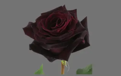
Burgundy-Colored Flowers
Burgundy-colored flowers are a captivating choice for adding depth and richness to any floral arrangement or garden. These flowers, with their deep red hues reminiscent of the luxurious burgundy color, make a striking statement and bring a sense of elegance and sophistication to any space. Examples of commonly found flowers include:
i. Burgundy Dahlias
Dahlias come in a variety of colors, including stunning burgundy shades. With their intricate petal formations and rich tones, burgundy dahlias add drama and beauty to floral displays.
ii. Burgundy Roses
Roses are timeless and romantic, and when they come in burgundy hues, they become even more alluring. Burgundy roses symbolize deep love and passion, making them a perfect choice for special occasions or to express intense emotions.
iii. Burgundy Calla Lilies
Calla lilies are known for their graceful elegance, and when they showcase the rich burgundy color, they become a true focal point. These flowers exude sophistication and are often used in bridal bouquets and formal arrangements.
iv. Burgundy Tulips
Tulips are vibrant and cheerful flowers, and when they bloom in burgundy shades, they bring a sense of warmth and luxury. Burgundy tulips can be used to create eye-catching floral arrangements or to add a pop of color to a garden bed.
v. Burgundy Peonies
Peonies are adored for their lush and romantic blooms. When they come in burgundy tones, they take on a velvety appearance, making them a captivating choice for bouquets and centerpieces.
Symbolism of Burgundy
Burgundy color painting portrays different meanings and symbolisms in different cultures. Below are some of the meanings and associations associated with this lovely hue:
Luxury
Burgundy is often associated with luxury due to its deep and opulent appearance. The rich and intense hue of burgundy evokes a sense of extravagance and high quality. It is frequently used in fashion, interior design, and luxury branding to convey a sense of sophistication and exclusivity.
Elegance
Burgundy exudes elegance with its deep and refined tones. The color is often chosen for formal events, upscale designs, and sophisticated aesthetics. Its timeless appeal and regal undertones make it a go-to choice for adding a touch of class and grace to various settings.
Sophistication
Burgundy is synonymous with sophistication. The depth and complexity of this color create a sense of refinement and cultivated taste. Whether used in fashion, interior design, or artwork, burgundy adds a level of sophistication that elevates the overall aesthetic.
Tradition
Burgundy is rooted in tradition, particularly with its association with wine and the region of Burgundy in France. The color signifies a connection to history, heritage, and established customs. It is often used in formal and traditional settings to evoke a sense of time-honored values.
Power
Burgundy carries a sense of power and authority. Its deep and commanding presence demands attention and exudes confidence. In fashion, burgundy is often chosen to make a bold statement or convey a sense of strength and influence.
Wealth
Burgundy has long been associated with wealth and prosperity. Its association with luxurious fabrics, regal aesthetics, and fine wines contributes to this symbolism. The deep, rich tones of burgundy convey a sense of abundance and affluence.
Intensity
Burgundy’s intensity is reflected in its deep and saturated tones. The color exudes a sense of passion, depth, and emotional intensity. It can create a visually striking impact and captivate attention with its bold and vibrant presence.
Romance
Burgundy is often associated with romance and passion. Its deep red undertones evoke emotions of love, desire, and sensuality. The color is frequently used in romantic settings, such as weddings and intimate spaces, to create an atmosphere of warmth, intimacy, and romance.
Commonly Confused Colors with Burgundy
Burgundy confuses many people because of its similarity to other shades. Some of these common shades include purple, brown and red:
Red vs. Burgundy Color
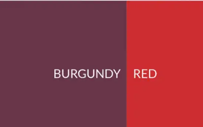
Red and burgundy are often confused due to their similar deep and rich appearances. While burgundy is a shade of red, it has distinct characteristics that set it apart.
Burgundy is a darker and more intense variation of red, with undertones of purple or blue. It leans towards a deep red wine color, conveying a sense of sophistication and depth.
Red, on the other hand, encompasses a broader range of shades, from bright and vibrant to deeper hues. It lacks the specific undertones found in burgundy, and it can evoke different emotions and associations depending on its shade, such as energy, passion, or excitement.
Brown vs. Burgundy Color
Brown and burgundy are both warm and earthy colors, but they differ in terms of depth and undertones. Brown is a broad color category that encompasses a range of shades, from light tan to dark chocolate.
It is predominantly a mixture of red, yellow, and black pigments. Burgundy, however, is a deeper and darker shade with red as its primary undertone.
It carries a sense of richness and sophistication, while brown has a more neutral and organic feel. Burgundy adds intensity and a touch of luxury, while brown provides warmth and a natural earthy tone.
Check our article on how to mix brown paint acrylic if you are interested in this compo.
Purple vs. Burgundy Color
Purple and burgundy share similar undertones, making them frequently mistaken for one another. However, there are distinctions between the two.
Purple is a broad color category that includes a range of shades, from light lilac to deep eggplant. Burgundy, on the other hand, is a specific shade of red with purple or blue undertones. It falls within the darker end of the purple spectrum, often resembling the color of red wine.
While purple can convey various moods and associations depending on its shade, burgundy exudes a sense of depth, sophistication, and elegance.
Burgundy leans towards a more reddish hue, while purple encompasses a broader range of shades, including both warmer and cooler tones.
Maroon vs. Burgundy Color
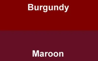
Maroon and burgundy are often used interchangeably, but they do have slight differences. Maroon color is a dark, red-brown tint that falls within the red color family. It has a warm undertone and is slightly less vibrant than burgundy.
While burgundy has undertones of purple or blue, maroon leans more towards brown. The distinction between maroon and burgundy can be subtle, and the terms are sometimes used interchangeably, particularly in fashion and design.
To help you differentiate further, you can read about what colors make maroon.
Wine vs. Burgundy Color:
Wine color is closely related to burgundy, as both are inspired by the hues of red wine. Wine color shares similar deep red and purple undertones with burgundy, often appearing rich and sophisticated.
However, wine color can have more variations, encompassing shades that range from lighter to darker tones within the red-purple spectrum. While there may be some overlap, the specific shades and associations of wine color can differ from those of burgundy.
More Interesting Facts to Know About Burgundy Paint
- Origin: Burgundy paint gets its name from the Burgundy region in France, which is famous for its production of deep red wines. The color is inspired by the rich and intense hues found in these wines.
- Historical Significance: Burgundy paint has a long history and has been used in art and design for centuries. It gained popularity in the late 19th century as a color associated with elegance and luxury.
- Versatility: Burgundy paint is a versatile color that can be used in various design styles, from traditional to contemporary. It adds depth, warmth, and sophistication to interiors, creating a sense of richness and opulence.
- Emotional Impact: Burgundy is often associated with emotions such as power, passion, and strength. It has a commanding presence and can create a dramatic and bold statement in any space.
- Complementary Colors: Burgundy pairs well with a range of colors, including neutrals like beige and cream, as well as contrasting colors like teal or mustard. It can be used as an accent color or as a dominant hue, depending on the desired effect.
- Symbolism: Burgundy is often associated with wealth, luxury, and prestige. It is frequently used in high-end fashion, interior design, and branding to evoke a sense of sophistication and exclusivity.
- Cultural Significance: Burgundy is deeply rooted in French culture, particularly in relation to wine and gastronomy. It represents the region’s heritage and is often associated with fine dining and refined taste.
- Timeless Appeal: Despite evolving color trends, burgundy has maintained its allure and continues to be a popular choice in design. Its timeless appeal and ability to create a sense of elegance make it a classic color choice.
- Artistic Expression: Artists often use burgundy paint to add depth and intensity to their works. It can convey emotions, create contrast, and add a sense of drama to paintings, sculptures, and mixed media pieces.
- Psychological Influence: Burgundy is believed to have psychological effects on individuals, such as stimulating creativity, boosting confidence, and promoting feelings of warmth and comfort.
Related post: How do you make bronze?
FAQs
Is burgundy a shade of red?
Burgundy is often considered a shade of red. It is a dark red color with purple or blue undertones, resulting in a deeper and richer hue. While burgundy falls within the red color family, it is distinguished by its specific tone and intensity, which sets it apart from brighter or lighter shades of red.
Which colors are close to burgundy?
Colors that are close to burgundy include maroon, wine, and deep red. These colors share similar dark and rich qualities, often appearing deep and intense. While they may have slight variations in undertones, they are all within the same color family, sharing a sense of depth and sophistication.
Is burgundy a warm or cool color?
Burgundy is a warm color due to its red base. Warm colors are associated with energy, passion, and coziness. However, depending on the specific shade and undertones, burgundy can have cool elements as well, such as when it leans towards a bluish or purplish hue. Overall, burgundy is often perceived as a rich and warm color.
What does burgundy look like?
Burgundy is a deep and dark red color with undertones of purple or blue. It resembles the color of red wine, exhibiting a sense of depth, richness, and elegance. Burgundy can vary in intensity and saturation, but it generally appears deep and velvety, creating a sense of sophistication and luxury.
What color is closest to burgundy?
The color closest to burgundy is typically maroon. Maroon shares similar deep red undertones with burgundy and is often used interchangeably. While there may be slight variations in specific shades and undertones, maroon closely resembles the rich and dark qualities of burgundy.
Why is burgundy a trendy color for hair?
Burgundy is a trendy color for hair due to its unique and eye-catching appearance. It adds a bold and vibrant dimension to hair, offering a departure from more traditional hair colors. Burgundy hair dye is associated with a sense of individuality, confidence, and a touch of edginess, making it a popular choice for those seeking a striking and fashionable look.
What Colors give Burgundy a deep reddish brown color look?
To achieve the deep reddish-brown color of burgundy, a combination of red and purple is typically used. Adding a touch of brown to the mix enhances the richness and depth. Therefore, the colors that give burgundy its characteristic look are primarily red, purple, and a hint of brown.
How to make burgundy acrylic paint?
To make burgundy acrylic paint, start with a base of red acrylic paint. Gradually incorporate blue or purple pigments to the red until the desired burgundy shade is achieved. Adjust the ratios of red, blue, and purple to fine-tune the color. Continuously evaluate and mix until the desired burgundy hue is achieved.
Read also: How to make royal blue acrylic color paint.
Are there alternative natural pigments for making burgundy?
Yes, there are alternative natural pigments for making burgundy. Some options include using natural dyes from plants such as madder root, beetroot, or elderberry. These natural pigments can be extracted and used to create a range of burgundy shades, providing a more organic and sustainable approach to achieving the color.
What is a contrasting color to burgundy?
A contrasting color to burgundy is typically a light or pale shade. Light or pastel colors such as blush pink, light gray, or soft peach can create a contrasting effect when paired with burgundy. The contrast between the deep burgundy color and the lighter shades can create a visually appealing and balanced color palette.
I have already simplified the procedure on how to make peach color and how to make pink paint with primary colors, so that you don’t struggle to find light colors.
Conclusion
With the right combination of colors, a stunning display of art can be accomplished with burgundy. Now you know how to coordinate and mix your way to a fabulous burgundy tone. Use these steps and have fun, whether it’s for walls, furniture, walls or artwork.
Remember to keep playing around with those combinations until you find the best shade that suits your room or project. Follow these simple guidelines, and you’ll be well on your way to creating an amazing masterpiece of deep, dark burgundy hues that will certainly wow all who see it.


Leave a Reply